Building the Skeleton
Most books on CSS begin by teaching you how to deal with the bits and pieces of a Web page: fonts, colors, lists, and the like. Then, they move on to explaining the broader issues associated with CSS positioning (CSS-P), which affect the layout of pages rather than the appearance of individual elements.
In this book, I take the opposite approach. I first look at the site-level and pagelevel issues involved with CSS design, so that we can understand the big picture perspective of page layout without tables (which is, after all, the primary thrust of this book). And later, in Part III, I’ll discuss styling the content of the pages we’ll be laying out in this and the next chapter.
This chapter focuses specifically on creating the basic structural layout of a Web page or site using CSS. In it, I’ll discuss multi-column layouts – both in general and very specifically – as they relate to the Footbag Freaks site. I’ll teach you about boxes, borders, and the famous Box Model of CSS design. I’ll delve into the intricacies of creating and using two- and three-column page layouts, and into the mysteries of floating objects. I’ll guide you through the process of creating dummy layouts for the pages you’ll encounter in the Footbag Freaks project, and in other projects you may create.
I’ll conclude with the usual tips on dealing with the layout issues presented in this chapter – the issues involved in converting pages to CSS from an existing table-centric design.
Enumerating Design Types
One of the first decisions you have to make when you create any Website, but particularly one where you intend to put CSS to its most effective use, is how many different types of pages and elements you’re going to need.
How Many Page Types?
Most sites use more than one basic page layout. The front, or index page, often has a different look and feel from the “inside” pages. In the Footbag Freaks site, for example, the specification tells us that bread-crumb navigation will appear on all but the front page. An inspection reveals that the large graphic that displays near the top of the front page does not appear on other pages of the site.
On a typically complex ecommerce site, you might run into far more page types. For example, such a site might include different layouts for its:
- front page (index)
- catalog pages
- secure ordering pages
- main content pages
- site map page
Some of these pages might display dynamic content that is stored in a database and generated in response to specific user requests. Others might be flat HTML pages that never change unless you redesign them.
The Footbag Freaks site appears to need only one type of page layout. The secondary page has fewer elements than the home page, but the relative positioning and layout of the common elements doesn’t change from one page type to the other.
How Many Design Elements?
Figure 5.1. The Footbag Freaks Home Page

Looking at the Footbag Freaks home page, we can easily identify the following seven design elements, indicated in Figure 5.1:
- the top of the page where the Footbag Freaks logo appears against a colored background
The second page of the site eliminates the fourth design element from this list and adds a submenu navigation element inside the main navigation. So, each page type has seven design elements, six of which are common, and one of which is unique to each page.
CSS Positioning and Multi-Column Page Layouts
Now that you have an idea of the number of pieces of design for which you’re going to define CSS rules, let’s take a step back and get a basic grounding in how to use specific CSS rules to create these layouts and effects.
The CSS Box Model
From the perspective of a style sheet, everything you deal with in HTML pages can be viewed as living inside a box. This fact is generally far more obvious when you’re formatting large chunks of content, like the seven design elements in the Footbag Freaks Website. But it’s true even when you’re dealing with individual components of those elements, like headings, lists, list elements, and even segments of text.
The basic CSS box model is shown in Figure 5.2.
Figure 5.2. Basic CSS Box Model

At the center of the CSS box model is the content itself. Don’t think of this “content” as being the same as words or pictures that comprise the content of a news story or a set of links. The content is anything contained within the area of the box.
Notice from Figure 5.2 that the visible width of the box is determined by adding together the content width, the padding and the border. The margin determines the distance on each side between the visible box and adjacent elements. Similarly, the visible height of the box is determined by adding the content’s height to the padding and border settings. Once again, the margin determines how far the box will be separated from adjacent objects vertically.
The width of each of these elements – margin, border, and padding – can be set using four CSS properties (one for each side of the box), or using a single shorthand property. Border behavior is slightly more complicated because a border can have not only a width but also visible characteristics such as line style and color.
I’ll begin by explaining and demonstrating the use of padding in some detail. Then, I’ll move on to a discussion of margins, which will be briefer, as it’s so similar to padding. Finally, I’ll discuss the border property and its variations.
For the next several sections, I’ll use a basic, single-box layout to demonstrate CSS rule techniques. It starts out as in Figure 5.3 with no padding, border, or margin properties defined, so that the content is the same size as the box.
Figure 5.3. Starting Point for Box Model Demonstrations

I’ve given the h1 element a gray background so you can see more easily the impact of the effects I’ll be demonstrating. I’ll describe the background-color property I’ve used here more fully in Chapter 7.
This HTML produces the page shown in Figure 5.3:
<!DOCTYPE html PUBLIC "-//W3C//DTD XHTML 1.0 Transitional//EN"

"https://www.w3.org/TR/xhtml1/DTD/xhtml1-transitional.dtd">

<html xmlns="https://www.w3.org/1999/xhtml">

<head>

<title>Box Model Demo</title>

<meta http-equiv="Content-Type"

content="text/html; charset=iso-8859-1" />

<style type="text/css">

<!--

h1 {

  background-color: #c0c0c0;

}

-->

</style>

</head>

<body>

<h1>Help! I'm Stuck in a Box Model!</h1>

</body>

</html>
Throughout the rest of this discussion, I’ll be modifying only the style sheet information, so I’ll reproduce only that section of the code, indicating any changes
in bold.
Pixels Versus Percentages
Because the box model deals with the display of content on the screen, the pixel measurement (abbreviated px) is the most commonly used of the absolute measurement units in CSS. However, often we desire to create a “stretchy” layout, in which case it is necessary and appropriate to use the percentage model (with the % symbol), rather than pixels. I’ll have more to say on this subject in
Chapter 6.
Setting the Padding Properties
There are four properties that together define the padding around an object in a CSS rule: padding-left, padding-right, padding-top and padding-bottom.
Let’s change just one of the padding settings to get a feel for how this works. Modify the style sheet in the sample file, so that it looks like the following fragment (remember that the new material is bold):
h1 {

  background-color: #c0c0c0;

  padding-left: 25px;

}
The result of this change is shown in Figure 5.4. Notice that the text now begins 25 pixels from the left side of the box, resulting in 25 pixels of blank, gray space to the left of the text.
Figure 5.4. padding-left Demonstration

As you’d expect, you can set the other padding sizes the same way, as shown in this code fragment:
h1 {

  background-color: #c0c0c0;

  padding-left: 25px;

  padding-top: 15px;

  padding-bottom: 30px;

  padding-right: 20px;

}
You can see the effect of these changes in Figure 5.5.
Figure 5.5. All Four Padding Properties Defined

You may notice that the right side of the padding appears not to have worked. You asked for 20 pixels, but no matter how wide you stretch the window, the gray area defining the box that contains our h1 element just goes on and on.
This is because padding-right creates a space between the right edge of the text and the right edge of the heading, as represented by the gray box. This spacing is difficult to see in this case, because the heading automatically spans the width of the browser window, leaving plenty of room for the text to breathe on the right
side. If you make the browser narrow enough, though, you can see the padding
take effect.
Figure 5.6 demonstrates this principle. The first screenshot shows how the page in Figure 5.5 looks if you narrow the browser window so that there would be room on the first line for the word “in” if padding-right were not set as it is. The second screenshot reinforces this idea by showing the page resized so that one word only fits on each line. Notice that the right padding size looks, in several cases, large enough to accommodate the word on the next line. In fact, merely removing the padding-right property from the style sheet produces the result shown in the third screenshot.
Figure 5.6. Demonstration of Effect of padding-right

Because it’s often necessary to adjust padding around objects in HTML, the CSS standards define a shorthand property simply called padding. You can give this property up to four values. Table 5.1 tells you how the properties will be assigned in each case.
Table 5.1. Effect of Multiple Values on padding Shorthand Property
1 You can remember this as clockwise, starting from the top, or as TRBL (trouble), whichever you find easier to remember.

For example, the last code fragment above could be rewritten using the padding shorthand property as follows:
<style type="text/css">

<!--

h1 {

  background-color: #c0c0c0;

  padding: 15px 20px 30px 25px;

}

-->

</style>
To create equal top and bottom padding, and equal left and right padding, even though right padding is all but meaningless in this context, you could use:
<style type="text/css">

<!--

h1 {

  background-color: #c0c0c0;

  padding: 15px 25px;

}

-->

</style>
The result of this code fragment is shown in Figure 5.7.
Figure 5.7. Equal Top-Bottom and Left-Right Padding Using padding Shorthand

Finally, to create equal padding on all four sides of the h1 element, you could code this:
h1 {

  background-color: #c0c0c0;

  padding: 25px;

}
This code produces the result shown in Figure 5.8.
Figure 5.8. Equal Padding on All Sides Using padding Shorthand

What if you use either ems or percentages for the padding values? The two have slightly different effects. The em unit scales the padding according to the size of the font of the content, while the percentage unit scales the padding according to the width of the block that contains the element. To demonstrate these effects, we’ll work with a new HTML page that displays two headings against colored backgrounds on a page of a contrasting color.
Here’s the HTML for that demo page.
<!DOCTYPE html PUBLIC "-//W3C//DTD XHTML 1.0 Transitional//EN"

"https://www.w3.org/TR/xhtml1/DTD/xhtml1-transitional.dtd">

<html xmlns="https://www.w3.org/1999/xhtml">

<head>

<title>Box Model Demo</title>

<meta http-equiv="Content-Type"

content="text/html; charset=iso-8859-1" />

<style type="text/css">

<!--

body {

  background-color: #808080;

}

h1, h4 {

  background-color: #c0c0c0;

}

-->

</style>

</head>

<body>

<h1>Help! I'm Stuck in a Box Model!</h1>

<h4>But it's not too crowded if you're just a little old h4

heading like me! In fact, it's kind of cozy in here.</h4>

</body>

</html>
Notice that I’ve given the page a dark grey background and I’ve added an h4 element, which I’ve styled in the same CSS rule as the h1 element.
This HTML page displays as shown in Figure 5.9.
Figure 5.9. Proportional padding Page Starting Point

Now, let’s change the style sheet in this page so that it uses the padding shorthand to create a 1em padding space around the objects. The code fragment below will do the trick:
body {

  background-color: #808080;

}

h1, h4 {

  background-color: #c0c0c0;

  padding: 1em;

}
As you can see in Figure 5.10, the amount of padding placed around the two heading elements is proportional to the size of the font in the elements themselves. Recall that 1em is equal to the height of the font in use. Consequently, much more space is placed around the h1 element than around the h4 element.
Figure 5.10. Using ems for Proportional Padding

Now, let’s see what happens if we use a percentage rather than an em for the proportional padding value. Change the HTML, so the style sheet looks like this:
body {

  background-color: #808080;

}

h1, h4 {

  background-color: #c0c0c0;

  padding: 10%;

}
The result of this change can be seen in Figure 5.11. Wow! There’s a huge amount of space around those elements. The browser has applied 10% of the width of the page (the body is the containing block for heading elements) as the padding on all four sides.
Figure 5.11. Using Percentage for Proportional Spacing

I’ve been using background color behind the text of the elements to make it easy for you to see the effect of these padding settings, but it’s not necessary to have background colors behind those elements to position them. Figure 5.12 uses the same HTML code as Figure 5.11, the only difference being that I’ve removed the background colors of the body and the h1 and h4 elements. As you can see, they maintain their relative spacing.
Figure 5.12. Demonstration of padding Without Color Backgrounds

Setting Margin Properties
The way we set margin properties is identical to the way we set padding properties. The property names substitute the word “margin” for the word “padding,” including the shorthand property.
The difference between margins and padding is that margins exist outside the boundaries of the object, while padding exists inside those boundaries. Figure 5.13 illustrates this difference, based on the style sheet rules in the following code fragment.
body {

  background-color: #808080;

}

h1 {

  background-color: #c0c0c0;

}

h2 {

  background-color: #c0c0c0;

  margin-left: 5%;

}

p {

  background-color: #c0c0c0;

  margin-left: 20%;

}
Figure 5.13. margin-left Settings Push Content and Background Over

Notice that the second-level heading and the paragraph, for both of which we’ve set margin-left properties, are indented from the left edge of the browser. But here, unlike the example in which we set the padding-left property, the text and its background color block are indented. This is because the color block and the text are inside the content box and the margin is outside that box.
Let’s next apply padding-left and margin-left settings to the code fragment.
body {

  background-color: #808080;

}

h1 {

  background-color: #c0c0c0;

}

h2 {

  background-color: #c0c0c0;

  margin-left: 5%;

  padding-left: 1em;

}

p {

  background: #c0c0c0;

  margin-left: 20%;

  padding-left: 10%;

}
As you can see in Figure 5.14, the margin has pushed the HTML elements and their surrounding background color blocks to the right, while the padding has moved the text to the right within the colored background blocks.
Figure 5.14. margin-left Combined with padding-left Setting

Horizontal margin effects are cumulative. Take a look at the following HTML code, and at Figure 5.15, which shows how it is rendered.
<!DOCTYPE html PUBLIC "-//W3C//DTD XHTML 1.0 Transitional//EN"

"https://www.w3.org/TR/xhtml1/DTD/xhtml1-transitional.dtd">

<html xmlns="https://www.w3.org/1999/xhtml">

<head>

<title>Box Model Demo</title>

<meta http-equiv="Content-Type"

content="text/html; charset=iso-8859-1" />

<style type="text/css">

<!--

body {

  background-color: #808080;

}

h1 {

  background-color: #c0c0c0;

}

h2 {

  background-color: #c0c0c0;

  margin-left: 5%;

  padding-left: 1em;

}

p {

  background-color: #c0c0c0;

  margin-left: 20%;

  padding-left: 10%;

}

li {

  background-color: #ffffff;

}

li p {

  margin-left: 10%;

}

-->

</style>

</head>

<body>

<h1>No left margin set for this level-one heading</h1>

<h2>Left margin set at 5% for me</h2>

<p>A paragraph with a margin-left set at 20%. This will result in

a deep indent of the paragraph from the left margin.</p>

<ul>

<li>Item one</li>

<li><p>Paragraph item</p></li>

</ul>

</body>

</html>
Figure 5.15. Cumulative Effect of Horizontal Margin Settings

The big difference here is in the bulleted list. Notice that the first item in the list displays with no extra indentation. This is not surprising, as the style rules do not define any extra margin settings for an li element. Look at the second list element, however, which is a paragraph. The last style rule in the HTML above assigns a paragraph that is the descendant of an li element a margin-left setting of 10%. As you can see, this margin applies to the existing left margin of the bulleted list, which results in the paragraph item being pushed further to the right. Note also that this same element is a paragraph, so it retains the styling of all p elements, including their padding-left setting of 10%. This produces the additional indentation of the paragraph text within the gray box in the list.
If you load the above HTML (from the file boxmodel4.html included in the code archive for this book) and resize it, you’ll notice that the indentation of the paragraph element inside the list changes as the width of the window changes. That’s because I used a relative value of 20% for the margin and 10% for the padding. Both of these values are therefore calculated relative to the width of the containing block (the list item), which in turn takes its width from the browser window. The bigger the browser window, the bigger the margin and padding on the nested paragraph.
You can set vertical margins with the margin-top and margin-bottom properties. Here’s another HTML page that demonstrates vertical margins:
<!DOCTYPE html PUBLIC "-//W3C//DTD XHTML 1.0 Transitional//EN"

"https://www.w3.org/TR/xhtml1/DTD/xhtml1-transitional.dtd">

<html xmlns="https://www.w3.org/1999/xhtml">

<head>

<title>Box Model Demo</title>

<meta http-equiv="Content-Type"

content="text/html; charset=iso-8859-1" />

<style type="text/css">

<!--

body {

  background-color: #808080;

}

h1 {

  background-color: #c0c0c0;

  margin-bottom: 5%;

}

h2 {

  background-color: #c0c0c0;

  margin-left: 5%;

  margin-top: 5%;

  margin-bottom: 5%;

  padding-left: 1em;

}

p {

  background: #c0c0c0;

  margin-left: 20%;

  padding-left: 10%;

  margin-top: 5%;

  margin-bottom: 5%;

}

-->

</style>

</head>

<body>

<h1>No top margin but 5% bottom margin</h1>

<h2>Top and bottom margins set 5% for me</h2>

<p>A paragraph with top and bottom margins set at 5%</p>

</body>

</html>
This page renders as shown in Figure 5.16. If you load this document (boxmodel5.html) and resize the browser, you’ll notice that vertical spacing increases and decreases accordingly, but stays proportional.
Figure 5.16. Demonstration of Vertical Margins

Vertical margins, unlike horizontal margins, are not cumulative. If you have two elements stacked on top of one another, like the h1 and h2 elements in Figure 5.16, the vertical spacing between them will be the greater of the marginbottom setting of the top element, and the margin-top setting of the bottom element. In this case, they are both 5%, so the distance between the two elements is 5%, not 10% as you might have guessed. If I had defined the margin-bottom of the h1 as 10%, then the vertical distance separating the two elements would have been 10% of the height of the containing block. The containing block in this case is the body, which is, for all practical purposes, the same as the browser window’s client area.
It is possible to use negative values for margin property settings. This comes in handy when you’ve set a margin-left property for the body of an HTML page, but you want to move an element closer to the left margin of the page. The following HTML results in the display shown in Figure 5.17.
<!DOCTYPE html PUBLIC "-//W3C//DTD XHTML 1.0 Transitional//EN"

"https://www.w3.org/TR/xhtml1/DTD/xhtml1-transitional.dtd">

<html xmlns="https://www.w3.org/1999/xhtml">

<head>

<title>Box Model Demo</title>

<meta http-equiv="Content-Type"

content="text/html; charset=iso-8859-1" />

<style type="text/css">

<!--

body {

  background-color: #808080;

  margin-left: 5%;

}

h1 {

  background-color: #c0c0c0;

  margin-left: -3%;

  margin-bottom: 5%;

}

h2 {

  background-color: #c0c0c0;

  margin-top: 5%;

  margin-bottom: 5%;

}

-->

</style>

</head>

<body>

<h1>Body margin is 5%, but I'm set to -3%</h1>

<h2>I have no margin-left setting, so I use the body 5%

setting</h2>

</body>

</html>
Figure 5.17. Usefulness of Negative Margin Setting

As with the padding property, the margin shorthand property lets you set all four margins with a single property declaration, and interprets multiple values using the rules shown in Table 5.1.
Setting Border Properties
Border properties are more complex than padding and margin properties because they affect not only the spacing between objects, but also the appearance of that intervening space. A border can be, and usually is, visible. In most ways, managing border properties is similar to the process for managing margins and padding. But there are some key differences.
Borders have three types of properties: style, width, and color. By default, their style is set to none, their width to medium and their color to the text color of the HTML element to which they are applied.
The border-style property can take any one of a range of constant values. The available values and the browsers that support them are shown in Table 5.2.
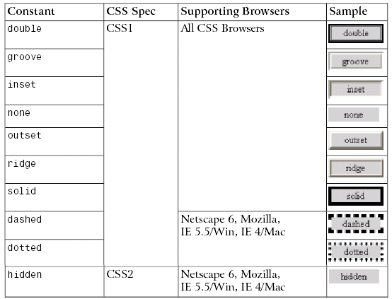
Table 5.2. CSS Border Style Constants
The hidden value has the same effect as none, except when applied to table layouts. Refer to the border-style property in Appendix C, for further details.
W3C specifications leave the issue of the precise appearance of these borders largely up to the browsers, so don’t be surprised if the results of using these characteristics vary a bit from browser to browser, and platform to platform. But, as is the case with default behaviors for other border settings, the browsers largely treat this issue predictably and satisfactorily within reason.
The width of a border around an object can be set either with four individual property-value pairs, or with the border-width shorthand syntax. The four property-value pairs are border-top-width, border-right-width, border-bottom-width, and border-left-width. Each of these values can be set with a pixel or em value setting, or with one of three descriptive settings: thin, medium, or thick.
If you use the descriptive settings of thin, medium, and thick, the results are browser-dependent. They are, however, fairly predictable and consistent across browsers and operating systems, within a pixel or so for each of the three descriptive settings.
Note that if you wish to use specific measurements for border widths, you should
use pixels. This is the most meaningful unit of measurement for screen layouts, which is where border-width is an important property.
You can control the colors associated with all four borders using the bordercolor shorthand property. Alternatively, you can create different colors for all four borders by using the border-top-color, border-right-color, borderbottom-color, and border-left-color properties.
As I’ll explain in greater detail in Chapter 7, you can supply a color argument in any of the standard ways: using a full RGB code as in #ff9900, using a three-digit
RGB shortcut as in #f90, with the rgb method as in rgb(102,153,0), or using a standard color name as in red.
The shorthand properties border-style, border-width, and border-color all accept multiple values according to the rules in Table 5.1. Note, however, that Netscape Navigator 4.x does not recognize multiple arguments to these properties, nor does it support the side-specific style and color properties.
There is one additional shorthand property that is probably the most widely used approach to defining border properties. Using the border property, you can specify the style, width, and color of all four borders of an object in a compact form. Since a uniform border surrounding an object is most often your desire, this is an efficient way to set border property values.
This property declaration will produce a uniform 3-pixel, solid, green border around any element to which it is legally applied:
border: 3px solid green;The display Property
Before we can move on to look at CSS positioning issues, there is one more CSS property we need to understand. It comes up infrequently, but when it does, it has a significant impact on page layout.
The display property determines how a browser displays an element – whether it treats it as a block, an inline text fragment, or something else. Although it can be assigned any of 17 legal values, browser support realities confine the list to six, only four of which are really important. For a full reference to display, see Appendix C.
The six possible values for the display property are:
- block
- inline
- list-item
- none
- table-footer-group
- table-header-group
The default value varies from element to element. Block elements such as p, h1, and div default to block, while inline elements such as strong, code, and span default to inline. List items, quite obviously, default to list-item. Assigning non-default settings to elements (such as setting a div to display: inline) can produce some interesting effects (imagine a paragraph containing two divs and a list being displayed in the middle of a line of text).
If you supply a value of none, the element to which it applies is not shown and the space it would normally occupy is collapsed. This differentiates the display: none property-value pair from the visibility: hidden setting commonly used to hide the element but preserve the space it would occupy if it were visible.
CSS Positioning and Multi-Column Layouts
The box model we’ve been examining so far in this chapter applies within groups of content. Generally, you use a <div> tag to group together collections of related content and to assign CSS styles to such a group.
But CSS Positioning (CSS-P) involves more than working with individual groups of related information. The connections between groups of content on an HTML page are equally important in determining the layout of the page. The primary CSS property involved in these connections is the position property.
The position property takes a single constant value. The value determines how the block is positioned on the page. The two most frequently used values for the position property are absolute and relative. Another value, static, is the default value, and is seldom used in CSS rules. A fourth value, fixed, is not supported by IE on Windows at all, which unfortunately means it’s almost unusable in practical sites. Refer to Appendix C, for complete details on these more esoteric settings.
Absolute, Relative, and Positioning Contexts
Positioning can be confusing in CSS because the coordinate system within which a block is placed depends on the positioning context of the block. There’s no universal set of coordinates to guide that placement, even when the absolute value is assigned to the position property. Each time a block is positioned on the page (with a position setting other than static), it creates a new positioning context for its descendants, in which the upper left corner of its content area has the coordinates (0,0). So, if you use CSS to position an element that is within the block, its position will be calculated relative to that new coordinate system – it’s
positioning context.
The best way to understand this concept is to look at a few simple, interrelated examples. I’ll start with a blank page. In this context, the upper left corner of the client area (also referred to in modern Web design parlance as the “document”) is where the initial (0,0) coordinates are located. In that context, place a simple bit of text in a div (which uses a style sheet rule associated with the class big-Title, to make it more readable) as shown in Figure 5.18.
Figure 5.18. Initial Positioning of Element on Blank Page

Here’s the HTML fragment that produces the result shown in Figure 5.18. The CSS properties top and left are used to position the div on the page.
<div class="bigTitle"

style="position:absolute; left:125px; top:75px;">

This is the first line of text being positioned.

</div>
Now put a second div completely inside the first one, as shown here:
<div class="bigTitle"

  style="position:absolute; left:125px; top:75px;">

  This is the first line of text being positioned.

    <div class="bigTitle"

    style="position:absolute; left:25px; top:30px;">

    This is a second line.

  </div>

</div>
Figure 5.19. Positioning an Element Within a Pre-Positioned Block

The result is shown in Figure 5.19. Notice that the second line of text is indented 25 pixels from the left of the first line of text, because that first line sets the positioning context for the second. Notice, too, that its font size is huge. Why? Take a look at the style rule for the bigTitle class and you’ll understand:
.bigTitle {

  font-family: Arial, Verdana, sans-serif;

  font-size: 2em;

  font-weight: bold;

}
As the second div is a child of the first, its font size is calculated relative to that of the first div. The style rule defines the font as being of size 2 ems, which instructs the browser to render the text at twice the size it would otherwise be. When that 2 em rule is applied to the first line, its size is doubled. But when it is applied to the second line, the font size of the first line is doubled to calculate that of the second.
The page now has two div elements, one nested inside the other. Both use absolute positioning. Now I’ll add a third element, this time a span element that will be contained in the second div block. Using relative positioning, the HTML turns out to look like this:
<div class="firstDiv"

    style="position:absolute; left:125px; top:75px;">

  This is the first line of text being positioned.

  <div class="firstDiv"

    style="position:absolute; left:25px; top:30px;">

    This is<span style="position:relative; left:10px;

top:30px;">an example of</span> a second line.

  </div>

</div>
The result of this bit of HTML can be seen in Figure 5.20. Notice that the words “an example of,” which are contained in the span, appear below, and slightly to the right of their original position. Relative positioning is always based on the positioned element’s original position on the page. In other words, the positioning context of an element that uses relative positioning is provided by its default position. In this example, the span is positioned below and to the right of where it would appear in the line if the positioning were removed, as it is in Figure 5.21.
Figure 5.20. Relative Positioning an Element on a Page

Figure 5.21. Original Location of Relatively Positioned Content

In summary, the basic rules that determine the positioning context for an element when we’re using the CSS position property are:
- Absolutely positioned elements are positioned relative to the positioning context in which they are located.
Basic Three-Column Layout
The sample site for this book, Footbag Freaks, uses a combination of a three column layout with a header at the top and a footer at the bottom. This is a classic Web page design. Some have even called it “the Holy Grail” when it includes a fluid center column. The first place I saw this reference was on Eric Costello’s website, http://www.glish.com/.
To understand the CSS involved in creating this basic page layout, let’s start by looking at the core code for building a three-column layout with a fluid center column. Then, we’ll add the top-level header area. Finally, we’ll take apart the core of the Footbag Freaks home page to see how we built the site on the basis of those standards, but tweaked it a little to produce a more creative design.
A basic three-column layout involves a CSS style sheet with separate rules for the layout and positioning of the left-hand column, the center column, and the right-hand column. We’ll call these three sections left, center, and right. Later, we’ll mix in the top and bottom areas. Here is the CSS rule that defines the block whose identifier is left:
#left {

  position: absolute;

  left: 10px;

  top: 10px;

  width: 200px;

}
This is quite straightforward. Using absolute positioning, this column has its upper left corner placed 10 pixels down from the top of the document area of the browser and 10 pixels to the right of the left margin of that space. It sets a fixed width for the column, though as we’ll see, you could supply a relative value (such as a percentage) to create a stretchy layout that would keep the left column’s width proportional to the document area’s width.
The center column of the three-column layout uses the following CSS rule:
#center {

  margin-left: 220px;

  margin-right: 220px;

}
Note that this column is not positioned. Its position will thus retain its “natural” place based on its location in the HTML file that generates the page. Margin settings of 220px ensure that the left and right columns (which are set to 200 pixels in width and 10 pixels in from the document edge) will have room for their content without overlapping any of the adjoining columns.
Finally, a basic right-hand column looks much like the left:
#right {

  position: absolute;

  right: 10px;

  top: 10px;

  width: 200px;

}
Here, the right: 10px property is used to ensure that the this column is placed with its right hand side 10 pixels from the right hand side of the page. The impact of these style rules on a demonstration HTML page can be seen in Figure 5.22.
Figure 5.22. Demonstration Basic Three-Column Layout

Here’s the HTML for the page in Figure 5.21. The <link> tag in the header points to the threecoldemo.css file, which contains the three CSS rules above.
<!DOCTYPE html PUBLIC "-//W3C//DTD XHTML 1.0 Transitional//EN"

"https://www.w3.org/TR/xhtml1/DTD/xhtml1-transitional.dtd">

<html xmlns="https://www.w3.org/1999/xhtml">

<head>

<title>Three-Column Layout Demonstration</title>

<meta http-equiv="Content-Type"

content="text/html; charset=iso-8859-1" />

<link rel="stylesheet" href="threecoldemo.css" type="text/css" />

</head>

<body>

  <div id="left">

    <p>

      This is quite straight-forward. Using absolute positioning,

      this column has its upper left corner placed 10 pixels down

      from the top of the document area of the browser and 10

      pixels to the right of the left margin of that space. It

      sets a fixed width for the column, though as we will see,

      you could supply a relative value (such as a percentage) to

      create a stretchy layout that would keep the left column's

      width proportional to the document area's width.

    </p>

  </div>

  <div id="center">

    <p>

      Notice that this column is not able to be positioned. Its

      position will thus retain its "natural" place based on its

      location in the HTML file that generates the page. Margin

      settings ensure that the left and right columns (which are

      set to 200 pixels in width) will have room for their content

      without creating a visible space between any of the

      adjoining columns.

    </p>

  </div>

  <div id="right">

    <p>

      The right-hand column is so much like the left-hand column

      that it seems unworthy of comment.

    </p>

  </div>

</body>

</html>
Adding a Top Header Area
Another common page layout modifies the basic three-column design by adding a top-level header area. As you can imagine, this is not difficult to achieve. Here are the style rules for the four content <div> blocks on such a page. The three holdovers are nearly identical; I’ve added a gray background to the center block and given the top block a gray background as well, simply to make it easier to see where blocks start and end.
#top {

  margin: 20px;

  padding: 10px;

  background: #ccc;

  height: 100px;

}

#left {

  position: absolute;

  left: 10px;

  top: 160px;

  width: 200px;

}

#center {

  background: #ccc;

  margin-top: 0;

  margin-left: 220px;

  margin-right: 220px;

}

#right {

  position: absolute;

  right: 10px;

  top: 160px;

  width: 200px;

}
Figure 5.23 shows the result of applying those rules to a page that is nearly identical to the HTML that generated Figure 5.22. The only difference is that this HTML contains the following fragment, which defines the content of the top block on the page:
<div id="top">

  <h1>

    This is the header area of the three-column-plus-header layout

  </h1>

</div>
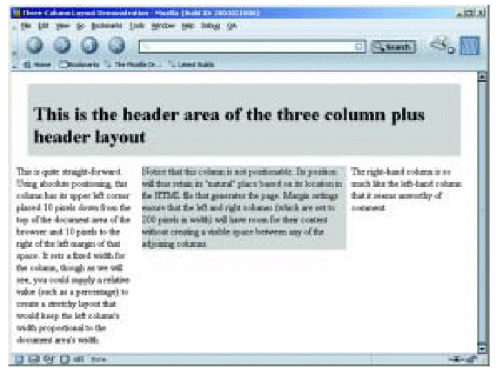
Figure 5.23. Basic Three-Column Layout With Top Header Block
There are numerous variations on these layout themes. One of the best places I know of to learn how to apply these variations effectively is at Owen Briggs’ wonderful site, The Noodle Incident.
Summary
This chapter presented the important concepts involved in CSS layout and positioning, beginning with the box model and continuing through the multiple variations of the position property. We then drove a number of these points home by assembling an example of the “classic” three-column layout.
You may have noticed that there is often more than one way to achieve a given effect in CSS. For example, if you want to place a block on the right-hand side of the browser window occupying 20% of its width, you can either give it a margin-left of 80%, use absolute positioning and set its left property to 80% and its width property to 20%, or use absolute positioning and set its right property to 0 and its width property to 20%.
In Chapter 6, we’ll see that not all of these options work quite the same in practice. We’ll explore some of the non-ideal behaviors of current browsers that lead us to choose one option over the another. We’ll also look at a few more advanced CSS properties that affect the layout relationships of elements on the page.
That’s it for these four chapters! If you’d like to try before you buy, simply download all 4 sample chapters, plus free sample reference material now! For the complete guide to building your very own CSS-based Website, please check out the print book now by clicking here.
The book contains not only the four chapters you just read, but also eight more chapters that cover the precise details of layout, the styling of text and other content, and some of the less common, but important uses of CSS, including improvement of the user experience, along with validation and backward compatibility. The book also includes a complete set of appendices to make it a fantastic reference for CSS-based Web page development. For more information, see the book page.
 Dan Shafer
Dan cut his teeth as the first Webmaster and Director of Technology at Salon.com, then spent almost five years as the Master Builder at CNET's Builder.com. He's recently written HTML Utopia: Designing Without Tables Using CSS. for SitePoint.