Create Mouthwatering Bread Typography in Photoshop

Food imagery can foster surprisingly strong reactions in viewers. Whether they’re part of holiday promotions or everyday advertising, consumers are reliably hungry, and a triggered appetite can often result in a sale, a lead, or at least a strong impression.
In this tutorial, I’ll show you how to create a wonderful baked bread text effect using Photoshop. I will explain every step in order to achieve the best possible result. Let’s get started!
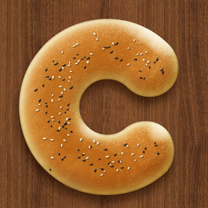
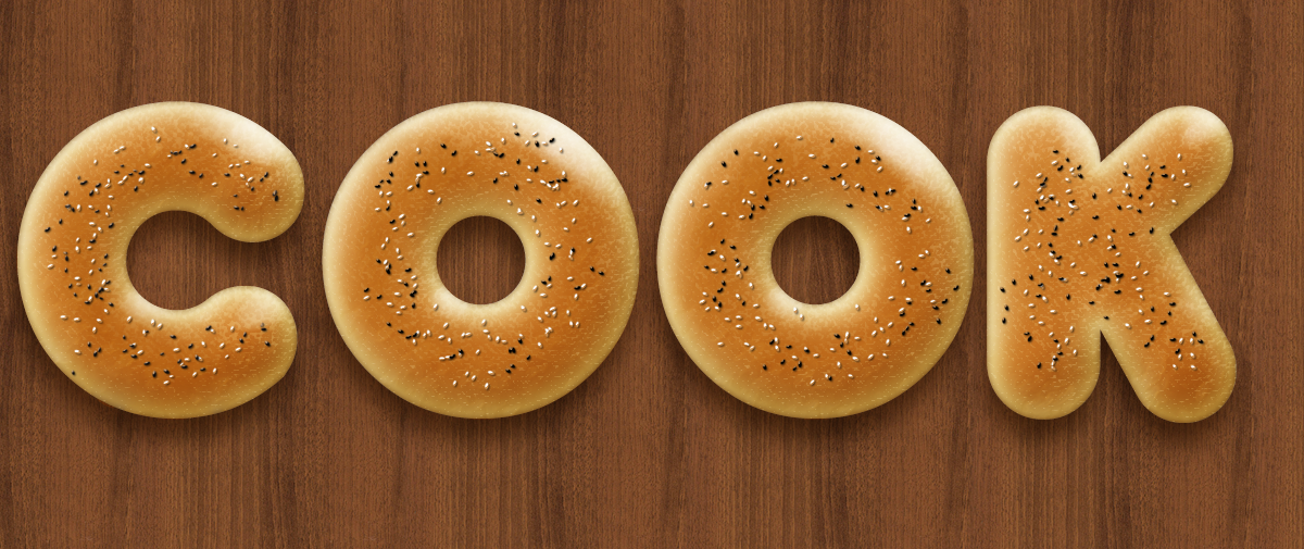
First, let’s have a peek ahead at the final outcome.

Resources:
Step 1
First of all, you have to create a Photoshop document. In this case, we will work on an 800px by 800px canvas.
Step 2
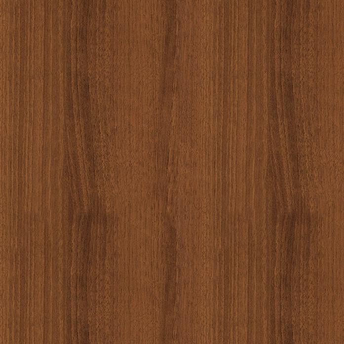
Before creating the letter “C”, we have to include a proper background. I chose a wood pattern, but you can decide to use something else (another wood pattern or a floral one work work very well).
Step 3
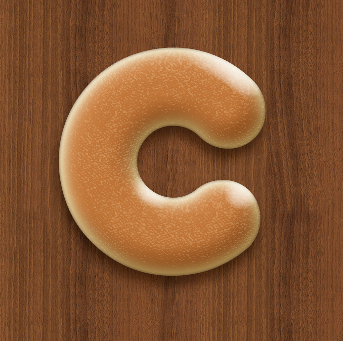
Now, it’s time to work on the text. Select the horizontal type tool and write the letter “C”. We set the size to 600 pixels and we’ve used a bold font like “Franks”. Set the color of the text to #eddcb9.

Step 4
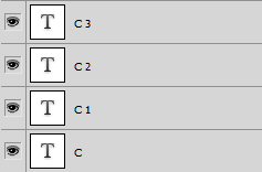
Duplicate this newly-created text layer three times and call the copies C1, C2, and C3. Set the fill value of these three levels to 0%.
Step 5
We’ll now work on the original text layer and add some effects. So, open the “Layer Styles” window and choose the “Outer Glow”. use the following values:
- Blend Mode: Multiply
- Color: #79581d
- Opacity: 70%
- Angle: 75°
- Distance: 18
- Spread: 0
- Size: 18
Choose the “Bevel and Emboss” and set the following values:
- Style: Inner bevel
- Technique: Smooth
- Depth: 100%
- Direction: Up
- Size: 60
- Soften: 10
- Angle: 120°
- Altitude: 25°
- Highlight mode: Screen (White)
- Opacity: 70%
- Shadow mode: Multiply (#b69c65)
- Opacity: 70%
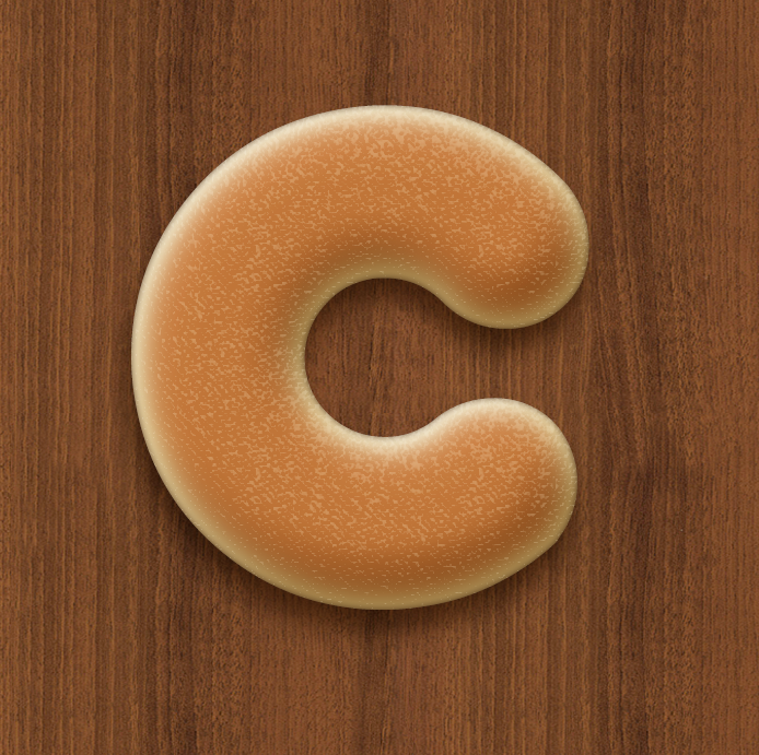
You should get a result like the one shown below.

Step 6
Double-click on the level called “C1” and apply the following “Inner Shadow” values:
- Blend Mode: Multiply (#533416)
- Opacity: 70%
- Angle: 125° to 130°
- Distance: 0
- Choke: 0
- Size: 10
- Noise: 0
Then, apply the following “Inner Glow” values:
- Blend Mode: Multiply
- Opacity: 80%
- Fill: gradient fill from #d77e36 to #e0c09a
- Technique: Precise
- Source: Center
- Size: 45
- Contour: Gaussian
- Range: 75

Step 7
Move on the “C2” level and, as we did before, open the “Layer Styles” window. Choose “Bevel and Emboss” and set the values based on the following:
- Style: Inner Bevel Technique: Smooth Depth: 100% Direction: Up
- Size: 60
- Soften: 0
- Angle: 70°
- Altitude: 65°
- Highlight mode: Screen (#f7e0be) Opacity: 30%
- Shadow mode: Multiply (Black)
- Opacity: 0%
Then click on “Texture” and insert the following pattern:

You should have an identical Photoshop project to the one shown below:
Step 8
Now, double-click on the last text level, “C3” and open the “Bevel and Emboss” window.
- Style: Inner Bevel Technique: Smooth Depth: 75% Direction: Up
- Size: 70
- Soften: 0
- Angle: 55°
- Altitude: 40°
- Highlight mode: Screen (White) Opacity: 80%
- Shadow mode: Multiply (Black) Opacity: 0%
We have almost completed the first part of the tutorial.
Step 9
Create a new layer and call it “Color”. Choose the brush tool, set the size to 30 pixels, set the color to #a7520f, and adjust the flow to 5/6%. You simply have to color the inner part of the letter to give a more realistic appearance.

Step 10
Create another new layer and name it “Effect”. Set the primary color to #f3d6ac and set the background to #9a7230. Create a new selection by selecting the “C” layers together with this newly-created layer. Hold the Ctrl key to select all necessary layers. Then go to “Filter” > “Render” > “Clouds”. Once again, click on “Filter” > “Sketch” > “Bas Relief”. Set “Detail” to 13 and “Smoothness” to 3. Lastly, change the Blend Mode to “Soft Light.”

Step 11
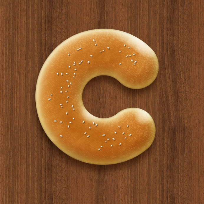
The majority of the design is complete. We only have to draw the sesame and poppy seeds that are present on the lettering. Let’s start from the white ones. We have to create a new custom Photoshop brush, but don’t worry, it won’t be difficult.
Pick the “Brush Tool” and open its window (click on “Window”, then on “Brush”). Thanks to this panel, we’ll be able to develop a new custom brush easily. Set the size to 10 pixels, the angle to 0°, the roundness to 40%, the hardness to 85% and the Spacing to 200%. Then, click on “Shape Dynamics” and set the “Size Jitter” to 40%, the “Minimum Diameter” to 5%, the “Angle Jitter” to 100% and the “Roundness Jitter” to 0%.
Go to “Scattering” and set “Scatter” to 1000%, set the “Count” to 3, and set the “Count Jitter” to 4%.
Your custom brush should be similar to this one:

Choose white as your brush color and draw some seeds on the letter “C”.

Step 12
Now, open the “Layer styles” window and go to “Bevel and Emboss”. Set the following values:
- Style: Inner Bevel Technique: Smooth Depth: 100% Direction: Up
- Size: 7
- Soften: 0
- Angle: 55°
- Altitude: 40°
- Highlight mode: Screen (#f4ad63) Opacity: 80%
- Shadow mode: Multiply (#ad6110) Opacity: 0%
Now we’ll work on the “Drop Shadow”:
- Blend Mode: Multiply (Black) Opacity: 50%
- Angle: 120°
- Distance: 2
- Spread: 0 Size: 3
Step 13
It’s time to create the black poppy seeds. We have to repeat what we did in steps 12 and 13 with the only difference being that the brush color will be black and not white.

Conclusion
We’ve finally finished the letter “C”. To create other letters and words you just have to repeat the process and use the same techniques and layer styles. I remind you that you can use the function “Copy Layer Style” in order to add the same effect on different levels in seconds.
I hope you enjoyed the tutorial and have some delicious baked bread lettering as a result. Let me know how it turned out!
Frequently Asked Questions about Bread Typography in Photoshop
What is bread typography in Photoshop?
Bread typography in Photoshop is a unique and creative way of designing text using images of bread. It involves manipulating and arranging bread images to form letters and words. This technique is often used in food advertising, packaging, and menu design to create a visually appealing and mouthwatering effect. It requires a good understanding of Photoshop tools and techniques such as layering, masking, and blending modes.
How can I create realistic bread textures in Photoshop?
Creating realistic bread textures in Photoshop involves using the right combination of filters, brushes, and blending modes. Start by selecting a high-resolution image of bread. Use the Clone Stamp tool to replicate the texture across your text. Apply the Bevel and Emboss layer style to give the text a 3D effect. Adjust the settings to match the light and shadow of the original bread image. Finally, use the Burn and Dodge tools to enhance the texture and make it look more realistic.
Can I use other food images for typography in Photoshop?
Yes, you can use any food image for typography in Photoshop. The process is similar to creating bread typography. You just need to select a high-resolution image of the food you want to use, and then follow the same steps of layering, masking, and blending to create the text.
What are the best Photoshop tools for creating bread typography?
The best Photoshop tools for creating bread typography include the Clone Stamp tool, the Pen tool, the Brush tool, and the Layer Styles. The Clone Stamp tool is used to replicate the bread texture, the Pen tool is used to create the shape of the letters, the Brush tool is used to add details and enhance the texture, and the Layer Styles are used to apply effects such as Bevel and Emboss.
How can I make my bread typography look more appetizing?
To make your bread typography look more appetizing, focus on the details. Use high-quality images of bread with a good texture and color. Enhance the texture using the Burn and Dodge tools. Add shadows and highlights to give the text a 3D effect. You can also add other elements such as crumbs or steam to make it look more realistic and mouthwatering.
Can I use bread typography for commercial purposes?
Yes, you can use bread typography for commercial purposes. However, make sure to use images that you have the rights to use. If you’re using stock images, check the license agreement to see if it allows commercial use.
How can I improve my skills in bread typography?
The best way to improve your skills in bread typography is through practice. Try creating different types of bread typography using different bread images and text styles. Experiment with different Photoshop tools and techniques. You can also learn from tutorials and online courses.
What are the challenges in creating bread typography?
Some of the challenges in creating bread typography include finding the right bread image, replicating the bread texture, and making the text look realistic. It requires a good understanding of Photoshop tools and techniques, as well as a keen eye for details.
Can I create bread typography in other software?
While Photoshop is the most commonly used software for creating bread typography, you can also use other graphic design software that has similar tools and features. However, the process and results may vary.
How long does it take to create bread typography?
The time it takes to create bread typography depends on your skills and experience in Photoshop, the complexity of the text, and the quality of the bread image. For beginners, it may take a few hours to create a simple bread typography. For experienced designers, it may take less time.
Simone is a graphic designer who loves technology, design and who is always looking for new trends and innovative concepts. He also likes to give tips and to share his knowledge with other tech-lovers.