
So without delay let’s continue our series on color. Having last week looked at color schemes, let’s continue now with palettes, and how to create them. We’ll also finish by examining a few useful tools that are near indispensable to anyone working with color on the web.
“A palette?” you might ask. “Isn’t that the same as a color scheme?” Well, yes and no. A color scheme will only give you two, three, or four colors to work with. Although a limited palette can be beautiful, you’re probably going to need a few more colors to design your website. It’s better to nail down this process while you’re thinking in the language of color, rather than pick ancillary colors at random as you need them for your layout. The number of colors you’ll need will depend on the complexity of your design. I like to start off with at least five or six solid color choices before I even think about applying them to my layout.
Key Takeaways
- A color palette is more extensive than a color scheme, often including five or six colors, and is essential for designing a website. It should be carefully curated, not randomly selected as needed.
- Hexadecimal notation provides a standard way to refer to colors in a palette. Each color is represented by a six-digit hexadecimal code, which specifies the levels of red, green, and blue that constitute the color.
- Various tools and resources can assist in creating a color palette, including Color Scheme Designer 3, Adobe Kuler, COLOURlovers.com, and the Color Stream iPhone App. These tools can generate color combinations, simulate vision for color blindness, and even extract color palettes from images.
- When creating a color palette, it’s important to consider contrast for readability, color psychology to evoke certain emotions, and potential color blindness among viewers. It’s also essential to test the palette in different contexts and lighting conditions.
Hexadecimal Notation
Since this is the stage in which we become specific about each color we’re choosing, we’re going to need a standard way to refer to the colors in our palette. You probably already know about hexadecimal RGB color values, but if you don’t, here’s the quick drive-through version of the theory.
The hexadecimal counting system is much like the decimal counting system you’re used to, except that instead of being based on multiples of ten, it’s based on multiples of sixteen, and has six additional digits: A (which is the equivalent of decimal 10), B (11), C (12), D (13), E (14), and F (15). Table 1, “Counting from 1 to 255 in hexadecimal” shows how we count from 1 to 255 in decimal and hexadecimal.
So, what does this have to do with color palettes? Earlier, I explained that your monitor uses an additive RGB color model, and that every pixel in the screen is “painted” using a combination of red, green, and blue light. What I failed to mention was that there are 256 different levels of red light, 256 levels of green light, and 256 levels of blue light; we can use these to create 16,777,216 distinct colors (yup, that’s over sixteen million seven hundred thousand colors!).
Thankfully, we have a way of describing each of these colors quickly and easily—using hexadecimal color codes. A hexadecimal color code specifies the levels of red, green, and blue that go into a given color. For example, combining red, green, and blue at their highest possible levels makes white. To use white in a web page, we set its red component to 255 (FF in hexadecimal), its green component to 255 (FF), and its blue component to 255 (FF). We then combine these hexadecimal values in the order red, green, and blue and come up with the code FFFFFF.
| Decimal | Hexadecimal | Decimal | Hexadecimal | Decimal | Hexadecimal |
|---|---|---|---|---|---|
| 0 | 00 |
16 | 10 |
32 | 20 |
| 1 | 01 |
17 | 11 |
33 | 21 |
| 2 | 02 |
18 | 12 |
34 | 22 |
| 3 | 03 |
19 | 13 |
35 | 23 |
| 4 | 04 |
20 | 14 |
… | |
| 5 | 05 |
21 | 15 |
245 | F5 |
| 6 | 06 |
22 | 16 |
246 | F6 |
| 7 | 07 |
23 | 17 |
247 | F7 |
| 8 | 08 |
24 | 18 |
248 | F8 |
| 9 | 09 |
25 | 19 |
249 | F9 |
| 10 | 0A |
26 | 1A |
250 | FA |
| 11 | 0B |
27 | 1B |
251 | FB |
| 12 | 0C |
28 | 1C |
252 | FC |
| 13 | 0D |
29 | 1D |
253 | FD |
| 14 | 0E |
30 | 1E |
254 | FE |
| 15 | 0F |
31 | 1F |
255 | FF |
Table 1, “Counting from 1 to 255 in hexadecimal”
Black, which is made by setting red, green, and blue to zero (00), has the code 000000. Red, which we can create by setting red to FF and leaving green and blue at 00, has the code FF0000. Figure 1, “Hexadecimal color examples” shows several standard colors with their hex value. After you’ve seen and used a lot of hex colors, you’ll start to see the colors in the code. #F26382, for instance, is a coral-colored shade of pink and #371324 is the color of a slightly purple red wine. Once you think you’ve reached that Jedi Hex-Master status, try a little game of “What the Hex?”

Fig. 1, “Hexadecimal color examples”
Color Tools and Resources
Now we all have a basic understanding of how colors are represented as hexadecimal values. The next step is to find out those values for each color with which we want to work. Many resources are available to help you choose colors for your palette, including a ton of stand-alone applications and plugins for both Macs and PCs. Here are a few of my favorites:
Color Scheme Designer 3
Although there are many online color pickers out there, my favorite is Color Scheme Designer (formerly known as the WellStyled Color Scheme Generator), shown in Figure 2, Color Scheme Designer 3 — the author’s pick”. Where many other applications use a RGB or CMYK color wheel, this awesome HTML tool uses the traditional red, yellow, and blue color wheel. With just a few clicks, you can choose and customize a color scheme, as well as identify a variety of other colors from which to build a harmonious palette. Once you have a palette you like, you can use the Vision Simulator to see what those colors look like to people with various levels of color blindness; then you can export your colors as HTML/CSS, XML, Text, a Photoshop palette, or a GIMP palette.

Fig. 2, Color Scheme Designer 3 — the author’s pick
Adobe Kuler
Another excellent color selection resource is Adobe Kuler. On the Kuler website, you can create color combinations based on the standard color scheme configuration similar to the way Color Scheme Designer 3 works. Unlike that site, though, Kuler will also generate a palette from an uploaded image. Another key feature of Kuler is its community. If you create a login for the site, you can save and share your color palettes with other Kuler users, and anyone can browse the most-recent and highest-rated color combinations on the site. Figure 3, “The Adobe Kuler AIR application” shows the handy AIR app version of the site, which can be installed on both Macs and PCs.
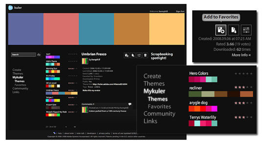
Fig. 3, “The Adobe Kuler AIR application”
COLOURlovers.com
If Kuler provides too limited a community to suit your social needs, the COLOURlovers website, shown in Figure 4, “COLOURlovers — for lovers of color”, certainly will. It’s less of a color generator tool and more of an inspiration-sharing website. It started off with just color schemes, but now you can also share patterns and view color (or colour if you insist) inspirations for a variety of design fields.
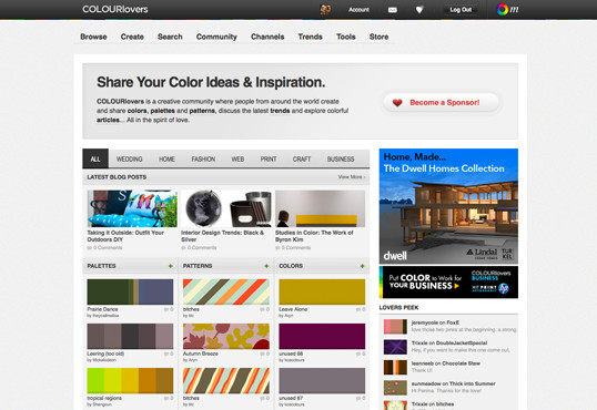
Fig. 4, “COLOURlovers — for lovers of color”
Color Stream iPhone App
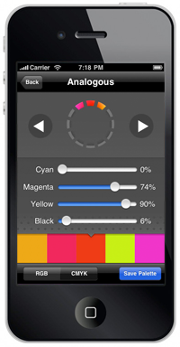 Color Stream is an app (available for $2.99 from the iTunes store) that puts some of the best features of Color Scheme Designer and Adobe Kuler into the palm of your hand. Created by Sahil Lavingia, Color Stream lets you create and store color palettes that are either created from scratch, extracted from a photo, or even generated automatically using a built-in color schemer. It really is an elegant, well-polished application that makes picking a color palette fun and easy. Figure 5, “Palettes on the go with Color Stream” on the right shows what selecting a color palette from a photo looks like in the app.
Pictaculous
Kuler and COLOURLovers are great tools to meticulously tweak and gain social feedback about color schemes you’re working on, but what if you see some color inspiration on the go? That’s where Pictaculous comes in handy. Pictaculous is a free MailChimp Labs project that provides color schemes based on your pictures via email. You simply take a picture with your smartphone and email it to colors@mailchimp.com. Within a couple of minutes, you’ll receive an email with a five-color palette, an assortment of suggested color schemes from Kuler and COLOURLovers, and an attached Adobe color palette (.aco) file. There are alternatives to doing it by email, though. Figure 6, “Pictaculous Color” shows Pictaculous’s color suggestions for a picture that I uploaded to the service from my computer.
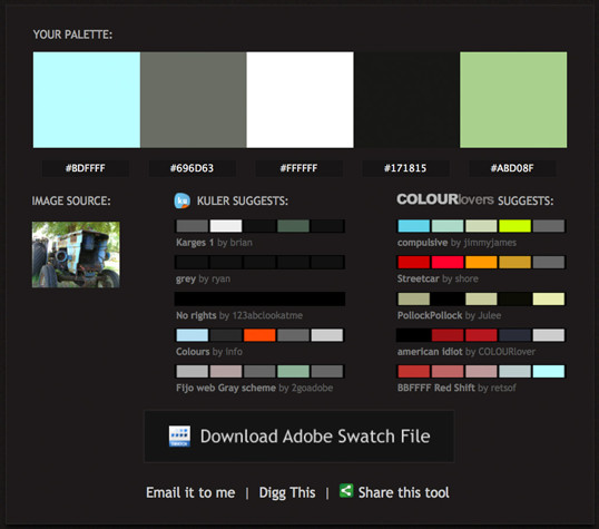
Fig. 6, “Pictaculous Color”
Colour Contrast Check
When choosing the colors for your palettes, it’s always good to try to pick at least two colors that have enough contrast to be used as background and text colors. Having a proper contrast between text and background colors is essential for interactive design; without it, some people may be unable to read your site. An easy way to confirm that there’s enough contrast between two colors is to plug the RGB values for your foreground and background into Jonathan Snook’s Colour Contrast Check website.
Sometimes combinations that you think would be valid fail to meet the color difference and brightness requirements of the Web. As Jonathan says in his blog post about the contrast checker, “… this tool shouldn’t be taken as gospel … but rather should help guide you towards better colour choices.”
Being able to come up with a unique color palette is all about keeping your eyes open. If you see a website, advertisement, illustration, or other graphic that stands out, try to figure out what the dominant colors are, and what type of color scheme underlies the palette. Remember, though, that color inspiration can come from anywhere. Is there a color that reminds you of a certain song? How about the colors of your favorite meal? Maybe there’s even a color in that tacky seventies wallpaper in your parents’ house that would work well for you. Being aware of the kinds of issues associated with color usage will give you an eye for color and an ability to come up with original palettes that fulfill the requirements of your client.
The Principles of Beautiful Web Design
This article is from Jason Beaird’s The Principles of Beautiful Web Design book (the second edition is out now!). This look at palettes concludes the chapters on color, but be sure to look out for further articles from the book here on Design Festival.
Frequently Asked Questions about Creating a Color Palette
What is a hex color code and how is it used in creating a color palette?
A hex color code, also known as a hexadecimal color code, is a six-digit code used in HTML, CSS, and design software to represent colors. Each hex code corresponds to a specific color, allowing for precise color selection and consistency across different platforms. When creating a color palette, you can use hex codes to ensure that you’re using the exact same shades of colors throughout your design.
How can I convert RGB colors to hex color codes?
Converting RGB (Red, Green, Blue) colors to hex color codes is a straightforward process. Each RGB color has three values ranging from 0 to 255. These values can be converted to a hexadecimal format, which is a base-16 number system. Each two-digit hexadecimal number represents the intensity of red, green, or blue in the color. There are many online tools available that can do this conversion for you.
How many colors should I include in my color palette?
The number of colors in your palette can vary depending on the complexity of your design. However, a good rule of thumb is to have around five colors. This usually includes two main colors, two complementary colors, and one accent color. Having too many colors can make your design look chaotic, while having too few can make it look dull.
How can I choose colors that go well together?
Choosing colors that go well together involves understanding color theory. Colors that are opposite each other on the color wheel are complementary and will create a vibrant contrast. Colors that are next to each other are analogous and will create a harmonious blend. You can also use a color scheme generator, which can suggest color combinations based on your chosen color.
What is the importance of color psychology in creating a color palette?
Color psychology is the study of how colors can influence human behavior and emotions. Different colors can evoke different feelings and reactions. For example, red can evoke feelings of passion and urgency, while blue can evoke feelings of calm and trust. When creating a color palette, it’s important to consider the message and emotion you want to convey with your design.
How can I use a color palette in web design?
In web design, a color palette is used to create a consistent and cohesive look throughout the website. The colors in the palette can be used for various elements such as the background, text, buttons, links, and images. It’s important to ensure that the colors are balanced and harmonious, and that they align with the brand’s identity.
What are some common mistakes to avoid when creating a color palette?
Some common mistakes to avoid include using too many colors, using colors that clash, not considering color blindness, and not considering the emotional impact of colors. It’s also important to test your color palette in different contexts to see how it looks in different lighting conditions and on different devices.
How can I create a monochromatic color palette?
A monochromatic color palette is created by choosing a single base color and then using different shades, tints, and tones of that color. This can create a cohesive and sophisticated look. You can create different shades and tints by adding black or white to the base color.
What is the difference between a color palette and a color scheme?
A color palette is a selection of colors that are used in a design, while a color scheme is how these colors are used together. The color scheme can include different color combinations such as complementary, analogous, triadic, and split-complementary.
How can I use color palettes in branding?
In branding, a color palette is used to create a consistent look and feel across all brand assets. This includes the logo, website, marketing materials, and products. The colors in the palette should reflect the brand’s personality and values. It’s also important to consider how the colors will look in different contexts and mediums.