


Key Takeaways
- Conic gradients, championed by Lea Verou, are starting to gain browser support and can be used to create effects such as pie charts and color wheels. They differ from radial gradients in that color stops are placed along the circumference of the circle, not the radial line.
- The syntax for conic gradients allows for the specification of starting angle and central position. If omitted, these default to zero and center respectively. Color-stop angles for the first and last color are assumed to be 0deg and 360deg if not specified.
- Conic gradients can be used to create pie charts by providing hard color-stop values for different colors. Each color of the gradient can be given a start and end angle, leading to the formation of distinct sectors. Two methods for specifying these color-stop values exist: setting the start angle for each color to zero, or setting the start angle of the next color equal to the end angle of the previous color.
- Repeating conic gradients accept the same values as regular conic gradients, but repeat until the whole 360 degrees have been covered. This can be used to create common image patterns that previously required the use of images.
More and more websites use gradients in one way or another. Some websites use them for navigation components, while others use them in elements like buttons, or with images to create some nice effects.
All browsers have had support for basic CSS linear and radial gradients for a long time now. The CSS Gradients: A Syntax Crash Course article on SitePoint gives you a quick summary of the syntax required to create linear and radial gradients, as well as how to use repeating gradients to create some basic patterns, which is great if you care about web performance and try to avoid using images whenever possible.
After linear and radial gradients, browsers are now slowly starting to support conic gradients, which were first championed by Lea Verou.
In this article, you will learn about the syntax, uses, and browser support for simple conic gradients and repeating conic gradients.
What are Conic Gradients?
Conic and radial gradients are similar in the sense that both of them start from a specified or default point as the center of the circle used to draw them. The difference between the two is that, in the case of radial gradients the color-stops are placed along the radial line, while in the case of conic gradients the color stops are placed along the circumference of the circle.
The position of color-stops for a conic gradient can be specified either in terms of percentage or in terms of degrees. A value of 0% or 0deg refers to the top of the conic gradient. The values keep increasing gradually as you move clockwise. A value of 360deg is equivalent to 0deg. Any color whose color-stop value is greater than 100% or 360deg won’t be drawn on the conic gradient but it will still affect its color distribution.
The following image shows a conic gradient that starts with a yellow color and ends with orange.
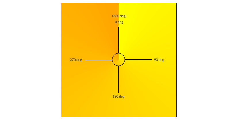
It is hard not to notice the sharp transition that separates the orange at 360deg from the yellow at 0deg. Remember that conic gradients always produce this transition whenever the starting and ending colors of the conic gradient are very different. One way to avoid it is setting the starting and ending color to the same value.
Syntax for Conic Gradients
Conic gradients allow you to specify their starting angle as well as their central position. When these values are omitted, the angle defaults to zero and the position defaults to center. Here is the syntax for conic gradients:
conic-gradient([ from <angle> ]? [ at <position> ]?, <angular-color-stop-list>)
The color-stop angle for the first and last color is assumed to be 0deg and 360deg respectively, if not specified. The yellow-orange conic gradient from the previous section could be created using any of the following versions:
background: conic-gradient(from 0deg at center, yellow 0deg, orange 360deg);

background: conic-gradient(at center, yellow 0deg, orange 360deg);

background: conic-gradient(at 50% 50%, yellow 0deg, orange 360deg);

background: conic-gradient(from 0deg, yellow 0deg, orange 360deg);

background: conic-gradient(yellow 0deg, orange 360deg);

background: conic-gradient(yellow, orange);
Instead of using degrees, you could also use percentages. As I have mentioned earlier, a value of 100% is equal to 360deg. So a value of 50% will be equal to 180deg. If you know exactly what part of the circle you want to cover with a specific color, using percentages might be easier. Similarly, the center position of the conic gradient can also be specified in terms of percentages. Any of the above conic gradient values will produce the following result:
See the Pen Creating a Conic Gradient by SitePoint (@SitePoint) on CodePen.
Not all browsers support conic gradients at present, so I will be including a reference image with each example to show what the final result is supposed to look like.
Uses of Conic Gradients
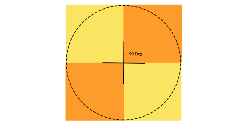
You can use conic gradients to create different kinds of color wheels. As an example, the following demo uses the colors of a rainbow in the conic gradient to create a rainbow wheel.
.wheel {

  background: conic-gradient(from 90deg, violet, indigo,  blue, green, yellow, orange, red, violet);

  border-radius: 50%;

}
Notice how I have set both the start and end color of the conic gradient to violet to avoid sudden transitions.
See the Pen Creating a Conic Gradient – Rainbow Wheel by SitePoint (@SitePoint) on CodePen.
Using CSS Conic Gradients for Pie Charts
Another benefit of conic gradients is the ability to create pie charts with ease. The process for creating pie charts is actually very simple. All you have to do is provide some hard color-stop values for different colors. Each color of the gradient can be given a start and end angle. When the value of the start angle for the next color is less than or equal to the value of the end angle for the current color, they will display in a very sharp, instantaneous color change resulting in the formation of distinct sectors.
There are two ways for specifying these color-stop values. The first one is to always set the start angle for each color to zero.
The second method is to set the start angle of the next color equal to the end angle of the previous color.
What you finally decide to do is a matter of preference.
The following code snippet shows the conic gradient value for both these methods side by side for comparison:
.pie {

  background: conic-gradient(#FF5722 0% 35%, #FFEB3B 0% 60%, #2196F3 0% 100%);

  border-radius: 50%;

}
.pie {

  background: conic-gradient(#FF5722 0% 35%, #FFEB3B 35% 60%, #2196F3 60% 100%);

  border-radius: 50%;

}
You can omit the start angle for your first color and end angle for your last color because they will be set to 0% and 100% respectively by default:
See the Pen Creating a Conic Gradient – Pie Charts by SitePoint (@SitePoint) on CodePen.
Using CSS Conic Gradients to Create Donut Charts
Creating a donut chart is just a matter of applying an additional radial gradient on your element with hard color-stops. The inner color of the radial gradient can be set to white and the outer portion can be made transparent.
.donut {

  background: radial-gradient(white 40%, transparent 41%), conic-gradient(#FF5722 0% 35%, #FFEB3B 35% 60%, #2196F3 60% 100%);

  border-radius: 50%;

}
See the Pen Creating a Conic Gradient – Donut Charts by SitePoint (@SitePoint) on CodePen.
Repeating Conic Gradients
A repeating conic gradient accepts all the same values as a regular conic gradient. The only difference is that this time it will keep repeating itself until the whole 360 degrees have been covered. You can use this repetition to create some common image patterns that previously required the use of images.
You can easily modify the pie charts to create starburst-like backgrounds. All you have to do is use repeating-conic-gradients and reduce the width of each color segment by a suitable amount.
.starburst {

  background: repeating-conic-gradient(#fbe462 0% 5%, #fd9c2a 5% 10%);

}
Similarly, you can create a checkerboard pattern with ease by setting the width of each sector to be 25% and setting the background-size.
The following image shows how extending a conic gradient with four 90 degree sectors over a rectangular or square area can create checkerboards:
Here is the CSS to create a checkerboard pattern:
.checker {

  background: repeating-conic-gradient(#fbe462 0% 25%, #fd9c2a 25% 50%);

  background-size: 100px 100px;

}
See the Pen Repeating Conic Gradient – Checkerboards by SitePoint (@SitePoint) on CodePen.
You can create many more patterns by varying the size of different sectors as well as changing the from angle for the gradients.
Browser Support and Polyfills
At the time of writing this article, conic gradients are supported in Chrome 59+ and Opera 46+ behind the “Experimental Web Platform Features” flag. No other browser supports this new standard, either by default or behind some flag. This means that you will have to wait a little before there is enough browsers support.
However, you can start using CSS conic gradients today with the help of an excellent CSS conic-gradient() polyfill created by Lea Verou. There is also a PostCSS Conic Gradient plugin that automatically adds a conic gradient fallback to your CSS files.
Final Thoughts
This tutorial showed you how to create pie and donut charts using conic gradients. After that, you learned how to create different background patterns using just CSS with the help of repeating conic gradients. Once the browser support is good enough, you will no longer have to rely on large libraries or images to accomplish these tasks.
To learn more on conic gradients, don’t miss these resources:
- Lea Verou’s talk for CSSconf EU 2015
- Conic gradients section in the CSS Image Values and Replaced Content Module Level 4
- Lea Verou’s initial draft specification, which dates back to 2011.
Can you suggest any unique uses for conic gradients on the web? Let us know in the comments.
Frequently Asked Questions (FAQs) about CSS Conic Gradients and Pie Charts
What is the significance of the color-stop value in CSS conic gradients?
The color-stop value in CSS conic gradients is crucial as it determines the position of each color in the gradient. It is expressed as a percentage or an angle. For instance, a color-stop value of 25% or 90deg means the color will end at a quarter of the way around the circle or at 90 degrees respectively. Manipulating these values allows you to create unique gradient effects.
How can I create a smooth transition between colors in a conic gradient?
To create a smooth transition between colors in a conic gradient, you can use multiple color-stop values. By placing color-stops close together, you can create a smooth, gradual transition between colors. The closer the color-stops are, the smoother the transition will be.
Can I use CSS conic gradients to create a pie chart? How?
Yes, you can use CSS conic gradients to create a pie chart. By setting different color-stop values, you can create sections of different colors that resemble a pie chart. You can then use these sections to represent different data points.
Why are my conic gradients not displaying correctly in some browsers?
Not all browsers support CSS conic gradients. For instance, Internet Explorer and some versions of Microsoft Edge do not support them. To ensure your gradients display correctly across all browsers, consider using a fallback background color or a polyfill.
How can I create a radial gradient with CSS conic gradients?
While CSS conic gradients create a gradient that radiates around a center point, CSS radial gradients create a gradient that radiates from a center point. To create a radial gradient, you would use the radial-gradient() function instead of the conic-gradient() function.
Can I use CSS variables with conic gradients?
Yes, you can use CSS variables with conic gradients. This allows you to create more dynamic and flexible styles. You can define a CSS variable with a specific value and then use that variable in your conic gradient.
How can I animate a CSS conic gradient?
You can animate a CSS conic gradient by using CSS animations or transitions. For instance, you could animate the rotation of the gradient, or animate the color-stop values to create a gradient that changes over time.
Can I use transparent colors in a CSS conic gradient?
Yes, you can use transparent colors in a CSS conic gradient. This can create interesting visual effects, such as a gradient that fades into transparency.
How can I create a repeating conic gradient?
To create a repeating conic gradient, you can use the repeating-conic-gradient() function. This allows you to create a gradient pattern that repeats around the circle.
Can I use CSS conic gradients with other CSS properties?
Yes, you can use CSS conic gradients with other CSS properties. For instance, you could use a conic gradient as the background of a text element, and then apply other CSS properties to that text, such as color, font-size, and text-shadow.