

We all know that designers have a set standard of pages that are critical for constructing a successful, complete website. From the introductory “About Me” pages to the informational “Contact” pages, each of these pages serve a purpose. But, what about the 404 page? The 404 page or, as it is sometimes referred to, the “Page Not Found” page is an important addition to have. As no design is ever perfect, it is a good practice to have a page to indicate and recognize an error should one occur. Often these errors occur due to broken or dead links. Whether the fault is yours or caused by a factor outside of your hands, the point is you should have a 404 page design implemented just in case. After all, you never know when something might go awry, and it’s important to handle these unexpected problems gracefully.
Naturally, you could just create a bland, basic 404 page design, but why spoil your stellar and creative website design with something ordinary and mundane? Creativity in design will gain you points with your visitors so you might as well give your 404 page the same treatment and consideration that you gave the rest of your website. It’s a great opportunity to address and appease the frustration brought by an error or a broken link. To get your creative juices flowing, here are some creatively-designed 404 pages that will surely inspire you to redesign your current 404 page.
Apadeloup
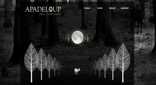
Not only does Villard’s portfolio feature a large image as the background but it has an eye-catching 404 page featuring simple silhouettes that stand out beautifully.
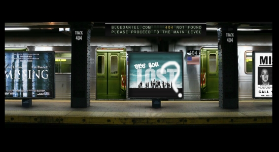
The Blue Daniel website is hauntingly beautiful in itself, featuring the infamous score from Edward Scissorhands. The 404 page fits perfectly as it creatively uses films and TV show titles with the themes of being missing or lost.
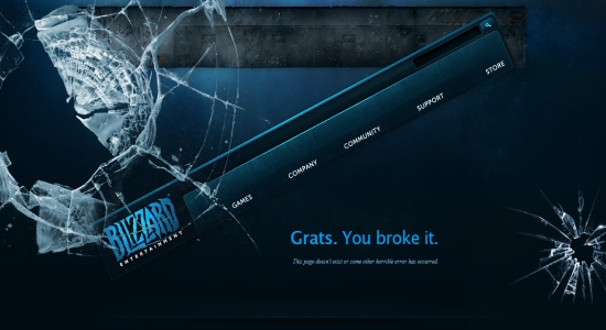
Blizzard’s 404 page takes the idea of the broken page and literally translates it to a broken page. It boasts a shattered screen and an askew navigation menu hanging on for dear life, coupled with the gamer slang of “Grats” as a nod to their customers.
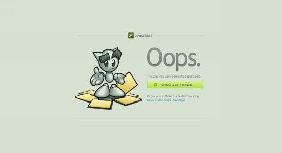
Users of Deviantart have more than likely ran into the 404 page a handful of times during their visits. The use of the site’s mascot is a nice touch.
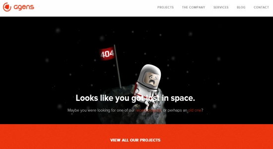
Getting lost is always a depressing thing, and Agens makes that clear with their 404 page design. Featuring a forlorn astronaut who is lost in space, the design is rather simple but still creative.
The Many Faces Of
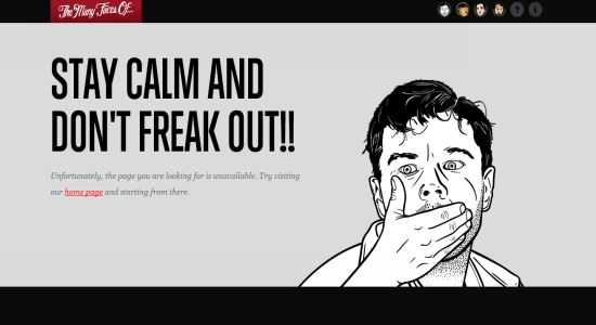
Using illustrations in your web design is a great way to make it stand out. The Many Faces Of does this perfectly and takes it one step farther by adding animation to make their Leonardo DiCaprio illustration gasp in horror as you are instructed to stay calm and not freak out.
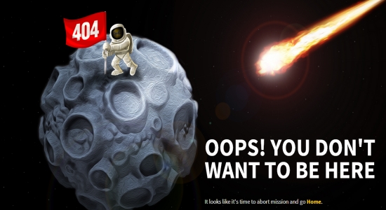
With the theme of being lost out in space, along with their already space themed site design, CoolApps has created a unique 404 page that urges you to turn back as you are currently in a place you really don’t want to be.

Most people can appreciate witty humor, so MailChimp delivers it with their “that link is broken” announcement while featuring a vector sausage link image where a sausage has snapped off.
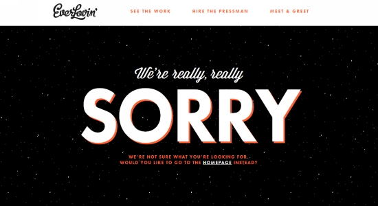
When you make a mistake that inconveniences others, it is always a good idea to apologize. EverLovin’s 404 page offers an apology in a simple format and a link to send you back to the home page.
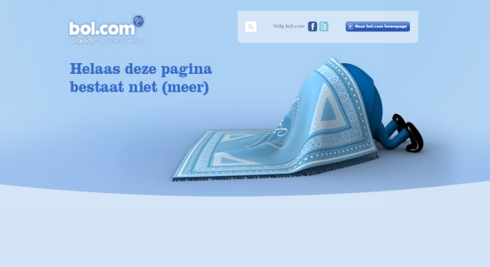
If your Dutch is a bit rusty “helaas deze pagina bestaat niet” translates to “unfortunately this page no longer exists.” Whether the character is hiding in embarrassment or is hunting for the missing content remains to be seen, but the design coupled with the blue is really nice.

It’s not often that you see 404 pages that look like sketches. The design is very detailed, and having the error message as the only pop of color is a nice a touch.
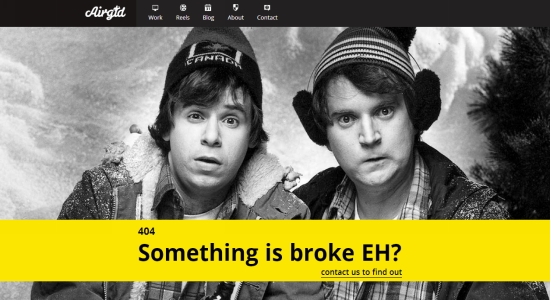
Sometimes, it isn’t necessary to have a colorful illustration. A photo can translate that you’ve encountered a problem especially if your photo features people with expressive looks on their faces.
When you’re working on your 404 page design, you’ll want to try to make sure it works well with the rest of your site. Pulpfingers does a great job at this by keeping the same elements without making the page too busy.
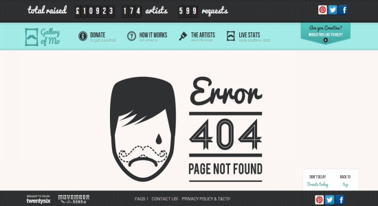
Large images and typography can help your error messages stand out against the background, just like the one featured here on the Gallery of Mo website.
BlackMoon Design
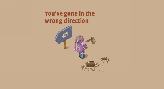
Remember that keeping your pages consistent is a good practice to get into. BlackMoon Design keeps the old school gaming graphics going while letting you know that you have gone in the wrong direction.
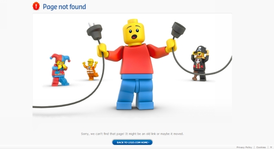
Using recognizable characters that are part of your company’s brand is smart thinking when building your 404 page. Lego does a great job by having their characters illustrate that you have run into a bit of a problem.
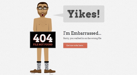
Broken links can be truly embarrassing for your site, so adding a humorous 404 page that acknowledges awkwardness is a human-friendly approach, as William Csete’s page demonstrates.
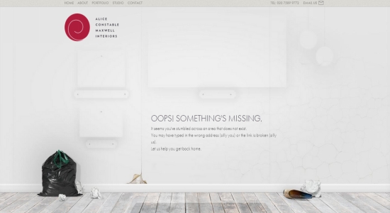
Since using large photographs as backgrounds of your website is still trendy, there is no reason why you shouldn’t be able to use one for your 404 page. An empty room is a great image for an interior design site to use.

You don’t always have to base your error message images around your company — perhaps you never should. Sometimes, designing the image around the message works just as well especially in the case of Peapod Studio’s 404 page.
Conclusion
While you should make sure you have a 404 page designed just in case something goes amiss, it certainly doesn’t make it any more acceptable to ignore site errors… even if you secretly want to show off your creative 404 error page. Take some cues from the showcase above and create something fun and daring, but keep your site running smoothly.
Do you have a favorite 404 page design in today’s showcase? What do you think makes a great 404 page?
Frequently Asked Questions (FAQs) about Creative and Unusual 404 Pages
What is the importance of having a creative 404 page on my website?
A creative 404 page is not just about aesthetics, it’s about user experience. When a visitor lands on a 404 page, it means they’ve hit a dead end. This can be frustrating and may lead them to leave your site. However, a creative and engaging 404 page can turn this negative experience into a positive one. It can entertain, inform, and guide the user back to your site, reducing bounce rates and potentially increasing conversions.
How can I make my 404 page more engaging?
There are several ways to make your 404 page more engaging. You can use humor, surprise, or even a game to keep your visitors entertained. You can also provide useful links or a search bar to help them find what they were looking for. The key is to make your 404 page a reflection of your brand’s personality while still being helpful and user-friendly.
What are some examples of creative 404 pages?
There are many examples of creative 404 pages out there. Some brands use humor, like Lego’s page that features a Lego man looking confused and the text “Sorry, we can’t find that page!”. Others use interactive elements, like MailChimp’s page that lets you play a game while you decide where to go next. The possibilities are endless and depend on your brand’s personality and your audience’s preferences.
Can a 404 page affect my SEO?
While 404 pages themselves do not directly affect your SEO, they can indirectly impact it. If a user lands on a 404 page and decides to leave your site, this increases your bounce rate, which can negatively affect your SEO. However, a well-designed and engaging 404 page can keep users on your site longer, reducing your bounce rate and potentially improving your SEO.
How can I track the performance of my 404 page?
You can track the performance of your 404 page using tools like Google Analytics. You can set up a custom report to see how many users land on your 404 page, how long they stay, and where they go next. This can give you valuable insights into how effective your 404 page is at keeping users engaged and on your site.
What should I avoid when designing a 404 page?
When designing a 404 page, avoid making it too complex or confusing. The main purpose of a 404 page is to inform the user that the page they were looking for does not exist and to guide them back to your site. If your 404 page is too complex or confusing, it may frustrate the user and cause them to leave your site.
Can I customize my 404 page on any website platform?
Most website platforms allow you to customize your 404 page. The process may vary depending on the platform you’re using, but generally, you can customize your 404 page in the same way you would customize any other page on your site.
How often should I update my 404 page?
There’s no set rule for how often you should update your 404 page. However, it’s a good idea to review it regularly to ensure it’s still effective and engaging. If you notice that your bounce rate is increasing or that users are not interacting with your 404 page, it may be time for an update.
Can I use my 404 page to promote my products or services?
Yes, you can use your 404 page to promote your products or services. However, it’s important to do this in a way that’s helpful and not overly promotional. For example, you could include a link to your most popular product or a special offer.
What are some resources for 404 page design inspiration?
There are many online resources for 404 page design inspiration. Websites like SitePoint, Creative Bloq, and Webflow have articles showcasing creative and unusual 404 pages. You can also look at popular websites in your industry to see how they’ve designed their 404 pages.