Communication plays a vital role in design. Whether you design websites, mobile apps, or wearable UIs, your creations have to clearly communicate their intent and purpose. And since text does a lot of the heavy lifting in communicating purpose, you need a solid understanding of typography.
Of course, designing a user interface differs from designing an ebook or blog theme. But the principles of type-centric design still apply. After all, on-screen communication happens through words, and type is the UI of language.
As Oliver Reichenstein states in his seminal essay, Web Design is 95% Typography:
Optimizing typography is optimizing readability, accessibility, usability(!), overall graphic balance.
In other words: optimizing your typography also optimizes your UI. Here are 4 ways to do just that—plus 3 beautiful products that make the most of their type.
4 tips on setting type in user interfaces (UIs)
Master typographer Robert Bringhurst opens his magnum opus, The Elements of Typographic Style, with this statement:
Typography exists to honor content
Every interface includes a series of choices the user can make. Your type should support that decision-making process, honoring the content in a way that never adds to the user’s cognitive load. Great typography draws the reader to the content, not to the type itself.
1. Choose a typeface that works well in various sizes
Most user interfaces require text elements of various sizes (button copy, field labels, section headers, etc). Choose a typeface that works well in multiple sizes and weights to maintain readability and usability in every size.
Examples : Avenir, Univers, Lato
2. Choose a typeface with easily distinguishable letterforms
Many typefaces make it too easy to confuse similar letterforms. Uppercase I’s and lowercase L’s can look identical. Set together, a lowercase R and N can easily become a lowercase M. So clarify things for your users by picking a face that makes a clear distinction between these forms.
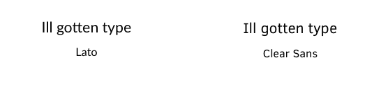
Example : Clear Sans vs. Lato (look at the uppercase I and lowercase L)
Handily, if you skip the lorem ipsum and use real copy in your InVision prototypes, you’ll catch such easily confused letter combos.
3. Treat text as UI
Cameron Moll has been preaching this message for almost a decade now, stating that while good designers treat text as content, the great ones treat text as UI.
At the risk of sounding redundant, this is so true when designing an interface. When your text represents a functional element, it is UI. All the practices of UI design apply to your type. And if you’re not convinced, just think of the confusion you felt when you encountered a door with pull handles … labeled “Push.”
4. Consider the job to be done
If you’re not familiar with JTBD, it’s a framework that focuses your design on the user’s needs. So ask yourself what problems you’re helping users solve. The answer to that question should dictate your UI decisions, type included.
As Tim Brown puts it:
Different typefaces do different jobs.
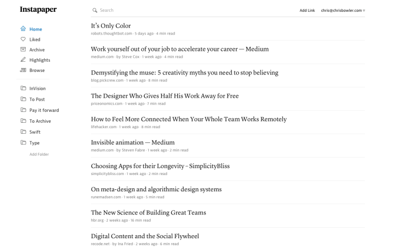
The designers over at Instapaper have done a superb job of matching the typeface to the job to be done.
Instapaper’s web and mobile apps perform 2 functions:
- Letting people save web content for later
- Giving them a place to read it.
Because the UI is mostly text-based and focused on reading, Instapaper’s designers selected 2 very different faces: the serifed Lyon in text and display weights for the content, and the sans-serifed JAF Bernino Sans for the UI. This creates a clear distinction between the content you’re meant to enjoy and the content that helps you get stuff done (the UI elements).
These typeface choices play off users’ expectations to incredible effect. From thousands of books, magazines, and newspapers, we’ve grown used to seeing and consuming longform content through the medium of serif typefaces. The more recent sans serif style really came into its own with the emergence of the web, making it a natural for the UI elements.
Learn from the pros
Thankfully, there’s no shortage of sites to inspire and instruct when it comes to typesetting a beautiful, usable UI. Here are 3 of my favorites.
Medium
Medium brilliantly illustrates the concept of “text as UI”. As a platform for reading and writing ( texts of all lengths), Medium gives type the highest priority. Other writing platforms and CMSes would do well to follow the example Medium sets.
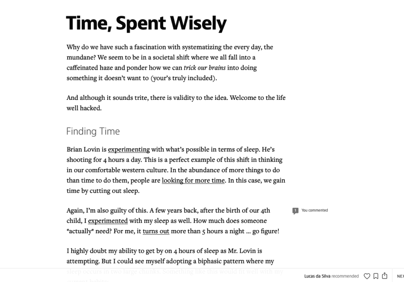
The published content (set in Freight Text Pro and JAF Bernino Sans) is gorgeous, easy to read, and filled with thoughtful, versatile treatments. (Two different blockquote styles? Yes, please!) Plus, the writing experience is identical to the final published form, so there’s no need to toggle between modes—what you see is literally what you get.
And the functional portions? They’re set in Bernino, the same face as the content headings, but are easily distinguished due to their smaller size in UI applications.
Slack
In this example, text is still the primary form of content. As a team communication platform, Slack leans heavily on text for both interaction and content elements. Like Buffer, it sticks to a single typeface (Lato), but makes the most it.
Through the thoughtful application of casing, varying weights and colors, and white space, the designers at Slack created a platform that’s both easy to navigate and a pleasure to read.
Rdio
As a music app, Rdio leans the least on text. But even here we see it treated as part of the UI, and the typeface (Whitney) works well at various sizes.
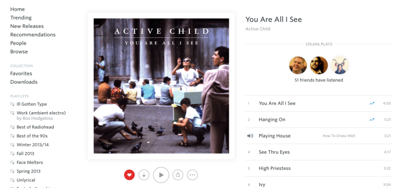
Aside : Both Lato and Whitney suffer from the problem of a similar uppercase “I” and lowercase “L.” Be sure to always review the full character sets of the typefaces you’re considering and evaluate how much of an issue this might be for your product.
Setting type in your UIs
No matter the purpose of your project, type will play a vital role in your UI. Set well, it’ll enable your users—set poorly, it’ll impede them. But armed with these guidelines and plenty of practice, you’ll make better decisions for your type, and your users.
 Chris Bowler
Chris Bowler is a writer and aspiring creative working in words, pixels, sketches, and scribbles. Plus a type enthusiast, seasonal gardener, and lousy woodworker. Seriously. Currently at Wildbit, he’s also shared his customer-centric expertise with the teams at Campaign Monitor and InVision.