Imagine for a moment that we are back in the early 2000’s – 2005 to be specific. You are in San Francisco and own fledgling design agency. You saw first hand the highs achieved by those at the crest of the dotcom bubble and what happened to them once it burst.
The design agency you started only a few years early has begun to attract some amazing clients. Celebrities, technology companies like Google and industry giants like NASA. So, what would you say if a new, unproven start-up came to you and offered equity in return for designing their brand and logo?
This is the question posed to the Cuban Council when Mark Zuckerberg and Sean Parker met with them in 2005.
False Positives
Although Facebook had a promising start and seasoned entrepreneur in former Napster founder, Sean Parker, there was nothing to say the positive signs were to be trusted. There have been plenty of examples where quality entrepreneurs started new services that looked promising but ultimately failed and netted investors zero or negative return. An example of this was the Kevin Rose founded Oink. Rose had founded the enormously successful website Digg and went on to a litany of high profile wins. With this background, Oink saw it’s app usage sore to over 150,000 users. Despite this rapid rise, it still ended up shutting its doors less than 6 months after it’s launch.$100 Million to Design a Logo?
Hindsight is 20/20 but at the time it was not even remotely clear that what they were being offered would turn out to be worth roughly $100 million dollars… to design a logo.
This is not hyperbole.
At the very same time as the Cuban Council were pondering this offer David Choe, a San Franciscan artist, had taken equity to create a now famous mural at the Facebook offices. His equity, post IPO, was valued at approximately $200 million dollars.

We’d all like to think that we are savvy enough to take the equity, do the work and laugh all the way to the bank. I mean it’s just a logo. How much work could it be? You’d have it done in no time. Right?
Maybe.
Taking equity in place of money is a pretty good way to ensure your business doesn’t last very long. When do you stop working for equity? It certainly doesn’t pay the bills or your employees. If we follow the success of even the best venture capitalists you’re looking at a very low success rates. So unless you are very lucky you might have to make equity deals with dozens of companies before one returns any value.
In this episode of True North, we tell the story of the Cuban Council and the decision they faced when offered equity to design the Facebook logo. We’re taken back to the happenings of 2005 by Cuban Council co-founder and current Google design manager, Mike Buzzard.
We also hear from Peter Markatos, the Head of Brand at Uber, the man who said drop the “the” from The Facebook.
What is the True North Podcast?
True North is available on iTunes or at truenorthpodcast.com where you can find previous episodes on topics such as the UX of implants, designing to reduce anxiety in sick children, or what is wrong with design education. We also have great interviews with UX leads from Google, SAP, Mailchimp, Saleforce and more. We’ll be back with Episode 3 in a couple of weeks. Thanks for listening.
Shouldn’t developers understand the design fundamentals too? Gabrielle Gosha teaches them in her course – Principles of Design for Developers.
Frequently Asked Questions about the Facebook Logo
What is the significance of the Facebook logo?
The Facebook logo is a symbol of the company’s brand identity. It is designed to be simple, yet recognizable. The blue color was chosen because Mark Zuckerberg, the founder of Facebook, is red-green colorblind and blue is the color he sees best. The logo has undergone several changes over the years, but it has always maintained its simplicity and recognizability.
How much did the Facebook logo cost?
The exact cost of the Facebook logo is not publicly disclosed. However, it is known that the logo was designed by Cuban Council, a design firm based in San Francisco. The cost of a logo design can vary greatly depending on the complexity of the design and the reputation of the design firm.
Who designed the Facebook logo?
The Facebook logo was designed by Mike Buzzard of Cuban Council, a design firm based in San Francisco. The logo was created in 2005 and has undergone several changes since then, but the original design by Buzzard remains the basis for the current logo.
Why did Facebook change its logo?
Facebook has changed its logo several times over the years to keep up with the changing times and to reflect the company’s growth and evolution. The changes are usually subtle and are designed to improve readability and scalability, especially on mobile devices.
What is the meaning behind the Facebook logo?
The Facebook logo is a symbol of the company’s brand identity. The blue color was chosen because it is the color that Mark Zuckerberg, the founder of Facebook, sees best. The logo is designed to be simple and recognizable, reflecting the company’s mission to connect people around the world.
What font is used in the Facebook logo?
The Facebook logo uses a custom typeface created by Eric Olson of Process Type Foundry. The typeface, called Klavika, was chosen for its modern, clean lines and its versatility.
Has the Facebook logo always been blue?
Yes, the Facebook logo has always been blue. The color was chosen because Mark Zuckerberg, the founder of Facebook, is red-green colorblind and blue is the color he sees best.
What is the size of the Facebook logo?
The size of the Facebook logo can vary depending on the context in which it is used. However, the logo is designed to be scalable, meaning it can be resized without losing its clarity or recognizability.
Can I use the Facebook logo for my own purposes?
The Facebook logo is a trademark of Facebook, Inc. and its use is subject to the company’s brand guidelines. Unauthorized use of the logo could constitute trademark infringement.
What is the future of the Facebook logo?
The future of the Facebook logo is uncertain. As the company continues to grow and evolve, it is likely that the logo will continue to change to reflect these developments. However, any changes will likely be subtle and designed to maintain the logo’s recognizability and association with the Facebook brand.
 Alex Walker
Alex has been doing cruel and unusual things to CSS since 2001. He is the lead front-end design and dev for SitePoint and one-time SitePoint's Design and UX editor with over 150+ newsletter written. Co-author of The Principles of Beautiful Web Design. Now Alex is involved in the planning, development, production, and marketing of a huge range of printed and online products and references. He has designed over 60+ of SitePoint's book covers.
 Ben Newton
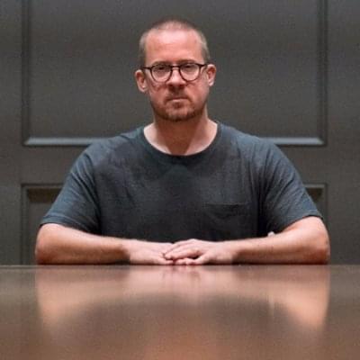
Ben Newton is the host of True North and a product manager at the user testing tool, Loop11.
