
CSS transformations are great, but they don’t (yet?) apply to background images. This article presents a workaround for those times when you really do want to rotate a background image or keep it fixed while its container element is rotated.
For more advanced CSS knowledge like this, check out our book CSS Master, 3rd Edition.
Key Takeaways
- CSS Transformations and Background Images: While CSS transformations can rotate, scale, or skew elements, they don’t apply to background images. This article presents effective workarounds for manipulating background images, like rotating them independently of their container or fixing them while the container is rotated.
- Creative Use of Pseudo Elements: The key technique involves using ::before or ::after pseudo-elements to achieve background transformations. By applying the background image to a pseudo-element, you can then transform it independently, offering more flexibility in design without additional server-side or client-side processing.
- Practical Examples and Browser Compatibility: The article provides practical CSS code examples demonstrating how to implement these techniques, as well as live demos on CodePen for a hands-on understanding. Additionally, it assures compatibility with all major browsers, including Internet Explorer 9, ensuring broad audience reach.
Scaling, Skewing, and Rotating Elements
Scaling, skewing, and rotating any element is possible with the CSS3 transform property. It’s supported in all modern browsers without vendor prefixes:
#myelement {
  transform: rotate(30deg);
}
However, this rotates the whole element — its content, border, and background image. What if you only want to transform background image? Or what if you want the container background image to remain fixed while the content is rotated?
There’s no W3C CSS proposal for background-image transformations. It would be incredibly useful, so perhaps one will appear eventually, but that doesn’t help developers who want to use similar effects today.
One option would be to create a new background image from the original, say, rotated by 45 degrees. This could be achieved using:
- A server-side image manipulation process
- A client-side canvas-based image handling code, or
- APIs provided by some image-hosting CDN services.
But all these require additional effort, processing, and costs.
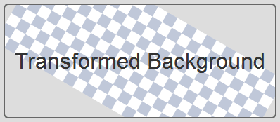
Fortunately, there’s a CSS-based solution. In essence, it’s a hack that applies the background image to a ::before or ::after pseudo-element rather than the parent container. The pseudo-element can then be transformed independently of the content.
CSS Transform Functions Explained
To deepen your understanding of CSS transformations, let’s explore some commonly used CSS background transform functions like rotate(), matrix(), and rotate3d().
1. rotate()
The rotate() function rotates an element around a fixed point, which by default is the center of the element.
<div class="box rotate">rotate()</div>

.rotate {
  transform: rotate(45deg); /* Rotate 45 degrees clockwise */
}
The rotate() function spins the element clockwise (positive values) or counterclockwise (negative values) around the center.
2. matrix()
The matrix() function provides a more flexible way to apply 2D transformations like rotation, scaling, skewing, and translating. It’s a shorthand for transforming an element with a combination of scale(), skew(), and translate().
<div class="box matrix">matrix()</div>

#matrix{ transform: matrix(1, 0.5, -0.5, 1, 100, 50);
The matrix() function takes six values, allowing for more intricate transformations. The syntax corresponds to a 2D transformation matrix: matrix(a, b, c, d, tx, ty) Where a, b, c, and d control scaling, skewing, and rotation, while tx and ty control the translation.
3. rotate3d()
The rotate3d() function enables 3D rotations along the X, Y, or Z axis. It allows for rotating an element in 3D space.
<div class="box rotate3d">rotate3d()</div>

.rotate3d{ transform: rotate3d(1, 1, 0, 45deg); /* Rotate 45 degrees along X and Y axes */ }
The function syntax is rotate3d(x, y, z, angle), where x, y, and z are the coordinates of the axis of rotation, and angle is the degree of rotation. This function rotates an element in 3D space by specifying the direction and angle of rotation.
Browser Compatibility for CSS Transformations
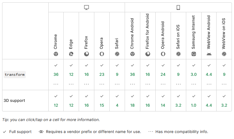
CSS transformations are widely supported in modern browsers. However, older versions of some browsers, especially Internet Explorer and mobile browsers, may require vendor prefixes for full compatibility.
Most modern browsers support CSS transformations without prefixes:
- Chrome, Firefox, Safari, Edge, Opera: No prefixes required.
- Internet Explorer (IE 9+): Requires the -ms- prefix for transforms.
- Mobile Browsers: Safari (iOS) and Android browsers (4.4+) support transforms without prefixes; older versions may need -webkit-.
Vendor Prefixes
For older browsers, use these prefixes:
- -webkit-: Needed for older Chrome, Safari, and Android Browser versions.
- -moz-: For Firefox versions prior to 3.5.
- -ms-: Required for IE 9+.
Example:
#container {
-webkit-transform: rotate(45deg); /* Safari 3.1+ /
-moz-transform: rotate(45deg); / Firefox 3.5+ /
-ms-transform: rotate(45deg); / IE 9+ /
transform: rotate(45deg); / Modern browsers */
}
Transforming the Background Only
The container element can have any style applied, but it must be set to position: relative, since our pseudo-element will be positioned within the container. You should also set overflow: hidden unless you’re happy for the background to spill out beyond the confines of the container:
#myelement {
  position: relative;
  overflow: hidden;
}
We can now create an absolutely positioned pseudo-element with a transformed background. The z-index is set to -1 to ensure it appears below the container’s content. We also set background-repeat and background-size properties to control the image rendering.
#myelement::before {
  content: "";
  position: absolute;
  width: 200%;
  height: 200%;
  top: -50%;
  left: -50%;
  z-index: -1;
  background: url('background.png') no-repeat center; /* No-repeat background */
  background-color: #ddd; /* Fallback background color */
  background-size: cover; /* Cover entire pseudo-element area */
  transform: rotate(45deg); /* css rotate background image, css background rotate */
}
Note that you may need to adjust the pseudo element’s width, height, and background position. For example, if you’re using a repeated image, a rotated area must be larger than its container to fully cover the background.
This technique is commonly referred to as css rotate background image because it focuses on rotating only the background image while keeping the container content unaffected.
Fixing the Background on a Transformed Element
All transforms on the parent container are applied to pseudo elements. Therefore, we need to undo that transformation. For example, if the container is rotated by 30 degrees, the background must be rotated -30 degrees to return to its original position. This method is often used in cases where you need to rotate background css without affecting the element’s content.
#myelement {
  position: relative;
  overflow: hidden;
  transform: rotate(30deg);
}

#myelement::before {
  content: "";
  position: absolute;
  width: 200%;
  height: 200%;
  top: -50%;
  left: -50%;
  z-index: -1;
  background: url(background.png) 0 0 repeat;
  transform: rotate(-30deg);
}
Again, you’ll need to adjust the size and position to ensure the background adequately covers the parent container.
Here are the relevant demos live on CodePen.
The effects work in all major browsers, and Internet Explorer is back to version 9. Older browsers are unlikely to show transformations but the background should still appear.
Practical Use Cases of Transform
1. Dynamic Hero Sections on Landing Pages

Rotating background images can add visual interest to a website’s hero section, drawing users’ attention and creating a more engaging experience. The background could rotate or change its angle dynamically to showcase different scenes or products.
2. Product Display for E-Commerce Websites
Rotating background images can be used to create an interactive and dynamic product display. This is useful when showing items like furniture, clothing, or tech products, where different angles or views can make a significant impact on customer decisions.
3. Portfolio Websites

Designers and photographers often use background rotations to create interactive and engaging portfolio websites. Rotating background images can visually represent different aspects of their work, from photography to graphic design.
You can find interactive examples of the above 3 use cases in Codepen.
Best Practices
1. Performance Optimization
- Transformations can be resource-intensive, especially when applied to large elements or multiple elements at once. This can affect performance on lower-end devices, resulting in janky animations or slow page loads.
- Use CSS Transitions for smoother animations: This avoids the need for JavaScript, which can be more taxing on performance.
- Use will-change wisely: The will-change property can improve performance by informing the browser in advance which property is likely to change, allowing for optimized rendering:
.background-image { will-change: transform; }- Avoid overuse of complex transformations (like matrix()), as they can be more expensive than simpler ones like rotate().
- Test on multiple devices: Always ensure that the visual effects are smooth on both high-end and low-end devices.
2. Maintainable CSS
When writing CSS that includes transformations:
- Use modular classes: Break down complex transformations into smaller, reusable classes.
- Write clear and organized code: This ensures that you or others can maintain and adjust styles later.
.rotate-45 { transform: rotate(45deg); } .scale-1-2 { transform: scale(1.2); }3. Mobile Optimization
For mobile devices, avoid using too many transformations on large elements, as this could impact the load time or responsiveness. Instead, keep it minimal and apply only when necessary.
4. Accessibility Considerations
Transformations like rotate() and scale() do not convey any change to screen readers, which could make the experience poor for visually impaired users who rely on non-visual cues.
Ensure that all important content remains accessible through other means, such as:
- Textual descriptions: Provide detailed context for transformed elements.
- ARIA Labels: Use ARIA attributes to describe the role of transformed elements.
- Alt Text for Images: Provide clear and concise alt text for background images or elements undergoing transformation, so that screen readers can properly convey the content.
<img src="image.jpg" alt="A rotating background image showcasing a city skyline">Summary for Manipulating Background Images
| Technique | Description | Example Code |
| Rotate Background Image | Use ::before pseudo-element to rotate the background. | #container::before { content: ""; position: absolute; background: url('background.png'); transform: rotate(45deg); } |
| Fix Background While Rotating | Rotate the content but fix the background. | #container { transform: rotate(30deg); } #container::before { transform: rotate(-30deg); } |
| Scale Background Image | Use transform: scale() to adjust background size. | #container::before { content: ""; position: absolute; background: url('background.png'); transform: scale(1.5); } |
| Animate Background Rotation | Rotate the background on hover with the transition. | #container:hover::before { transform: rotate(45deg); transition: transform 0.5s ease; } |
Troubleshooting Tips
1. Background Image Doesn’t Rotate
- Cause: The transformation might not be applied to the correct element (e.g., the parent container instead of the pseudo-element).
- Solution: Make sure you are applying the transformation to a pseudo-element (like ::before or ::after) and not directly to the background.
2. Transitions Not Working Smoothly
- Cause: The transition property may not be applied to the correct CSS properties.
- Solution: Ensure you are transitioning only the properties that support smooth animations, such as transform. Example:
.background-image { transition: transform 1s ease-in-out; }3. Element Disappears After Transformation
- Cause: The element might be moving out of view, especially when rotating.
- Solution: Adjust the element’s overflow property or apply a larger width/height to accommodate the transformed image.
4. Animation Flickers or Jumps
- Cause: This could be due to reflows or unnecessary page re-rendering.
- Solution: Optimize the transform and transition properties, avoid layout-affecting properties like width, height, or top, and use will-change.
FAQs on How to Rotate Background Image CSS
Let’s end by looking at some frequently asked questions about rotating background images with CSS.
How to Rotate Container Background Images in CSS?
Technically, you can’t directly rotate container background images in CSS. However, you can achieve this effect by:
- Creating a pseudo-element (e.g., ::before or ::after).
- Applying the background image to the pseudo-element.
- Using the transform property to rotate the pseudo-element.
How Can You Rotate the Container Background Image in a Container?
To rotate a background image:
- Set the container to position: relative.
- Use a pseudo-element:
.container::before {
    content: '';
    position: absolute;
    top: 0;
    left: 0;
    width: 100%;
    height: 100%;
    background-image: url('image.jpg');
    background-size: cover;
    transform: rotate(30deg); /* Example rotation */
}
How Do I Rotate an Image 90 Degrees in CSS?
You can rotate any element, including pseudo-elements, using:
transform: rotate(90deg);What Is rotate() in CSS?
The rotate() function in CSS is one of several options available with CSS Transforms. The rotate() function serves to spin an element around a fixed point, known as the transform origin, which is the center of the element by default.
What Is the matrix() Function in CSS?
The matrix() function allows for complex 2D transformations, combining translate, rotate, scale, and skew functions into a single transformation matrix. It requires six values to define the transformation:
#container { transform: matrix(1, 0.5, -0.5, 1, 100, 50); /* Example matrix transformation */ }How Does rotate3d() Work in CSS?
The rotate3d() function allows you to rotate an element around a specific axis in 3D space. The syntax is rotate3d(x, y, z, angle), where x, y, and z define the rotation axis, and angle is the rotation angle.
#container { transform: rotate3d(1, 1, 0, 45deg); /* Rotate 45 degrees along the X and Y axes */ }What Is the CSS3 Transform Property and How Does It Work?
The CSS3 transform property allows you to modify the coordinate space of the CSS visual formatting model. It’s a powerful tool that lets you rotate, scale, skew, or translate an element. It modifies the element in the 2D or 3D space. For instance, the rotate function can be used to rotate an element clockwise or counterclockwise, and the scale function can be used to change the size of an element.
- Rotation: transform: rotate(45deg);
- Scaling: transform: scale(1.5);
- Translation: transform: translate(50px, 100px);
How Can I Rotate a Background Image Using CSS3?
You can perform background image rotate using the CSS3 transform property. However, it’s important to note that the transform property applies to the element itself, not just the background image. If you want to rotate only the background image, you’ll need to use a pseudo-element like ::before or ::after, apply the background image to it, and then rotate that pseudo-element.
How to Rotate Background Image in CSS Without Rotating the Content?
Yes, you can rotate a background image without affecting the content of the element. This can be achieved by using a pseudo-element like ::before or ::after. You apply the background image to the pseudo-element and then rotate it. This way, the rotation will not affect the actual content of the element.
How Can I Animate the Rotation of a Background Image?
To animate css background rotate, you can use CSS3 animations or transitions in combination with the transform property. You can define keyframes for the animation, specifying the rotation at different points in time. Alternatively, you can use a transition to change the rotation smoothly over a specified duration.
Why Is My Rotated Background Image Getting Cut Off?
When you rotate an element, it might get cut off if it exceeds the boundaries of its parent element. To prevent this, you can use the overflow property on the parent element and set it to visible. This will ensure that the rotated element is fully visible.
overflow: visible; /* on the parent */Can I Use the CSS3 Transform Property in All Browsers?
The CSS3 transform property is widely supported in all modern browsers, including Chrome, Firefox, Safari, and Edge. However, for older versions of Internet Explorer (9 and below), you need to use the -ms- prefix. It’s always a good practice to include vendor prefixes for maximum compatibility.
-ms-transform: rotate(45deg);How Can I Rotate a Background Image at a Specific Angle?
You can specify the angle of rotation in the rotate function of the transform property. The angle is specified in degrees, with positive values for clockwise rotation and negative values for counterclockwise rotation. For example:
transform: rotate(45deg); /* Rotates 45 degrees clockwise */
transform: rotate(-30deg); /* Rotates 30 degrees counterclockwise */
Can I Rotate a Background Image Around a Specific Point?
Yes, you can rotate an element around a specific point using the transform-origin property. By default, the element is rotated around its center. But you can change this by setting the transform-origin property to a different value.
Can I Combine Multiple Transformations on a Single Element?
Yes, you can apply multiple transformations to a single element by specifying multiple functions in the transform property. The functions are applied in the order they are listed. For example, you can rotate and scale an element at the same time using transform: rotate(45deg) scale(2).
How Can I Reverse a Transformation?
You can reverse a transformation by applying the inverse of the transformation. For example, if you have rotated an element 45 degrees clockwise, you can reverse this by rotating it 45 degrees counterclockwise. Alternatively, you can use the CSS3 animation or transition to animate the transformation in reverse.
transform: rotate(-45deg); /* Reverses a 45-degree clockwise rotation */