Android applications face a number of challenges that other mobile platforms may not have to deal with (yet). Android is available on a wide variety of hardware, each having a different screen size and pixel density (DPI), sometimes with a physical keyboard and sometimes without a touch screen (e.g. Google TV). Throw in different user interface cues in different versions of Android, and it can be a lot of variables for the application designer to take into consideration. In this article, we’re going to look at the different mechanisms that Android provides to make this task easier.
Basic Layout
Android user interfaces can be put together programmatically, but more often they are defined in XML files, and then inflated by the Activity that uses them. A sample layout file is shown below:
<?xml version="1.0" encoding="utf-8"?>
<LinearLayout xmlns:android="http://schemas.android.com/apk/res/android" android:layout_width="fill_parent" android:layout_height="fill_parent" android:orientation="vertical">
    <ListView android:id="@android:id/list" android:layout_width="fill_parent"  android:layout_height="fill_parent" android:layout_weight="1.0"/>
    <LinearLayout android:gravity="center" android:paddingTop="5px" android:layout_width="fill_parent" android:layout_height="wrap_content" android:background="#777">
        <Button android:text="@string/addaccountbutton" android:id="@+id/addaccountbutton" android:layout_width="wrap_content" android:layout_height="wrap_content"/>
    </LinearLayout>
</LinearLayout>
The resulting widget looks like this (list content provided by the program):
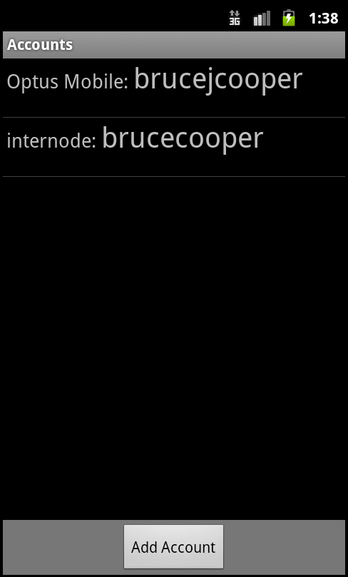
Rather than specifying pixel locations, LayoutManagers decide how space is allocated. Layout hints are passed into the layout manager using XML attributes. If you look at the example above, you’ll see that the top layout used is a LinearLayout, with two child views, a ListView and another LinearLayout, which in turn has a single Button child. Each component has the layout attributes layout_width and layout_height, which specify how they should calculate their preferred size. In this circumstance, we are using fill_parent to use up as much space as possible, or wrap_content to simply be big enough to contain its contents. The ListView component also has a layout_weight attribute to instruct the layout that any remaining space should be allocated to that component.
There are a number of default layouts that are available, or you can define your own. The defaults are:
- LinearLayout – children are stacked either horizontally or vertically, each with a layout weight to allocate additional space to.
- FrameLayout – all children are stacked on top of each other, using up all the space
- RelativeLayout – Allows components to be laid out to the left, right, etc.. of other components, or the frame itself.
- TableLayout – lays out components in a table
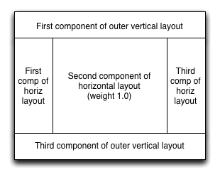
Layouts can be nested, allowing for complex layouts if required. A common example would be the standard central component with borders around the outside. This is simply a vertical LinearLayout with a horizontal LinearLayout as its middle child.
Dealing with Different Screen Sizes and Orientations
So far, defining our layouts has been pretty straightforward. There are times, however, when simply instructing the layout how to resize is not enough. A layout designed for a portrait screen may not look right on a landscape screen, requiring a different layout. Android has this covered using resource selectors.
Resources for an Android application are laid out in the project in the res directory. A sample application might have a directory structure that looks like this. Pay attention to the last two lines ending in -en and -it as we’ll come back to those.
/res
/res/layout/
/res/layout-port/mainscreen.xml
/res/layout-land/mainscreen.xml
/res/drawable-hdpi/icon.png
/res/drawable-ldpi/icon.png
/res/values-en/strings.xml
/res/values-it/strings.xml
When your application asks for a resource, it tries to find the file based upon attributes that the phone has. For example, if our phone was in landscape orientation when the request for the mainscreen layout was made, it would first look in the layout-land directory, and if it didn’t find it, would fallback to the main layout directory.
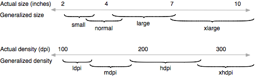
So, to have a different layout for portrait and landscape, we simply create two files with the same name in the layout-port and layout-land directories respectively. The same goes for almost every resource in the system. Other commonly used selectors are screen DPI density or screen size.
NOTE: Android 3.2 (Honeycomb) introduces a new scheme for selecting resources. See the section called Declaring Tablet Layouts for Android 3.2 in the Supporting Multiple Screens article of the Android Developer docs for more info.
Another useful selector is the language of the device. Strings can be abstracted in Android into an XML file, which can then be internationalized. In the layout example at the start of the article, the Button’s text is defined by the string reference @string/addaccountbutton. At runtime, this value will be looked up in values/strings.xml, but this resource is subject to selectors just like anything else. In this way we could use values-it/strings.xml to provide an Italian translation for the application.
Themes and Styles
The last part of the design puzzle comes down to theming. We don’t want to have to repeat colours and values throughout our application. Just as HTML has CSS, Android provides a theming capability. As usual, themes are defined in a XML file called res/values/styles.xml. A sample style file is shown below:
<?xml version="1.0" encoding="utf-8"?>
<resources>
    <style name="TitleTheme" parent="android:Theme">
        <item name="android:windowTitleStyle">@style/WindowTitle</item>
        <item name="android:windowTitleSize">49dip</item>
        <item name="android:windowTitleBackgroundStyle">@style/CustomWindowTitleBackground</item>
    </style>

    <style name="CustomWindowTitleBackground">
        <item name="android:background">@drawable/bluegradient</item>
    </style>

    <style name="largeText">
        <item name="android:textSize">27sp</item>
    </style>

    <style name="ttButton">
        <item name="android:layout_width">wrap_content</item>
        <item name="android:layout_height">wrap_content</item>
        <item name="android:textColor">#ffffff</item>
        <item name="android:paddingTop">10dp</item>
        <item name="android:paddingLeft">10dp</item>
        <item name="android:paddingBottom">10dp</item>
        <item name="android:paddingRight">10dp</item>
        <item name="android:layout_marginTop">10dp</item>
        <item name="android:layout_marginLeft">10dp</item>
        <item name="android:layout_marginBottom">10dp</item>
        <item name="android:layout_marginRight">10dp</item>
        <item name="android:textSize">25dp</item>
        <item name="android:width">120dp</item>
        <item name="android:shadowColor">#000</item>
        <item name="android:shadowDx">2.0</item>
        <item name="android:shadowDy">2.0</item>
        <item name="android:shadowRadius">2.0</item>
        <item name="android:textStyle">bold</item>
    </style>

    <style name="greenButton" parent="ttButton">
        <item name="android:background">@drawable/greenbutton</item>
    </style>
    <style name="redButton" parent="ttButton">
        <item name="android:background">@drawable/redbutton</item>
    </style>
    <style name="blueButton" parent="ttButton">
        <item name="android:background">@drawable/bluebutton</item>
    </style>
</resources>
Styles are given a name, can inherit from other styles, and are specified as a set of key/value pairs. To use a style, simply add a style=@styles/stylename attribute to the view to which you wish to apply the style. As an example, a big red button could be defined as:
<Button android:text="@string/addaccountbutton" style="@style/redButton" android:id="@+id/addaccountbutton"/>
All other values are specified by the style. Its not quite as expressive as CSS, but it provides the basis of what is needed.
The Wrap Up
So there you have it. Android doesn’t have a good graphical user interface builder, but does provide powerful mechanisms for providing interfaces that will work across a variety of devices. Astute readers will notice that the approach to laying out components is quite similar to how HTML documents are laid out using CSS. Anyone who is familiar with web design should be able to put together Android views easily. Personally, I prefer having the flexibility of being able to see the full definition in code/XML.
 Bruce Cooper
Bruce Cooper is an IT consultant who feels that in order to be able to serve his customers well he should have an understanding of the different technologies that are out there, and how they work. The best way to learn is through doing, so he often takes on small side projects to pick up a new technology.