Adapting Your Site to Different Window Sizes
Key Takeaways
- Modern browsers support the width and height properties of the CSS Device Adaptation, enabling web developers to control automatic content scaling across different window dimensions. This is particularly useful for optimizing sites for browsing on touch-enabled tablet devices in the snapped view and in portrait orientation.
- The best narrow layouts are custom-made by the web developer, which may require changes to image sizes, reordering of content, alternative tools for site navigation, or other fundamental changes to content. If a site is already optimized for narrow windows, Device Adaptation can be used to override the default scale.
- Adapting your website to different window sizes, or responsive web design, is crucial in today’s digital age. It improves user experience, leading to increased visitor engagement, retention, and conversion. Additionally, search engines like Google prioritize mobile-friendly websites in their search results, so having a responsive website can also improve your SEO ranking.
Modern browsers like the latest versions of Internet Explorer, Firefox, Safari and Opera support the width and height properties of the W3C Working Draft CSS Device Adaptation, which as of 1 November has evolved to an Editor’s Draft. This gives Web developers a simple tool to control automatic content scaling across various window dimensions. In particular, it enables sites to easily adapt to browsing on touch-enabled tablet devices in the snapped view and in portrait orientation.
Auto-Scaling and When it is Used
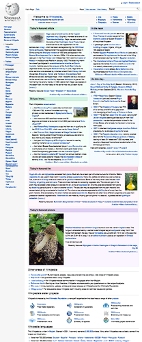
Many websites have prioritized optimization for a 1024 pixel wide window. This ensures a good user experience for a wide variety of displays when the browser is maximized. However, sites may not work well on new form factors like tablets and portrait screen orientation if they haven’t optimized for other window sizes as well. In particular, pages often clip or distort layout when viewed in a narrow width.


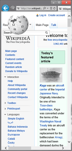
This narrow layout is particularly important in Windows 8, where the snapped view of the browser is in this exact state. This situation also occurs for portrait mode on slate devices due to the smaller form factor.
The snapped view and portrait mode are auto-scaled by default to ensure at least 1024 pixels of layout width. Mobile devices take a similar approach when displaying non-mobile-optimized sites on a narrow form factor. Since most sites are built to work well at 1024 pixels, this ensures that they are laid out well and do not clip content by default.


Although this approach ensures a good default experience, users will need to zoom in to view and interact with the site.
Working Well In a Narrow Window
The best narrow layouts are those that have been custom-made by the Web developer. In addition to fitting the site into a narrower region, this also may require changes to image sizes, reordering of content, alternative tools for site navigation, or other fundamental changes to content.
If your site has already made these modifications for narrow windows, then Device Adaptation can be used to override the default scale.
For some great examples of adaptive layouts, check out Media Queries. Metal Toad Media also has a great article discussing layout width support based on prevalent devices and screen sizes in the market.
Using @viewport
Simple support for the snapped view
If your site is already capable of a 320 pixel width layout, you can easily choose to show that version in the snapped view. Combining Device Adaptation with CSS media queries allows the auto-scaling feature to be overridden selectively. This CSS overrides the default auto-scaling, and instead enforces a consistent 320 pixel layout width for all windows 320 pixels wide or narrower:
@media screen and (max-width: 320px) { @viewport { width: 320px; } }When the window is less than 320 pixels wide the content will be scaled down to fit. For example, a 300 pixel wide window will show the content at 93.75% scale. For larger widths, normal scaling applies (for example, when the browser is in portrait mode).
Device adaptation degrades gracefully in browsers which do not yet support it. These browsers can still benefit from narrow layout support—they just won’t auto-scale to fit content to the window.
Portrait support
If your site supports a 768 pixel wide layout as well, then portrait mode support can be easily added with a second viewport rule:
@media screen and (max-width: 320px) { @viewport { width: 320px; } } @media screen and (min-width: 768px) and (max-width: 959px) { @viewport { width: 768px; } }I recommend testing your site in layout widths of 768 pixels (portrait on most slates) and 320 pixels (snapped browser) in addition to 1024 pixels and wider (landscape). You can see an example of the viewport rule in action in the Make it Snappy! demo on the IE Test Drive site.
Frequently Asked Questions (FAQs) on Adapting Your Site to Different Window Sizes
What is the importance of adapting my website to different window sizes?
Adapting your website to different window sizes, also known as responsive web design, is crucial in today’s digital age. It ensures that your website provides an optimal viewing experience across a wide range of devices, from desktop computers to mobile phones. This is important because it improves user experience, which can lead to increased visitor engagement, retention, and conversion. Moreover, search engines like Google prioritize mobile-friendly websites in their search results, so having a responsive website can also improve your SEO ranking.
How can I make my website fit any screen size?
To make your website fit any screen size, you need to use responsive web design techniques. This involves using flexible layouts, flexible images, and CSS media queries. Flexible layouts use relative units instead of absolute units to resize the page elements. Flexible images are also sized in relative units to prevent them from displaying outside their containing element. CSS media queries allow the page to use different CSS style rules based on the characteristics of the device the site is being displayed on, such as its screen size.
What are CSS media queries and how do they work?
CSS media queries are a feature of CSS3 that allow content to adapt to different conditions such as screen resolution. They work by applying different style rules for different media types and conditions. For example, you can have one set of styles for screens wider than 800px, and a different set for screens smaller than 800px. This allows you to create a responsive design that adapts to the user’s environment.
How can I test if my website is responsive?
There are several ways to test if your website is responsive. One way is to manually resize your browser window and see if the layout adjusts accordingly. You can also use online tools like Google’s Mobile-Friendly Test or Responsive Design Checker. These tools allow you to enter your website’s URL and they will show you how your website looks on different devices.
What is the difference between adaptive and responsive design?
While both adaptive and responsive design aim to optimize the user experience across different devices, they do so in different ways. Responsive design uses flexible and fluid layouts that adjust to the screen size, while adaptive design uses static layouts that are designed for specific screen resolutions. In other words, responsive design is more flexible and adapts to the screen size, while adaptive design delivers the most appropriate static layout for the screen.
How does responsive design affect SEO?
Responsive design can have a positive impact on SEO. Google has stated that it prefers responsive web design over mobile templates. Having one single URL makes it easier for Google to crawl your site and reduces the chance of on-page SEO errors. Moreover, users tend to stay longer and interact more with responsive websites, which can improve your site’s ranking.
Can I use JavaScript to make my website responsive?
Yes, you can use JavaScript along with CSS to make your website responsive. JavaScript can be used to manipulate the DOM and change the layout based on the user’s screen size. However, it’s generally recommended to use CSS media queries for responsive design as they are more efficient and easier to maintain.
What is the viewport meta tag and why is it important?
The viewport meta tag is an HTML tag used in responsive design to control the layout on mobile browsers. It ensures that the width of the webpage matches the screen width of the device, and allows you to control the page’s scaling and zooming. Without it, mobile browsers might render your page at a desktop screen width, leading to a poor user experience.
How can I make images responsive?
To make images responsive, you can use CSS to ensure they scale and resize properly. One common technique is to set the max-width property of the image to 100%, which means the image will never be larger than its container. You can also use CSS media queries to serve different images based on the screen size.
What are some common mistakes to avoid when creating a responsive design?
Some common mistakes to avoid when creating a responsive design include not testing on actual devices, using absolute units instead of relative units, not considering the performance on mobile devices, and not designing for touch. It’s also important to avoid hiding content on smaller screens, as this can lead to a poor user experience and potential SEO issues.
Matt Rakow is a Program Manager on the Internet Explorer team.

