Here are the 5 Things Great Designers Do Differently

Key Takeaways
- Great designers prioritize effective microcopy, understanding that it’s a crucial aspect of the design process and can significantly enhance the user experience.
- Rather than simply following established design rules, great designers learn them thoroughly, then break them when necessary to innovate and create fresh solutions to user issues.
- Understanding the value of speed is a hallmark of great designers, who recognize that even the most beautifully designed website is useless if it doesn’t load quickly. They collaborate with developers to optimize loading times and improve overall user experience.

Demand for UX designers is rising every year. General Assembly estimates that UX design will be one of the most-promising careers in 2020, but with more demand…comes more supply. Here are the 5 things great designers do differently to beat their competition.
———
Pretty much every sector from health, to finance, to tech, and even retail, needs user experience designers. These master problem-solvers are geniuses at creating both online and offline experiences that prioritize the needs of the users.
Looking to hire a great UX designer? Here’s what one looks like:
1. Great Designers Write Damn Good Microcopy
Have you ever felt lost at sea when using a website or app because the UI text was too vague? What about when you’re filling out a form and it’s not quite clear what it is that you need to do? Well, this confusion is a direct result of bad microcopy.
As Joshua Porter says, “Microcopy is small yet powerful copy. It’s fast, light, and deadly. It’s a short sentence, a phrase, a few words. A single word. It’s the small copy that has the biggest impact. Don’t judge it on its size…judge it on its effectiveness.”
When microcopy is too vague or robotic-sounding, the user doesn’t resonate with the communication as well as they would do with a more conversational, humanlike tone of voice. Great designers understand that writing interface microcopy is a core aspect of the design process, and it’s just as important as prototyping, visual design or user research.
Let’s take this form design by Tumblr, for instance. Do you see where it says, “(you can change this at any time)”? Just this short snippet of microcopy tells the user: “Hey, don’t work yourself up about it, you can come back to this step later”. It’s informative, it’s empathetic, and it gives the user options. Without this microcopy, the user might force themselves to think of a suitable URL.

2. Great Designers Learn the Rules…and Break Them
Great designers do more than think outside the box. As technology evolves and the needs of users change, they learn how to redefine the entire space when necessary. Great designers learn as much as humanly possible about the box before deciding to break the rules, as they know that reinventing the wheel is costly and sometimes risky.
Having a fair amount of knowledge about the users before designing the experiences, allows designers to deviate from these so-called design rules when necessary. Knowing these rules, and why they were established to begin with, means being able to understand the consequences of breaking them (both the risks and benefits).
Great designers are innovative. When they do break the rules, they come up with fresh ideas to solve the issues that users are having, when the usual solutions aren’t working. The implementation of these ideas is how design trends are born!
3. Great Designers Steal
Yes, you read that correctly. Great designers steal, then they improve. And I’m not the first to make this claim. As it turns out, Picasso, one of the most influential fine artists of the 20th century, felt the same way.
“Good artists copy. Great artists steal.” ~ Pablo Picasso.
In the example below, Smena created this snazzy paper shredder image.

Hanna Jung, a designer at Google, restyled the image slightly and added animation to it. It’s quite clear that Jung did not come up with the original concept, but was nonetheless inspired to tweak it and make it into something even better.

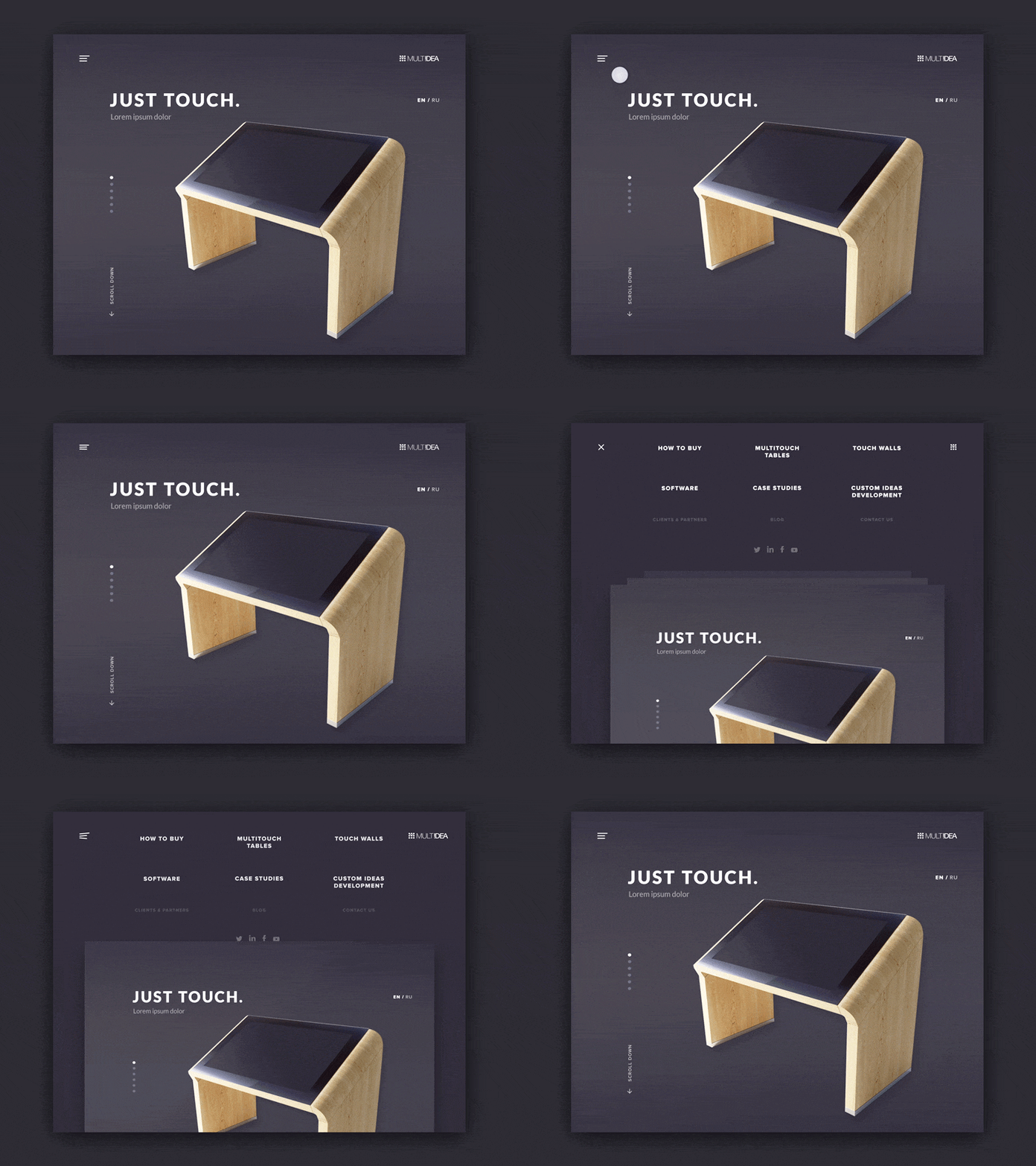
We find another example in Brandon Termini’s fresh take on the navigation system for a technology company’s web site.

Inspired by Termini’s navigation concept, Ilya Kostin decided to try something similar and the result was nothing short of elegant.

4. Great Designers Declutter Ruthlessly
“The ability to simplify means to eliminate the unnecessary so that the necessary may speak.” ~ Hans Hofmann.
What’s usually deemed as unnecessary in interface design is visual noise, too much text, over-animated objects, and basically anything that steals the spotlight from the necessary elements. Great designers know this—they experiment various ideas, then reduce the overall design to declutter.
“We’re the leading company…, we offer this, that and also this…, we understand why…, we will do this, this and that…, blah blah blah…”. Does any of this sound hugely familiar? Minimalism is about more than using a white background and flat user interface elements (actually, it’s often not about either of those things)—decluttering starts with content.
Why? Because users hate noise, it waste’s their time. All the average user wants to know is:
- What your brand/company does
- How it benefits them
- How to reap those benefits immediately
When you bury the valuable information in fancy visuals, unnecessary features and fluffy, unmeaningful copy, the easier it is for users to try their luck with another competitor.
Let’s take the Buffer homepage for example. Right off the bat the webpage describes what Buffer does (“share on social media”), why you should choose it (“A better way”), and offers a clear direction for the user to take (“Get Started for Free”).

5. Great Designers Understand the Value of Speed
Fantastic websites are aesthetically pleasing, mobile-friendly, use legible typography with emotionally captivating imagery, flawlessly forms, and wonderful user experiences overall. But, as laudable as all of these features are, they’re utterly useless if the website doesn’t load in less than 3 seconds.
Let’s face it, website speed matters. Faster-loading sites are better by all metrics: better user experience, higher conversions, more valuable engagements, and even higher search rankings. Great designers understand that loading times and perceived performance matters, even if the other half of this feat is taken care of by the developer.
An Kissmetrics study showed that a 1-second delay in load time could result in a 7% loss in conversions!
Great designers collaborate with developers to analyze the way users are engaging with their websites, identifying which webpages/mobile app screens are loading slowly, or which are perceived to be slow because of excessive images/features.
And then they rethink, reduce and improve!
———
Obviously there is much, much more to being a great designer than what’s been mentioned above, but these are the 5 hot design skills that are turning heads in particular. So, are you a head-turner, or a face-palmer?
Frequently Asked Questions (FAQs) about Design Principles
What are the key principles that every designer should follow?
The key principles that every designer should follow include balance, contrast, emphasis, movement, and unity. These principles guide the arrangement and application of elements in design projects. They help to create a visual hierarchy, where the eye is drawn to certain parts of the design first, and create a sense of balance and harmony.
How can I improve my design skills?
Improving design skills requires practice, learning, and feedback. Regularly experimenting with different design techniques, studying the work of successful designers, and seeking feedback from peers and mentors can significantly enhance your design skills. Additionally, staying updated with the latest design trends and technologies can also be beneficial.
What role does color play in design?
Color plays a crucial role in design as it can influence mood, create emphasis, and convey meaning. Understanding color theory and the psychological effects of different colors can help designers make effective color choices. It’s also important to consider contrast and harmony when selecting colors for a design project.
How can I create a balanced design?
Creating a balanced design involves distributing elements evenly throughout the design. This can be achieved through symmetry, asymmetry, or radial balance. Balance helps to create a sense of stability and cohesion in a design, making it more pleasing to the eye.
What is the importance of typography in design?
Typography is a vital aspect of design as it can greatly influence readability, mood, and visual appeal. Choosing the right font, size, spacing, and color can enhance the overall effectiveness of a design. It’s also important to consider the legibility and readability of text in different contexts.
How can I create emphasis in my design?
Emphasis in design can be created through contrast, size, placement, color, or use of space. By creating points of emphasis, designers can guide viewers’ attention to the most important elements of a design.
What is the role of negative space in design?
Negative space, or white space, is the area around and between the elements of a design. It can help to create balance, emphasize important elements, improve readability, and give a design a clean, minimalist look.
How can movement be incorporated into a design?
Movement can be incorporated into a design through the use of lines, shapes, colors, and textures that guide the viewer’s eye through the design. This can create a sense of flow and dynamism, making the design more engaging and interesting.
How can unity be achieved in a design?
Unity in design can be achieved through the consistent use of colors, shapes, textures, and styles. This creates a sense of cohesion and harmony, making the design feel like a cohesive whole.
What are some common mistakes to avoid in design?
Some common mistakes to avoid in design include overloading the design with too many elements, using too many different fonts or colors, neglecting the use of white space, and failing to create a clear visual hierarchy. It’s also important to ensure that the design is appropriate for its intended audience and purpose.
Tobi is a writer, marketing consultant, science geek and tech nerd.
Published in
·CMS & Frameworks·Databases·Debugging & Deployment·Patterns & Practices·PHP·Programming·July 11, 2014

Published in
·Design·Design & UX·Prototypes & Mockups·Statistics and Analysis·Typography·UI Design·Usability·UX·November 1, 2016


