25,000 Votes Later, Greenpeace Pick A New BP Logo
A couple of months ago, Greenpeace launched a rebranding competition that caught the imagination of the design community. The brief was to re-design a logo for BP which would be more “appropriate” than their current logo of a shiny green sunflower.
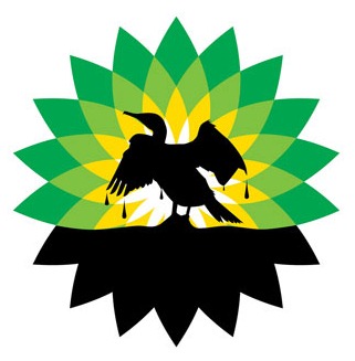
2000 submitted logos and 25,000 votes later, the judges (that’s anyone who wanted to vote) have chosen a logo to reflect the company’s determination to extract oil from just about anywhere. The winning logo by French designer Laurent Hunziker features a seabird dripping in oil with the lower part of the sunflower blacked out.
Describing his inspiration for the logo, he said:
The silhouette shape comes from a very moving picture I saw of this poor bird in panic, glued in oil… His agony is a strong reflection of what is happening to our world with these tragic events. Placed in front of the BP logo, and it all looks like a fatal sunset for us
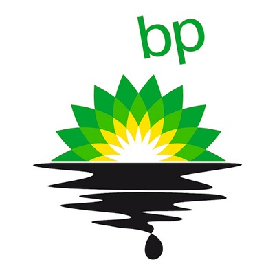
The Best Rebranded Logo – Judges’ Choice went to German designer Alexander Hettich, for a similar idea. The judges chose this logo because it is “simple, clear and effective”.
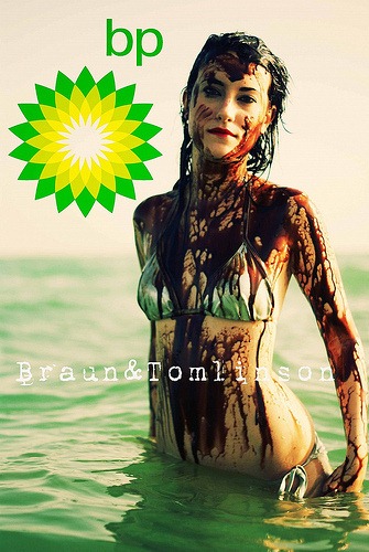
Other categories included the Best Illustrated Logo by Brian David Braun and Tara Tomlinson with the evocative photograph of a bather covered in oil.
We thought if we could combine our photography style with oil soaked beach goers it would really hit home and illustrate just how our way of life would be permanently altered and destroyed if that oil was allowed to hit here and we created some seriously powerful images.
Other categories included Best Wildlife Logo, Best WTF! Logo and Best Slogan Logo, which used “It’s time to think outside the barrel”, a quote from an old BP campaign. To see the full set of winners in each category, visit the Greenpeace BP logo site.
What do you think of the winning logo design? Does it capture the spirit of the campaign successfully?
Frequently Asked Questions about the BP Logo Redesign
What was the reason behind BP’s logo redesign?
The primary reason behind BP’s logo redesign was to reflect the company’s commitment to environmental sustainability and clean energy. The new logo, featuring a vibrant green and yellow sunflower design, was intended to symbolize BP’s shift towards renewable energy sources and away from traditional fossil fuels. This was a strategic move to improve the company’s public image and align with global efforts to combat climate change.
How much did the BP logo redesign cost?
The BP logo redesign reportedly cost around $211 million. This figure includes not only the design process but also the implementation of the new logo across all platforms and locations, including petrol stations, company vehicles, and digital platforms. This cost underscores the significance of a logo in representing a company’s brand identity and values.
Who designed the new BP logo?
The new BP logo was designed by the London-based brand consultancy firm, Landor Associates. They are known for their expertise in brand strategy and design, and have worked with a wide range of global clients across various industries.
What does the new BP logo represent?
The new BP logo represents a sunflower, with the green and yellow colors symbolizing nature and energy. The design is intended to reflect BP’s commitment to environmental sustainability and its shift towards renewable energy sources.
How was the new BP logo received by the public?
The new BP logo received mixed reactions from the public. While some appreciated the fresh, modern design and the company’s commitment to sustainability, others criticized it as a mere PR stunt, given BP’s history with oil spills and environmental controversies.
How does the new BP logo compare to other oil company logos?
Compared to other oil company logos, the new BP logo stands out with its vibrant colors and modern design. While most oil companies use traditional symbols like shields or simple text, BP’s sunflower design is unique and easily recognizable.
What was the process of implementing the new BP logo?
The process of implementing the new BP logo was a massive undertaking, given the company’s global presence. It involved replacing the old logo on all platforms and locations, including petrol stations, company vehicles, and digital platforms. This process reportedly cost around $211 million.
How does the new BP logo reflect the company’s future direction?
The new BP logo reflects the company’s future direction towards environmental sustainability and renewable energy. The sunflower design and green and yellow colors symbolize nature and energy, representing BP’s commitment to these values.
What was the public’s role in choosing the new BP logo?
The public played a significant role in choosing the new BP logo. Greenpeace, an environmental organization, launched a competition inviting people to design a new logo for BP. The winning design, which was similar to the current logo, was chosen based on public votes.
How has the new BP logo impacted the company’s brand image?
The new BP logo has significantly impacted the company’s brand image. It has helped to portray BP as a company committed to environmental sustainability and renewable energy. However, it has also attracted criticism from those who view it as a mere PR stunt, given BP’s history with environmental controversies.
Jennifer Farley is a designer, illustrator and design instructor based in Ireland. She writes about design and illustration on her blog at Laughing Lion Design.


