

Since its invention, the humble ‘navigation menu’ has been one of the core experiences of browsing the web. In fact, the Web’s first-ever webpage — recently restored to it’s original 1991 CERN URL — consists mostly of a rudimentary text navigation menu.

As spartan as it appears, the reality is that the vast majority of webpages ever since have used some sort of variation on Sir Tim Berner-Lee’s original handiwork.
Navigation menus have taken on many different looks and functionality, showing that you can customize them to your liking in order to make your design cohesive.
Today’s showcase focuses on 20 attractive and original navigation menus for your 2014 design inspiration.
Enjoy.
Spark
An already eye-catching website, the Spark website carries an overall sleek look that is also seen in their navigation menu. Foregoing the typical text menu Spark utilizes creative grey icons instead to match the site’s aesthetic.
• sparkdesign.cn
What Happens Next
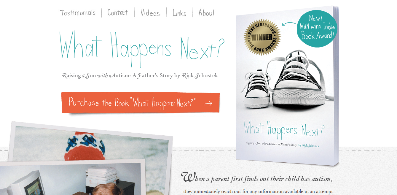
Depending on your website design you may just want to keep your design simple so not to take away from the finished product. If you want simple menu design you might want to take a cue from What Happens Next and use a creative typeface.
• whathappensnextbook.com
TeamGeek
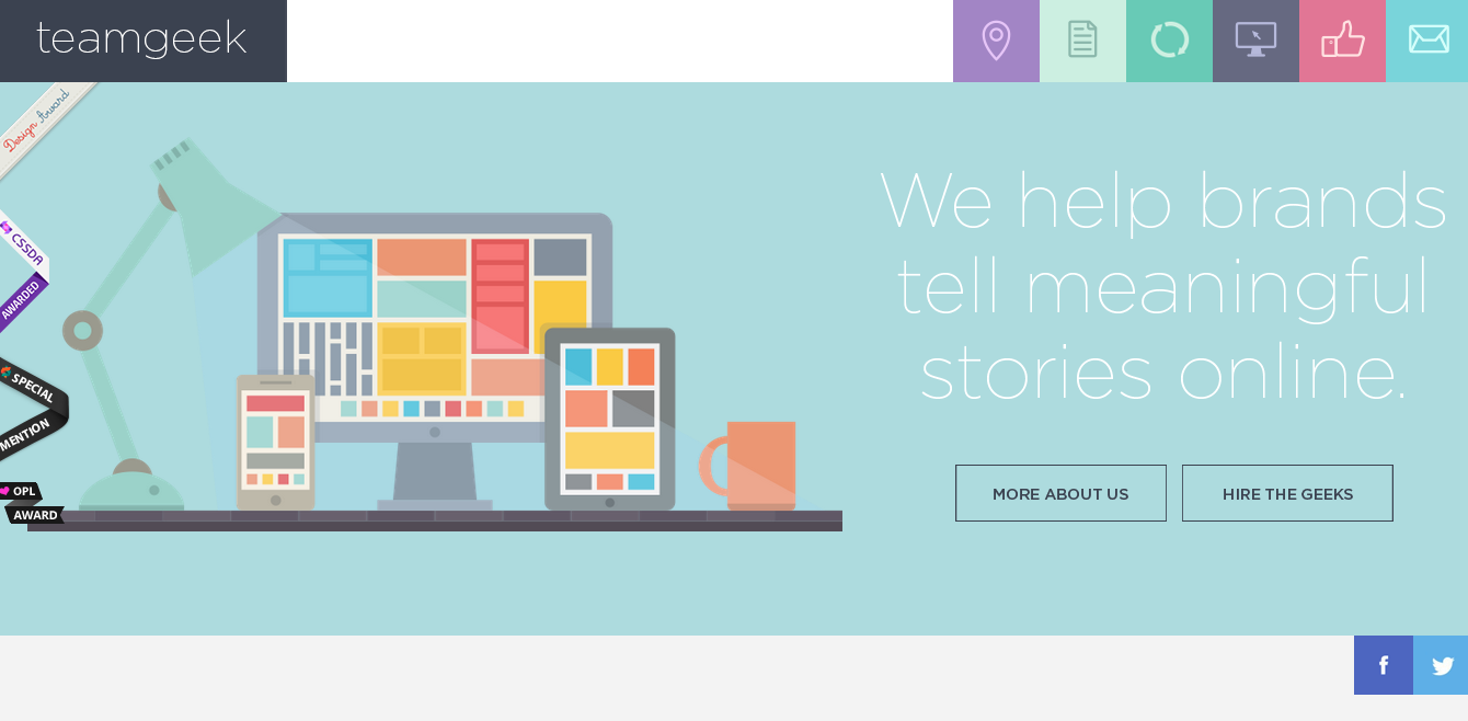
TeamGeek at first glance has a great flat design going for it but then you look at the navigation menu and understand the importance of cohesive elements. The flat icons used in the menu give the site a fresh look.
• teamgeek.co.za
Hauska
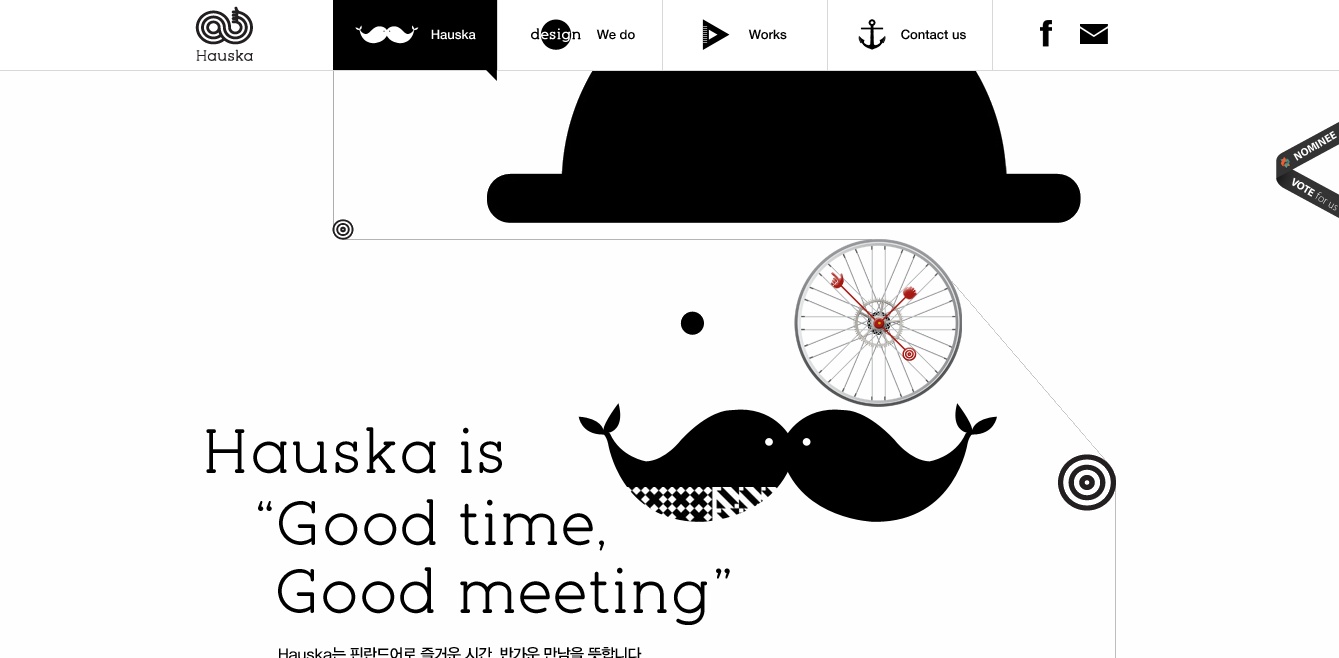
Once again keeping your designs simple doesn’t have to mean you are left with something boring. Hauska adds not only icons to the menu with their text but also an eye-catching black highlight that lets you know what page you are on.
• hauska.co.kr
Epic
Though at first glance you might not think the Epic navigation menu is all that creative the use of the typography is what really makes the design so great. The alternation of large and smaller fonts makes the menu read well.
• epic.net
Libor
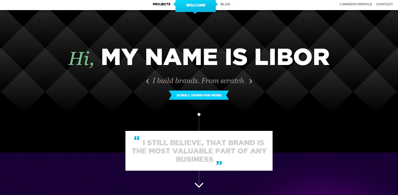
If you are trying to have a site that promotes you as a designer you will definitely want your site to stand out including your method of navigation. The mini navigation menu on Libor’s site is effective especially with the highlight design.
• liborzezulka.com
Plug and Play Design
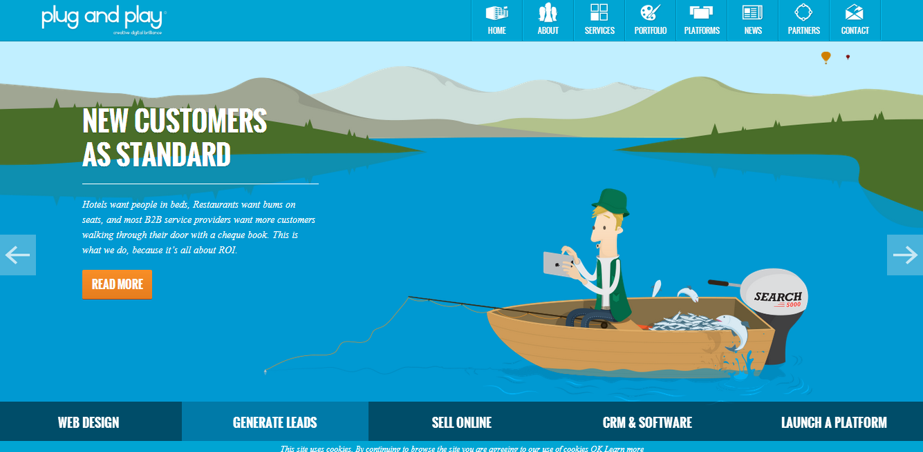
Plug and Play takes on the icon filled navigation style but does it in their own style. The icons have a deliberate design that is explained by the underneath text. The isolation of each icon in its own box keeps everything from meshing together.
• plugandplaydesign.co.uk
Dwarf Planet
Sometimes you don’t need to place your navigation menu in its own box, sometimes just giving each link enough breathing room works just the same. Dwarf Planet takes this method while providing a pink box to distinguish the current page from the others.
• dwarfplanet.co
Lucas Nikitczuk
Lucas Nikitczuk’s site is really an eye-catcher. Going far from the traditional page design you will notice that their is no apparent navigation menu. Upon closer investigation you realize that the small dots to the right of the screen take you to where you want to go.
• lucasnikitczuk.com.ar
Nerval
When designing your website there are some things you should know, one of them being that the navigation menu does not always have to be at the top of the page. Nerval’s site places the navigation closer to the bottom of the screen but large enough so that you can see it.
• nerval.ch
AWD Agency
Sometimes the horizontal navigation menu just doesn’t work out which leads you to having to try something different. The vertical navigation is always an option. As shown on the AWD Agency website a vertical navigation menu can look very professional.
• AWDagency.com
Webshocker
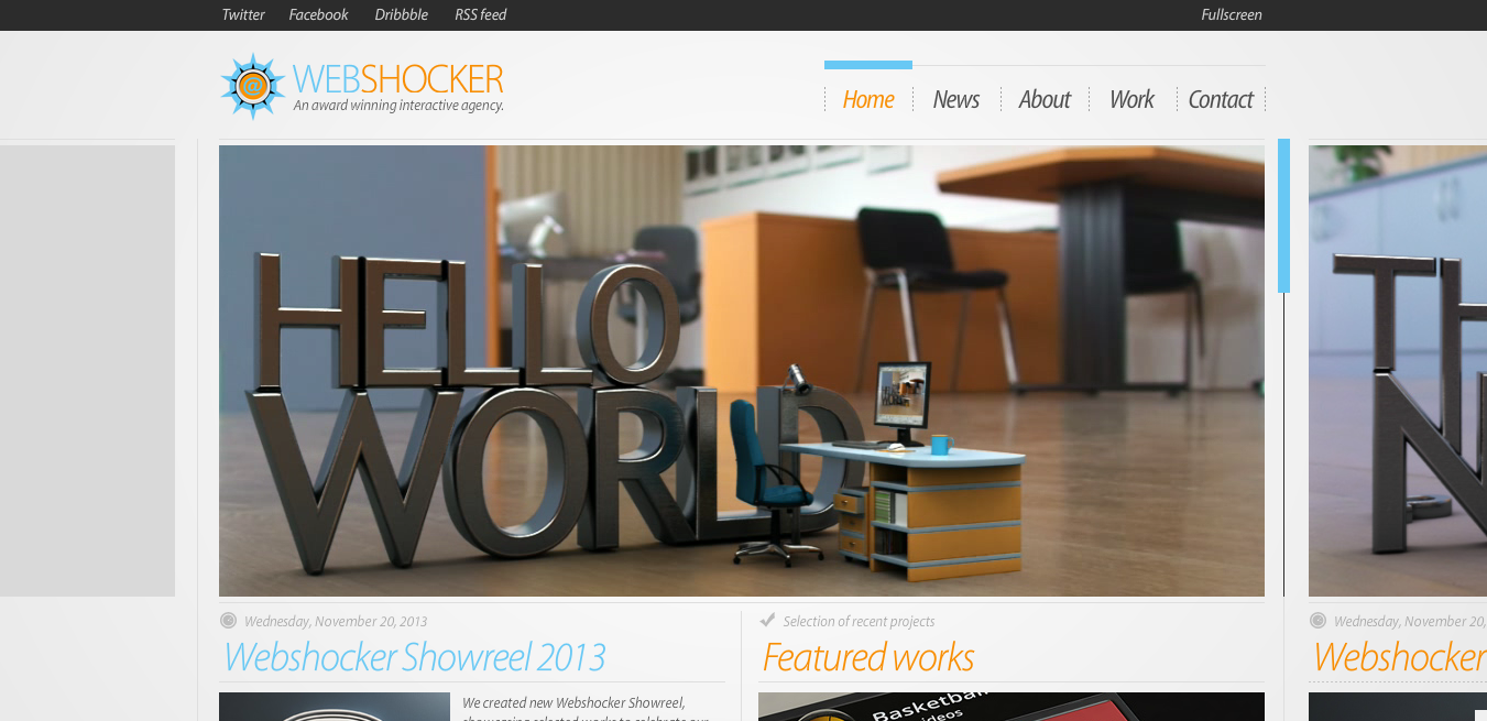
Going all out on your navigation menu isn’t always necessary just to attract attention and let your visitors know what pages are available to them. Webshocker clearly is aware of this so offers simple dividing lines and an overhead highlight of color for the active page.
• webshocker.net
Kutztown
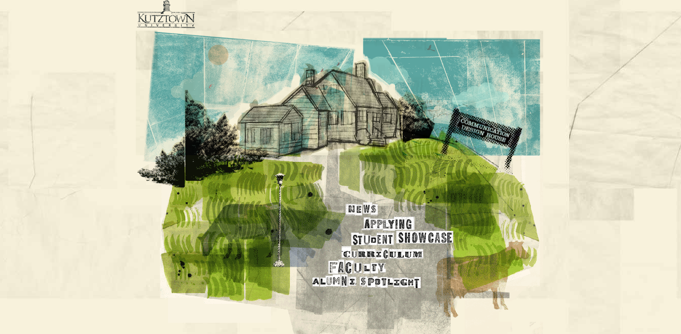
If you’re looking for a really creative way to advertise your pages then Kutztown’s academic website is a great place to get inspiration. The site’s navigation is truly refreshing and throws all the rules out of the window.
• kutztown.edu
Unfold
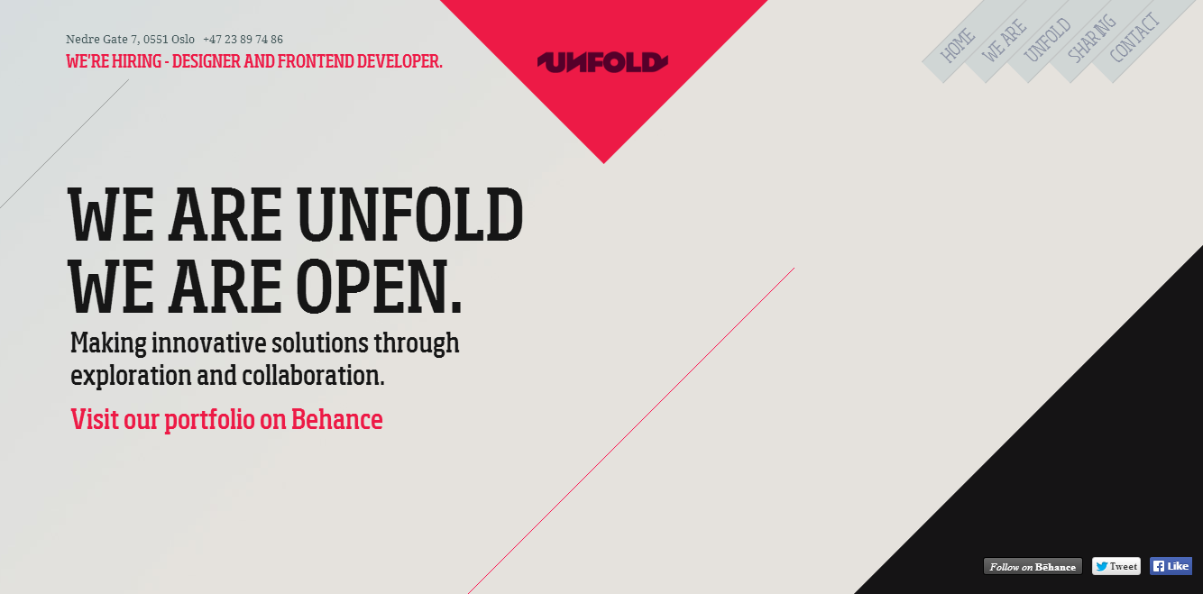
Just because you place your navigation menu at the top of the screen doesn’t mean that it has to be boring. Unfold takes their navigation menu and turns it sideways for an interesting look that just so happens to work with their site design.
• unfold.no
Sensi Soft
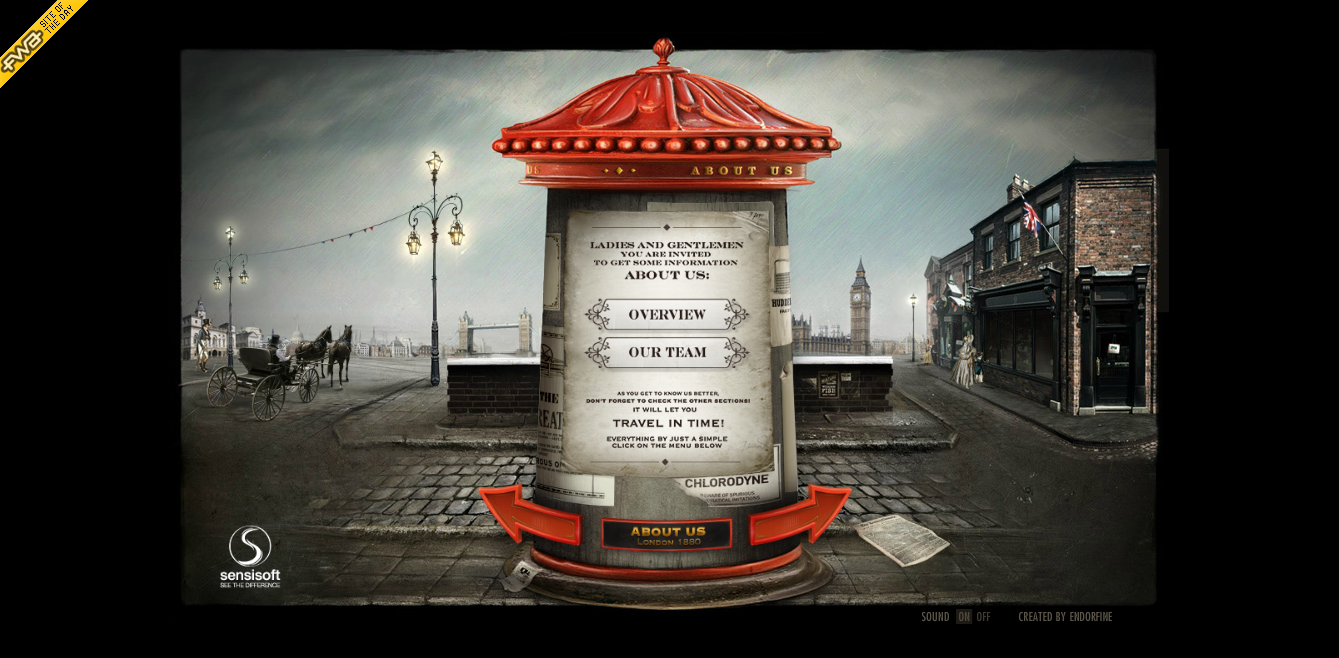
Sensi Soft has a truly engaging navigation menu as not only do they place their menu in the center of the screen but they also design it into a centerpiece that stays in the center of the screen as you navigate your way through the site.
• sensisoft.com
Secret Key
The icon navigation menu may seem overdone at points but it is one design trend that can be continuously reinvented as shown in Secret Key’s design. Adding in color and movement upon scrolling over each link is a great look.
• secretkey.it
Resn
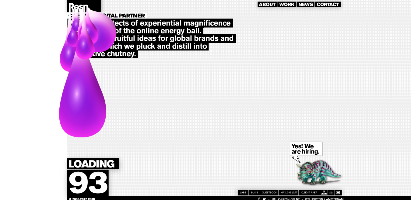
Resn’s site is pretty cool without even taking their navigation menu into consideration but once you do you may find yourself wanting to redesign your own menu. When you scroll over each navigation link a swan appears from underneath it.
• resn.co.nz
MacRabbit
MacRabbit (makers of the popular Espresso code editor) has an icon based navigation menu that gives the site a clean and modern look. Instead of featuring a color change whenever you go to a new page the link is highlighted with a circle almost as if a button has been pushed in.
• macrabbit.com
Cultured Code
Usually navigation menus tend to be fairly large so that the visitors will automatically take notice of it but Cultured Code prefers to do the exact opposite. The small navigation may not be your cup of tea but it nicely takes up little space.
Frequently Asked Questions about Navigation Menu Designs
What are the key elements to consider when designing a navigation menu?
When designing a navigation menu, it’s crucial to consider its functionality, simplicity, and consistency. The menu should be easy to find and use, with clear labels for each section. It should also be consistent across all pages of the website, providing a seamless experience for users. Additionally, the design should be responsive, meaning it adapts to different screen sizes and devices. Lastly, the aesthetics of the menu should align with the overall design and branding of the website.
How can I make my navigation menu more user-friendly?
To make your navigation menu more user-friendly, ensure it’s simple and intuitive. Avoid using jargon or complex terms in your menu labels. Instead, use familiar and straightforward language that your audience can easily understand. Also, limit the number of items in your menu to prevent overwhelming users. A good rule of thumb is to have between five to seven items. Lastly, ensure your menu is accessible to all users, including those with disabilities, by following accessibility guidelines.
What are some creative navigation menu designs I can use for inspiration?
There are numerous creative navigation menu designs you can use for inspiration. Some examples include the “hamburger” menu, which is a three-line icon that opens up into a full menu when clicked, and the “mega menu”, which is a large, two-dimensional dropdown menu. Other innovative designs include the “sticky” menu that remains visible as users scroll down the page, and the “vertical” menu that runs down the side of the page.
How can I design a responsive navigation menu?
Designing a responsive navigation menu involves ensuring that the menu adapts to different screen sizes and devices. This can be achieved by using flexible layouts, images, and CSS media queries. For smaller screens, consider using a hamburger menu or a dropdown menu to save space. Also, ensure that the menu items are large enough to be easily tapped on a touchscreen.
What are some common mistakes to avoid when designing a navigation menu?
Some common mistakes to avoid when designing a navigation menu include using too many menu items, using vague or unclear labels, and not making the menu accessible to all users. Also, avoid using complex or unconventional designs that may confuse users. Remember, the primary purpose of a navigation menu is to help users navigate your website easily and efficiently.
How can I test the usability of my navigation menu?
You can test the usability of your navigation menu by conducting user testing. This involves observing users as they navigate your website and noting any difficulties or issues they encounter. You can also use heatmaps to see where users are clicking on your menu, or analytics tools to see which menu items are most and least clicked.
How can I improve the aesthetics of my navigation menu?
Improving the aesthetics of your navigation menu can be achieved by using consistent and appealing colors, fonts, and icons. Ensure that the menu aligns with the overall design and branding of your website. Also, consider using animations or transitions for a more engaging user experience. However, ensure that these elements do not compromise the functionality or usability of the menu.
How can I make my navigation menu more accessible?
Making your navigation menu more accessible involves ensuring that it can be used by all users, including those with disabilities. This can be achieved by using large, readable fonts, high contrast colors, and clear labels. Also, ensure that the menu can be navigated using a keyboard and that it’s compatible with screen readers.
What is the role of a navigation menu in SEO?
A navigation menu plays a crucial role in SEO as it helps search engines understand the structure and content of your website. A well-designed menu with clear and descriptive labels can improve your website’s crawlability and indexing. Also, a user-friendly menu can enhance user engagement and reduce bounce rates, which can positively impact your SEO.
How often should I update my navigation menu?
The frequency of updating your navigation menu depends on various factors such as changes in your website content, user feedback, and website analytics. If you add new sections or pages to your website, you should update your menu accordingly. Also, if user testing or analytics indicate that users are having difficulty navigating your website, it may be time to update your menu. However, avoid making frequent changes as this can confuse returning users.