
Effective event flyers are designed very carefully to grab your attention. They are often posted in high traffic areas, on telephone poles, message boards, and elsewhere. Competition is high in these areas, so the idea is to make your event flyer stand out from all of the others. You must combine many different elements to create an event flyer that will assertively grab your viewer’s attention.
Key Takeaways
- Effective event flyers combine powerful imagery, bold typography, high contrast, vibrant colors, special effects, and clear readability to grab attention and convey information.
- To make an event flyer stand out, use high-quality images that represent the event, eye-catching typography, contrasting colors for readability, and special effects that enhance without distracting from the message.
- Despite the use of various design elements, the text on an event flyer should be easy to read, with headlines that can be seen from a distance and body copy that is large enough for all ages to read. The effects should support the message, not detract from it.
Powerful Imagery
Using the right image is extremely important. Using a high quality, crisp image will set your event flyer apart from others easily. Take the main idea or the main purpose of your event and choose an image or an object that will best represent the event effectively as a whole. If you are designing a flyer for a dance event, you could use an image of a dancer in an unexpected pose. Using an image with a lot of action can gain a lot of attention as well. For example, your subject could be upside-down in mid air performing an exciting acrobatic move.

This is an excellent flyer promoting the Discovery Channel television event. This amazing mix of images really shows off great composition, bold typography, and powerful imagery. The images stand out very well surrounded by black.
Big, Bold Typography
Many people will tell you that “a picture is worth a thousand words,” but great typography can create a lot of impact as well. Extremely bold or eye-catching type can garner a lot of attention. Asking an unexpected question or using a curious, provocative phrase can cause people to take notice of your event flyer.
You can’t miss this event flyer. The typography is huge and very bold. It really stands out against the background. The layout is simple, and you can find and easily read all of the information quickly.
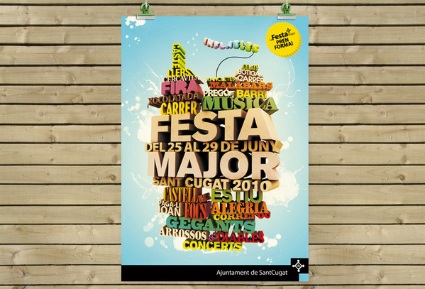
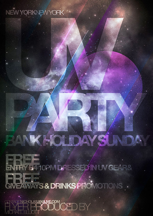
The majority of this event flyer is typography. The stacked three dimensional text stands out well against the plain, light background. The mix of different colors separates the different titles, which helps to break down each piece of information.
High Contrast
Using high contrast in your event flyer will make it stand out even more. Choosing all light colors or all dark colors will make a flyer fade into the background easily. If you use a black or very dark background, use bright colored text, and vice versa. If you have an image with varied lights and darks in the background, you may want to try using a stroke or a hefty drop shadow around the text. If you would prefer a smoother transition, you might try a change in texture or blocking off an area that contains the main portion of your type with a solid color that makes your text stand out.
These colors are bold while providing a great deal of contrast at the same time. This adds to the readability of the text and makes it very clear while making the entire event flyer as a whole stand out at the same time.
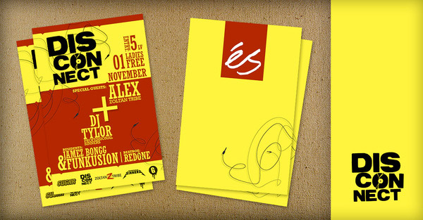
Using colors that contrast but cooperate makes this event flyer really stand out. The mix of blue, red, and white make this piece simple and easy to visually process.
Vibrant Color
Using dull colors is a great way for your event flyer to go completely unnoticed. Conversely, using vibrant color combinations will make your flyer stand out immediately. This works especially well if your flyer will be hung up on a wall or a cork board somewhere. If you combine vibrant colors with the previously-mentioned high contrast, then you will maximize visual impact. This doesn’t mean that you have to use wild colors that don’t fit well with your brand. If your event flyer needs to adhere to the colors from your brand, then you will want to use those colors, but simply add a vibrant accent color or two.
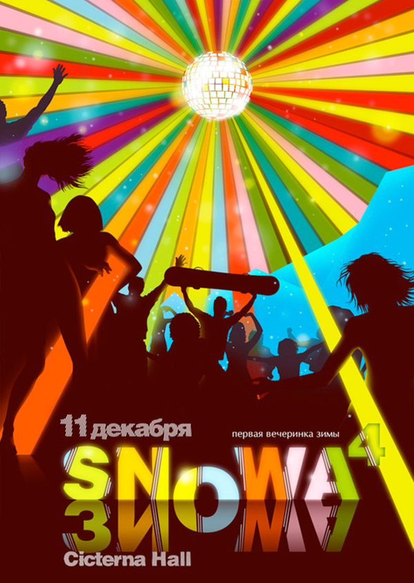
The colorful sunburst effect really creates a vibrant sense of action. The glow around the text further illuminates the text against the dark background. This event flyer utilizes a multitude of different colors without being visually overwhelming.
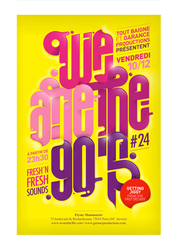
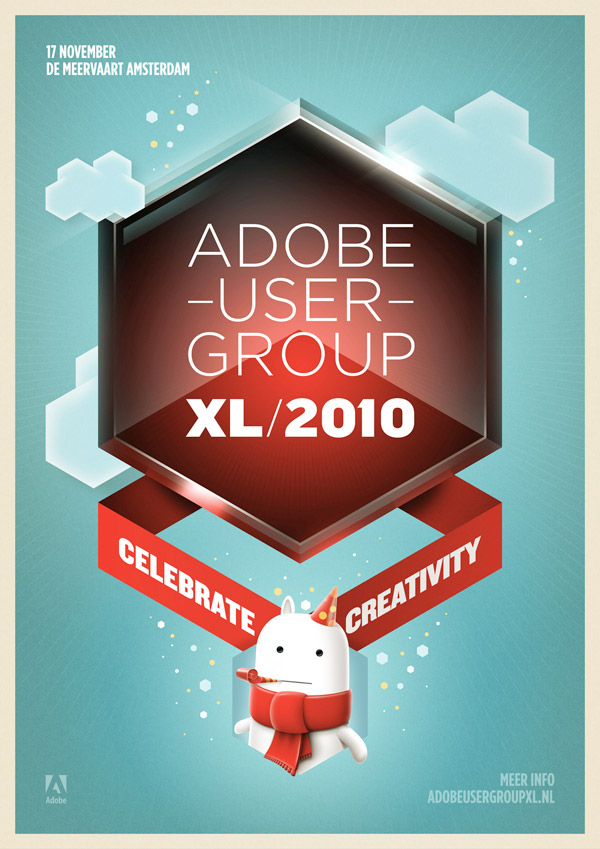
Purple and yellow are complimentary colors, and this event flyer does a great job of using brilliant colors while offering strong contrast at the same time. this flyer is easy to read, beautiful, and would be hard not to notice hanging on a wall. Notice how the red circle really stands out; this is a great example of an accent that really commands attention from the viewer without being distracting.
Special Effects
Using special effects is a surefire way to get anyone’s attention. This can be anything that you can imagine and implement with your design skills: fire effects, lighting effects, colorized effects, filters, textures, and much more. Using dazzling lighting effects can set a mood that would be difficult to recreate in real life. Adding textures to your event flyer design can create a tactile look that makes your flyer stand out from flatter, texture-less peers. You can apply these effects to any aspect of your flyer, just remember not to overdo it. For example, you can apply effects to the text in your flyer, or you could apply them strictly to your main image, but you most likely won’t want to apply them to both. If you do, make they don’t visually compete with one another. Here are some examples of great special effects:
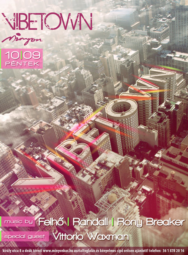
This is an absolutely amazing event flyer that uses special effects to create powerful typography from an image. The artist turned the central buildings into lettering, which you can’t help but to stop and notice.
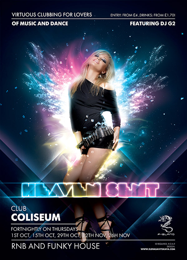
This event flyer combines a strong central image with special glow effects to drive the concept home. The effect is further accentuated by the vibrant text and lighting effects. The designer did a great job by not applying the effects to all of the text, so that the smaller type would be easy to read.
Make It Easy To Read
Whatever you do, however many effects, textures, and techniques that you apply to your flyer, make sure that it is easy to read. You can design the most beautiful event flyer in the world, but if no one knows what it says, then your efforts have been wasted and your message has been lost. Make the headlines big and bold, so they can be read from a reasonable distance away. Then, make sure that the body copy is large enough so that anyone (people of all ages) can easily read it. Don’t apply too many special effects to your text to the point that it becomes illegible. Your effects should support the message, not detract from it.
Conclusion
There are several elements that make up a great event flyer. The main point of an event flyer is to get the attention of people passing by and to inform them of the event taking place. At the same time, the flyer has to entice the viewer into coming to the event and telling their friends about it. By combining powerful typography, strong imagery, special effects, and good design principles, you can make any flyer for any event stand out and get noticed.
Do you have any tips for creating an eye-catching event flyer? If so, free to share them in the comments section below.
Frequently Asked Questions about Designing an Event Flyer for Impact
What are some key elements to consider when designing an event flyer?
When designing an event flyer, it’s crucial to consider elements such as the event’s purpose, target audience, and the message you want to convey. The design should be visually appealing and easy to read. Use high-quality images, bold fonts, and vibrant colors to grab attention. Also, include essential details like the event’s date, time, location, and contact information.
How can I make my event flyer stand out from the rest?
To make your event flyer stand out, focus on creating a unique and compelling design. Use a catchy headline, striking visuals, and a clear call-to-action. Experiment with different layouts, color schemes, and typography. Also, consider adding a unique selling proposition to differentiate your event from others.
What are some common mistakes to avoid when designing an event flyer?
Common mistakes to avoid include overcrowding the flyer with too much information, using low-quality images, and not proofreading for errors. Also, avoid using too many different fonts and colors as it can make the flyer look unprofessional. Ensure the text is legible and the design aligns with your event’s theme.
How can I effectively use colors in my event flyer design?
Colors play a crucial role in flyer design. They can evoke emotions and influence the viewer’s perception of your event. Use colors that align with your event’s theme and target audience. For instance, bright and vibrant colors can be used for a fun and energetic event, while muted and cool tones can be used for a more formal event.
What are some effective ways to distribute my event flyer?
There are several ways to distribute your event flyer. You can hand them out in high-traffic areas, mail them directly to potential attendees, or distribute them at local businesses. Additionally, consider digital distribution methods like email marketing, social media promotion, or posting on event listing websites.
How can I measure the success of my event flyer?
You can measure the success of your event flyer by tracking the number of attendees who learned about the event through the flyer. You can also use a unique promo code on the flyer and track how many people use it. Feedback from attendees can also provide valuable insights.
Can I use templates for designing my event flyer?
Yes, using templates can be a great starting point, especially if you’re new to flyer design. Templates provide a pre-designed layout that you can customize to fit your event’s theme and branding. However, ensure to add unique elements to make your flyer stand out.
What should be the size of my event flyer?
The size of your event flyer depends on its purpose and distribution method. Standard flyer sizes include 8.5″ x 11″ or 5.5″ x 8.5″. However, if you’re planning to distribute your flyer digitally, consider the platform’s specifications.
How can I make my event flyer more engaging?
To make your event flyer more engaging, add interactive elements like QR codes that link to your event’s website or registration page. You can also include testimonials or quotes from previous attendees to build credibility.
What software can I use to design my event flyer?
There are several software options available for flyer design, including Adobe Photoshop, Illustrator, and InDesign. Online tools like Canva also offer easy-to-use design features and a variety of templates. Choose a tool that fits your skill level and design needs.