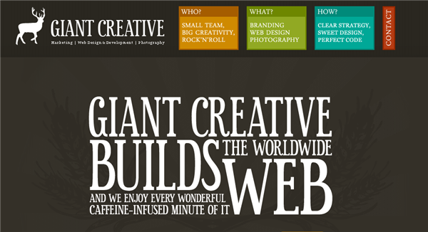
In the final part of this series on the elements of design, we’re taking a look at type. I’ve left type until last in this series because over the last few weeks I’ve also been writing about typefaces and the categories they fall into. (See these posts for more Old Style, Modern, Slab Serif, Sans Serif, Script, Decorative). By recognizing some of the broad categories of type you can make informed decisions about which type to choose for your designs, whether they are on the web or for print.
Type is a fundamental part of any design it appears in. It can be used as text to read, as a shape and as a visual element where the choice of typeface conveys an emotion or mood. Type, when used well doesn’t need a photograph or illustration to back it up.
Creating A Mood
The font you choose can convey a lot of emotion. Look at the words below in four different typefaces.
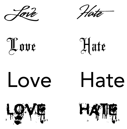
We can read the same words but the font evokes different feelings and some fonts are more appropriate than others. The font at the top is a soft script font that (to me anyway) conveys Love more than Hate. The second font is a black letter font. Black letter fonts have a long history and have been associated with everything from Nazis to gangster rappers. The third font down is a sans-serif font called Avenir, which gives a fairly neutral feeling to both words. Finally, the fourth font is a grungy, distorted font which adds more meaning to the word Hate.
Which Fonts To Choose?
There is no simple answer to this but a good rule of thumb for using and choosing fonts is to stick to two or less typefaces per design. When it comes to fonts restraint is a good thing. Always remember LESS IS MORE. You can achieve interest by choosing two contrasting typefaces. For example on your website you might use a script or grungy font for your headings and contrast them with a sans-serif font in for your body text. You could do this using images for your headlines (I know, not very search engine friendly) or by using technology such as sIFR, Typekit and Cufon.
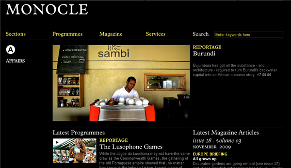
If you want to stick to web safe fonts you can achieve contrast by using serif and sans-serif fonts. The Monocle website does just that.
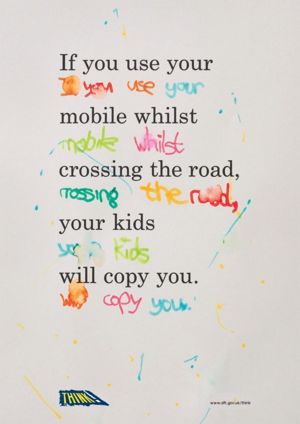
The UK Government Think advertisement contrasts a serif font with colorful childlike writing for a very effective campaign poster.
Type Size
You need to consider your audience when choosing the font size. Form follows function. If you’re creating a website for an over 60’s community, it’s probably a good idea to avoid font sizes 8 and 10 as that will be bothersome to read for many of the readers. On the other hand type that is too large can overpower a design and make it look a little less sophisticated.
Large type as headlines has been a popular trend on the web in the past few years with some designers choosing massive headlines to contrast with small body text.
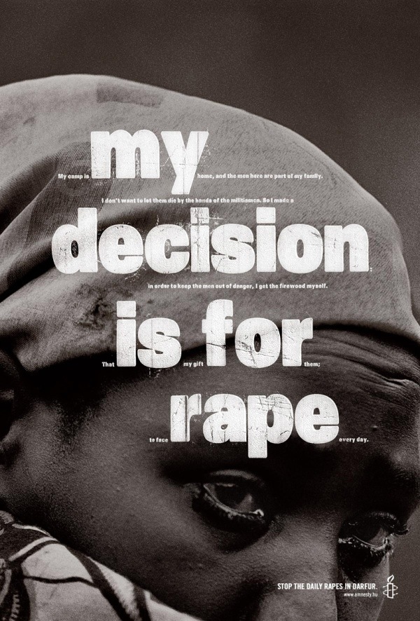
Amnesty International’s dramatic poster using very large and very small type overlaying a stark black and white image to get the point across. You need to look closely at this poster to read all the text but on first glance it clearly communicates its shocking message.
Type As A Shape
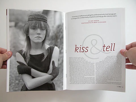
“Body copy” refers to larger tracts of text as opposed to short headlines, pull quotes. Type takes on a shape, often a simple rectangle on websites, when body copy is added to the page. The intensity of the shape can depend on the size of the font, the font face and how you lay out the text. In the magazine layout below the two columns of body copy are fully justified and also wrap around the circular ampersand symbol in the headline. The text is aesthetically pleasing and attractive with plenty of whitespace above the main headline which allows breathing space.
Trendy Vs Timeless
It can be tempting to go for the newest, coolest and trendiest typefaces out there. With so many free and cheap fonts available, there are literally thousands of fonts to play around with. Some of them are very “now” but next year they may look very dated. That’s not to say you shouldn’t use them. Just be aware of why you’re using them. If you’re new to design, you’ll also find that your tastes will change as you learn more.
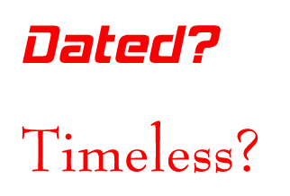
That’s Hemi Head on the top and Bernhard Modern on the bottom. Hemi Head has a touch of Star Trek about it and could be useful if you’re designing for a retro space design. Bernhard Modern looks more sophisticated and classic. Some of the oldest typefaces are true classics which have been around for hundreds of years. They’ve been around that long and are in continued use because they are well designed and legible. Over time you’ll find that practice and experience will tell you which way to go with your type choices.
To sum up, some of the things to think about when using type as a design element are:
- Is the typeface I’m using appropriate? Is it in keeping with the message I’m communicating?
- If I’m using more than one typeface, are they contrasting or conflicting? How well do they work together?
- Is the size right for the medium and the message?
- Am I using a typeface that’s a timeless classic or will this typeface be the equivalent of 80’s shoulder pads next week?
So here ends the Elements of Design series. I hope you’ve found it useful.
Next week I’m starting another series that falls under the umbrella of “Design Principles”, I hope you can join me.
Related Reading:
- Design Elements: The Line
- Design Elements: Shape
- Design Elements: Texture
- Primary Design Elements, A New Series
Frequently Asked Questions (FAQs) about Elements of Design
What is the importance of color in design?
Color is a fundamental element in design. It can evoke emotions, draw attention, and make a design memorable. Different colors can convey different meanings and can be used to create contrast or harmony within a design. For instance, warm colors like red and orange can evoke feelings of warmth and passion, while cool colors like blue and green can create a calming effect. Understanding color theory and how to use it effectively is crucial for any designer.
How does space contribute to design?
Space is an essential element in design. It refers to the area around, between, or within elements of a piece. Effective use of space can help guide the viewer’s eye and create a sense of balance and harmony. Negative space, or the space around and between the subject of an image, can be used to emphasize the subject and create interesting visual effects.
What role does texture play in design?
Texture refers to the surface quality of a design. It can be physical, like the surface of a painting, or visual, like the appearance of texture in a photograph. Texture can add depth and interest to a design, making it more engaging and appealing to the viewer. It can also be used to create contrast and help elements stand out.
How can shape be used in design?
Shape is a basic building block of design. It can be used to create patterns, organize information, convey meaning, and create visual interest. Shapes can be geometric, like squares and circles, or organic, like the shapes found in nature. The use of shape can greatly influence the mood and message of a design.
What is the significance of form in design?
Form refers to the three-dimensional quality of an object. It includes its length, width, and depth. Form can be used to create a sense of depth and perspective in a design, making it appear more realistic. It can also be used to create a sense of movement and dynamism.
How does line contribute to design?
Line is a fundamental element in design. It can be used to guide the viewer’s eye, divide space, outline forms, convey movement, and create a variety of moods and emotions. Lines can be straight or curved, thick or thin, and can be used to create patterns and textures.
What is the role of value in design?
Value refers to the lightness or darkness of a color. It can be used to create contrast, depth, and emphasis in a design. By varying the value of a color, designers can create a sense of depth and volume, and can highlight important elements in a design.
How can typography enhance a design?
Typography is the art of arranging type to make text legible, readable, and appealing. It includes the choice of typeface, point size, line length, line spacing, and letter spacing. Good typography can enhance the readability and appeal of a design, and can help convey the mood and message of the design.
What is the importance of balance in design?
Balance is a principle of design that refers to the distribution of visual weight in a design. It can be symmetrical, with elements arranged evenly around a central point, or asymmetrical, with elements arranged in a way that creates a sense of balance without symmetry. Balance can create a sense of stability and harmony in a design.
How does contrast contribute to design?
Contrast is a design principle that refers to the arrangement of opposite elements in a design. It can be created through differences in color, size, shape, and texture. Contrast can be used to create visual interest, guide the viewer’s eye, and emphasize important elements in a design.
Jennifer Farley is a designer, illustrator and design instructor based in Ireland. She writes about design and illustration on her blog at Laughing Lion Design.

