
Key Takeaways
- High-converting websites are designed with the end user in mind, ensuring that the site is easy to navigate, loads quickly, and isn’t cluttered with unnecessary elements.
- Effective calls to action (CTAs) are a crucial part of high-converting websites. They should be clear, concise, and create a sense of urgency, guiding visitors towards a specific action.
- High-converting websites provide proof of their success, using statistics, case studies, or hard data to show potential customers that they can trust the company and its products or services.
- Successful websites focus on the benefits of their products or services, rather than just their features. This customer-centric approach helps to build a connection with the audience and can lead to higher conversion rates.

You’ve done everything right. You hired a (costly) web designer and now have a sleek website you’re proud of. You implemented SEO to help you rank higher. People are visiting your website… but they’re not buying.
What gives?
Having a well-designed, or even well-optimized website is one thing. Getting traffic to convert from one is another. You’ve got to constantly pay attention to your audience and how they’re responding to what you have happening on your website.
Looking for inspiration? There are dozens of sites that have this formula down for you to take notes from. Here, get lessons from high-converting websites that you can apply to your own.
1. The Website is Designed for Visitors, Not Web Designers
Web design can be an echo chamber, and designers can often be guilty of designing for design’s sake, and not for the end user or SEO purposes.
An example of this is Flash. Now nearly extinct (but not quite), Flash at first turned the heads of web designers, programmers, and businesses because it provided new visual capabilities for websites. However, in this era of imperative SEO and mobile-friendly websites, it simply no longer stands up to what is required of it.
A user-friendly website, on the other hand, has an impressive — but simple — design. It’s easy to navigate, and the user never has to wait for images to load. The technology is certainly available for these functionalities right now, so companies still relying on older, clunkier design elements would do well to upgrade.
2. The Website “Asks for It”
Even the most perfect web copy, balanced with just-right keyword density, may fail to convert customers without this critical element: a solid call to action. Visitors can read your amazing web copy, but after that, what do you want? Without a nudge in the right direction, they may go to another site where your competitor will be happy to tell them what to do.
A well-targeted call to action (CTA) drives people to take a specific action. Smart websites use one CTA on a page to avoid confusion. Certainly, a web page (especially the home page) should have multiple instances of that CTA, but the drive should be to complete one single action, such as:
- Buy now
- Sign up
- Click to learn more
The CTA should, when possible, create a sense of urgency. You want your visitor to feel like they need to act this instant, not later, to take advantage of the incredible offer you’re presenting. And given that our attention spans are shorter than those of goldfish, now may be the only chance you get to capture their attention.
Here’s an example: on subscription company BirchBox’s page, you see, front and center, a button enticing you to Shop Now. For the visitor that doesn’t want to browse the offerings on the home page, he (or she) can click that button to get down to business. The button is repeated a few other times on the home page.
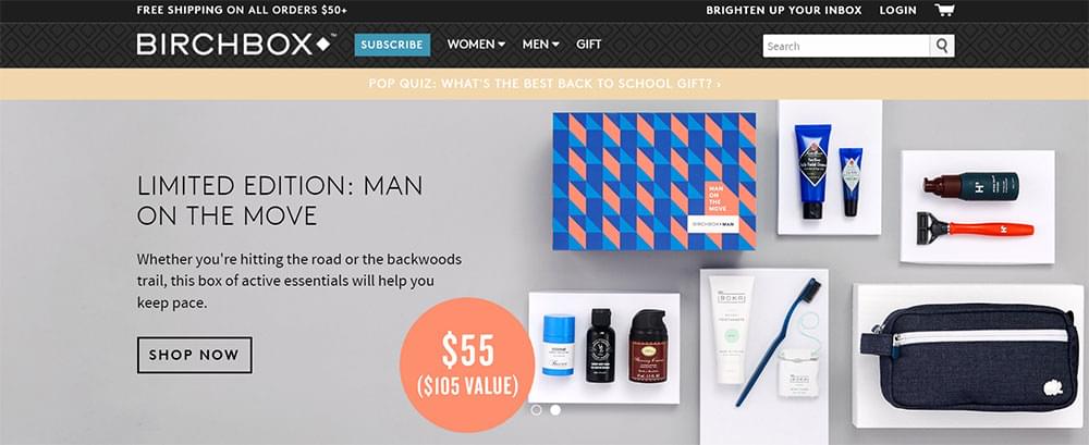
Sure, a visitor may dedicate half an hour to reading all your web copy, but for those who want shortcuts to the action, place highly-visible calls to action throughout your website.
3. It Uses Buttons That Put the Visitor at the Center of the Action
There’s a new trend in website buttons that go beyond the standard copy of “subscribe now” to highlight the benefits of actually clicking them. These buttons sometimes provide mocking alternatives to clicking the positive one (“Yes, I want to make more money” versus “No, I have enough money.”), making visitors smile. Who wants to be the dummy who says they have enough money and couldn’t use more?
Neil Patel, founder of QuickSprout, has perfected the art of these next-gen buttons. His websites use verbiage that puts the visitor front and center, and provide reasons to click in a few simple words strategically placed on that button.
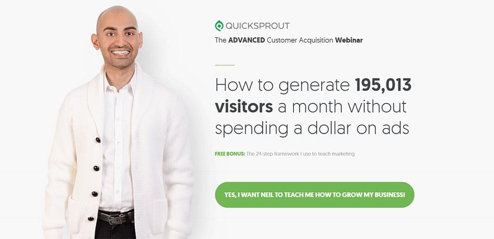
Test out new wording for your own buttons and see if you can’t increase conversion as a result. You can also test different colors for your buttons to see which have the higher conversion.
4. The Website Offers Proof
Some websites (maybe even yours) can be nebulous about actual results. If people are going to spend money with a company, they want some evidence that doing so will benefit them.
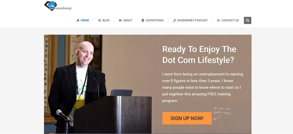
High-converting websites give examples of success through statistics, case studies, and hard numbers. Blogger ShoeMoney advertises immediately on his homepage that he went from being unemployed to earning 8 figures in less than 5 years. That’s impressive to a visitor. But beyond these bragging rights, he goes into details about advertising revenue numbers, website visitors, and other data that show visitors exactly how he can help them with his advertising advice.
5. The Checkout Process is Simple
One of the most common mistakes eCommerce companies make with their websites is not streamlining the checkout process. If this is the cause of low conversion rates, you’ll be able to tell by examining your abandoned cart statistics. If a significant number of people are leaving after putting an item in their cart but before completing the transaction, your checkout process is likely the issue.
Now, I don’t know about you, but if someone has already spent the time to find products of mine that they want to buy, I certainly don’t want to make it hard for them to complete that transaction.
Successful sites minimize the number of fields a shopper has to fill out to complete a transaction, and keeps the number of pages to click through low. Using merchant tools that allow shoppers to save credit card information is one way to simplify the checkout process for repeat customers.
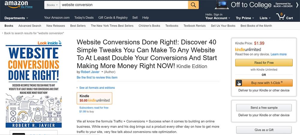
There’s no better example of an effective checkout process than Amazon’s. Shoppers can all-too-easily click the “Buy Now with 1-Click” button once they have set up their accounts and entered financial details. When it’s easy to buy on your site, people buy more.
If you’re seeing a lot of shoppers abandoning their carts, assess your own checkout process. Are there fields you can remove from the process? Could you simplify the checkout workflow into fewer pages? Are there parts of the process where pages take a long time to load?
Run through the checkout process yourself, and ask a few other people to do it as well, taking notes on bottlenecks so you can improve them.
6. The Website Focuses on Benefits, Not Features
This is standard Marketing 101, but if you’re not a marketer, you might not realize it. Brands often have the tendency of focusing their web copy around the features of their products (“newer, faster, better”) with little regard for the benefits they provide to the end user (“wipes out stains, prolongs the life of your clothes”).
High-converting websites, on the other hand, put the focus of the copy on the customer. It’s not about how amazing you think your company is, but rather how you can help visitors solve a problem. Talk directly to the visitor by using “you” verbiage, not “we.”
QuickBooks could talk about the features of its accounting software on its homepage, but instead, it speaks to the small business owner. With verbiage like “Built for your small business,” it’s clear that the company, at least from a marketing perspective, has its small business customer at heart.
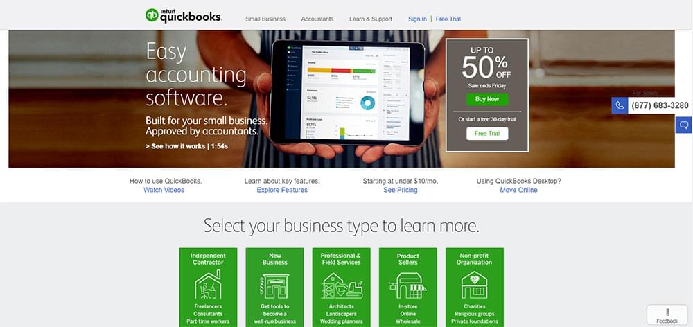
Visitors to the page can select the type of business they run. They’re then directed to a landing page that addresses their specific concerns that QuickBooks can help with.
By veering the focus away from your brand and toward how you can help people, you can build a connection with your audience that will result in higher conversions to sales.
Often, you only need a small tweak or two to turn your web traffic into customers. But before you implement all of these strategies at once, spend time assessing your analytics. If it’s not the checkout process that’s turning people away, what page are the majority of people exiting on? This may provide you with clues as to what the issue is.
If your home page has a high bounce rate, look at the copy. Is there an effective and clear-to-follow call to action that guides people to a next step? Do the keywords you’re using to drive traffic from search results align with what people find on your site? Or is the website cluttered and difficult to navigate?
You may want someone other than yourself to assess the site with fresh eyes to see what issues there might be. Once you have an idea of what’s not converting people, test out one strategy and wait a few weeks to see if conversion improves. If you want to keep moving the needle, implement additional tactics, one at a time, until yours is a high-converting website too.
Having a website that converts doesn’t require you to have a billion dollar budget. You just need to pay attention to what your customers see when they land on your site, and make it as friendly a place to serve their needs as possible.
Frequently Asked Questions (FAQs) about High-Converting Websites
What are the key elements of a high-converting website?
High-converting websites have several key elements. Firstly, they have a clear and compelling value proposition that communicates the unique benefits of their product or service. Secondly, they have a user-friendly design that makes it easy for visitors to navigate and find what they’re looking for. Thirdly, they use persuasive, benefit-focused copy that speaks directly to the visitor’s needs and desires. Lastly, they have strong calls-to-action that guide visitors towards taking the desired action, whether that’s making a purchase, signing up for a newsletter, or requesting a quote.
How can I improve the conversion rate of my website?
There are several strategies you can use to improve your website’s conversion rate. These include optimizing your website’s design for usability, improving your website’s speed, using high-quality images and videos, writing compelling copy that speaks to your target audience’s needs and desires, and testing different versions of your website to see which one performs best.
What is the role of website design in conversion rates?
Website design plays a crucial role in conversion rates. A well-designed website can make it easier for visitors to find what they’re looking for, understand your value proposition, and take the desired action. On the other hand, a poorly designed website can confuse and frustrate visitors, causing them to leave without converting.
How can I make my website more user-friendly?
Making your website more user-friendly involves improving its usability. This can be achieved by ensuring your website loads quickly, is easy to navigate, has a clear and intuitive layout, uses legible fonts and colors, and is mobile-friendly.
What is the importance of a clear call-to-action (CTA) on a website?
A clear call-to-action (CTA) is crucial for guiding visitors towards taking the desired action on your website. Without a clear CTA, visitors may not know what action they’re supposed to take, which can lead to lower conversion rates.
How can I write compelling copy for my website?
Writing compelling copy involves understanding your target audience’s needs and desires, and then communicating how your product or service can meet those needs. It’s also important to use persuasive techniques, such as highlighting the benefits of your product or service, using social proof, and creating a sense of urgency.
What is A/B testing and how can it improve my website’s conversion rate?
A/B testing involves creating two different versions of a webpage and then testing them against each other to see which one performs better. This can help you identify which elements of your website are working well and which ones need improvement, ultimately leading to a higher conversion rate.
How can high-quality images and videos improve my website’s conversion rate?
High-quality images and videos can improve your website’s conversion rate by making your website more engaging and visually appealing. They can also help to communicate your value proposition more effectively, and can build trust with your visitors by showing them what your product or service looks like in action.
What is mobile optimization and why is it important for my website’s conversion rate?
Mobile optimization involves designing your website so that it looks and functions well on mobile devices. This is important because a growing number of people are using their mobile devices to browse the web, and a website that isn’t mobile-friendly can frustrate these visitors and cause them to leave without converting.
How can I measure the success of my website’s conversion rate?
You can measure the success of your website’s conversion rate by using tools like Google Analytics, which can provide you with detailed information about your website’s performance, including how many visitors are converting, where those conversions are coming from, and what actions they’re taking on your website.