
Key Takeaways
- In the 21st century, the focus of web design has shifted from flashy visuals and over-hyped technology to productivity and efficiency. Good web design now prioritizes providing information or facilitating transactions quickly and simply, without unnecessary distractions.
- Emerging tools and techniques such as Cascading Style Sheets (CSS), liquid tables, and XML are providing web designers with more creative flexibility and control. However, they also require careful implementation and thorough browser compatibility testing.
- Good web design is essential for business success. It not only improves the user experience but also enhances productivity on the design side. Therefore, web designers need to ensure their sites are user-friendly, visually appealing, and accessible to all users, including those with disabilities.
“Technology is so much fun but we can drown in our technology. The fog of information can drive out knowledge.”
– Daniel J. Boorstin
Reflect for a moment on the Great Internet Buildout of the late 1990s. It’s not hard to wax philosophical about the Web’s beginnings, when anyone with a few hours’ worth of HTML experience was immediately hired to design Web pages. And who can forget the results? Websites of the boom were often a cyberspace food fight of eye candy and over-hyped technology.
These days, most site design is focused on the improvement and upgrade of existing Websites. As the economy continues to sag, more emphasis has been placed on maintaining what already exists, rather than breaking new ground. As a result, productivity, ROI, and other measures of efficiency have found their way into the lexicon of Web design.
This focus on productivity has seen Website designs go back to basics. With the end user in mind, the core purpose of today’s sites is to provide information or make transactions quickly, simply, and without the distraction of long animated introductions, overblown visuals, or multi-hyperlink black holes.
So let’s take a look at the basics of good Web design, as well as some of the current tools and technologies available to assist you in creating powerful, usable Websites. We’ll also look at some concepts that are out there on the bleeding edge of design theory and browser technology, just to keep you on the edge of your seat!
Good Websites Start with Good Web Design
In the heady days of the Buildout, Web designers went straight to page design, building the overall concept and user experience one Web page at a time. Only after all the pages were built were they connected together – the results were usually a mess.
In today’s world, most Web designers begin by developing a concept before they create their actual Web pages. Several techniques have evolved to assist designers develop a concept, such as wire framing and site architecting. In any of these cases, a designer defines a starting point, then builds out the various parent/child relationships between pages, documents, external links, and so on. In addition, a separate “link framework” can be defined to point to documents or external destinations. And of course, today, programmatic elements such as dynamic markup language, database connectivity, and Web service support are defined before anyone begins to build any pages.
Like a symphony performance, where the music binds each instrument together in harmony, so a Website’s concept definition binds each participant (graphic designer, copywriter, programmer) together in design harmony. And just as the conductor keeps time and manages the performance, the Web project manager uses this concept definition to coordinate resources, and ensure that the Web project moves through its milestones as scheduled.
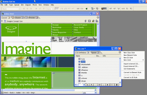
Current Web authoring software programs, such as Adobe GoLive, provide Web designers with information architecture, user experience definition, and other design tools. With this kind of toolkit, you can architect a better user experience up front. Whether you create this roadmap for yourself or for a team of graphic artists, designers, and copy editors, a well thought-out site design will ensure your symphony doesn’t hit any sour notes.
For a glimpse of the future of information architecture, check out a new application by UC Berkeley’s Group for User Interface Research, DENIM. This application “sketches” designs, then helps you hook them up together, before exporting the designs as HTML.
1% Perspiration, 99% Presentation
It seems ironic that a communication medium with the potential to provide rich information to billions of people is designed around tables. Tables are optimized to display tabular data in rigid boxes defined by height and width – which is great if you’re reading a spreadsheet, but awful if you’re trying to have an interactive experience. Sure, we tried frames for a while, but we all know which way they went. So, just what are designers left with?
Cascading Style Sheets (CSS) seem to offer the most promise for unchaining design from the restrictions of tables. Simply put, CSS enables designers to separate the style of information from its structure.
Typographic elements (fonts, sizes, and so forth), colors, and other design elements are divided into a separate set of HTML that is leveraged for all the data on a page, which helps avoid fatter elements such as image maps. CSS is reusable across multiple pages, which adds to its versatility. CSS Level 2 (CSS2), an upgrade from the original CSS spec that’s been in use for several years now, provides additional control and functionality such as “@media,” which allows the designer to set specific styles for particular media.
CSS1 took some time to become widely adopted because there were (and in fact continue to be) browser incompatibility issues associated with the technology. While a lot of the problems have since been fixed, it is still advisable to complete thorough browser testing before deploying your CSS-based design. As for CSS2, well, it’s still new enough to suffer from a number of deployment problems, so tread lightly. See HTML Utopia – Designing Without Tables Using CSS, Parts 1 and 2 for the ultimate introduction to this topic.
Another concept of note to the burgeoning Web designer is “liquid tables.” Tables that stretch and shrink give designers considerable creative flexibility, removing the rigid constraints of standard table design. Liquid table design basically works by setting percentages for width and height, instead of specific pixel measurements.
But be forewarned – liquid design is a complex technique that requires a designer to account for the users’ screen size as a separate element in a design. Elements such as navigation bars and menus become more complex because a range of placement issues must be accounted for in the design. Regardless, well-implemented, liquid pages provide designers with a higher level of flexibility. For an introduction to on liquid design, see Nick Wilson’s article What is Liquid Design?. And for a good primer on the topic, try this article by Rudy Limeback.
There’s Something About XML…
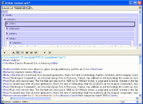
XML is in one sense a markup language like HTML or PHP. However, because tag semantics and tag sets are undefined, rather than fixed, XML is really a “meta-language” for describing other languages that you – the Web designer – define. To use XML, you write a Document Type Definition (DTD) that describes a series of tags and the elements to be used with those tags.
XML’s flexibility is not only its greatest asset, but also its greatest liability. In order for computer systems to talk to each other using XML, they need to share a standard (in the form of a DTD). This invites numerous coordination problems, especially if different enterprises create different standards for the same application. Security is also an issue, especially for government Web designers, again because of the necessity of shared DTDs in order for different systems to communicate together.
Problems aside, there has been a lot of work done around XML, especially by enterprises with critical content management requirements. Small- and middle-market publishers have been aggressively pursuing XML-based workflows that elegantly store data for both print and the Web, and allow for cross-platform sharing of that data. Plus, these homegrown systems contain business rules and other logic that assist with content routing, deadline management, and archiving.
For Web design, eXtensible Stylesheet Language Transformation (XSLT) is of particular interest. It allows Web designers to define transformations on XML documents and XML-based data, creating presentation structures for end users. XSLT can also help transform XML into non-XML formats, such as HTML. It can work behind the scenes on the Web server, or on the client side with more recent browser updates.
XSLT is still a very complicated language that requires some programming sophistication. It has not been well incorporated into visual design tools, either. And unfortunately, today’s browsers don’t fully support direct XML rendering, so most XML-based Websites still need to transform that XML back to HTML for optimum compatibility. However, as design applications and browsers grow more sophisticated, expect to see more support for both XML and XSLT.
Just Browsing, Thank You
Every Web designer has his/her favorite browser mishap (lined up end-to-end, they’d encircle the earth eight times), so I won’t add more to the pile. In spite of this, the number of browsers continues to grow — Safari and Opera are two of the most recent entries.
Fundamentally, though, the end user experience remains unchanged from years past. Content and data are presented in a window, and requests for other pages or data are made through this window. Browsers also continue to be thin-client in nature, requiring the Web servers on the other end to do most of the heavy code parsing before they present results to a user.
If you really want to glimpse the future, consider events taking place at the extreme fringe of browser concepts. Here you will find applications that break the window metaphor and use visualizations, spider-Web imagery, and other non-traditional elements to guide a user to information or a destination. Some of the more interesting concepts include the Ambulator, the DataCloud, and the Webstalker.
These ideas have a lot of potential, as the traditional PC/monitor interface ages rapidly and the proliferation of wireless devices and wireless connectivity force the design community to deal with a myriad of new presentation platforms.
What Do I Need to Do About It?
As you approach Website design, ask yourself the following questions:
- Can my users get to their desired information in two clicks?
- Are my visuals distracting or useful?
- What technologies are appropriate and not overkill?
- Do my users know where they are within the Website at all times?
- Can users get back to the front/home page with one click?
- Is my content accessible to disabled users?
This list is simple enough, but many Websites continue to violate these basic rules–and frustrate users in the process. Remember, your competitor’s Website is only one click away, so removing these barriers above will aid in keeping users (and their dollars) at your site.
Good Design is Good Business
The boom years distracted many from good design techniques as we were lead astray by a rash of new technologies and competitive fervor.
In today’s more competitive and focused design world, the provision of clean, crisp information and interaction design leads to greater productivity on the design side and a better user experience on the client side. Plus, design applications have improved over time, incorporating many sophisticated features that allow designers to optimize their creativity, while keeping the programmatic side in check. What’s more, these tools are no longer accused of writing “bloated” code – something that has in the past plagued these applications.
There are still many emerging technologies, a growing number of presentation platforms, and some lingering issues in today’s browsers, but it boils down to this — good design is good business.
Frequently Asked Questions on Web Design Essentials
What are the key elements of a good website design?
A good website design is a combination of several elements. First, it should be visually appealing and consistent with your brand’s identity. This includes the use of colors, fonts, and images. Second, it should be easy to navigate. This means that users should be able to find what they’re looking for quickly and easily. Third, it should be responsive, meaning it should look and function well on all devices, including desktops, laptops, tablets, and smartphones. Lastly, it should be optimized for search engines to help increase your website’s visibility and ranking.
How can I make my website more user-friendly?
Making your website user-friendly involves several steps. First, ensure your site loads quickly, as slow loading times can frustrate users and cause them to leave. Second, make your navigation intuitive. Users should be able to find what they’re looking for without having to click through multiple pages. Third, use clear and concise language. Avoid jargon and ensure your content is easy to understand. Lastly, make sure your website is accessible to all users, including those with disabilities. This can involve things like providing alt text for images and ensuring your site is navigable with a keyboard.
What is responsive design and why is it important?
Responsive design is a web design approach that ensures your website looks and functions well on all devices, including desktops, laptops, tablets, and smartphones. It’s important because more and more people are using mobile devices to access the internet. If your website isn’t responsive, you could be losing out on a significant number of potential customers. Additionally, search engines like Google prioritize responsive websites in their search results, so having a responsive design can also help improve your SEO.
How can I optimize my website for search engines?
Search engine optimization (SEO) involves several steps. First, ensure your website loads quickly, as search engines prioritize fast-loading sites. Second, use relevant keywords in your content, titles, and meta descriptions. However, avoid keyword stuffing, as this can actually harm your SEO. Third, make sure your website is accessible and easy to navigate. Search engines prioritize sites that provide a good user experience. Lastly, create high-quality, original content. Search engines prioritize sites that provide valuable information to users.
What is the role of color in web design?
Color plays a crucial role in web design. It can help set the mood of your website, convey your brand’s personality, and guide users’ attention to important elements on the page. Different colors can evoke different emotions, so it’s important to choose colors that align with your brand’s identity and the message you want to convey. Additionally, using contrasting colors can help make your text more readable and your call-to-action buttons more noticeable.
How can I make my website more engaging?
There are several ways to make your website more engaging. First, use compelling visuals, such as high-quality images and videos. Second, use interactive elements, such as forms, quizzes, and polls. Third, provide valuable content that answers users’ questions and provides solutions to their problems. Lastly, encourage user-generated content, such as reviews and testimonials. This can help build trust and foster a sense of community.
What is the importance of typography in web design?
Typography is an essential element of web design. It can help convey your brand’s personality, guide users’ attention, and enhance readability. Choosing the right font, size, and line spacing can make your text more readable and your website more visually appealing. Additionally, using different types of typography, such as bold or italic, can help highlight important information and guide users’ attention.
How can I ensure my website is accessible to all users?
Ensuring your website is accessible involves several steps. First, provide alt text for images. This allows screen readers to describe the image to users who are visually impaired. Second, ensure your site is navigable with a keyboard. This allows users who can’t use a mouse or touch screen to navigate your site. Third, use clear and concise language. This makes your content more understandable to users with cognitive disabilities. Lastly, use high contrast colors. This makes your text more readable to users with visual impairments.
How can I measure the success of my website design?
There are several ways to measure the success of your website design. First, track your website’s traffic and conversion rates. This can give you an idea of how many people are visiting your site and how many are taking the desired action, such as making a purchase or signing up for a newsletter. Second, use user feedback. This can give you insight into what users like and dislike about your site. Lastly, use A/B testing. This involves creating two versions of a page and seeing which one performs better.
What is the role of white space in web design?
White space, also known as negative space, is the empty space between elements on a page. It plays a crucial role in web design by helping to create a clean, uncluttered look, guiding users’ attention, and improving readability. By strategically using white space, you can highlight important elements on your page, make your content more digestible, and create a more enjoyable user experience.