

The September, 2010 edition of American fashion and lifestyle magazine W featured a newly revamped W logo and a brand new tagline. The new branding comes as part of an overhaul of the entire magazine.
 |
 |
| The new italic W logo | The old W logo |
Speaking about the re-design in an interview with WWD, editor in chief of W Magazine, Stefano Tonchi, said,
And then it is a new logo, as much as it looks like the old one, in a new typeface [called] Benton. It’s kind of skinny, it’s very vertical. It’s very elegant and it is italic, with a sense of movement, evolution. Then there is a tag line — that was never a part of W — which I think defines what W stands for. It’s not just women’s fashion, but the world of style and, more exactly, our five Ws: the who, the what, the where, the when and the why in the world of style.
 |
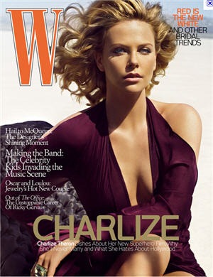 |
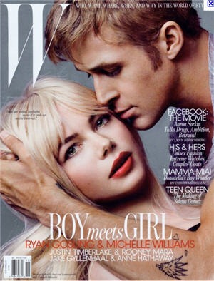
| Magazine cover with new logo and tagline | Old cover |
As mentioned the new typeface is accompanied by the tagline featuring five Ws which appear on the magazine’s website. This is used as a way to divide content on the web site and also in the magazine. That’s certainly not a new idea but it works beautifully.
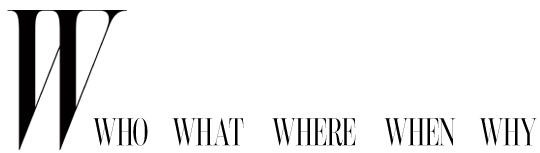
Personally I love the new W. It is very elegant, almost a kind of an Audrey Hepburn of the font world. The touching serifs almost create another shape with a nice sense of movement. It’s only when I compare old and new that I realize I never really noticed the old one, but the new W has a beautiful, sophisticated look that’s easy on the eye.
What do you think of the new logo? An improvement or a step backwards?
Frequently Asked Questions about W Magazine Logo
What is the significance of the W Magazine logo?
The W Magazine logo is a significant representation of the brand’s identity. It is designed in a minimalist and modern style, reflecting the magazine’s focus on fashion, culture, and art. The logo’s simplicity makes it easily recognizable and memorable, which is crucial in the highly competitive magazine industry. The bold, capitalized “W” symbolizes strength and dominance, aligning with the magazine’s reputation as a leading authority in fashion and lifestyle.
Who designed the W Magazine logo?
The W Magazine logo was designed by a team of professional graphic designers who specialize in brand identity and logo design. The team aimed to create a logo that would reflect the magazine’s modern and sophisticated image, while also being versatile enough to be used across various platforms, including print, digital, and social media.
How has the W Magazine logo evolved over the years?
Over the years, the W Magazine logo has undergone several changes to keep up with design trends and the evolving brand image. However, the core elements of the logo, such as the bold “W” and the minimalist design, have remained consistent. These changes reflect the magazine’s commitment to staying relevant and appealing to its audience.
What colors are used in the W Magazine logo?
The W Magazine logo primarily uses black and white colors. The use of black signifies power, elegance, and sophistication, while white represents purity and simplicity. This color scheme aligns with the magazine’s modern and minimalist aesthetic.
How does the W Magazine logo reflect its brand identity?
The W Magazine logo effectively reflects its brand identity by being modern, minimalist, and sophisticated. The bold “W” symbolizes the magazine’s authority in fashion and lifestyle, while the simple design makes it easily recognizable and memorable. The logo’s design aligns with the magazine’s mission to provide high-quality content on fashion, culture, and art.
Why is the W Magazine logo important for its branding?
The W Magazine logo plays a crucial role in its branding. It helps in establishing a strong brand identity and differentiating the magazine from its competitors. The logo’s design communicates the magazine’s values and mission, helping to attract and retain its target audience.
How is the W Magazine logo used across different platforms?
The W Magazine logo is used across various platforms, including print, digital, and social media. Its versatile design allows it to be easily adapted to different formats and sizes, ensuring consistent brand representation across all platforms.
What is the impact of the W Magazine logo on its audience?
The W Magazine logo has a significant impact on its audience. Its modern and minimalist design appeals to the magazine’s target audience, who value sophistication and elegance. The logo’s design also helps in building brand recognition and loyalty among its readers.
How does the W Magazine logo compare to other magazine logos?
Compared to other magazine logos, the W Magazine logo stands out for its simplicity and modern design. While other magazines may use intricate designs or multiple colors, the W Magazine logo’s minimalist design and black and white color scheme make it unique and easily recognizable.
What are some key elements to consider when designing a magazine logo like W Magazine?
When designing a magazine logo like W Magazine, some key elements to consider include simplicity, versatility, and relevance. The logo should be simple enough to be easily recognizable, versatile enough to be used across various platforms, and relevant enough to reflect the magazine’s brand identity and appeal to its target audience.

