

Key Takeaways
- Versals, also known as drop or raised capitals, are large, often ornately decorated letters that mark the opening of a text or verse. They date back to the era before Western printing and were traditionally hand-inked by scribes due to their ornate nature and the color variety they offered. Modern typography has largely lost these classical decorations.
- Setting versals on the web can be achieved with images and manually adding a span tag with your styled class to the opening letter. However, more standards-friendly and efficient methods exist, such as using the CSS pseudo-selector :first-letter to refer to the first letter of an element. Browser consistency, particularly with Internet Explorer, can be a challenge.
- Versals can be used effectively in digital design to add elegance to websites, e-books, and digital magazines. While finding versals with further decoration done other than through size and placement is rare on the web, it’s possible to replace the first letter entirely with a graphic, though this may lead to accessibility issues.
Versals, drop capitals, or raised capitals are large and oft ornately decorated letters (particularly in the case of versals) that mark the opening of a running body of text or a verse:
vers•al |ˈvərsəl|
adjective
of or relating to a style of ornate capital letter used to start a verse, paragraph, etc., in a manuscript, typically built up by inking between pen strokes and with long, rather flat serifs.
noun
a versal letter.
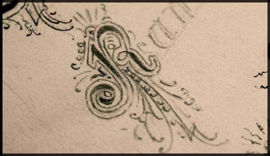
Some beautifully hand-drawn versals that I found in the back of an old un-named sketch book a while back.
A Little History
Versals date back before the time of Gutenberg and the advent of Western printing, and were hand-inked by scribes. In fact early printing tried to mimic the handwriting style of the time (the “blackletter” styles we associate with that era), and versal letters continued to be hand-inked even while much of the rest of the page was printed via letterpress.
This hand-inking process continued because the method was well-practiced and the versals were quite ornate and difficult to print with the early presses. Hand-inking also allowed for easier use of numerous colors for the versal.
Modern typography (if we can call it that—most set type isn’t sadly set with much typographic thought) has lost these classical decorations, largely in favor of a more clinical and neutral page. A lot can be achieved with a little typographic flourish which I feel many designers aimlessly try to achieve by copying trends of overly reflective and glossy elements (think “web 2.0” as a design aesthetic).
Versals on the Web
Setting versals on the web isn’t particularly hard. The quick and dirty method is with images and manually adding a span tag with your styled class to the opening letter, but there are far more standards-friendly and efficient means to go about spicing up your opening letters.
There is a useful CSS pseudo-selector that we can use to refer to the first letter of an element: the :first-letter. You can combine this with other selectors to refer to the first letter of the first paragraph of a page, heading, or whatever else strikes your fancy (utilizing the DOM structure properly is helpful in making this work properly).
Note: Internet Explorer has historically had many issues with selectors and pseudo-selectors in CSS 2.1 but it understands :first-letter fairly well, and IE8 has full support.
The CSS styling may look something like this:
div#content h2.entry-title + p:first-letter {

    font-size: 4.2em;

    float: left;

    display: in-line;

    text-transform: uppercase;

    }
The positioning of the versal is entirely up to you. You can place it as you like using line-height and margin properties, and have the text wrap around the versal using the float; if you want the versal to sit aside from the text and avoid wrapping don’t set the float.
For more variants see Jon Tan’s examples #9, #10, and #11 of his paragraph styles samples.
Targeting the first letter and styling it was simple; browser consistency is the hair-pulling part. Internet Explorer in particular complicates things because it doesn’t understand the preceding selector (element + first-child). If your versals are vital to the page, see Bill Weaver’s article, Wrangling Drop Caps, which goes into closer detail on the subject including a JavaScript method.
A note of cautioon: when printing a page in Internet Explorer featuring a versal specified using the pseudo-selector :first-letter IE bizarrely displaces other floated elements in proximity to the paragraph. See Nicholas Rougeux’s article Drop caps in the wild for an example.
Finding versal letters with further decoration done other than through size and placement is a rarity on the web. Replacing the first letter entirely with a graphic isn’t impossible but you’re bound to run into many accessibility issues using image replacement on the fly (and getting the right letter — that means designing twenty four versals and some scripting). I do however like Piotr Fedorczyk’s simple static method:
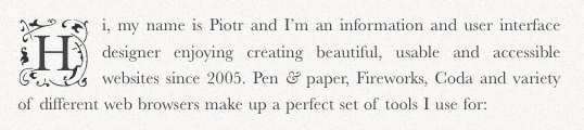
Piotr drew ornate background images and placed them behind the versal giving a them that extra love. The only issues here would be visibility of the background image depending on the glyph size—an “I” is smaller in width than a “R” or “Q”, and of course what happens when the user ups the font size. The CSS now would look something like this:
div#content h2.entry-title + p:first-letter {

    font-size: 4.2em;

    float: left;

    text-transform: uppercase;

    background-image: url(../images/versal-bg.png);

    background-repeat: no-repeat;

    background-position: center center;

    }
You can see them in action at Piotr’s site.
Finding or coming up with some versals of your own (for example, using Piotr’s method) isn’t hard. A quick search for “blackletter” typefaces on FontSquirrel.com yielded a few viable faces: Rothenburg Decorative, Dearest, and Zenda. And of course you’re not limited to using blackletter faces—you could use whatever you fancied.
If you’ve come across any good use of versals please share them below.
Frequently Asked Questions about Versals
What is the historical significance of versals?
Versals, also known as drop capitals, have a rich history dating back to the Middle Ages. They were primarily used in illuminated manuscripts, which were handwritten books adorned with gold or silver. Versals added an artistic touch to these manuscripts, making them more visually appealing. They were often elaborately decorated with intricate designs and sometimes even incorporated images related to the text. Versals played a significant role in the evolution of typography and continue to be used in modern design for their aesthetic appeal.
How are versals used in modern design?
In contemporary design, versals are often used to add a touch of elegance and sophistication. They are commonly seen in the opening paragraphs of novels, magazines, and newspapers. Versals can also be used in logos, headings, and invitations to create a visually striking effect. They can be stylized in various ways to suit the overall design theme, making them a versatile design element.
What is the difference between versals and initial letters?
While both versals and initial letters are used to highlight the start of a text, there is a subtle difference between the two. Versals are typically larger and more ornate, often extending beyond the height of the text line. On the other hand, initial letters are usually the same size as the rest of the text and are not as elaborately decorated.
How can I create my own versals?
Creating your own versals can be a fun and creative process. You can start by sketching out the letter in a larger size and then adding decorative elements. You can use various tools such as pens, brushes, or digital software to create your versal. Remember, the key is to make the versal stand out, so don’t be afraid to experiment with different styles and designs.
Are there any rules for using versals?
While there are no strict rules for using versals, there are some general guidelines to keep in mind. Versals should be larger than the surrounding text to create a visual impact. They should also be clear and legible, even with the added decorative elements. It’s also important to ensure that the versal fits well with the overall design and doesn’t look out of place.
Can versals be used in digital design?
Yes, versals can be effectively used in digital design. They can add a touch of elegance to websites, e-books, and digital magazines. Many design software programs offer tools to create and customize versals, allowing you to experiment with different styles and effects.
What are some common styles of versals?
Versals can be designed in a variety of styles, from simple and minimalist to ornate and elaborate. Some common styles include Gothic, Celtic, and Renaissance. Each style has its own unique characteristics and can add a different feel to the design.
How can I incorporate versals into my design project?
Incorporating versals into your design project can add a unique touch. You can use them at the start of a paragraph, chapter, or section to draw the reader’s attention. You can also use them in headings, logos, or invitations for a visually striking effect. Remember to keep the overall design theme in mind when designing your versals.
Can versals be colored or have patterns?
Absolutely! Versals can be colored, patterned, or even filled with images. This can add an extra layer of visual interest and make your versals truly unique. However, it’s important to ensure that the color or pattern doesn’t compromise the legibility of the versal.
Are versals only used in print design?
While versals are commonly associated with print design, they can also be effectively used in digital design. They can add a touch of elegance to websites, e-books, and digital magazines. With the right design software, you can create and customize your own versals for any digital project.