

Key Takeaways
- Utilizing multiple backgrounds in web design can enhance flexibility and visual appeal, allowing for complex designs without adding extra HTML elements. This can be achieved by layering different background images and using CSS to control their position, size, and repeat properties.
- The order of the background images is crucial for achieving a realistic design. In CSS, the first item called will be the image closest to the viewer, while the last image defined will be the farthest back. Therefore, the order should reflect the natural scene (e.g., grass first, then clouds).
- A significant disadvantage of using multiple background images is that it can potentially slow down your site due to the addition of several large graphics. To mitigate this, it’s important to keep file sizes small and ensure that the combined height of your images is not taller than your shortest page.
- Using a .jpg file and two .png files, or perhaps three .png files, is common for this method. However, .png files tend to be larger than .jpg files, and the height of the three images is crucial; if they overlap on an unexpectedly short page, they can ruin the site’s appearance. Therefore, getting the image heights right might require time and multiple trials and errors.
If I’ve learned anything during the past few years as a designer, I’ve learned that you can always learn new tricks to solve common design challenges. One of the most common design challenges is creating a customized background that expands and contracts to accommodate varying browser heights. In cases like these, repeating background elements such as stripes or tiled patterns will not meet the need. The most challenging aspect of the task is that every page will most likely be a different height. You could design your background to fit the height of one page, but a rigid, static background image is not going to accommodate shorter pages such as your contact page.
You could simply hope that nobody will notice backgrounds that cut off or abruptly stop partway down the page, but background glitches are hard to miss; despite technically being in the background, they stick out like a sore thumb. One viable solution is to create a background image for the top portion of your site and a separate one for the footer area. As long as you keep your file sizes small and you don’t make either of these elements extremely tall, this can work well for quite a few designs. Note that the combined height of your two background images should not be taller than your shortest page.
However, limiting yourself to two background images means that the extensible middle-ground of your background has to be either a color, a CSS3 gradient or a repeating image, which doesn’t work for all designs, and in some cases leaves you with the same problem that you started with. But, with a little CSS know-how, you can add a third background image in between your first two while maintaining the same extensibility and keeping your overall design intact.
Step 1: Create a Seamless Background
In Photoshop, I created a document wide enough to fill a browser, and I filled it with a sky blue color.

Step 2: Choose a Gradient
For added effect, I added a new layer on top and chose white as my foreground color.

Step 3: Subtlety is Key
I selected the gradient tool, selected the foreground to transparent option, drew a reflected gradient in the center of my canvas and lowered the opacity of this layer to 15-20%.
Step 4: Merge and Crop
I merged both layers together. Then, I chose the single row marquee tool and made a selection.

Step 5: Save Your Repeating Image
I went to Image> Crop to create a wide image that is 1px tall. I saved this for web as a .jpg file named “sky.jpg.”


Step 6: Find Your Imagery
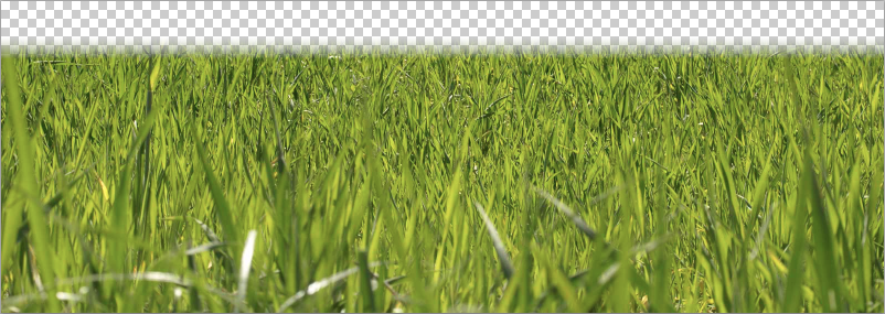
I went online and found an image of grass.

Step 7: Creatively Crop What You Need
I brought this image into Photoshop and cropped it so that it wasn’t too tall.

Step 8: Blend Your Image With a Mask
I added a layer mask and used the gradient tool to fade the top of the grass to transparency.

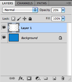
Step 9: Apply Your Mask
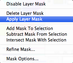
I right-clicked the mask icon and chose “apply mask” to merge it with the image.
Step 10: Save For Transparency
I saved for the web again, but this time I chose png-24 with transparency, so that the top could fade away.
Step 11: Set a Contrasting Background
For my last image, I created a new Photoshop document, made it around 200px tall and filled the background layer with a sky blue (just for visual reference).

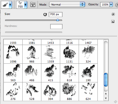
Step 12: Use Custom Brushes
There are many places online where you can download custom brushes, so I found some custom cloud brushes, chose white as my foreground color, created a new layer and began painting clouds on the new layer.
Step 13: Stay Away From Edges
I made sure not to get too close to the bottom edge so that there would be no harsh lines breaking the effect of the clouds. I deleted the background layer, only leaving the clouds on a transparent background. I chose File > Save for the Web and Devices, and I saved this file as a png-24 with transparency as well.


Step 14: Putting it All Together
Now, with a little CSS magic, I can use these images to create a grassy, cloud-capped background that fits every one of my pages perfectly. I have created a dummy site for a lawn care company to show you how to apply this technique. We can call all three background images using CSS: the grass centered at the bottom, the clouds centered at the top and the blue sky filling the varying height in between them. Use the background method to set the background attributes of your site as you normally would, but in this case, pay close attention to order. The way you order these three background images will feel similar to layers in Photoshop. The first item you call will be the image closest to you, and the last image that you define will be farthest back. In the case of this project, I defined the grass first and the clouds second, because in a real scene, the clouds would disappear over the horizon, which for our purposes is represented by the grass. In other words, clouds shouldn’t have the opportunity to go in front of the grass, because that wouldn’t look realistic. Both images are set not to repeat, and the grass is aligned to the bottom, while the clouds are aligned to the top and they are both centered.
Step 15: Order is Essential
body {

background: url(images/grass.png) center bottom no-repeat, url(images/clouds.png) center top no-repeat, url(images/sky.jpg) center top repeat;

font-family: Arial, Helvetica, sans-serif;

color: #060;

text-align: justify;

}
Step 16: Stack Your Images Correctly
The third and last image defined is the “sky.jpg” file, which is centered and repeated on its y-axis. This ensures that no matter how tall a content page is, “sky.jpg” will bridge the gap, while the clouds and grass decorate the top and bottom respectively. The result is a seamless, dynamic background design that fits every page.

Important Things to Keep in Mind
I can’t show you this without talking about the downsides of this method. It gives you another creative option for your web design projects, but one major downside to this method is that you are using three seperate images to create your background, which can lower your site speed due to the addition of multiple large graphics. You are likely using a .jpg and two .png files, or perhaps three .png files, which tend to be larger than .jpg files. Another factor to consider is the height of your three images, because if they overlap on an unexpectedly short page, they can ruin the look of your site. Getting the image heights right might take time and multiple trials and errors, but if your clients or colleagues insist on a complex, scalable background, they should expect it to take a little longer than a standard, simple one.
Frequently Asked Questions on Using Multiple Backgrounds for Flexibility in Web Design
How can I use multiple backgrounds in web design to enhance flexibility?
Using multiple backgrounds in web design can significantly enhance the flexibility and visual appeal of your website. This can be achieved by layering different background images, using CSS to control their position, size, and repeat properties. You can also use gradients as one of the layers to create a unique visual effect. This technique allows you to create complex designs without the need for multiple divs or complex HTML structures.
What are the benefits of using multiple backgrounds in web design?
Multiple backgrounds in web design offer several benefits. They allow for more creative and complex designs without adding extra HTML elements. They can also help to create a more engaging and interactive user experience. Additionally, using multiple backgrounds can help to reduce the load time of your website, as smaller, repeated images can load faster than a single large image.
How can I control the position and size of multiple backgrounds?
The position and size of multiple backgrounds can be controlled using CSS properties. The ‘background-position’ property allows you to specify the position of the background image, while the ‘background-size’ property allows you to control the size. You can use these properties in combination to create a variety of effects, such as parallax scrolling or responsive backgrounds.
Can I use gradients as a background in web design?
Yes, gradients can be used as a background in web design. They can be used alone or in combination with other background images to create a unique visual effect. CSS3 allows you to create linear and radial gradients with multiple color stops, giving you a lot of flexibility in your design.
How can I create a parallax scrolling effect with multiple backgrounds?
A parallax scrolling effect can be created with multiple backgrounds by using the ‘background-attachment’ property in CSS. By setting this property to ‘fixed’ for one of your background images, you can create the illusion of depth as the user scrolls down the page. This can create a more engaging and interactive user experience.
How can I make my background images responsive?
Making your background images responsive can be achieved by using the ‘background-size’ property in CSS. By setting this property to ‘cover’, your background image will scale to cover the entire container, regardless of its size. This ensures that your background images look good on all screen sizes and devices.
How can I use multiple backgrounds to reduce the load time of my website?
Using multiple, smaller background images can help to reduce the load time of your website. Smaller images generally load faster than larger ones, and by repeating these images, you can create complex designs without the need for a single large image. This can help to improve the performance of your website and enhance the user experience.
Can I use multiple backgrounds with CSS animations?
Yes, you can use multiple backgrounds with CSS animations to create dynamic and interactive designs. By animating the position, size, or other properties of your background images, you can create a variety of effects, such as a sliding background or a changing gradient.
How can I use multiple backgrounds to create a layered effect?
A layered effect can be created with multiple backgrounds by using different z-index values for each background image. The z-index property in CSS determines the stacking order of elements, with higher values appearing on top. By using different z-index values, you can create a layered effect with your background images.
Can I use multiple backgrounds with CSS transitions?
Yes, you can use multiple backgrounds with CSS transitions to create smooth changes between different states of your website. By transitioning the properties of your background images, such as their position or size, you can create a variety of effects, such as a fading background or a changing gradient.

