
One of the things you probably have noticed when you visit Bootstrap’s website is the right-side navigation that moves as you scroll through the page. This scrolling effect can be achieved combining the Affix and ScrollSpy jQuery plugins, both available as Bootstrap components.
In this article, I’ll show you how to add this cool feature to one of your own projects. As always, to better demonstrate these, I’ll use a demo project.
Let’s start by taking a look at the HTML structure of it.
Key Takeaways
- The Affix and ScrollSpy jQuery plugins, available as Bootstrap components, can be combined to create a navigation that moves as you scroll through a webpage. Affix helps “fix” the position of navigation, and ScrollSpy automatically updates navigation based on scroll position.
- The Affix plugin toggles between three classes: affix-top, affix, and affix-bottom. These classes change the element’s type of positioning as the user scrolls up and down the page. The affix class is the most important as it pins an element as the user scrolls down the page.
- ScrollSpy requires a Bootstrap nav component and the body element to be defined as the element to “spy” on during page scrolling. The plugin adds the active class to any appropriate li child elements while the user is scrolling.
- Both Affix and ScrollSpy plugins can be used on the same page to create a more dynamic and user-friendly page. They can work together to keep a navigation menu in place and highlight the current section in the navigation menu as you scroll through the page.
The Basic Markup for Our Demo
For small screens we use a single column layout. For medium and large screens our layout will consist of two columns. On the one hand, we have the navigation, which occupies one quarter of a row’s width. On the other hand, we have the main content sections, which occupy the other three quarters of a row’s width. Each of these sections has an id attribute value that matches the href attribute value of the corresponding anchor (a) element.
In our example, we want the scrolling effect to occur only when the viewport exceeds 991px (i.e. medium and large screens). For this reason, we add the hidden-xs and hidden-sm helper classes to the navigation.
See the code below. Note that for brevity, we’re not including content that isn’t relevant to the technique.
<div class="col-md-3 scrollspy">

  <ul id="nav" class="nav hidden-xs hidden-sm" data-spy="affix">

    <li>

      <a href="#web-design">Web Design</a>

    </li>

    <li>

      <a href="#web-development">Web Development</a>

      <ul class="nav">

        <li>

          <a href="#ruby">

            <span class="fa fa-angle-double-right"></span>Ruby

          </a>

        </li>

        <li>

          <a href="#python">

            <span class="fa fa-angle-double-right"></span>Python

          </a>

        </li>
      </ul><!--end of sub navigation-->

    </li>
  </ul><!-- end of main navigation -->

</div>

<div class="col-md-9">

  <section id="web-design">

  </section>

  <section id="web-development">

    <section id="ruby">

    </section>

    <section id="python">

    </section>
  </section>

</div>
Now that we understood the basic structure of our project, we can include the plugins to add the functionality.
Using Affix
The Affix plugin will help us “fix” the position of our navigation section, while allowing us to add vertical offsets to this fixed element, depending on where the user has scrolled.
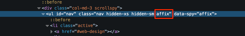
To use the Affix plugin in our project, we have to specify the element that will receive the “affix” behavior. We can do this by adding the data-spy="affix" attribute/value to it. In our example, the desired element is the ul element.
The plugin toggles between three classes, described here:
- The
affix-topclass, which indicates that the element is in its top-most position. - The
affixclass, which is added when the element starts to scroll off the screen, and which applies theposition: fixedproperty to it. - The
affix-bottomclass, which indicates thebottomoffset of the element.
In brief, the plugin changes the element’s type of positioning as the user scrolls up and down the page, using the three classes to do so.
Note that we can optionally take advantage of all the classes in our implementation. The most important class is the affix one, which allows us to pin an element as the user scrolls down the page. However, depending on the structure of our project, we might want to use the affix-top and/or affix-bottom classes as well.
Let’s now see how we can include all three classes in our example.
First, we assign the affix-top class to the ul element. To do this, we can use either custom data-* attributes or JavaScript. Here’s the required jQuery/JavaScript:
$('#nav').affix({

    offset: {

        top: $('#nav').offset().top

    }

});
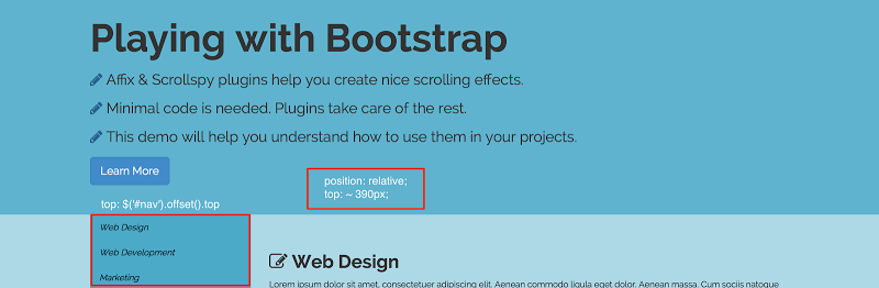
At this point, we have applied the element’s top position. This is around 390px. By default, its position is set to static. Even though Bootstrap mentions that no CSS positioning is required, I’ve set its position to relative. Here’s a screenshot with annotations to show what’s going on:
The HTML of the ul element looks like this when the page first loads:
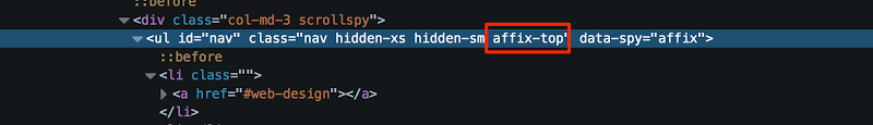
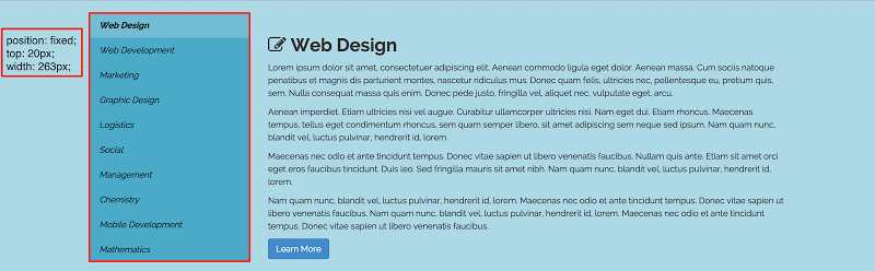
As you can see, when the user first starts to scroll, the ul element has the affix-top class. When the “scrolling” exceeds the element’s initial top position (around 390px), the ul receives the affix class and its position changes to fixed. Then we set its new top (try to change its value to see the difference) position and width properties. Here are the corresponding styles:
.affix {

  top: 20px;

  width: 213px;

}
@media (min-width: 1200px) {

  .affix {

    width: 263px;

  }

}
Below is a screenshot that corresponds to this phase:
And the generated HTML:
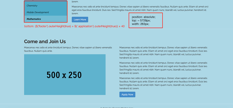
As the user scrolls, the ul is pinned to the top of the page. Of course, this is a nice effect, but we eventually want to stop the pinning. We can do this by using the affix-bottom class. To cause the plugin to trigger this class, we have to specify the bottom offset of the target element. Again, this can be achieved by using either custom attributes or jQuery/JavaScript. Here’s how to do it with jQuery:
$('#nav').affix({

  offset: {

    bottom: ($('footer').outerHeight(true) +

            $('.application').outerHeight(true)) +

            40

  }

});
During this phase, we have to use CSS to specify the type of positioning for our element. For instance, we can apply position: absolute or position: relative to it. In our example, I’ve chosen the first option. We also set its width property. Here are the required styles:
.affix-bottom {

  position: absolute;

  width: 213px;

}
@media (min-width: 1200px) {

  .affix-bottom {

    width: 263px;

  }

}
At this final stage, our demo will look like this:
Note: This final screenshot is based on a typical desktop screen resolution.
And here is the generated HTML:
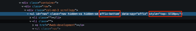
As shown above, based on the bottom offset that we defined with jQuery, the plugin applies a new top offset to the element.
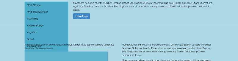
Finally, it’s important to mention that in the case of this specific demo, we had to specify a bottom offset for the element. This is because there’s content after the education-related sections. For instance, if we didn’t specify an offset, our page would look something like this:
Now that we have our Affix plugin working, we can add the ScrollSpy functionality.
Using ScrollSpy
To add ScrollSpy to our project, we have to define the element we want to “spy” on during page scrolling. Usually this will be the body element. ScrollSpy also requires that we use a Bootstrap nav component.
First, we apply the data-spy="scroll" attribute/value to the “spied” body element. At this point, it’s worth mentioning that Bootstrap suggests setting the position of our “spied” element to relative.
Next, we identify the specific parts of that element we want to track by adding the data-target attribute to the element we’re spying on (again, in our case this is the body). The value of this attribute should match the id or the class of the parent of the nav component. So the body tag would look like this (notice the “.” included as part of the value of the data-* attribute):
<body data-spy="scroll" data-target=".scrollspy">
Similar to the Affix plugin, there’s also the option to activate the ScrollSpy plugin via JavaScript. In our example, we won’t use this option.
After activating the plugin, our HTML would look like this:
<body data-spy="scroll" data-target=".scrollspy">

<!-- content here... -->
  <div class="col-md-3 scrollspy">

    <ul id="nav"

        class="nav hidden-xs hidden-sm"

        data-spy="affix">

        <!-- nav items here... -->

    </ul>

  </div>
  <!-- content here... -->

</body>
And the only necessary CSS:
body {

  position: relative;

}
Notice that we “watch” the direct parent element of the ul and not the ul.
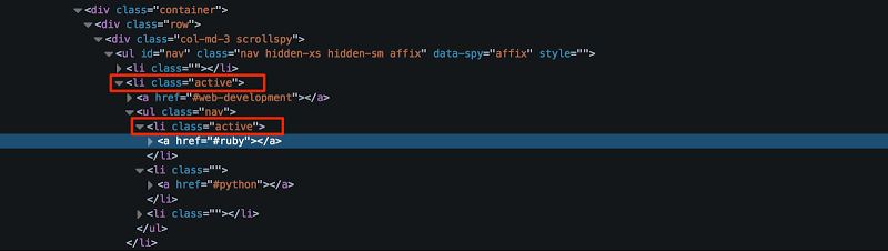
We can use our browser’s developer tools to understand what the plugin does. While the user is scrolling, the plugin “watches” the target element and adds the active class to any appropriate li child elements. We then style the active elements based on this class. Some of our li elements contain sub navigation elements, which we can also style to see a nice effect.
The screenshot below shows the generated HTML when the ScrollSpy plugin is in use:
Below are the styles I’ve applied to the nav component in our demo. Notice the styles take into account that I’m using nested nav components.
.nav .active {

  font-weight: bold;

  background: #72bcd4;

}
.nav .nav {

  display: none;

}
.nav .active .nav {

  display: block;

}
.nav .nav a {

  font-weight: normal;

  font-size: .85em;

}
.nav .nav span {

  margin: 0 5px 0 2px;

}
.nav .nav .active a,

.nav .nav .active:hover a,

.nav .nav .active:focus a {

  font-weight: bold;

  padding-left: 30px;

  border-left: 5px solid black;

}
.nav .nav .active span,

.nav .nav .active:hover span,

.nav .nav .active:focus span {

  display: none;

}
Conclusion
Here’s the link to the final demo:
Bootstrap Affix and ScrollSpy Demo
In this article, we’ve seen how to build scrolling effects using Bootstrap’s Affix and ScrollSpy plugins. You’ve probably seen these components in action on Bootstrap’s documentation pages, and now you know how they work.
If you’ve used these components or something similar from a third-party, feel free to let us know about your experiences in the discussion.
Frequently Asked Questions about Bootstrap’s Affix and Scrollspy Plugins
What is the main function of the Affix plugin in Bootstrap?
The Affix plugin in Bootstrap is used to lock an element in a specific area on the page. This means that when you scroll down the page, the element will remain in its position, providing a fixed point of reference. This is particularly useful for navigation menus or sidebars, as it allows users to easily access these elements at any point while scrolling through the page.
How does the Scrollspy plugin work in Bootstrap?
The Scrollspy plugin in Bootstrap is used to automatically update navigation or list group components based on scroll position to indicate which link is currently active in the viewport. It’s particularly useful for one-page websites or pages with long scrolling. It allows users to know where they are on the page based on the active state of these links.
How can I implement the Affix plugin in my Bootstrap project?
To implement the Affix plugin, you need to add data-spy=”affix” to the element you want to affix. Then, use the data-offset-top attribute to specify how many pixels to offset from the top before the element gets affixed. You can also use data-offset-bottom to specify the offset from the bottom.
Can I use both Affix and Scrollspy plugins on the same page?
Yes, you can use both Affix and Scrollspy plugins on the same page. They can work together to create a more dynamic and user-friendly page. For example, you can use the Affix plugin to keep your navigation menu in place, and the Scrollspy plugin to highlight the current section in the navigation menu as you scroll through the page.
How can I customize the offset value in the Affix plugin?
You can customize the offset value in the Affix plugin by using the data-offset-top and data-offset-bottom attributes. These attributes allow you to specify the number of pixels to offset from the top or bottom of the page before the element gets affixed.
How does the Scrollspy plugin determine which link is currently active?
The Scrollspy plugin determines which link is currently active based on the scroll position. It automatically updates the active state of the links in the navigation or list group component as you scroll through the page. The link corresponding to the section currently in the viewport becomes active.
Can I use the Affix plugin with elements other than navigation menus or sidebars?
Yes, you can use the Affix plugin with any element that you want to lock in a specific area on the page. This could be a navigation menu, a sidebar, a banner, or any other element that you want to keep in place as the user scrolls down the page.
How can I implement the Scrollspy plugin in my Bootstrap project?
To implement the Scrollspy plugin, you need to add data-spy=”scroll” to the element you want to spy on (usually the body). Then, use the data-target attribute to specify the ID or class of the navigation component.
What versions of Bootstrap support the Affix and Scrollspy plugins?
The Affix and Scrollspy plugins are supported in Bootstrap 3 and 4. However, please note that the Affix plugin has been dropped in Bootstrap 4. It’s recommended to use the position: sticky CSS property instead.
Are there any known issues or limitations with the Affix and Scrollspy plugins?
One known issue with the Affix plugin is that it doesn’t work with flexbox layouts in Bootstrap 4, as the plugin has been dropped in this version. As for the Scrollspy plugin, it requires the use of a Bootstrap nav component and doesn’t work with nested navs.