


Key Takeaways
- Bootstrap Modals are a lightweight, customizable and responsive jQuery Bootstrap plugin used to display alert popups, videos, images and more. They are divided into three sections: the header, body, and footer, each serving a unique purpose. No JavaScript coding is necessary as all code and styles are predefined by Bootstrap.
- Modals can be activated with jQuery by calling the .modal() function on the modal’s selector, with the option to customize behavior through a JavaScript object. Bootstrap Modals also support various events that are triggered while opening and closing the modal, which can be bound using jQuery’s .on() method.
- Bootstrap Modals are highly customizable, including the ability to change their size through the use of modifier classes. They can also be loaded with dynamic content and can be made scrollable. They are responsive, working well on both small and large devices, and can be prevented from closing when a user clicks outside of it by setting the backdrop option to ‘static’.
In this tutorial, we’ll be talking about one of the most useful jQuery Bootstrap plugins, the Bootstrap Modal. Bootstrap Modals offer a lightweight, multi-purpose JavaScript popup that’s customizable and responsive. They can be used to display alert popups, videos, and images in a website. Bootstrap-based websites can use Bootstrap modals to showcase, for example, terms and conditions (as part of a signup process), videos (similar to a standard light box), or even social media widgets.
Now let’s examine the different parts of Bootstrap Modals, so we can understand them better.
Bootstrap Modals are divided into three primary sections: the header, body, and footer. Each has its own role and hence should be used accordingly. We’ll discuss these shortly. The most exciting thing about Bootstrap modals? You don’t have to write a single line of JavaScript to use them! All the code and styles are predefined by Bootstrap. All that’s required is that you use the proper markup and attributes and they just work.
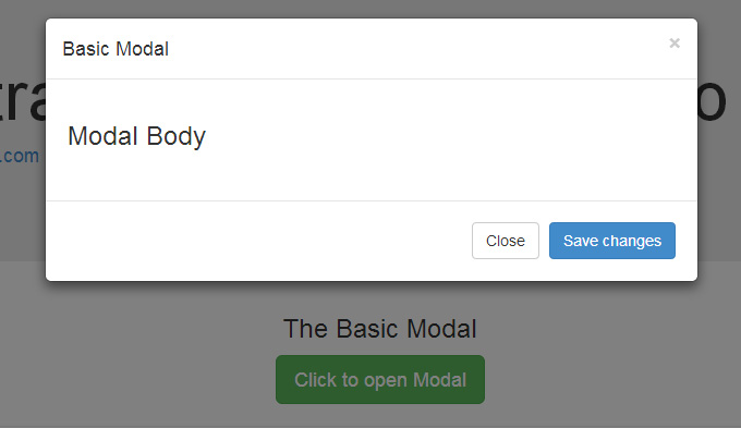
The Default Modal
The default Bootstrap Modal looks like this:
To trigger the modal, you’ll need to include a link or a button. The markup for the trigger element might look like this:
<a href="#" class="btn btn-lg btn-success" data-toggle="modal" data-target="#basicModal">

Click to open Modal

</a>
Notice the link element has two custom data attributes: data-toggle and data-target. The toggle tells Bootstrap what to do and the target tells Bootstrap which element is going to open. So whenever a link like that is clicked, a modal with an ID of “basicModal” will appear.
Now let’s see the code required to define the modal itself. Here’s the markup:
<div class="modal fade" id="basicModal" tabindex="-1" role="dialog" aria-labelledby="basicModal" aria-hidden="true">

<div class="modal-dialog">

<div class="modal-content">

<div class="modal-header">

<h4 class="modal-title" id="myModalLabel">Basic Modal </h4>

<button type="button" class="close" data-dismiss="modal" aria-label="Close">

<span aria-hidden="true">×</span>

</button>

</div>

<div class="modal-body">

<h3>Modal Body</h3>

</div>

<div class="modal-footer">

<button type="button" class="btn btn-default" data-dismiss="modal">Close</button>

<button type="button" class="btn btn-primary">Save changes</button>

</div>

</div>

</div>

</div>
The parent div of the modal should have the same ID as used in the trigger element above. In our case, it would be id="basicModal".
Note: Custom attributes like aria-labelledby and aria-hidden in the parent modal element are used for accessibility. It’s good practice to make your website accessible to all, so you should include these attributes since they won’t negatively affect the standard functionality of the modal.
In the modal’s HTML, we can see a wrapper div nested inside the parent modal div. This div has a class of modal-content that tells bootstrap.js where to look for the contents of the modal. Inside this div, we need to place the three sections I mentioned earlier: the header, body, and footer.
The modal header, as the name implies, is used to give the modal a title and some other elements like the “x” close button. This should have a data-dismiss attribute that tells Bootstrap to remove the element.
Then we have the modal body, a sibling div of the modal header. Consider the body an open canvas to play with. You can add any kind of data inside the body, including a YouTube video embed, an image, or just about anything else.
Lastly, we have the modal footer. This area is by default right aligned. In this area you could place action buttons like “Save”, “Close”, “Accept”, etc., that are associated with the action the modal is displaying.
Now we’re done with our first modal! You can check it out on our demo page.
Changing the Modal’s Size
Earlier I mentioned that the Bootstrap Modal is responsive and flexible.
The modal comes in two flavors: Large and Small. Add a modifier class modal-lg to the .modal-dialog div for a larger modal or modal-sm for a smaller modal.
Activating Bootstrap Modals with jQuery
The modal is a jQuery plugin, so if you want to control the modal using jQuery, you need to call the .modal() function on the modal’s selector. For Example:
$('#basicModal').modal(options);
The “options” here would be a JavaScript object that can be passed to customize the behavior. For example:
var options = {

'backdrop' : 'static'

}
Available options include:
- backdrop: This can be either
trueorstatic. This defines whether or not you want the user to be able to close the modal by clicking the background. - keyboard: if set to
truethe modal will close via the ESC key. - show: used for opening and closing the modal. It can be either
trueorfalse. - focus: puts the focus on the modal when initialized. It can be either true or false and is set to
falseby default.
Bootstrap Modal Events
You can further customize the normal behavior of the Bootstrap Modal by using various events that are triggered while opening and closing the modal. These events have to be bound using jQuery’s .on() method.
Various events available are:
- show.bs.modal: fired just before the modal is open.
- shown.bs.modal: fired after the modal is shown.
- hide.bs.modal: fired just before the modal is hidden.
- hidden.bs.modal: fired after the modal is closed.
You can use one of the above events like this:
$('#basicModal').on('shown.bs.modal', function (e) {

alert('Modal is successfully shown!');

});
Conclusion
The modal is one of the best plugins offered by Bootstrap. For a novice designer, it’s one of the best ways to load content inside a popup screen without writing any JavaScript.
Below is a CodePen demo with three example Bootstrap modals.
See the Pen Bootstrap 3.1.0 Modal Demos by SitePoint (@SitePoint) on CodePen.
If you’re building a site with Bootstrap that requires a login portal, check out our Creating a Login Portal with Bootstrap 4 course, which helps you get to grips with cards, forms, buttons and grids.
Frequently Asked Questions (FAQs) about Bootstrap Modals
What is the purpose of using Bootstrap Modals in web development?
Bootstrap Modals are a streamlined, but powerful, dialog prompts with the Bootstrap framework, which can be customized to display dynamic content. They are used to create a pop-up window that displays information without requiring the user to navigate away from the current page. This can be particularly useful for displaying forms, images, or detailed information about a product or service.
How can I trigger a Bootstrap Modal using JavaScript?
To trigger a Bootstrap Modal using JavaScript, you can use the .modal(‘show’) method. This method can be called on a jQuery object that has selected HTML elements with a modal class. Here’s an example:$('#myModal').modal('show');
In this example, ‘#myModal’ is the id of the modal you want to display.
How can I close a Bootstrap Modal using JavaScript?
Similar to triggering a modal, you can also close a Bootstrap Modal using JavaScript. You can use the .modal(‘hide’) method. Here’s an example:$('#myModal').modal('hide');
In this example, ‘#myModal’ is the id of the modal you want to close.
How can I customize the appearance of a Bootstrap Modal?
Bootstrap Modals are highly customizable. You can change the size, position, color, and more. For example, to change the size of a modal, you can use the .modal-lg, .modal-sm, or .modal-xl classes. To change the color, you can use Bootstrap’s color classes like .bg-primary, .text-danger, etc.
Can I use multiple Modals on the same page?
Yes, you can use multiple modals on the same page. However, it’s important to note that Bootstrap does not support displaying multiple modals at the same time. You need to close the current modal before opening a new one.
How can I add animations to a Bootstrap Modal?
Bootstrap Modals come with a fade effect by default. If you want to add more animations, you will need to use CSS or JavaScript. You can use CSS transitions or animations, or you can use JavaScript libraries like jQuery or animate.css.
Can I load dynamic content into a Bootstrap Modal?
Yes, you can load dynamic content into a Bootstrap Modal. You can use AJAX to load content from a server and insert it into the modal. You can also use JavaScript to dynamically change the content of the modal based on user interaction.
How can I make a Bootstrap Modal scrollable?
To make a Bootstrap Modal scrollable, you can use the .modal-dialog-scrollable class. This class makes the modal body scrollable, allowing the modal header and footer to stay fixed.
How can I prevent a Bootstrap Modal from being closed when the user clicks outside of it?
You can prevent a Bootstrap Modal from being closed by setting the backdrop option to ‘static’. Here’s an example:$('#myModal').modal({
backdrop: 'static'});
In this example, ‘#myModal’ is the id of the modal you want to prevent from being closed.
Can I use Bootstrap Modals on mobile devices?
Yes, Bootstrap Modals are responsive and work well on mobile devices. They automatically adjust to the size of the screen and provide a good user experience on both small and large devices.