 I came across an interesting little CSS quirk while looking one of the Panic.com web sites. The Panic guys are perhaps best known for their well-loved and respected Coda editor and Transmit FTP client.
 Panic always use lovely big, rich, cartoony graphics to decorate their pages but the type looked unusually rough and chunky on my system. Sure, Mac and PCs take different approaches to type rendering, but this was something else.
So, what exactly was going on here?
Digging into their CSS I found some interesting stuff. Rather than calling the font by its font-family name (for instance, ‘Helvetica Neue
‘) and setting the weight and style with the font-weight and font-style attributes respectively, the CSS directly referenced the PostScript name for that truetype font — “HelveticaNeue-Light”.
Panic always use lovely big, rich, cartoony graphics to decorate their pages but the type looked unusually rough and chunky on my system. Sure, Mac and PCs take different approaches to type rendering, but this was something else.
So, what exactly was going on here?
Digging into their CSS I found some interesting stuff. Rather than calling the font by its font-family name (for instance, ‘Helvetica Neue
‘) and setting the weight and style with the font-weight and font-style attributes respectively, the CSS directly referenced the PostScript name for that truetype font — “HelveticaNeue-Light”.
body {
font-family: "HelveticaNeue-Light", Helvetica, Arial, sans-serif;
}
Safari allows you to use a font’s additional weights by referencing their PostScript2 names — in this case, “HelveticaNeue-Light” — in your CSS; whereas you simply declare the font’s full name (“Helvetica Neue Light”) in your stylesheets to use it in Firefox 2 and other Gecko-based browsers like Camino. Thus, the following declaration will give you gorgeous Helvetica Neue Light in almost every Mac browserIt certainly is a mighty purdy look in Safari anywhere, and I could see why you would want to achieve this look. However the result is currently uniformly yuck on Firefox, Opera, Chrome and Internet Explorer for Windows users that have that font (as I obviously do).
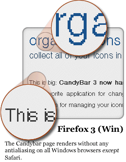
 In fact, I did some tests (right) using the italic variants which made me want to scrape out my eyeballs.
It also appears to do nasty things to Linux users. According to a comment left by Phillip Barnhart ‘ the page .. is almost completely unreadable on FireFox 3 and Konquorer on Linux
.’
It seems most non-Mac browsers can’t ignore this font declaration if the font is resident, but they’re also not very good at rendering it nicely either.
Of course, Panic makes Mac software for Mac users and clearly know their audience. Helvetica Neue also isn’t a common Windows font so I’m assuming most Windows users are seeing Arial at the Candybar site (let me know if I’m wrong), so no big deal.
Nevertheless, just in case there’s a temptation for developers to rejoice in its Mac loveliness and start using this technique with more common font variants, I thought it was worth pointing out the nastiness it potentially brings.
In fact, I did some tests (right) using the italic variants which made me want to scrape out my eyeballs.
It also appears to do nasty things to Linux users. According to a comment left by Phillip Barnhart ‘ the page .. is almost completely unreadable on FireFox 3 and Konquorer on Linux
.’
It seems most non-Mac browsers can’t ignore this font declaration if the font is resident, but they’re also not very good at rendering it nicely either.
Of course, Panic makes Mac software for Mac users and clearly know their audience. Helvetica Neue also isn’t a common Windows font so I’m assuming most Windows users are seeing Arial at the Candybar site (let me know if I’m wrong), so no big deal.
Nevertheless, just in case there’s a temptation for developers to rejoice in its Mac loveliness and start using this technique with more common font variants, I thought it was worth pointing out the nastiness it potentially brings.
Frequently Asked Questions about TrueType Font Variants and Antialiasing
What is the history of TrueType fonts?
TrueType fonts were first developed by Apple in the late 1980s as a response to Adobe’s Type 1 fonts used in PostScript. The goal was to create a font system that could be used on both screen and printer and that was fully scalable. Later, Microsoft also started using TrueType fonts, which led to their widespread adoption. Today, TrueType fonts are used across various operating systems and devices.
How does antialiasing work in TrueType fonts?
Antialiasing in TrueType fonts is a technique used to smooth the edges of the fonts to make them look more readable and less pixelated on screen. It works by adding semi-transparent pixels along the edges of the characters, which blends the font color with the background color, creating a smoother appearance.
What is the difference between TrueType and OpenType fonts?
TrueType and OpenType are both font formats, but they have some differences. TrueType was developed by Apple and Microsoft, while OpenType is a later development by Microsoft and Adobe. OpenType is essentially an extension of TrueType, and it supports a greater number of characters and more advanced typographic features. However, TrueType fonts are still widely used and supported.
How can I install TrueType fonts on my computer?
Installing TrueType fonts on your computer is usually a straightforward process. On most operating systems, you can simply double-click on the font file and then click on the “Install” button. However, the exact process may vary depending on your specific operating system.
Are TrueType fonts free to use?
The licensing terms for TrueType fonts can vary. Some TrueType fonts are free to use, while others require a license. It’s important to check the specific licensing terms for each font before using it.
How do TrueType fonts affect web design?
TrueType fonts can have a significant impact on web design. They can help to create a consistent look and feel across different devices and browsers. However, it’s important to consider factors such as readability and load times when choosing fonts for a website.
Can TrueType fonts be used in commercial projects?
Whether TrueType fonts can be used in commercial projects depends on the specific licensing terms of the font. Some fonts are free for both personal and commercial use, while others require a license for commercial use. Always check the licensing terms before using a font in a commercial project.
What are the advantages of TrueType fonts?
TrueType fonts have several advantages. They are fully scalable, which means they can be resized without losing quality. They also support a wide range of characters, making them suitable for use in many different languages. Additionally, TrueType fonts are widely supported across different operating systems and devices.
How can I create my own TrueType font?
Creating your own TrueType font requires specialized software, such as a font editor. These programs allow you to design each character, define the spacing and kerning, and export the font in the TrueType format. However, creating a font is a complex process that requires a good understanding of typography.
What is the future of TrueType fonts?
While newer font formats like OpenType have been developed, TrueType fonts are still widely used and supported. They continue to be a reliable choice for many applications, from web design to print. As technology continues to evolve, it’s likely that TrueType fonts will continue to adapt and remain relevant.
 Alex Walker
Alex has been doing cruel and unusual things to CSS since 2001. He is the lead front-end design and dev for SitePoint and one-time SitePoint's Design and UX editor with over 150+ newsletter written. Co-author of The Principles of Beautiful Web Design. Now Alex is involved in the planning, development, production, and marketing of a huge range of printed and online products and references. He has designed over 60+ of SitePoint's book covers.