
Key Takeaways
- Drop-down and fly-out menus can create usability and accessibility problems, such as skittish behavior, content disappearing below the fold, and lack of keyboard access. These issues can be mitigated by creating the menus as hierarchical lists in hard-coded HTML or generating the menus on the fly using JavaScript.
- The footer of a webpage, which often contains links to the same main sections as the top navigation bar, can be utilized as the source for creating drop-down menus. This approach combines the benefits of having menu content in static HTML and generating menus on the fly, while addressing usability and accessibility issues.
- The concept of using the footer as the menu can be extended to complex mega menus containing large amounts of content. Additional content hidden in the footer can be made visible and restyled when they’re in the mega menu, as demonstrated in the Amnesty International Australia website.
Drop-down and fly-out menus often come with a whole range of usability and accessibility problems — skittish behavior, content that disappears below the fold, or lack of keyboard access, to name but a few. For the most part, though, these problems are solvable (see: “The Right Way to Make a Drop-down Menu” for more).
However, there’s another issue that’s trickier to address: the question of how and where to create the content these menus use.
There are basically two options:
- Create the menus as hierarchical lists in hard-coded HTML. The top navigation bar is an unordered list, and each of its submenus is a nested list, a child of the top-level item that triggered it. The problem with this approach is that it means creating a large structure in HTML, which can be quite annoying for screen readers and other serial devices to navigate their way through. Put simply, it’s a whole lot of content to put in static HTML, when some user agents lack the ability to selectively show and hide it.
- Generate the menus on the fly. The submenu content is created as required, from configuration data in JavaScript, and appended or removed from the top-level triggers as necessary. The problem with this approach is that the content is then inaccessible without scripting, or in browsers that don’t support or fire the triggering events. This solution relies on other forms of navigation (such as a sitemap) to make up for the shortfall in content.
Neither of these solutions are perfect; one group suffers reduced usability, or another user group suffers reduced accessibility. If only there were a third way …
The Third Way
The image below is an abridged screenshot from a sample web page that’s typical of many site designs, in that it has both a header and a footer:
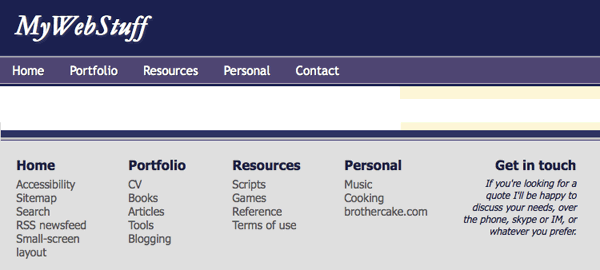
The header and footer of a sample web page
The header contains the primary navigation from which the drop-down menu would be triggered, and the footer contains supplementary navigation. Notice anything similar about them?
Each link in the top navigation bar is to one of the main sections of the site. And each set of links in the footer is for the same main sections of the site. They correspond exactly, and when it comes to implementing the drop-down menu, it’s likely that it will contain the same links we see in the footer.
In other words, the footer is the menu. So why not literally make it the menu?
Send in the Clones
Let’s design a menu with a single list of links as the top navigation bar; then, when a mouse or keyboard event triggers the appearance of a drop-down menu, we’ll create that menu by cloning the corresponding section of footer links.
This is the best of both worlds:
- We do have the menu content in static HTML, but it’s structured, usable, and out of the way. The usability issue with having all the content there by default is solved.
- We are generating the menus on the fly, but we’re doing it using content that nevertheless exists in static HTML. The accessibility issue with using dynamically created menus is solved.
I’ve made a fully functional demo to illustrate this concept, adapting a menu script from the drop-down menu post I linked to earlier. The menu script is imperfect; if I had more time I’d tighten up the event flow (and test it in IE6!) — but it should serve to demonstrate the concept nicely, and it’s a good starting point if you wish to develop this idea further.
Making Mega Menus
And we can take this concept a whole lot further! Recently I did some work for Amnesty International Australia, where the site design called for complex mega menus containing large amounts of content:

A mega menu from the Amnesty International Australia website
The site also featured a footer with structured links in sections, very similar to the first demo I showed you.

The footer from the same site
So I was able to use this technique to implement the basic menu. But I could take it much further, by adding supplementary content to the footer links hidden in the footer. The thumbnails and long descriptions of each menu links is still present in the footer, but you can only the main links themselves. The difference is just CSS — when the lists of links are in the footer, the additional content is invisible; when they’re in the mega menu, it’s made visible and restyled.
Visit the Amnesty International Australia website to see this in action.
You can also download a demo zip file if you’d like to play with the idea some more. It’s an idea that could be extended in many ways; in theory, any kind of dynamic content could be designed in this way — sourcing its data from another part of the page, where it exists in a different form.
Frequently Asked Questions about Website Footers and Menus
What is the importance of a website footer?
A website footer is a crucial element that appears at the bottom of a website. It serves as a secondary navigation area, providing important information and links that may not fit into the main navigation menu. This can include contact information, social media links, legal information, and more. A well-designed footer can enhance user experience, improve navigation, and increase the time visitors spend on your site.
How can I make my website footer more effective?
To make your website footer more effective, ensure it contains essential information such as your company’s contact details, social media links, and important navigational links. It should also be visually appealing and consistent with your website’s overall design. Additionally, keep it updated with the latest information and ensure it’s mobile-friendly.
What should be included in the main website navigation?
The main website navigation should include links to the most important pages of your site. This typically includes Home, About Us, Services or Products, Blog, and Contact Us. It’s also beneficial to include links to your FAQ page, customer testimonials, and any other pages that provide valuable information to your visitors.
How can I improve my website’s navigation?
Improving your website’s navigation can be achieved by keeping it simple and intuitive. Ensure your menu items are clearly labeled and organized in a logical manner. Use dropdown menus sparingly, as they can be difficult to navigate on mobile devices. Also, consider including a search function to help users find what they’re looking for quickly.
What is the role of CSS in website navigation?
CSS, or Cascading Style Sheets, is a style sheet language used for describing the look and formatting of a document written in HTML. In terms of website navigation, CSS can be used to style navigation menus, including the color, size, and font of menu items, as well as hover effects and transitions.
How can I create a bottom navigation using CSS?
Creating a bottom navigation using CSS involves defining a navigation bar at the bottom of your webpage using HTML, and then styling it with CSS. This can include setting the background color, text color, hover effects, and positioning of the navigation bar.
What are some common mistakes to avoid when designing website navigation?
Common mistakes to avoid when designing website navigation include making the navigation too complex, not making it mobile-friendly, using vague labels for menu items, and not including a search function. It’s also important to avoid having too many items in your navigation menu, as this can overwhelm users.
How can I make my website navigation more user-friendly?
To make your website navigation more user-friendly, keep it simple and intuitive. Use clear labels for your menu items and organize them in a logical manner. Include a search function to help users find what they’re looking for quickly. Also, ensure your navigation is mobile-friendly, as a large number of users will be accessing your site from mobile devices.
What is the difference between a footer and a menu in website design?
In website design, a footer is a section at the bottom of a webpage that typically contains secondary information and links, such as contact details, social media links, and legal information. A menu, on the other hand, is a primary navigation tool that includes links to the main pages of a website. Both are crucial for effective website navigation.
How can I ensure my website footer is mobile-friendly?
To ensure your website footer is mobile-friendly, make sure it’s responsive, meaning it adjusts to fit different screen sizes. Also, ensure the text is large enough to read on small screens and that any links are easy to click on with a finger. It’s also beneficial to limit the amount of information in your footer to avoid overwhelming mobile users.