

This is an excerpt from my book, The Art & Science Of CSS, which is available for FREE download for the next 14 days only. Just follow @sitepointdotcom on Twitter, and you’ll receive your free PDF. It’s a Twitaway – a Twitter giveaway. Grab your copy now!
Have you waded knee-deep into web standards and thought you’d never again encounter a table element? Tables may have quickly been shrunk from as “bad” and “evil,” due to past abuses as a layout element, but the web standards movement hasn’t quite eliminated them from the planet. In fact, all the proliferation of semantic markup has done is send tables back to doing what they do best: presenting tabular data.
While tabular data (and the spreadsheet horrors of which it probably reminds you) may not always seem to be the most exciting material to work with, working with tables gives us plenty of opportunity to break out some serious CSS skills and create some fantastic looks – even while adding a dash of usability.
In this chapter, we’ll spend some time gaining an understanding of the elements that go into the construction of a table. After we set this foundation, we’ll look at the various styles that can be applied to those table elements. Along the way, we’ll deal with the cross-browser problems that are sure to crop up at this moment in Web history. With the theory out of the way, we’ll reach some practical examples of how our tables can be made both functional and attractive, and become acquainted with some of the niceties a dash of JavaScript can offer to the humble table. Finally, we’ll look to the future to predict how CSS 3 will affect our table-designing efforts.
Key Takeaways
- CSS is not just for layout; it’s essential for styling tables effectively, especially when dealing with tabular data where tables excel.
- Understanding the structure of tables, including elements like `thead`, `tbody`, `tfoot`, `caption`, `col`, and `colgroup`, is foundational for sophisticated table styling.
- `border-collapse`, `border-spacing`, and `empty-cells` are crucial CSS properties for fine-tuning the appearance of tables.
- The `caption-side` property can greatly enhance the placement of table captions, improving readability and design aesthetics.
- Advanced CSS selectors from CSS 3, like `:nth-child`, can simplify the implementation of complex styling patterns such as zebra-striping without additional JavaScript.
- JavaScript can be employed to enhance table interactivity and usability, such as through row and column highlighting or dynamic content sorting.
- Future CSS specifications promise even more powerful selectors that will streamline the styling process and offer more dynamic design options without heavy reliance on scripts.
The Structure
Styling tables can be liberating and confusing at the same time. While the multiple elements of which a table can consist offer plenty of ways to tie in some additional style, cross-browser inconsistencies and the lack of support for some truly useful CSS selectors can prove to be frustrating roadblocks.
However, before we tackle the intricacies of styling a table, let’s go over all the different elements of which a table might consist. Much of this will probably be familiar ground, but there might be a couple of new elements that you haven’t encountered before. My apologies if this groundwork comes off as a little dry, but it’s well worth your attention. Think of table-styling as a roller-coaster; you’ve gotta spend time on the long slow ascent before you get into the wild ride of styling!
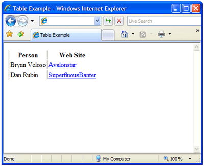
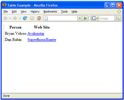
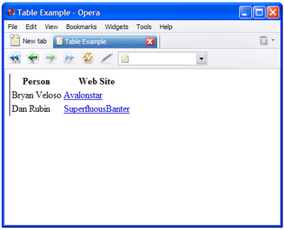
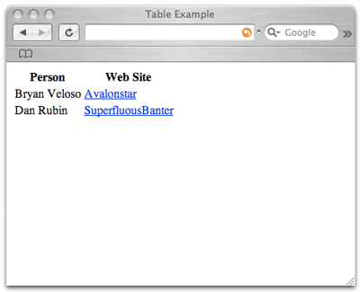
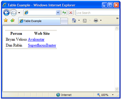
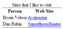
I’m sure all the tables you’ve put together up until now utilized at least three basic elements: table, tr, and td – those are, respectively, table, row, and data cell. Likewise, you’ve probably used or seen the th, the header cell. Your markup may have looked something like this:
Example 1. table-example-basic.html (excerpt)
<table>

  <tr>

    <th scope="col">Person</th>

    <th scope="col">Web Site</th>

  </tr>

  <tr>

    <td>Bryan Veloso</td>

    <td><a href="http://avalonstar.com/">Avalonstar</a></td>

  </tr>

  <tr>

    <td>Dan Rubin</td>

    <td><a href="http://superfluousbanter.org/">

SuperfluousBanter</a></td>

  </tr>

</table>
Those aren’t all the elemental components of a table, though. We also have the thead, tbody, tfoot, caption, col, and colgroup elements at our disposal. All of these elements serve a very semantic purpose, each of which I’ll explain in a little detail so you’ll know what element to use and when. Each of these elements will provide a point where we can hook in some CSS styling to take our table from being a boring blackspot on our page to being a mini work of art in its own right.
The table Element
A table isn’t a table without a table element. It all starts from here.
A table has a number of attributes, such as border, cellpadding, and cellspacing, all of which you’ve used often if you’ve emerged from the tables-for-layout school of web design. We can ignore border and cellpadding for now, as we can replicate these attributes in CSS. One presentational attribute we’ll need to keep handy is cellspacing. Internet Explorer doesn’t support the ability to handle cellspacing via CSS, which means that if we need to maintain control, we’ll have to do it at the HTML level.
In addition to those attributes, we also have the frame attribute and the rules attribute. The frame attribute controls the display of the outermost border on the table. Its possible values are void, above, below, hsides, vsides, lhs, rhs, box, and border. void is the default value and will remove the border from around the table.
The border manifests itself differently in each of the four browsers I used to test this markup:
- Internet Explorer rendered a three-dimensional border on all sides.
- Opera rendered a solid black border.
- Firefox rendered a gray border on the left and top, with black on the right and bottom.
- Safari rendered no border at all.
When Internet Explorer is given a value other than void, this browser will incorrectly render a border on the cells inside the table as well. For example, if you specify lhs, the left side of each cell will be rendered:
<table frame="lhs">Firefox and Opera render this markup correctly, as shown below:
Figure 1. Table with frame="lhs", as rendered by Internet Explorer, Firefox, Opera, and Safari
The rules attribute, which controls how the dividing borders of the table should be drawn, has five valid values: none, groups, rows, cols, and all. If a value of none – which is the default value – is specified, no lines will be drawn between the cells.
An interesting point to note here is that if you fail to specify a rules attribute, the border-style (using CSS) you’ve set for colgroup elements or col elements will be ignored. But if you specify a value of none, suddenly the border-style comes to life.
A value of groups will apply a border (gray and beveled in Internet Explorer, one-pixel and black in Firefox and Opera) around each thead, tfoot, tbody, and colgroup. Setting rules to rows or cols will apply a border between each respective row or column. all will apply a border around every cell. Again, if the frame attribute is omitted and rules is set to any value but none , IE breaks from the pack and displays a border around the entire table. As was the case with the frame attribute, Safari doesn’t support the rules attribute. Output rendered by the current versions of the four most common browsers can be seen in Figure 2.
Figure 2. Comparing frame="hsides" and rules="groups" applied to table
If you wish to use the frame or the rules attribute, it’s best to use them together, as frustrating rendering bugs can result if they’re used independently.
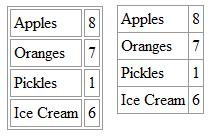
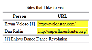
The caption Element
A caption is intended to display a summary of what the table is about and, by default, it appears centered above the table as seen in Figure 3. A caption doesn’t have any special attributes, which makes our styling fairly straightforward.
The caption element appears right after the <table> tag:
<table frame="hsides" rules="groups">

  <caption>Sites that I like to visit</caption>

  …
Figure 3. Default display of the caption element in Firefox
The thead, tbody, and tfoot Elements
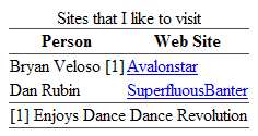
The thead, tbody, and tfoot elements are called row groups. Their function is to group bunches of rows together. A table can have only one thead and one tfoot, but it can have multiple tbody elements. Here’s an example to demonstrate the intended use of these elements:
Example 2. table-example.html (excerpt)
<table frame="hsides" rules="groups">

  <caption>Sites that I like to visit</caption>

  <thead>

    <tr>

      <th scope="col">Person</th>

      <th scope="col">URL</th>

    </tr>

  </thead>

  <tfoot>

    <tr>

      <td colspan="2">[1] Enjoys Dance Dance Revolution</td>

    </tr>

  </tfoot>

  <tbody>

    <tr>

      <td>Bryan Veloso [1]</td>

      <td><a href="http://avalonstar.com/">Avalonstar</a></td>

    </tr>

    <tr>

      <td>Dan Rubin</td>

      <td><a href="http://superfluousbanter.org/">

        SuperfluousBanter</a></td>

    </tr>

  </tbody>

</table>
As you might notice from this example, the footer actually appears before the body. Take a look at Figure 4 to see how it looks in the browser, though, and you’ll notice that the footer is positioned at the end of the table, where it belongs. “What gives?” you ask, quite reasonably. The specification was designed this way to allow a table to be rendered before the entire body of content was received.
Figure 4. tfoot displayed at end of table, despite source order
All row groups support the align and valign attributes. The align attribute adjusts the horizontal alignment whereas valign handles the vertical alignment. Don’t worry too much about these attributes, as we’ll handle them in CSS using the text-align and vertical-align properties.
The tr Element
A tr is a table row. Rows are much like row groups, in that they both support align and valign attributes. Table rows also have the bgcolor attribute that allows a background color to be set. Again, we’ll handle this step in CSS.
The th and td Elements
The th and td elements are the table cells, and hold the data for the table. Table cells have a congregation of attributes, many of which are important not only from a style perspective, but also from an accessibility standpoint.
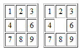
Like the row and row groups, table cells have align and valign attributes, as well as rowspan and colspan attributes. The rowspan attribute indicates how many rows high the cell should be, including the current cell. The colspan is very similar, concerned with – you guessed it – the width of the columns. Check out Figure 5 to see how columns and rows can be spanned.
Figure 5. colspan and rowspan attributes at work
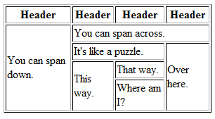
Now here’s the markup that produces this figure:
Example 3. colspan-rowspan.html (excerpt)
<table>

  <thead>

    <tr>

      <th scope="col">Header</th>

      <th scope="col">Header</th>

      <th scope="col">Header</th>

      <th scope="col">Header</th>

    </tr>

  </thead>

     <tbody>

       <tr>

         <td rowspan="6">You can span down.</td>

       </tr>

       <tr>

         <td colspan="3">You can span across.</td>

       </tr>

       <tr>

         <td colspan="2">It's like a puzzle.</td>

         <td rowspan="4">Over here.</td>

       </tr>

       <tr>

         <td rowspan="3">This way.</td>

       </tr>

       <tr>

         <td>That way.</td>

       </tr>

       <tr>

         <td>Where am I?</td>

      </tr>

  </tbody>

</table>
The th element may also contain the axis, headers, scope, and abbr attributes, each of which allow you to create relationships between the various cells. Screenreaders can use some of these attributes to improve a reader’s ability to navigate the table. It’s difficult to target specific elements via the presence of these attributes, due to browser support for some CSS selectors, but I mention them here for the sake of completeness. If you’d like to learn more about these attributes, check out the W3C CSS3 specification.
The col and colgroup Elements
I’ve saved the best for last! col is used to identify a column; colgroup identifies groups of columns. As far as styling is concerned, the greatest benefit of these two elements is that they allow us to style entire columns without resorting to the addition of a class to every cell in the column.
Spanning can be assigned to our colgroup elements and col elements. This assignation doesn’t actually collapse multiple cells into one, as would the rowspan or colspan attributes on a cell. It simply provides a shorthand way of specifying attributes to be applied across multiple columns:
<colgroup>

  <col />

  <col />

</colgroup>

<colgroup>

  <col />

  <col />

  <col />

</colgroup>
This can also be written as follows:
<colgroup span="2" />

<colgroup>

  <col span="2" />

  <col />

</colgroup>
The span attribute on the colgroup indicates that the colgroup spans two columns. The col elements aren’t used when a span attribute is present on a colgroup. If col elements do exist in a colgroup, the span attribute on the colgroup is ignored. The span attribute on the col element also indicates that there are two columns.
The width attribute can be specified using one of the three formats:
- width=”100″— width in pixels
- width=”20%” — width in percentage
- width=”2*” — relative width indicating that the cell should be twice as wide as a regular cell. (This relative sizing doesn’t work in Internet Explorer or Opera, so it’s best avoided.)
Using a percentage or relative width in Internet Explorer expands the overall table to 100%, whereas Firefox, Safari, and Opera collapse to the smallest area required to fill the cells – the expected behavior.
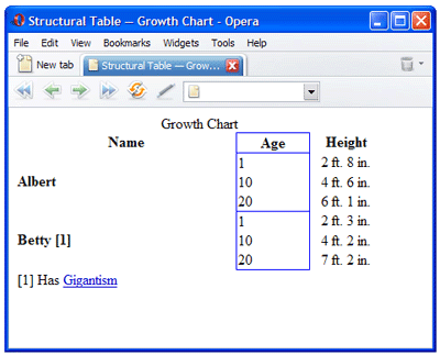
Here’s an example that demonstrates a number of the structural attributes we’ve just covered, including how it is displayed in Firefox (the end result of which you can see in Figure 6):
Example 4. growth-chart.html (excerpt)
<table>

  <caption>Growth Chart</caption>

  <col width="60%">

  <col width="20%">

  <col width="20%">

  <thead>

    <tr>

      <th scope="col">Name</th>

      <th scope="col">Age</th>

      <th scope="col">Height</th>

    </tr>

  </thead>

  <tfoot>

    <tr>

      <td colspan="3">[1] Has <a

  href="http://en.wikipedia.org/wiki/Gigantism">

  Gigantism</a></td>

    </tr>

  </tfoot>

  <tbody>

    <tr>

      <th rowspan="3" align="left">Albert</th>

      <td>1</td>

      <td align="center">2 ft. 8 in.</td>

    </tr>

    <tr>

      <td>10</td>

      <td align="center">4 ft. 6 in.</td>

    </tr>

    <tr>

      <td>20</td>

      <td align="center">6 ft. 1 in.</td>

    </tr>

  </tbody>

  <tbody>

    <tr>

      <th rowspan="3" align="left">Betty [1]</th>

      <td>1</td>

      <td align="center">2 ft. 3 in.</td>

    </tr>

    <tr>

      <td>10</td>

      <td align="center">4 ft. 2 in.</td>

    </tr>

    <tr>

      <td>20</td>

      <td align="center">7 ft. 2 in.</td>

    </tr>

  </tbody>

</table>
Figure 6. Preceding markup as rendered by Firefox
You’ve endured the slow, steep ascent and learned how to create a table; it’s almost time for that roller-coaster ride I promised at the start of the chapter! We’ll plunge into that styling right after we have a look at the CSS properties we need.
The Styling
Before we dive into some practical examples, it’s important to understand which CSS properties we can actually make use of and where we can use them. We’ll look at styles specific to the table element, columns, and captions. After that, we’ll learn how backgrounds are handled. From there on in, it’s all fun – we’ll go through some examples to demonstrate what can be done to bring a little art to the science of tables.
Using the table Element
Several properties are unique to the table element:
- border-collapse
- border-spacing
- empty-cells
The border-collapse property can have a value of either separate or collapse, as demonstrated in Figure 7, below. separate is the default property, but it creates tables that look fairly chunky. Using collapse removes the space between the cells, effectively overriding any cell spacing that may be set in the HTML. This step will make our tables look cleaner, so it’s a good move to start with.
Figure 7. Comparing separate and collapse values of border-collapse property
Issues with Collapsing Borders
Collapsing the border will create issues if you have borders between two cells where each cell has different border styles. A border conflict resolution guide that explains how these conflicts should be resolved is available from the W3C.
When setting the border-spacing property of a table, you can specify either one or two length values. If only one is specified, the value affects the spacing on all sides. If two values are specified, the first specifies the horizontal spacing (left and right of the cell) and the second specifies the vertical spacing (above and below the cell):
table {

  border-spacing: 2px 5px;

}
This example adds two pixels of vertical space and five pixels of horizontal space between each cell.
The color that appears in the space is always that of the table background. Setting the row or cell background will never change the colour between the cells.
Our nemesis Internet Explorer, however, doesn’t support the border-spacing property, even in IE7. The only course of action this situation leaves us with is to use the cellspacing attribute in HTML to achieve the same effect as border-spacing.
The empty-cells property has two values: show and hide, the rendering of which can be seen in Figure 8.
This property determines whether a border will be visible on an empty cell; it can be applied to almost any element within a table, such as specific rows or cells. Once again, however, Internet Explorer doesn’t support the empty-cells property.
Figure 8. Values for empty-cells property – show on left and hide on right
Setting Column Styles
The column group elements (colgroup) are unique in that cells don’t actually inherit anything from them. Therefore, there are only four properties that are applicable to colgroup: border, background, width, and visibility. The use of these properties results in inconsistencies across the browsers, as demonstrated in Figure 9, below – so be prepared!
The border property works well in Firefox and Safari. In Opera, applying border to a col element with a span attribute set on it doesn’t apply the border to each column as it does in Firefox or Safari. In Internet Explorer, the border CSS property doesn’t work at all.
Here’s how we go about setting table borders and border-collapse in CSS:
table {

  width: 400px;

  border-collapse: collapse;

}


#test {

  border: 1px solid blue;

}
… and modifying our HTML to disable the border attribute:
<table border="0">

  <caption>Growth Chart</caption>

  <col width="60%">

  <col width="20%" id="test">

  <col width="20%">

  ...
The border-collapse needs to be set to collapse for the border to show in Firefox and Safari.
Figure 9. Comparison of column border rendering between Firefox and Opera
The background property is fairly consistent across browsers, but it still has its little quirks. A background image, for example, applied to a column group is set as the background to each column in Opera, but is incorrectly applied to each separate cell in Safari and Internet Explorer. There are also layering issues that only Firefox can cope with sufficiently. With any luck, you’ll never run into these layering issues, but I’ll cover these in a little more detail in the section called “Applying Successful Backgrounds”.
The width property works well in all browsers tested. Keep in mind that when applied to a colgroup, the width affects the size of each column contained within that colgroup. For example, if you set a width of 200 pixels on a column group that contains two columns, then each column is 200 pixels, reaching a total of 400 pixels for the column group.
Finally, visibility is included just for completeness, but Firefox is the only browser that currently supports it. visibility can be set to collapse, which prevents the column from being seen.
Formatting Captions
captionelements can be formatted like most other block elements, including properties liketext-alignandfont-weight. There's an additional CSS property that can come in very handy, and that'scaption-side. This property can be set to eithertopor bottom, which will allow the caption to appear either above or below the table respectively. Firefox takes it a step further and supports values ofleftorright. I hate to sound like a broken record, but good ol' Internet Explorer doesn't supportcaption-side.Applying Successful Backgrounds
Since we're talking about backgrounds on columns, let's delve a little deeper into how backgrounds on tables should work. Essentially, different elements act as layers. Any transparency on one level reveals the background of the level below it. Figure 10 shows a W3C diagram that demonstrates the layering of backgrounds on table elements.
Figure 10. The W3C's schema of table layers
However, as you may have noticed with some of the cross-browser issues I mentioned before, most browsers don't handle backgrounds like the specification suggests. Many actually take any backgrounds specified at the column or row level and simply apply them at the cell level. When using patterned backgrounds, this can prove extremely frustrating - any repeating patterns fail to line up. Playing with the opacity at the cell level also reveals how badly Safari, Opera, and Internet Explorer get it wrong. As an example, have a look at Figure 11, which demonstrates a background being applied to a table row. Albert displays correctly in Firefox, but he's in real trouble when displayed in Internet Explorer.
Figure 11.
tdbackground comparison between Firefox and Internet Explorer
Unfortunately, table usage just isn't as popular as it used to be, so we'll most likely be waiting a very long time for this problem to be rectified in the rest of the browsers.
Luckily, the application of a background on the
tableelement does work consistently. The background should tile properly across the entire table and behave exactly as it should. Let's give this application a shot, and see whether Albert can avoid being fragmented when he encounters the rigors of being displayed in Internet Explorer.If our table and columns were of a fixed width, we could actually get around the cell background issues by offsetting the background for each column. It's a tedious task, but it's well worth it, so let's dive in! Here's an example to demonstrate this approach:
Example 5.
background-position.html(excerpt)
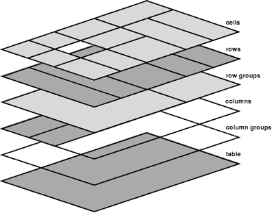
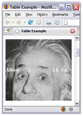
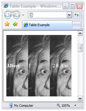
table {

  width: 223px;

}


td {

  background: red url(images/albert.jpg) repeat 0 0;

  height: 200px;

}


td.col1 {

  width: 90px;

}


td.col2 {

  background-position: -90px 0;

  width: 43px;

}


td.col3 {

  background-position: -133px 0;

  width: 90px;

}
Each column after the first is simply shifted over by the width of the previous cells. The first column doesn’t need to be shifted, whereas the second requires shifting over the width of the first column. Finally, the third column background has to be shifted over the total width of the first two columns. Figure 12 shows Albert in Internet Explorer again, but with the background shifted within each cell – he’s much happier.
Figure 12. Resolved Internet Explorer example
Well, that’s all, folks. For the minute, anyway. This understanding of column, caption, and background styles set us up well for that roller-coaster ride – now it’s time for us to look at some practical applications of all the styling we’ve learned!
Table Elements in Action
With all the details out of the way, let’s take a look at some examples of tables – how spiffy can we make them with the careful application of the styling we’ve learned?
Adding Style to Tabular Calendars
Calendars love tables. In fact, the two are a match made in heaven, what with calendars adapting their weeks so well to a series of rows, and their days to columns. Here’s a completely unadorned table:
Figure 13. Unstyled calendar
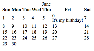
This is an okay and perfectly functional table, except that it’s arguably a bit dull; my need to promote my birthday has thrown out the balance just a smidgen, too. Let’s take a look at the markup and think about what it’ll take to give this table a bit more style andje ne sais qua:
Example 6. calendar.html (excerpt)
<table>
<caption>June</caption>
<col class="weekend" />
<col class="weekday" span="5" />
<col class="weekend" />
<thead>
<tr>
<th>Sun</th>
<th>Mon</th>
<th>Tue</th>
<th>Wed</th>
<th>Thu</th>
<th>Fri</th>
<th>Sat</th>
</tr>
</thead>
<tbody>
<tr>
<td><div class="day">1</div></td>
<td><div class="day">2</div></td>
<td><div class="day">3</div></td>
<td><div class="day">4</div></td>
<td><div class="day">5</div></td>
<td class="birthday"><div class="day">6</div>
<div class="notes">It's my birthday!</div></td>
<td><div class="day">7</div></td>
</tr>
...
</tbody>
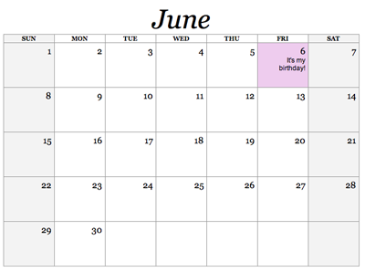
</table>We’ll specifically add a div around each day number. This allows additional items to be added to a day, and leaves us the flexibility of styling the number itself. More general styles, such as holidays, are applied to the table cell – let’s apply an appropriately stand-out style to my birthday!
To make this look more like a calendar, we can set up a number of styles. We’ll style a larger caption , causing the month to stand out more prominently. Each day is given a height and width, allowing room to add notes. The weekend columns have been set up to stand out from weekdays, and we can designate holidays and birthdays as special.
Here’s the CSS for our calendar table:
Example 7. calendar.html (excerpt)
table {

  border: 1px solid #999;

  border-collapse: collapse;

  font-family: Georgia, Times, serif;

}


th {

  border: 1px solid #999;

  font-size: 70%;

  text-transform: uppercase;

}


td {

  border: 1px solid #999;

  height: 5em;

  width: 5em;

  padding: 5px;

  vertical-align: top;

}


caption {

  font-size: 300%;

  font-style: italic;

}


.day {

  text-align: right;

}


.notes {

  font-family: Arial, Helvetica, sans-serif;

  font-size: 80%;

  text-align: right;

  padding-left: 20px;

}

.birthday {

  background-color: #ECE;

}

.weekend {

  background-color: #F3F3F3;

}
Once we’ve combined our modified markup and the style sheet, we get a much more aesthetically pleasing calendar.
Figure 14. Styled calendar
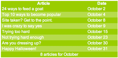
Striping Table Rows
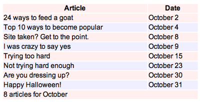
Striping, also known as zebra tables, is useful on large monotonous sets of data as it helps improve the readability. Too much text without delineation can make it difficult to see where one column lines up with another within a particular row.
To achieve striping, we simply add a class to every other row (check out the section called “The Future” at the end of this chapter for an even cooler, although less supported, approach to striping):
...

<tr>

  <td>...</td>

  <td>...</td>

  <td>...</td>

</tr>

<tr class="even">

  <td>...</td>

  <td>...</td>

  <td>...</td>

</tr>

...
Our base styles would be applied to the normal tr and then alternate styles applied to the tr elements that have a class of even:
Example 8. striped.html (excerpt)
tr {

  background-color: #FEE;

}

tr.even {

  background-color: #EEF;

}
In this example, the odd rows will be a light red and the even rows will be a light blue, as shown:
Figure 15. Different background-colors on alternate rows for an easier-to-read table
Another option I often choose when striping my tables is to use a semi-transparent PNG as a background image for the alternate rows, as I’ve done in Figure 16, below. Taking this route allows me to change out the background-color (or background-image) on the table without having to worry about sizing or color matching issues:
Example 9. striped-png.html (excerpt)
tbody tr.odd td {

  background: transparent url(images/tr_bg.png) repeat top left;

}
Figure 16. Striping alternate rows using a semi-transparent PNG
PNG, pronounced “ping,” is an image-format type just like GIF or JPG, but it also supports a graduated transparency. In other words, the background can be made partially visible through parts of the image, like looking through a foggy glass window. Conversely, GIF only supports index transparency where there are no levels of opaqueness – it’s either on or it’s off. JPG doesn’t support transparency at all. Most graphics software, such as Adobe Fireworks, The GIMP, or Adobe Photoshop, will happily export PNGs, so it’s a very useful image format to have up your sleeve.
I normally export a PNG that is just white and is set to a transparency of about 15% to 25% as this provides a semi-transparent overlay that’ll work in the context of almost any color scheme.
As discussed in Chapter 2 of The Art and Science of CSS, Internet Explorer didn’t support PNG background images prior to version 7. Once again, we’ll work around the problem by using Internet Explorer’s proprietary conditional comments:
Example 10. striped-ong.html (excerpt)
<!--[if lt IE 7]>

<style type="text/css" media="screen">

tr.even {

  background: none;

  filter: progid:DXImageTransform.Microsoft.AlphaImageLoader

    (src='images/tr_bg.png', sizingMethod='scale');

  }

</style>

<![endif]-->
“But, hang on a second,” you ask. “Why use a PNG instead of the opacity CSS property?” Well, setting opacity in CSS might seem like the obvious choice for achieving this effect; the trouble is, it applies the opacity to all elements contained within. Therefore, all text and images would also be see-through. Setting opacity on an element requires some additional trickery to make it compatible with Internet Explorer, as well as causing your CSS to be invalid – unless the proprietary filter property is set via IE conditional comments:
td {

  opacity: 0.2;

  filter: alpha(opacity=20);

}
The opacity property is supported in Safari, Firefox, and Opera, and is part of the CSS 3 specification. To accomplish the same result in Internet Explorer, you have to use the proprietary filter property, which lets you specify an alpha filter.
You’ve stuck with me this far into the chapter, so it’s time I let you in on a little secret of mine. One trick I’ve often used is to have an image applied to the table background that eventually fades off to a solid color:
table {

  width: 450px;

  color: #FFF;

  background: #333 url(images/table_bg.png) no-repeat top left;

  border-collapse: collapse;

  border: 8px solid #9C0;

}
This small exercise can give your table some crazy flair while still being an extremely solid cross-browser solution. Using this effect, in combination with the alpha PNGs, can allow you to create some very sexy tables!
The background-image is set on the table, which, as we covered in the section called “Applying Successful Backgrounds”, is reliable across all browsers. The image is specifically designed to fade out at the bottom to a solid color, which you can see below. In the example, we fade to a solid gray.
Figure 17. Combining alpha-PNG row striping with gradient background
So, there it is – I’m sure you’ll agree that a judiciously applied bit of CSS can make the most boring calendar bounce into a layout worthy of a wallplanner, with styling that allows latitude for creativity. Likewise, striping is a simple enough application, but produces a great effect that can be widely used in many table applications to give the most pedestrian content a colorful edge. It doesn’t end there, though.
Using JavaScript
As you’ve seen so far, CSS is fantastic for giving our tables some sexy sizzle. What can really send our tables over the edge is some nice JavaScript!
If you’ve been developing with web standards for some time, you’ve most likely come across the mantra: “separate your presentation from your content.” There’s a third spoke to this web-standards wheel, and that is behavior. Behavior is best handled through unobtrusive JavaScript. Unobtrusive JavaScript is having your scripts reside in an external file (just like a style sheet) that hooks itself into your HTML document.
Using unobtrusive JavaScript keeps your HTML clean and easily accessible, even for those users who don’t have JavaScript or have it turned off. The content itself will still be available and accessible for these users, who are, after all, in the minority; meanwhile, those users who have JavaScript turned on will be able to take advantage of the additional features you’ve enabled.
So, what can JavaScript do to pretty up our tables?
Row and Column Highlighting
A common feature is to add row highlighting support for Internet Explorer 6 (and lower). We can also take it to the next level and add column highlighting for all browsers.
If JavaScript isn’t your thing and the code in this example doesn’t make much sense, that’s okay. If you’re interested in learning JavaScript, I recommend that you grab a copy of the SitePoint book The JavaScript Anthology: 101 Essential Tips, Tricks, & Hacks which is an essential text in this area.
Let’s define a function that will run when the page loads. Thinking about our logic, we want this function to run any time a user moves the mouse over the table. More specifically, when the mouse is over a specific cell, it should change the background for that row and that column.
The first thing we need to do is to grab the table element and pass it into our highlight function.
Example 11. scripts/highlight.js (excerpt)
window.onload = function()

  {

    var tbl = document.getElementById('mytable');

    setHighlight(tbl);

  }
I’ve used window.onload, which is a really quick way to say that this block of code should run when the window has finished loading. Now, let’s see what the setHighlight function looks like.
Example 12. scripts/highlight.js (excerpt)
function setHighlight(table)

  {

    if (!table) return;

    var TDs = table.getElementsByTagName("td");

    for(var i = 0; i<TDs.length; i++) {

      TDs[i].onmouseover = rowColHighlight;

      TDs[i].onmouseout = rowColDelight;

    }

  }
Our highlight function will return to its origin if an element isn’t passed through to the function. If we have an element, it’ll attract all table cells within our table. It loops through them and attaches two events to each one. The rowColHighlight will be responsible for highlighting rows and columns when the user moves a mouse over a cell, and rowColDelight will be responsible for removing the highlight when the user moves the mouse out of a cell.
Example 13. scripts/highlight.js (excerpt)
function rowColHighlight()

  {

    highlighter(this, '#EEE');

  }


  function rowColDelight()

  {

    highlighter(this, '');

  }
Our two functions just call another function but pass in two variables. The first is the element to be highlighted. The this keyword refers to the element that triggered the event – in our case, it’s the cell. The second variable is the color that we want for the highlighter.
The highlighter function is our meat and potatoes:
Example 14. scripts/highlight.js (excerpt)
function highlighter(cell, color)

  {

    cell.parentNode.style.backgroundColor = color;

    var table = getTable(cell);

    var col = table.getElementsByTagName("col");

    col[cell.cellIndex].style.backgroundColor = color;

  }
First, from the cell, we tell it to get the parentNode (the row element surrounding my cells) and change the background-color to the color that was passed in. Then, we tell it to get the table that surrounds the cell. Retrieving the table element can be a little trickier depending on how the HTML is setup so we’ve created another function to handle this. I’ll touch on this again shortly.
Once we have our table element, we grab all the col elements in the table and then grab the one that matches the column in which the cell resides. The cellIndex property is the number of columns up to and including the current cell. Once we have the right column, we assign it a style. This styling should work as long as no background is specified on the other cells, rows, or row groups.
Back to the getTable function that I skipped before:
Example 15. scripts/highlight.js (excerpt)
function getTable(obj)

  {

    while (obj && obj.tagName.toLowerCase() != 'table')

      {

        obj = getTable(obj.parentNode);

      }

      return obj;

    }
This function takes the current element and checks to see whether it’s the table element. If it isn’t, then the function grabs the parent element and checks that. This checking process will continue until the function finds the table element or no element at all. Once the table is found, that table object is returned.
The next figure depicts our highlighting function in action.
Figure 18. Row and column highlighting compatible with most browsers
I should point out that the script makes a number of huge assumptions. To make your code more reliable, you should provide checking mechanisms to account for different scenarios. For example, one of the assumptions we’ve made here is that there would be the same number of col elements as there are cells in a row. This may not be the case if you used colgroup elements or the span attribute on other col elements. If any of those assumptions were incorrect, you’d be bound to see JavaScript errors.
Other Ideas
One of the other common responsibilities often relegated to JavaScript is table sorting. Table sorting is a very handy tool for your users, allowing them to manipulate the table view without requiring slow and repetitive page refreshes from the server. A quick search on Google for “table sorting” will yield a number of scripts, and I’ve used Stuart Langridge’s “sorttable script” with much success.
With the onslaught of Ajax – the ability to connect to and send and receive data from the server via JavaScript – you can even offer spreadsheet-like functionality including live editing. For a great example, check out Active Widgets Grid component. Speaking of things new and cutting-edge, by the way, what about CSS 3? Let’s indulge in some speculation of how this upcoming standard will revolutionize the way we style our tables.
The Future
Styling our table was easy enough, but you might have found some of it redundant, such as applying a class to every second row to create a striped table. Luckily, within the drafts of the new CSS 3 specification lie a number of useful selectors that will simplify our lives considerably.
Browser Support Conundrum
Some browser developers like those behind Firefox and Opera have been pushing ahead and trying to include early support for many of the useful things within the CSS 3 specification. Internet Explorer, however, is behind, surprise, surprise. Unfortunately, this fact means that with IE still being the browser of choice for the majority of web users, widespread adoption of CSS 3 support features is likely to be limited.
Probably the most exciting and most useful selector when it comes to styling tables is the child pseudo-selectors, of which there are a bunch.
The :nth-child(an+b) selector allows you to select every nth element. Essentially, a divides the set of elements and b is the offset. Remember our striped tables? Here’s how you’ll be able to style every second row with a different color:
tbody:nth-child(2n) { ... } /* even rows */

tbody:nth-child(2n+1) { ... } /* odd rows */
Alternatively, you could use the :nth-of-type(an+b) selector to accomplish the same thing:
tr:nth-of-type(2n) { ... }

tr:nth-of-type(2n+1) { ... }
Likewise, if you needed to style every second column with a different color, you could apply the style on every second td element:
tr:nth-child(2n) { ... }

td:nth-of-type(2n) { ... }
By providing a value of 0 for a, the offset allows you to select the nth element. For example, if you wanted to style just the fifth column:
tr:nth-child(0n+5) { ... }

td:nth-of-type(0n+5) { ... }
Both nth-child and nth-of-type are very similar but will give you fantastic control when it comes to styling your tables.
There’s also a glimmer of light at the end of the IE tunnel. Internet Explorer 7, recently released, has support for a number of new selectors, including :first-child and sibling selectors that allow us to mimic nth-child. The sibling selector uses the plus sign (+) to target elements. Therefore, if you wanted to style the second column from the left, such as that shown in Figure 19, below, you’d use the following:
td:first-child + td {

  background-color:#036;

}
Figure 19. Using td:first-child+td to alter background-color
The td:first-child will target the first cell within a row and then the sibling selector (the + sign) targets the element right beside it. If you wanted to target the fourth column you’d use the following:
td:first-child + td + td + td {

  background-color:#036;

}
Imagine a table, with a number of values, where you want the last column to be bolded to indicate that the data is a sum. Using the :last-child selector will do the trick:
td:last-child { ... }Taking advantage of :first-child and :last-child, you could expand on the striped table that we saw earlier to add rounded corners to the first and last cells of both the header and the footer. The border is an image set as the background-image of the first and last cells within each row.
Figure 20. Using CSS 3 selectors to add rounded corners to table
There are plenty more selectors that you can expect to see in the not-too-distant future. Although we’re probably a few years away from being able to use some of these features in all popular browsers, it never hurts to dream. For more information on the CSS 3 selectors, check out the relevant section of the W3C CSS 3 specification.
Summary
I hope you’ve finished this chapter with a newfound respect for tables. With any luck, I’ve shown you a few table elements you weren’t aware of before.
We’ve discovered how to create a perfectly semantic data table that provides lots of hooks for our CSS. We’ve set up a well-structured table and learned to style it effectively. Weâ;€™ve learned that giving a table some style actually makes our table more useful, making it easier to read and understand the data contained within.
We’ve seen how JavaScript can inject a little personality and some additional usability without making things difficult for those users who don’t have JavaScript. Hopefully, you’ve gained some valuable ideas on how to implement JavaScript on tables in new and useful ways.
We’ve seen the future, and it’s bright! We’ve anticipated how the new features of CSS 3 will offer us easy ways to make our tables look good, and now we have the knowledge to use them as they become available.
If you enjoyed this chapter of The Art & Science Of CSS, why not sign up to receive the entire book as a PDF for FREE? This “Twitaway” (Twitter giveaway) will run for 14 days only, so get in quick! Just follow @sitepointdotcom on Twitter, and you’ll receive your free PDF, no strings attached. Grab your copy now!
Frequently Asked Questions about CSS Tables
How can I create a responsive table using CSS?
Creating a responsive table using CSS involves using media queries to adjust the table layout based on the screen size. For smaller screens, you can transform the table into a 2-column layout, where the table headers become the first column, and their corresponding cells the second. This can be achieved using the “display: block” property for table elements and using pseudo-elements to display the headers.
How can I add hover effects to table rows in CSS?
You can add hover effects to table rows using the “:hover” pseudo-class in CSS. This pseudo-class applies styles to an element when the user hovers over it. For example, you can change the background color of a row when it’s hovered over with the following code:tr:hover {
background-color: #f5f5f5;}
How can I style the borders of a table in CSS?
You can style the borders of a table using various CSS properties. The “border” property allows you to set the width, style, and color of the border. The “border-collapse” property can be used to specify whether the table borders should be collapsed into a single border or detached as in standard HTML.
How can I align text in a table cell using CSS?
You can align text in a table cell using the “text-align” property for horizontal alignment and the “vertical-align” property for vertical alignment. The “text-align” property can take values like “left”, “right”, “center”, and “justify”, while the “vertical-align” property can take values like “top”, “middle”, “bottom”, and “baseline”.
How can I add zebra-striping to a table in CSS?
Zebra-striping refers to the practice of alternating the background color of table rows. This can be achieved using the “:nth-child” pseudo-class in CSS. For example, the following code will set a different background color for even and odd rows:tr:nth-child(even) {
background-color: #f2f2f2;}
How can I make a table scrollable using CSS?
You can make a table scrollable by wrapping it in a div and applying the “overflow: auto” property to the div. This will add a scrollbar to the div whenever the table’s width exceeds the div’s width.
How can I style the caption of a table in CSS?
The caption of a table can be styled using the “caption-side” property to position the caption, and other text styling properties like “font-size”, “font-weight”, and “text-align” to style the caption text.
How can I hide a table column using CSS?
You can hide a table column using the “display: none” property in CSS. However, this should be used carefully as it removes the column from the flow of the document, which can affect the layout of the table.
How can I add padding to a table cell in CSS?
You can add padding to a table cell using the “padding” property in CSS. This property sets the space between the cell content and its borders. You can specify the padding for all four sides at once, or individually for each side.
How can I make a table fit the width of its container using CSS?
You can make a table fit the width of its container by setting the “width” property of the table to “100%”. This will make the table as wide as its parent container, while still respecting the container’s padding and border.