If the 2000’s were all about the classic ‘three column layout‘, you could argue that the last five years have been about ‘the rise and rise of the One-Page Site‘.
Squarespace drives the point home by their Cover Pages option that allows site builders to put together a one page site for whatever they need. They’re not the only ones as One Page Love dedicates their site on showcasing the very best in the one page world.
So, what’s the secret sauce that has brought the one-pager to fame?
Today I’d like to share some fundamentals that should help you create simple yet killer designs for your next one-page project.
The Good Bits
The advantages of a one-page website design are certainly significant, and some projects will benefit from those factors more than others:
- Single-focus friendly
- Mobile friendly
- Reduced bandwidth usage (usually)
- Higher conversion rates (often)
- No re-direction
- Able to produce unique designs
The Not-so-good Bits
Yes, like most things, there are some drawbacks that you need to consider before you decide to scale down your site:
- Typically not SEO friendly
- Scroll, scroll, scroll
- Not suited for content-heavy niches
- Difficulties in sharing content
- Harder to discern user behavior and intentions
- You have to focus on one central point
The Fundamentals
When it comes to one-page website design it is best to start with the basics and branch out from there. In fact, it’s a formula that should be applied to any website project you happen to be delving in. Keep in mind this is truly the bare bones and it is up to you to take that extra step to knock your design out of the park.
Simple Means Success
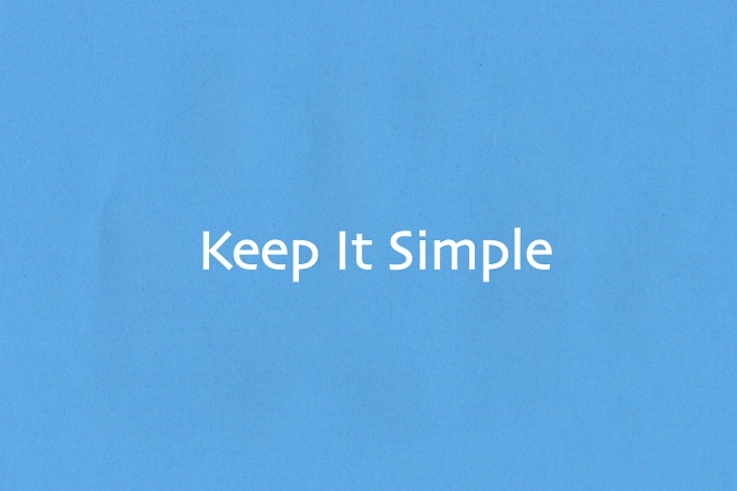
It goes without saying that any website does well to cherish the simpler things, and the one-page design is no exception. The great thing about the one-pager is that reducing the page count almost necessarily limits the project scope, so there is no better time to make sure you are following the KISS method.
As you are working in a confined screen real estate, you need to make sure all your content counts. The art of effective minimalism comes to mind when designing for such a trend. Remember that with one-pagers you are almost always focusing on conveying one idea and one idea alone. There is no reason to introduce a bathroom into the middle of your kitchen (I hope you wouldn’t), so don’t lose sight of your core goal when implementing a one-page design either.
The best way to keep your design simple is to know what you’re designing for first.
- Are you communicating a new idea? (i.e. Kickstarter)
- Are you building a brand?
- Are you marketing a product/service?
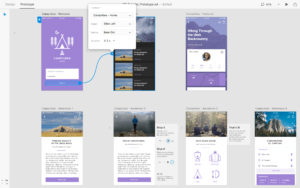
Do your homework and know what you want to say before you design. After that, you can get yourself a wireframe and map out what you want and see if it works long before you actually start working on your site.
Minimize the Mass

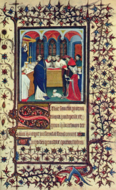
Back the middle ages paper was expensive to produce, so it’s easy to see why artisans would crowd so much content onto each page. In a similar way, when you only have one page, it is tempting to crowd that page like an illuminated manuscript. This is why you need to know how to carefully manage your content – and sometimes make hard calls on what content makes the grade.
White space is always your friend in the designing process to save you from creating a cluster of words and images. Using large breaks, images, colored panels and even visual separators i.e. lines, will keep your visitors from being overwhelmed. Everyone needs a break.
Plan out your content while you’re creating your wireframe. The best practice when it comes to micromanaging is to first create separate “visual pages” and then line each “page” under each other, one after another. This will allow you to break your content up into small chunks and see how your content will flow overall.
Carefully Consider Your Navigation
With the one-page website comes the increased likelihood that you will be dealing with infinite scrolling – which has its own set of pros and cons. But that doesn’t give you have permission to ignore your navigation menu.
It’s true, some one-page sites don’t even bother with a navigation menu, let alone one that follows you as you scroll, but I insist you treat your site visitors better. One popular practice in one-page designs is navigation menus that are linked to particular scrolling subsections of your page. This type of navigation is ideal as it keeps the visitor from scrolling unnecessarily to find what they are looking for.
I’m sure most of us have at some time become lost on a one-pager with inadequate navigation. Make sure your navigation still “sticks” close by and offer a “back to the top” button as well.
Fresh Design Choices

The one-page design is unique in its own little way and even though you are working in one continuous space you need to bring your design guns out to the fight. Because you’re working within a limited space, you can’t afford to just mimic what the next designer is doing.
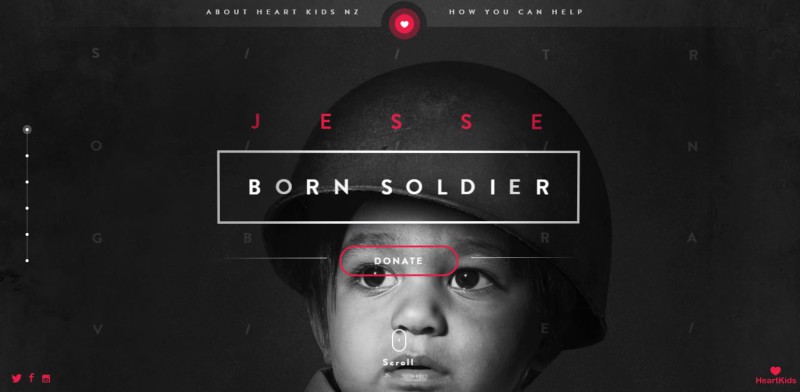
While you should make sure your design is overall simple, don’t feel like you have to stick to one design trend. Create a personalized unique hybrid of patterns, images and colors for better engagement. If you’re working with sections, feel free to bust out the contrast if it will help visitors spot those important bits.
You can also easily create the illusion that there are multiple pages in that one space which can keep visitors interested in your content. Ultimately, the design choices are yours but should be based around the site’s focus.
The Wrap Up
There you go, the basic fundamentals of the one-page website. Like any trend – flairs, hypercolor, the man bun – it was only a matter of time before it was abused, badly executed, or simply selected for the wrong application. I’ve certainly detected a slight kick-back against the one-pager approach in the last 6 months (and the man bun, for that matter).
Remember to get an effective one-page design you need to:
- focus on keeping your design light but make sure it is fun and engaging
- manage your content like it’s your baby and not an unwanted child
- be thoughtful with your navigation decisions to combat prolonged scrolling
- take a step outside of the box to design a unique experience
That’s it! The concept is pretty easy so now it’s your turn to go out there and design the house down.
What do you think about one-page website design? Hate it? Love it? Have any favorites? Let us know by leaving a comment.
 Gabrielle Gosha
Gabrielle is a creative type who specializes in graphic design, animation and photography.