


When designing an email — be it an e-newsletter, promotion, transactional email or announcement — there are a few standard rules to follow. Although a graphic email message may look and feel just like a standard web page, where and how it will be viewed is anything but standardized.
Aside from having to contend with the suite of standard web browsers (Chrome, Firefox, Safari, IE) and their idiosyncrasies, you also have to satisfy the requirements imposed by a slew of email clients and mobile apps, which don’t always render your messages the way your design intended them to.
Although constraints are a challenge, when trying to design something compelling, sticking to these best practices will ensure that your emails render beautifully across all clients and on mobile devices.
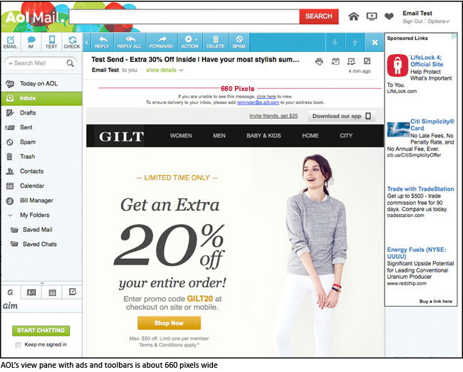
Rule #1. Design on a Width of 600 pixels
Emails are viewed in a variety of clients, and many different factors — advertisements, menus, and toolbars, just to name a few—can impact upon and minimize the view pane of the message.
The standard width for most emails is around 550-600 pixels, although the trend toward wider emails is increasing—and scalability, even on mobile devices, has improved with time. In short, if your design has to be wider than the 600 pixels, keep it under 700 pixels to be on the safe side.
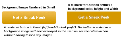
Rule #2. Use Background Images Sparingly
Since version 2007, Outlook has provided zero background image support. When using layered images in your design, be sure they can degrade gracefully. Always use a solid background color as a fallback for Outlook and make sure no crucial information or imagery exists solely in a background image.
Rule #3. Stick with System Fonts
Web fonts are not widely supported in email, so in most cases you’ll need a fallback. To circumvent the general lack of support available for handling these issues, stick with web-safe fonts like Arial, Helvetica, Tahoma, Times Roman, and Georgia.
Rule #4. Strive for a Good Balance of Text-to-Image Ratio
At first, it might seem that the best way to preserve the design of an email is to throw it all in an image tag or slice it up into lots of images. Then there’s no need to worry about being limited to ugly system fonts or stripping of the background images, right?
Not quite. An image-heavy email will increase the chances of your email client flagging it as spam, resulting in damage to your sender reputation.
As a general rule, the best way to avoid ending up in the dreaded Spam folder is to make sure that your emails reflect a balanced image to text ratio.
Most email clients block images by default. With this in mind, incorporate text that summarizes the main point of your message: the offer, the announcement, the transaction taking place, the action for the consumer to take, etc. Some text — especially the main call to action — should be viewable upon opening the email, even if the images are shut off.

Rule #5. Consider a Mobile-First Design
It’s true, CSS support in email has come a long way, and we can now incorporate some media queries to allow for responsive layouts — but by no means can we expect all clients and devices to support this yet.
It’s still wise to begin with a mobile-first design for optimal viewing across all platforms. Use single-column layouts, larger fonts, and clear and concise messaging and calls-to-action as much as possible.
Multi-column layouts don’t have to be off-limits for mobile, but keep them to a minimum as needed—and try to avoid going above a three-column layout.
After considering all the factors listed here, and updating your design to fit within these constraints, always remember to test your emails thoroughly on all devices and clients. Rendering tools like Campaign Monitor, Litmus and Returnpath offer a full display of the rendered image in different clients and platforms, and can really save you time and anguish.
Frequently Asked Questions (FAQs) about Best Practice Email Design
What are the key elements of a successful email design?
A successful email design incorporates several key elements. Firstly, it should have a clear and compelling subject line to grab the reader’s attention. Secondly, the email should be visually appealing with a clean layout, easy-to-read fonts, and relevant images. Thirdly, the content should be concise, engaging, and provide value to the reader. Lastly, a strong call-to-action is crucial to guide the reader on what to do next.
How can I make my email design mobile-friendly?
To make your email design mobile-friendly, ensure that it is responsive. This means that the email layout and content should automatically adjust to fit the screen size of the device it’s being viewed on. Use a single column layout, larger fonts, and touch-friendly buttons. Also, keep your email content concise as mobile users typically scan content.
What is the importance of personalization in email design?
Personalization in email design helps to make your emails more relevant and engaging to the recipient. This can be achieved by using the recipient’s name in the email, tailoring the content based on their preferences or past behavior, and sending the email at a time when they are most likely to read it.
How can I use images effectively in my email design?
Images can greatly enhance your email design by breaking up text and making the email more visually appealing. However, it’s important to use images sparingly and ensure they are relevant to your content. Also, always include alt text for images as some email clients may not display images by default.
What are some common mistakes to avoid in email design?
Some common mistakes to avoid in email design include using too many different fonts and colors, overloading the email with too much information, not including a clear call-to-action, and not testing the email on different devices and email clients before sending it.
How can I measure the success of my email design?
The success of your email design can be measured through various metrics such as open rate, click-through rate, conversion rate, and bounce rate. These metrics can provide valuable insights into how your emails are performing and where improvements can be made.
What is the role of a call-to-action in email design?
A call-to-action (CTA) in email design is a prompt that tells the reader what action they should take next. This could be to visit a website, make a purchase, sign up for a newsletter, etc. A strong CTA is clear, compelling, and easy to find within the email.
How can I ensure my email design is accessible to all users?
To ensure your email design is accessible, use a readable font size, high contrast colors, and clear headings. Also, include alt text for images and use a logical content structure that can be easily navigated with a screen reader.
How can I use email design to build brand consistency?
Email design can be used to build brand consistency by incorporating your brand’s logo, colors, fonts, and tone of voice into your emails. This helps to make your emails instantly recognizable to your subscribers and builds trust in your brand.
What is the importance of testing in email design?
Testing is crucial in email design to ensure that your emails look and function as intended across different devices and email clients. This can help to identify and fix any issues before the email is sent, ensuring a positive experience for all recipients.