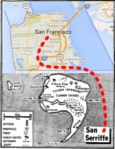
April 1977 must have been a confusing time for travel agents in London.
Suddenly hundreds of people were trying to book trips to the beautiful islands of San Serriffe deep in the Indian Ocean.
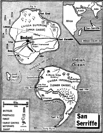
It turned out that the Guardian newspaper had just published a 7-page special report on San Serriffe. They noted the bustling docks at Port Clarendon, praised the golden beaches of Gill Sands and highlighted the important work taking place at the University of Perpetua.
The problem was San Seriffe didn’t exist. It was nothing more than a prank — although arguably one of the most elaborate and successful April Fools’ Day pranks ever.
Conceived by Guardian Features Manager Philip Davies and Features Editor Stuart St Clair Legge, it paid homage to many type-inspired destinations including the capital Bodoni, the remote Thirty Point, and the lapping waves of Garamondo.
Even advertisers including Kodak and Texaco gleefully joined in on the gag. In fact, what was to have been a single page had to be extended to accommodate advertiser demand.
Unfortunately the task of convincing grumpy englishmen that there were no available flights to San Serriffe proved more difficult than travel agents might have hoped.
Places & Faces
Places have often provided inspiration to type designers. Microsoft has used Matthew Carter’s Georgia — named for the US state, rather than the country — prominently for many years.
In the 1980’s, all Macs shipped with Susan Kare‘s New York, Los Angeles, Venice, Monaco, Geneva, Toronto and Chicago.
In fact, Kare originally named the fonts for more modest places — stations on her local train commute including Overbrook, Merion, and Ardmore. But Steve Jobs believed the fonts deserved to be named after ‘world-class’ cities, rather than “little cities that nobody’s ever heard of,”
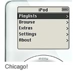
Chicago was a particularly much-loved font, becoming the ‘the OS face of Apple’ for more than a decade from 1984. It even returned briefly in 2001 for the earliest iPod screens.

‘San Francisco’ circa 1984
Kare also contributed a less fondly remembered font for the Mac that had a ‘birthday party meets ransom note’ feel to it.
It was called ‘San Francisco‘ — but, like Huey Lewis, never really made it out of the 80’s.
A Return Ticket for San Francisco
This week Apple released a new font called San Francisco. This new one took no obvious inspiration from its ancestor — probably a good thing.
San Francisco 2014 is a crisp, sensible sans-serif typeface.
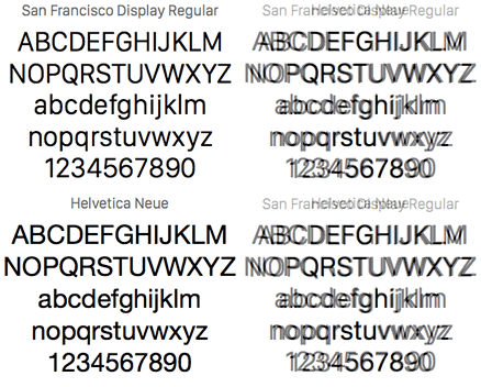
The rounded letters (eg. o, c, e, etc) are slightly flattened at the sides, creating more space between characters, and giving it a lighter, airier feeling than an equivalent such as Helvetica Neue (compare right).
San Francisco works very nicely as a system font, but has been specifically designed with the Apple Watch in mind, so it maintains excellent clarity at small sizes.
This is a well-designed, very polished TrueType font that should work well anywhere, regardless of OS.
Grab a copy of the new San Francisco Font here.
Republished from the SitePoint Design Newsletter
 Alex Walker
Alex has been doing cruel and unusual things to CSS since 2001. He is the lead front-end design and dev for SitePoint and one-time SitePoint's Design and UX editor with over 150+ newsletter written. Co-author of The Principles of Beautiful Web Design. Now Alex is involved in the planning, development, production, and marketing of a huge range of printed and online products and references. He has designed over 60+ of SitePoint's book covers.
