Though the first half of 2014 has come and gone, it leaves a handful of new design trends which will likely come to characterize the year as a whole. Amongst these 2014 signatures styles, the rise of the so-called ‘Ghost Button’ is one that caught my eye.
So, exactly what is a ‘Ghost Button’?
‘Ghost buttons’ are those transparent and empty buttons that have a basic shape form, such as a rectangular or perhaps squared. They are generally bordered by a very thin line, while the internal section consists of plain text printed in a light, sans-serif font.
These buttons, are also sometimes referred to as “empty” of “hollow” buttons, and tend to be bigger than standard colored buttons.
The attribute ‘ghost’ is due to the fact that, although they’re transparent as phantoms, they immediately grab the users’ gaze — almost in the way a ghost story can transfix your gaze.
Indeed a beautiful hollow button performs the neat magic trick of both merging itself seamlessly within a site, but, if set in a proper background and position, it can very successfully attract the users’ eyes.
Although you may find ghost buttons on a wide variety of websites, they aren’t appropriate for all sites. They are best suited to websites and applications, that have a minimalist or flat user interface or those which use large-scale photo background.
Origins of the Ghost
Though it is difficult to identify a single origin for ghost buttons, it’s possible to discern a handful of important seeds.
The term ‘ghost button’ seems to have been coined by a Tumblr blog (websiteswithghostbuttons.tumblr.com), which started documenting examples earlier this year.
The HUD
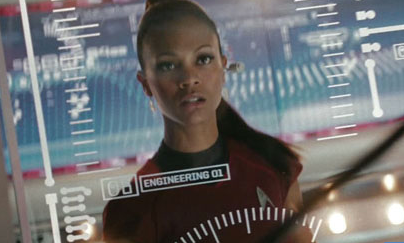
Head-Up Displays ( HUDs) have been used in military aircraft since the late 1960’s, but only really entered the popular culture in recent years via car dashboards, movies and video games.
As HUD data is projected on top your viewport, this data needs to be presented in a mostly transparent, lightweight style so as not to obscure the viewport. Although not strictly buttons, you’ll often find HUD interface elements are clear, text-based units enclosed by thin borders.

Hollywood FX teams seem to love a ‘ghosty’ UI. High profile examples has been seen in the visualizations created for Ironman’s HUD, Ender’s Game and the recent Star Trek reboot. I suspect all of these provided early inspirations for the current ghost button web trend.
IOS
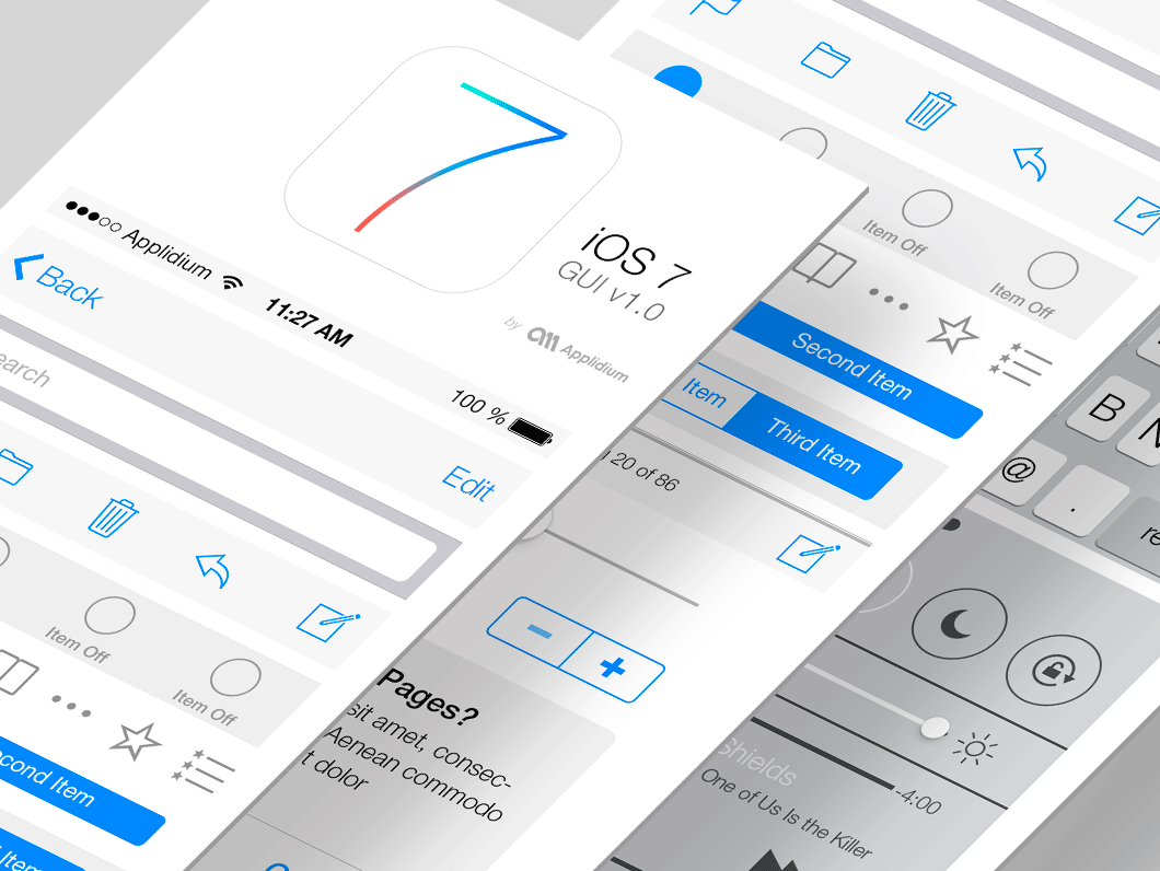
The arrival of the Apple’s iOS 7 contributed to the adoption of the empty buttons. Although not universally loved from the outset, the iOS user interface is choc-full of minimal buttons and icons, each delimited by very thin lines of grey or blue.
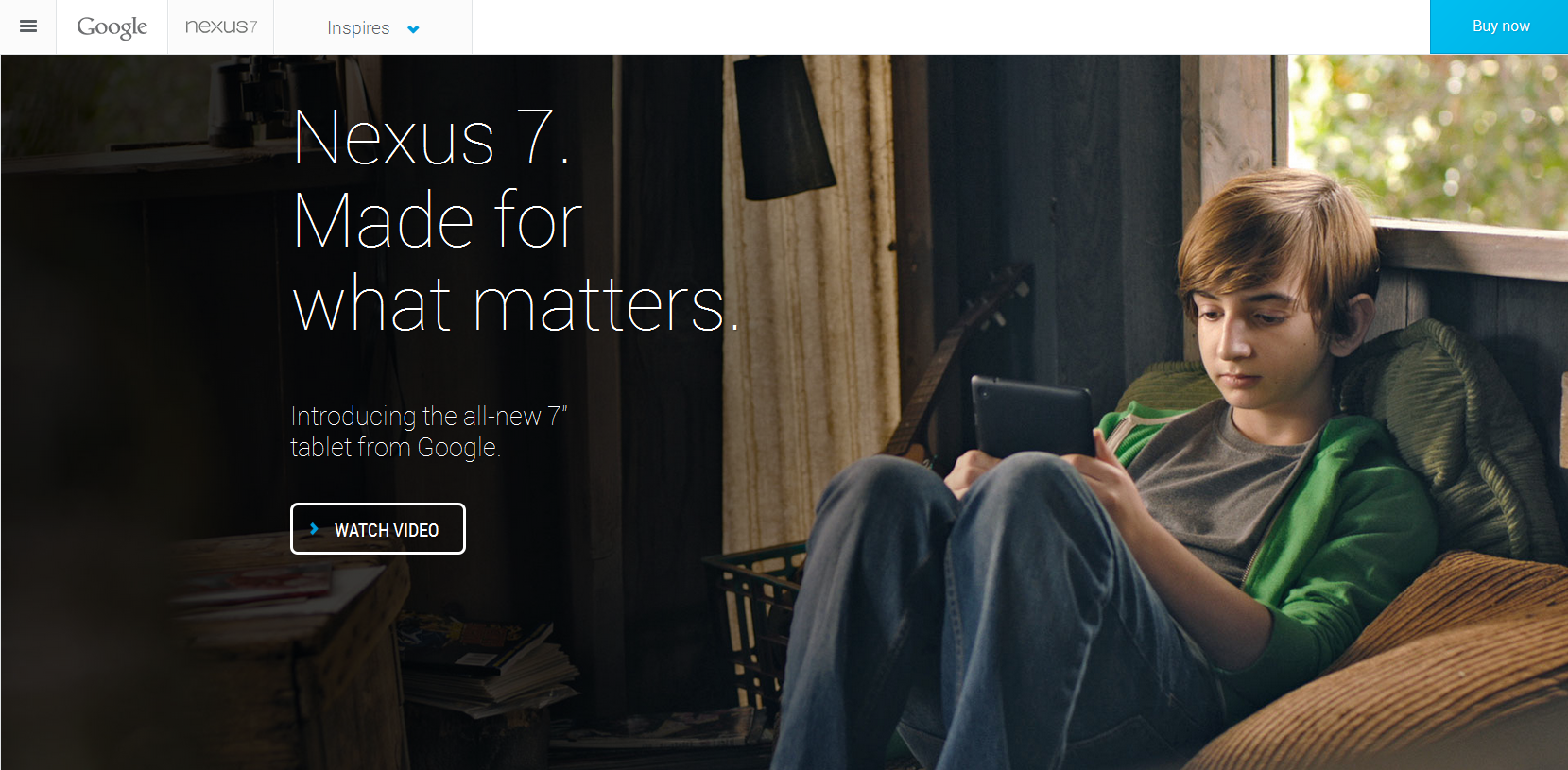
Later, Google also tapped into the ghost zeitgeist and from 2013 began using them in their Nexus 7 website. In the image, you can see that they opted for a transparent button identified by a white line which is deeply in contrast with the background.
Bootstrap
Bootstrap was another important contributor to the trend. In August 2013, Bootstrap 3 was released and on its homepage a prototype of ghost button was used. Though not strictly transparent, it came with a monochromatic background and with very plain traits.
Since Bootstrap was recognized as an easy and fast way to develop a website, many people started using it and, as a consequence, more and more sites were created with a propensity towards flat design and minimal buttons.
Bootstrap’s naturally simple, one colour backgrounds left plenty of breathing space for the more striking transparency of the now famous ghost buttons.
Pros
Let’s now have a look at some of the positive aspects that the ghost buttons can bring to your design experience.
- Ghost buttons are easy to create with Illustrator, Photoshop or with any other graphic software.
- Even though they aren’t difficult to create, they don’t necessarily look trivial or unsubstantial on the page. In fact, they can often give an elegant, finished look to a design.
- Ghost buttons are so subtle and linear that they almost seem to give an idea of freedom. Their use will certainly contribute to lightening the visual weight of your design while evoking a sense of order.
- As ghost buttons are mostly empty space, they will integrate easily with many other basic design elements and styles you might choose.
- Ghost buttons are a hot 2014 trend, so they’ll certainly give your site a very current feel.
However, ghost buttons do have some negative points that you should take into consideration when integrating them with your website up.
Cons
- While we noted that ghost buttons are very popular right now, they aren’t a magic design bullet. Using them can put you in danger of disappearing into the crowd. You’ll need to carefully consider how to use them in order to stand out.
- These buttons do break from the most established web design concept of ‘button’ – or even real world buttons for that matter Sometimes just spotting a ghost one can be difficult, particularly if it hasn’t been placed wisely.
- The transparency of ghost buttons can lead to problems of legibility. Photographic backgrounds and bad color choices can combine for bad results. We’ll see an example of this issue in the last section of the article.
The Gallery of Ghosts
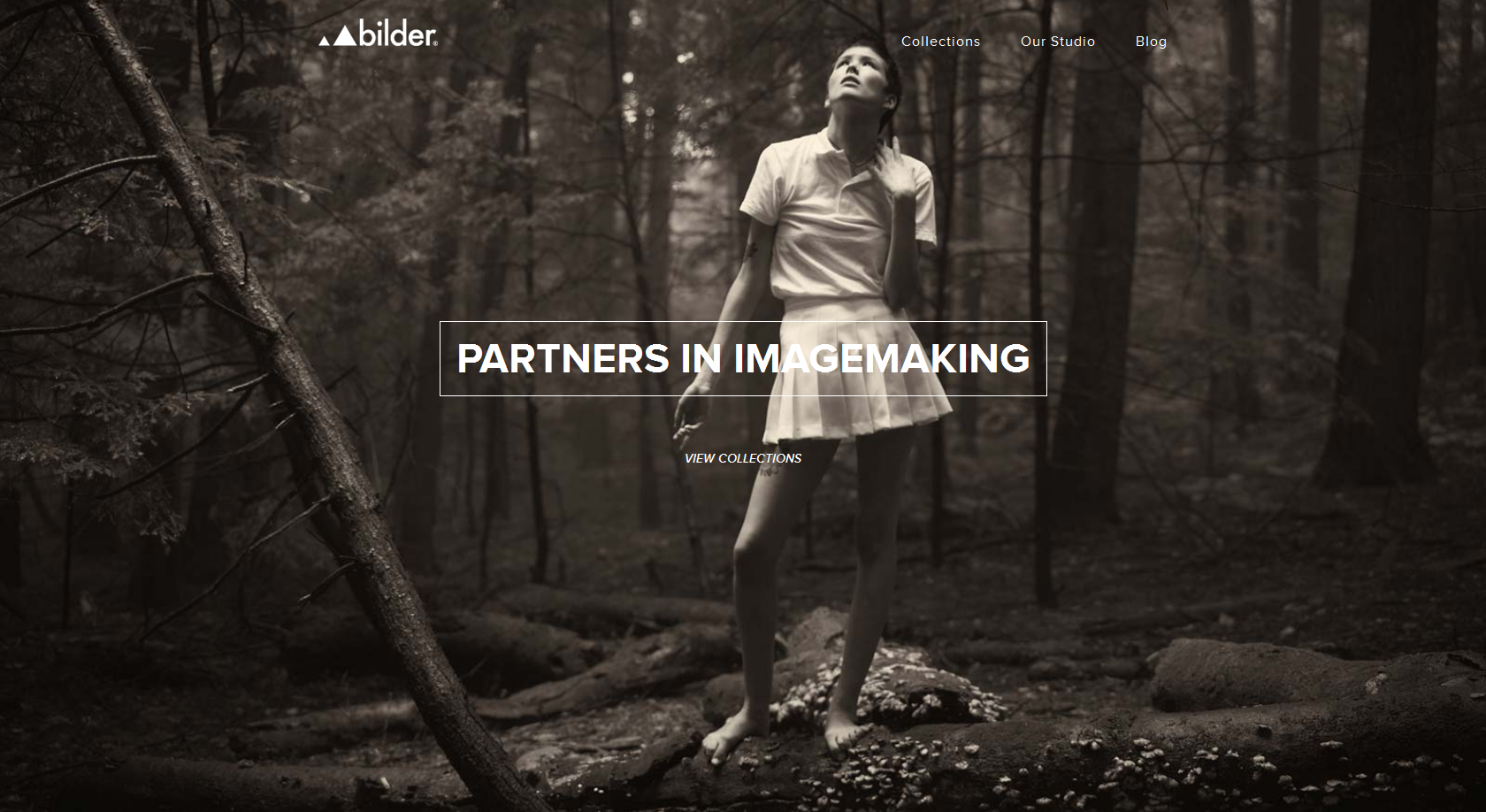
The first example is by bilderphoto.com, a website which uses a full screen photo as background.
The button is central to the goals of the site, inviting us to click in order to discover more about the company. It is nevertheless, I believe, not well placed. Indeed, since the colour chosen for the button is white, the word ‘imagemaking’ is not completely in contrast with the light dress of the girl. As such, the readability is significantly affected.
On the positive side, refreshing the page will get you different background images without this problem.
The next website is from UnionRoom, a web design and development company.
Rather than simply setting an image as background but they use a halftone video. All the services they offer are expressed through a flat and animated user interface. If you want more detail on what they do, you can click on the white ghost button.
Unlike the previous example, this one stands out clearly from the background which tends to a darker tonality. This button follows all the main feature of a good empty button because it can be spotted without efforts and, at the same time, it’s not an extraneous part from the rest of the website.
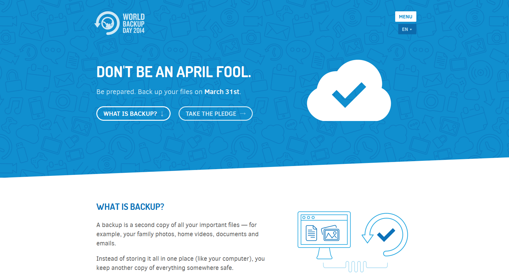
The last example regards a website that has a flat designed user interface. We are speaking of worldbackupday.com.
This site, which reminds us to backup our files, is based on the contrast between light-blue a white. You’ll notice the presence of two ghost buttons which are elliptical.
They are also clearly recognizable as buttons and they can’t be confused with the background. The guys who worked on this project did a good job.
So, is this a style you’ve been using?
Seen any examples you really like?
 Simone Sala
Simone is a graphic designer who loves technology, design and who is always looking for new trends and innovative concepts. He also likes to give tips and to share his knowledge with other tech-lovers.
