Penguin books have long been renowned for their unique book cover designs. I loved the covers when I was child and years later, now as a designer, I have more of an appreciation of the genius that is the grid layout on many of the Penguin book covers, In 1946 German typographer Jan Tschichold was appointed head of design and devised rigorous design templates for all Penguin’s books and also accepted illustrated covers for some books.
These templates were used for years on Penguin book covers.
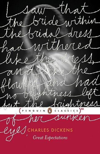
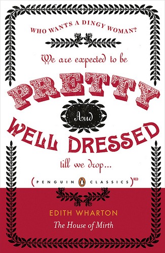
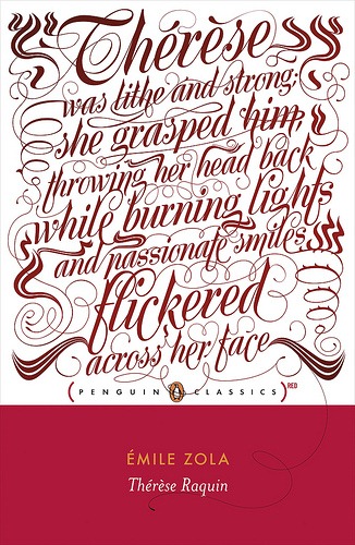
In recent times, Penguin has collaborated RED, the AIDS awareness fund and a new team of designers to produce eight new covers for Penguin Classics. The new covers feature a large red band at the bottom along with the familiar Penguin logo centered between the words “Penguin Classics”. Above the red band each book has a quote from the book in a unique typographic style. On some of the books the typography spills over the logo onto the red band. Three of the original eight re-designs were created in-house by Penguin designers Jim Stoddart, Coralie Bickford-Smith and Stefanie Posavec, with each of the remaining covers were designed by five different designers or studios.
Here’s the first eight covers:
Anna Karenina designed by Fuel
Dracula designed by Non Format
Great Expectations designed by Stefanie Posavec
House Of Mirth designed by Nathan Burton
Notes From The Underground designed by Gray318
Therese Raquin designed by Jim Stoddart
The Secret Agent designed by Coralie Bickford-Smith
The Turn Of The Screw designed By Studio Frith
The next book to be re-issued under the Penguin Classics RED banner is Wuthering Heights which was chosen by Penguin Readers, no previews yet. You can read more about the philosophy behind the RED and Penguin collaboration here.
What do you think about the new designs?
Jennifer Farley is a designer, illustrator and design instructor based in Ireland. She writes about design and illustration on her blog at Laughing Lion Design.
