This tutorial shows how to create a product website using React and Tailwind CSS. We’ll cover how to set up React with Tailwind CSS using Create React App Configuration Override (CRACO); Tailwind’s CSS utility classes and variants and how to use them; how to easily make the website dark mode compatible; what groups are; and how to enable variants.
You can view a demo of the website we’re creating here, and you can find the code for this repository on this GitHub repository.
Key Takeaways
- Utilize Create React App and CRACO to set up React with Tailwind CSS efficiently, avoiding complexities of manual configuration.
- Leverage Tailwind CSS utility classes and variants to style components easily without writing extensive custom CSS.
- Implement dark mode with simple configuration changes in Tailwind CSS to adapt to user’s OS preferences.
- Explore the power of utility classes for responsive design and pseudo-classes, making styling more dynamic and flexible.
- Customize Tailwind’s theme to fit branding needs by modifying colors, fonts, and other elements directly in the config file.
- Use Tailwind CSS plugins and extend functionality to include additional styles, utilities, and custom components.
- Enable specific Tailwind CSS variants for hover states and responsive adjustments, enhancing interactive and responsive aspects of the website.
Prerequisites
Before we start, you need to have Node.js and npm installed. If you have Node.js installed, then you’ll have npm installed.
To check if Node is installed, run the following in the command line:
node -v
You should be able to see the version. Do the same for npm:
npm -v
It should be noted that Tailwind CSS requires Node.js version 12.13.0 or higher.
If you get an error for either, then you have to install Node. You can follow the installation instructions on the Node website, or you can follow along with our article “Installing Multiple Versions of Node.js Using nvm”.
Setting Up React and Tailwind CSS
Note: if you’re unfamiliar with Create React App, check out “Create React App: Get React Projects Ready Fast” first.
First, create a React project with create-react-app:
npx create-react-app react-shop
Then, change directory to the created project:
cd react-shop
Next, we’ll install the dependencies required for Tailwind CSS:
npm install -D tailwindcss@npm:@tailwindcss/postcss7-compat postcss@^7 autoprefixer@^9
We’re installing Tailwind CSS with the PostCSS 7 compatibility build, as Create React App (or CRA) does not support PostCSS 8 at the time of writing this article. We’re also installing autoprefixer, as it’s required for Tailwind CSS after version 2.0.
Setting Up CRACO
Usually, to configure CRA you need to run react-scripts eject or npm run eject with the default scripts of CRA. However, this is very inconvenient, as it will eject all the configurations that are hidden in CRA (like webpack configurations, Babel configurations, PostCSS configurations, and much more) into your project, and editing it can become a hassle or produce issues that CRA will no longer be able to support.
This is where Create React App Configuration Override (or CRACO) comes in. CRACO is a library that adds a simple configuration layer to CRA. Instead of ejecting all the configurations inside CRA into your project — for example, just to add some configuration to Webpack — all new configurations or changes to the original configuration will be put in a new file craco.config.js. CRACO allows you to configure CRA to get the best out of it without the hassle.
We need CRACO here to override PostCSS configurations and add the tailwindcss plugin. So, let’s first install it:
npm install @craco/craco
When using CRA, the scripts in package.json look like this:
"scripts": {
  "start": "react-scripts start",
  "build": "react-scripts build",
  "test": "react-scripts test",
  "eject": "react-scripts eject"
}
As we’re using CRACO to do what we can’t do with CRA by default, we need to change the scripts to use CRACO for building the project or running it in development:
"scripts": {
  "start": "craco start",
  "build": "craco build",
  "test": "craco test",
  "eject": "react-scripts eject"
},
We’ve replaced react-scripts with craco in the start, build and test scripts. We haven’t make any changes to the eject script.
Next, create the CRACO configuration file craco.config.js in the root of the project:
module.exports = {
  style: {
    postcss: {
      plugins: [
        require('tailwindcss'),
        require('autoprefixer'),
      ],
    },
  },
}
This configuration file adds the tailwindcss and autoprefixer plugins to postcss.
Now we’ll generate the configuration file for Tailwind CSS:
npx tailwindcss init
Note: if you’re using Node.js v14, there’s a reported issue about an error thrown while running this command that says “Cannot find module ‘autoprefixer'”. Updating to Node.js v15 should work, but if you’re unable to do that, please follow one of the workarounds here.
This will create the file tailwind.config.js in the root of the project. It will have the following content:
module.exports = {
  purge: [],
  darkMode: false, // or 'media' or 'class'
  theme: {
    extend: {},
  },
  variants: {
    extend: {},
  },
  plugins: [],
}
Here’s what each of the configuration keys means:
purge: this is used to specify the files Tailwind CSS should scan and see which Tailwind CSS classes are being used, so that it can remove all unused styles and classes in production.darkMode: this specifies the behavior of dark mode in your project. The value can bemedia— meaning that the dark mode styling will be applied based on the dark mode media query, which depends on the default mode for the user’s OS. It can also beclass, which means that the dark mode styling will be applied when a parent element in the HTML document has thedarkclass.theme: this can be used to modify the color palette of the theme, fonts, breakpoints, and more. We’ll see how to make changes to the theme later in the tutorial.variants: this allows you to apply additional variants to the core plugins of Tailwind CSS. We’ll see how it works later on in the tutorial.plugins: a section to add plugins that can add extra utility classes, custom variants, base styles or more.
For now, we’ll just make two changes. First, we’ll change the purge key:
purge: ["./src/**/*.{js,jsx,ts,tsx}", "./public/index.html"],
This tells Tailwind CSS to look through all js, jsx, ts and tsx files in the src directory, and the public/index.html file to figure out which classes will be used from Tailwind CSS and remove any unused classes.
The second change will be for dark mode:
darkMode: "media", // or false or 'class'
For the sake of simplicity in this tutorial, we’ll keep dark mode just based on the user’s OS preference.
The final step in setting up our React project with Tailwind CSS is to include some of the Tailwind CSS styles in src/index.css. Replace the contents of this file with the following:
@tailwind base;
@tailwind components;
@tailwind utilities;
The @tailwind directive basically imports the styles into index.css. And by default, CRA imports src/index.css in src/index.js:
import './index.css';
This means that Tailwind CSS styles will be applied in our React project, and we’re ready to start building a beautiful website!
Understanding Tailwind CSS Utilities and Variants
Before getting into the coding, let’s understand what Tailwind CSS utility classes and variants are. Tailwind CSS is designed to make styling components easier and help you focus on making reusable components. Utility classes are a wide range of classes that allow you to style your component in any way you can think of without writing any CSS.
For example, to style a <div> element with a border, change font size, change background and text color, you’ll need to write something like this with CSS:
div {
  border: 1px solid #f00;
  font-size: 15px;
  background-color: #ff007f;
  color: #fff;
}
Using Tailwind CSS, you can do it just using the utility classes:
<div class="border border-red-100 text-lg bg-red-400 text-white">
</div>
Here’s what each class means in this example:
border: sets border width to 1pxborder-red-100: sets border color to a shade of red (based on the theme)text-lg: gives font size1.125remand line height1.75rembg-red-400: sets background color to a shade of red (based on the theme)text-white: sets text color to white
There are many other classes you can use, with many different shades of colors as well, which makes theming easier. Using the utility classes, you rarely need to actually write any CSS at all.
Okay, but what about media queries? What about psuedo classes? What about dark mode? Can these be done without having to write any CSS yourself?
That’s when variants come in. Variants allow you to add styling to elements based on device breakpoints, states of elements, or whether dark mode is enabled or not.
So, previously you might have done this to change the width of an element based on the size of the device:
div {
  width: 50%;
}

@media screen and (max-width: 1024px) and (min-width: 768px) {
  div {
    width: 80%;
  }
}

@media screen and (max-width: 767px){
  div {
    width: 100%
  }
}
With Tailwind CSS, it can be simply done as this:
<div class="w-full md:w-3/4 lg:w-1/2">
</div>
This applies the w-1/2 class (which means width: 50%) when min-width: 1025px applies to the current screen width, applies w-3/4 class (which means width: 80%) when min-width: 768px applies to the current screen width, and applies w-full class (which means width: 100%;) when the other variants don’t apply anymore.
This definitely makes the tedious work you have to do in every project easier and faster. At first, it might look confusing, but when you start dabbling in it more you’ll realize how it becomes second nature to use the utility classes and variants.
You can read more about configuring Tailwind in the project’s official documentation.
Implementing Our Components
Back to our website. We’re creating a simple website that will display products in a neat design. For simplicity, we’ll be using fake data from Fake Store API. Instead of actually performing the requests to the API, we’ll take a sample JSON response and place it in a JSON file in our project. Again, this is just for the simplicity of the tutorial.
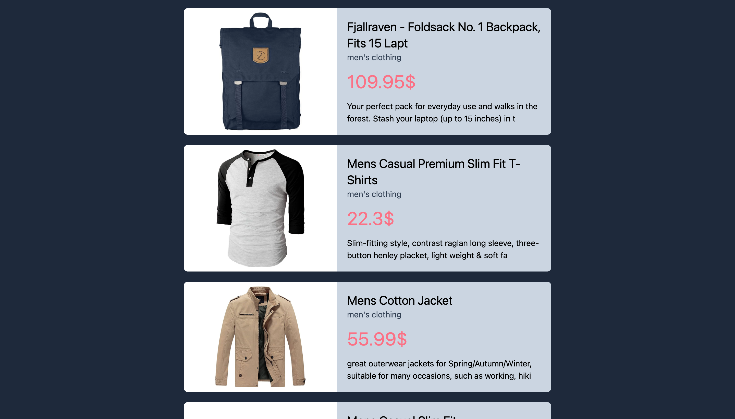
Go to the products endpoint and copy the response. Then, create the file src/data/products.json and paste the response in it. It should be an array of objects similar to this:
{
  "id": 1,
  "title": "Fjallraven - Foldsack No. 1 Backpack, Fits 15 Laptops",
  "price": 109.95,
  "description": "Your perfect pack for everyday use and walks in the forest. Stash your laptop (up to 15 inches) in the padded sleeve, your everyday",
  "category": "men's clothing",
  "image": "https://fakestoreapi.com/img/81fPKd-2AYL._AC_SL1500_.jpg"
}
Let’s start with implementing the Product component. This component will be a card component that shows information about the product. Create src/components/Product.js with the following content:
function Product ({product: {title, price, description, category, image}}) { return ( <div> <div style={{backgroundImage: `url(${image})`}}></div> <div> <h1>{title.substr(0, 50)}</h1> <h3>{category}</h3> <p>{price}lt;/p>
<div>{description.substr(0, 100)}</div>
</div>
</div>
);
}
export default Product;
As you can see, the
Productcomponent just shows the product details. We haven't added any classes for styling at the moment.Next, go to
src/App.jsand change the content to the following:import "./App.css"; import Product from "./components/Product"; import products from "./data/products.json"; function App() { return ( <div> <div> {products.map((product) => ( <Product product={product} key={product.id} /> ))} </div> </div> ); } export default App;Here, we're importing the
products.jsonfile asproducts. Then, we're looping overproductsand displaying each product using theProductcomponent we created earlier. Again, notice we haven't added any classes for styling.Let's start the server now. Run the following command:
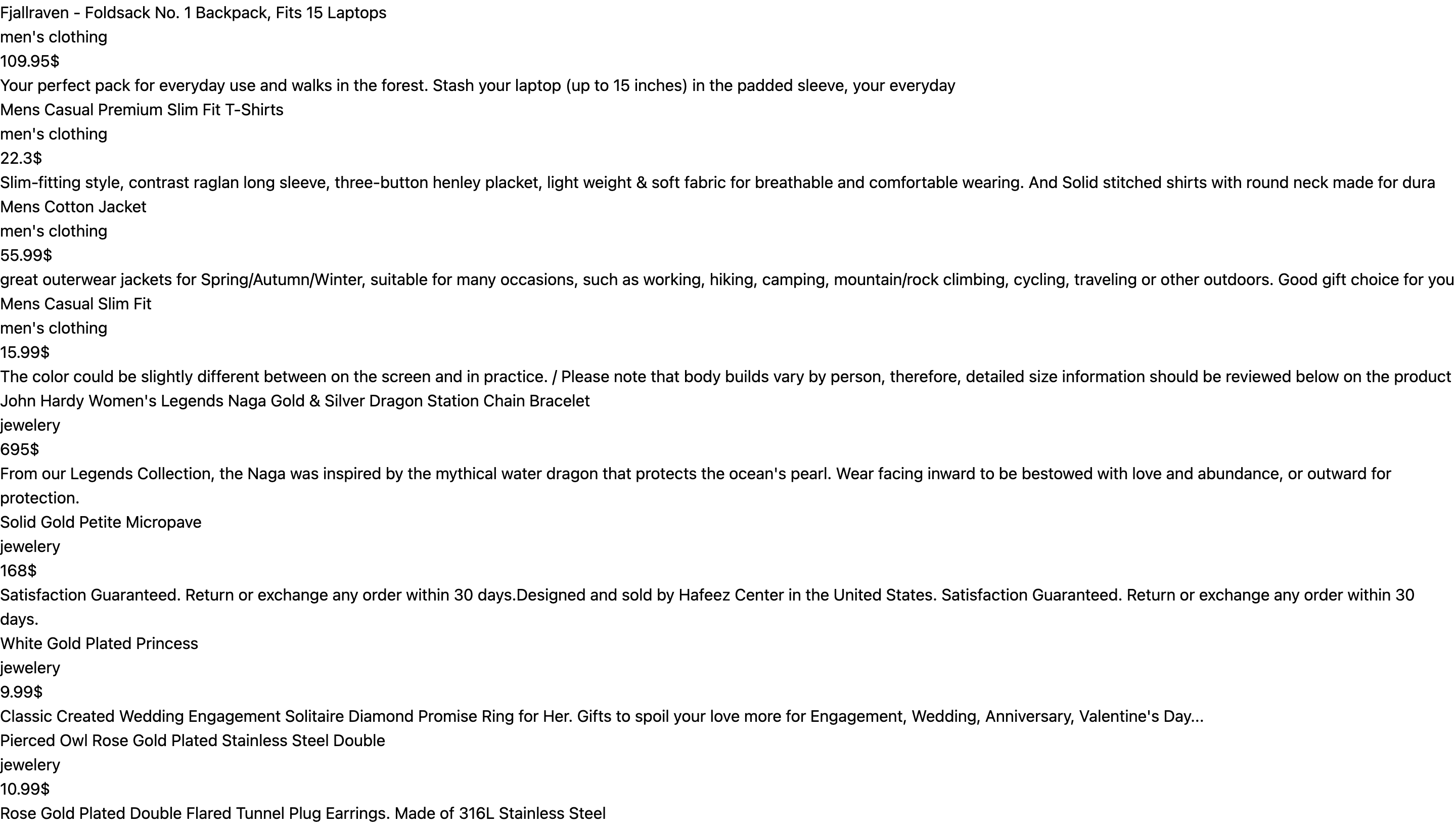
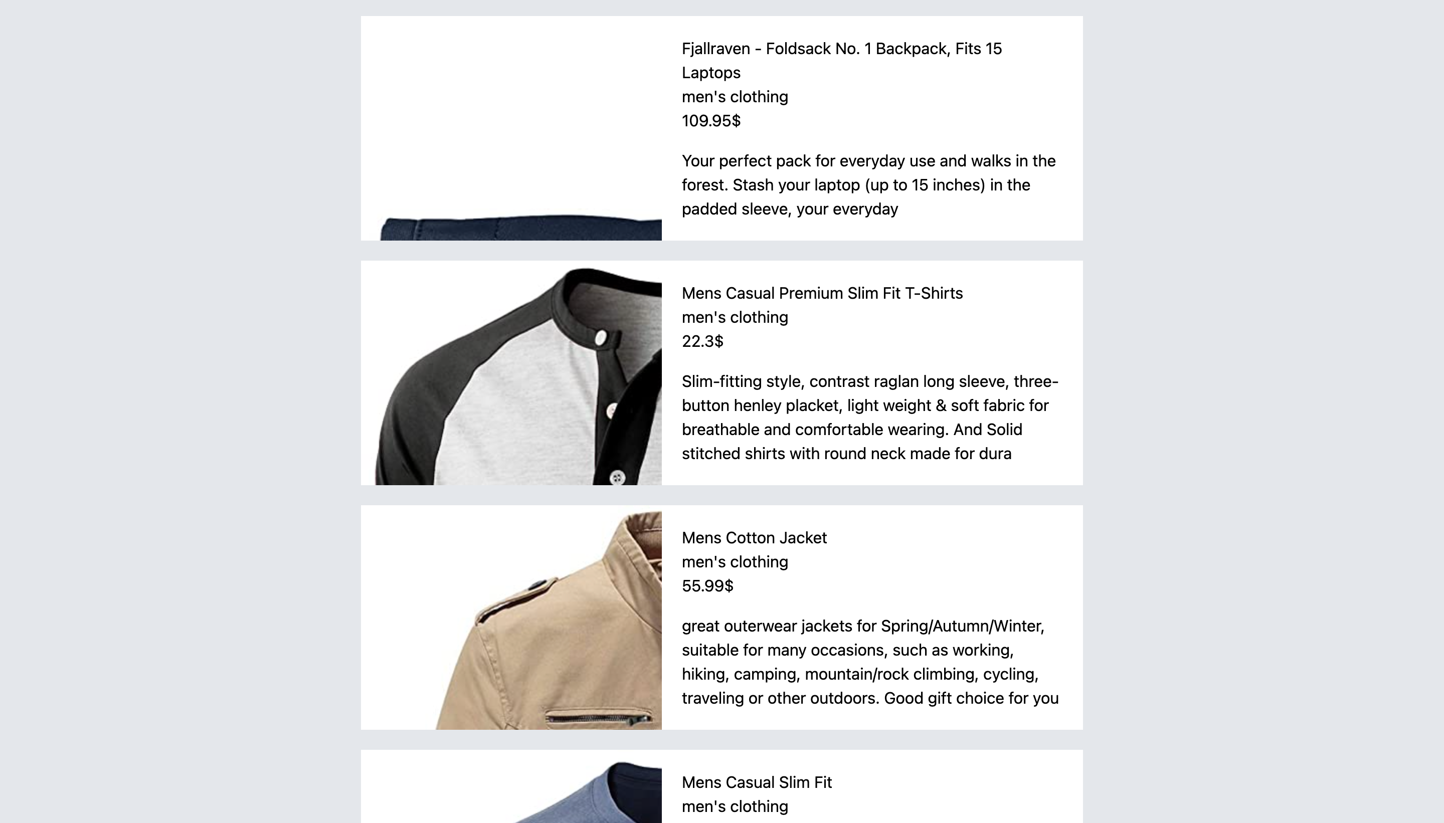
npm startYou'll see that there's just a bunch of text, but no styling whatsoever.
Adding some background color
Let's start adding some styling. First, we'll change the background color of the page. To do that, we'll utilize Tailwind's background color classes. The background color classes are in the format
bg-{color}-{numericScale}, wherenumericScaleis optional.The colors by default can be
white,black,gray,red,blue,green,yellow,orange,indigo,purpleandpink. The numeric scale defines the shade of the color, where50is the lightest shade and900is the darkest. For example, if you want the background color to be light red, you can usebg-red-200.In our website, we'll set the background color to be light gray, so we'll add the class
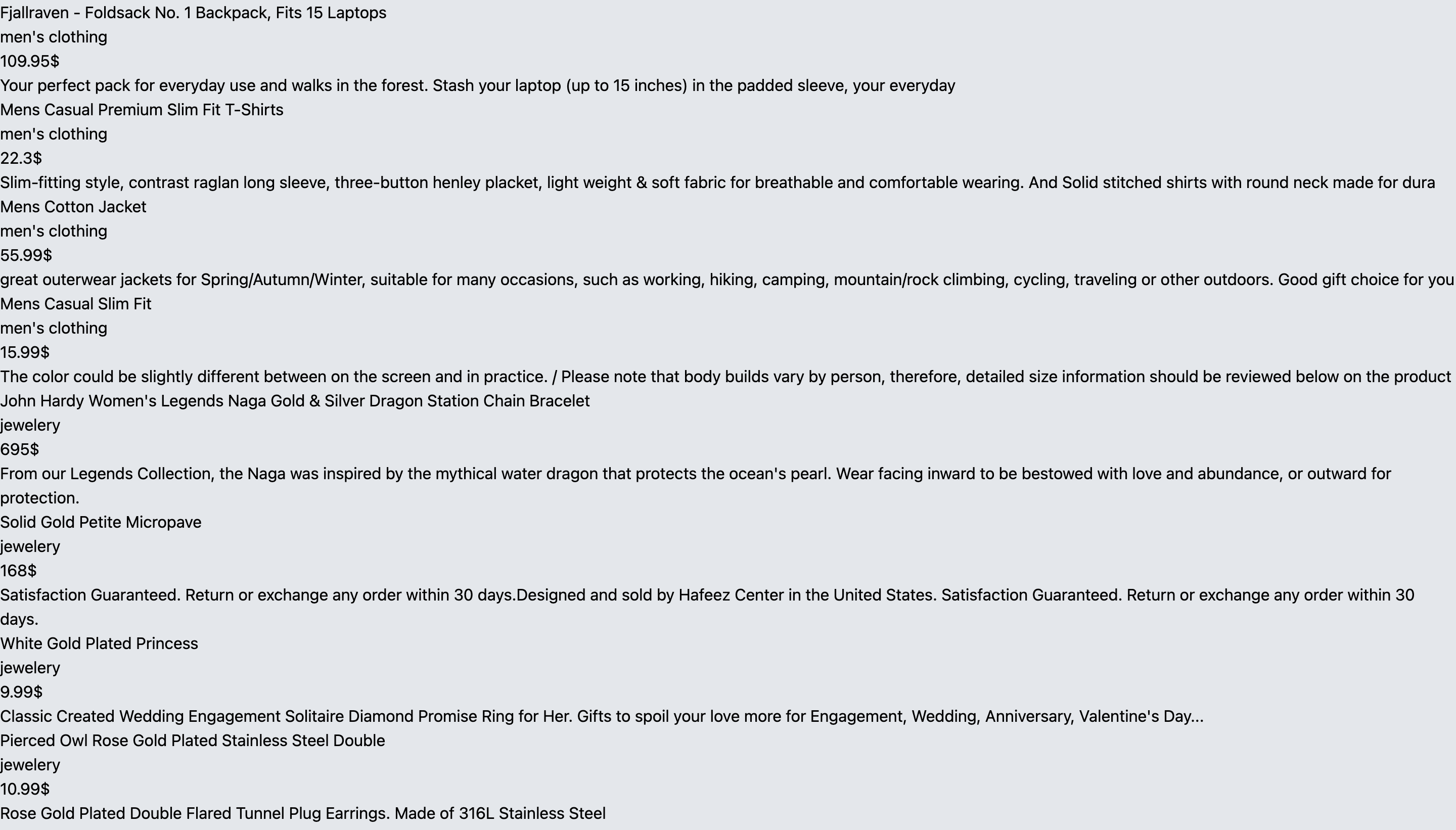
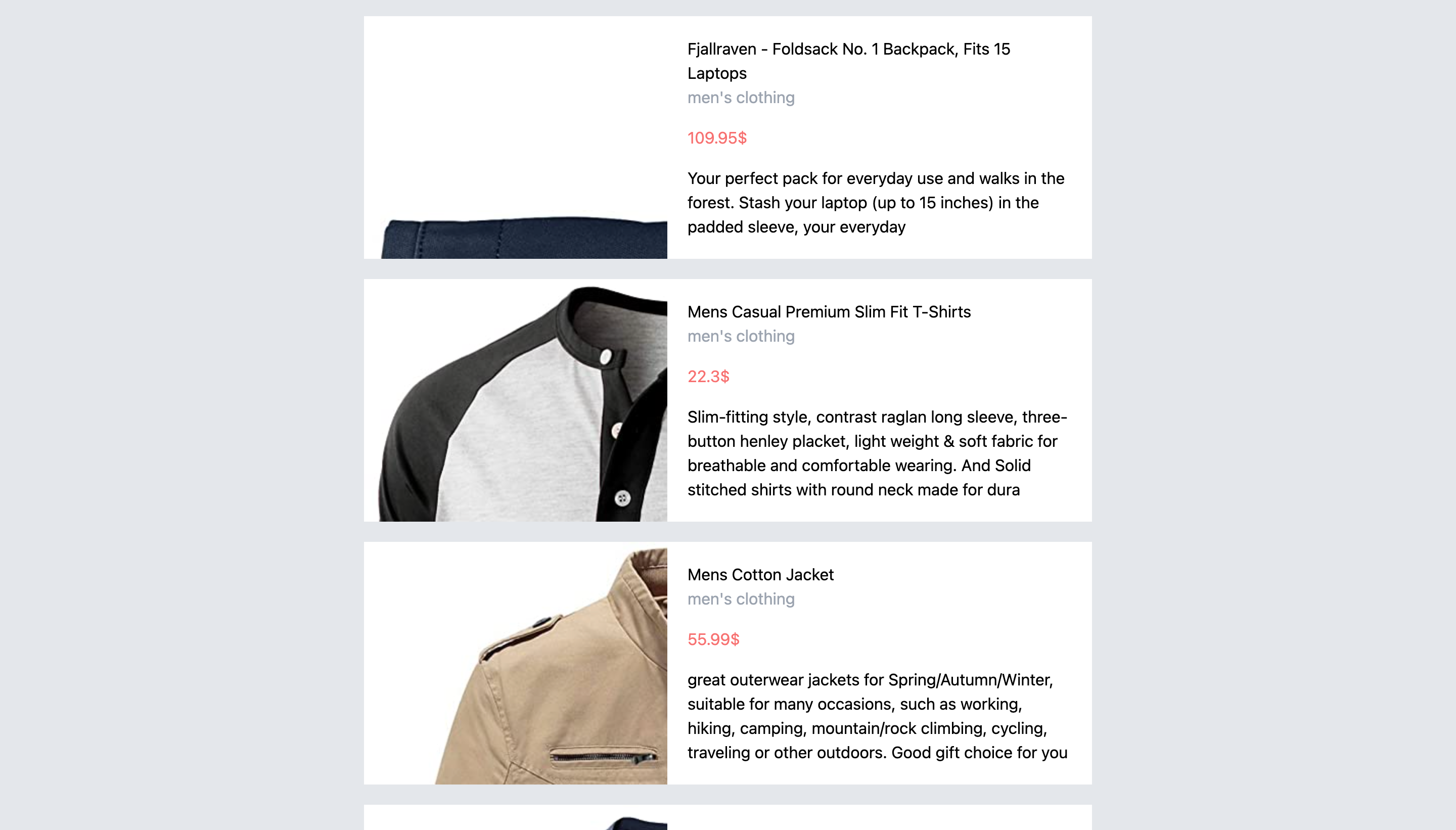
bg-gray-200to the most outer<div>element insrc/App.js:return ( <div className="bg-gray-200"> <div> {products.map((product) => ( <Product product={product} key={product.id} /> ))} </div> </div> );If you check the website now (if you don't have the server still running, make sure to run it again), you'll see that the background has changed to a light shade of gray.
Changing the content width
Next thing we're going to do is change the width of the content to 50% of the actual width of the screen when the screen's width is at least
768px, but keep it full width on small devices. We'll utilize Tailwind's width classes, which we went over before a little. The width classes are in the formatw-{size}, wheresizecan be a range from 0 to 96, which refers to a value inrem; a ratio like1/2or3/5, or other ratios which refer to a percentage; or a keyword likeautofor auto width orfullfor 100% width.To specify the width based on a screen size, we use variants like
sm,md,lg, etc. These variants specify the minimum screen size that's required for a rule to be applied.In our case, since we want the width to be 50% of the parent for screens having a width of at least
768px, we'll use themdvariant withw-1/2:return ( <div className="bg-gray-200"> <div className="md:w-1/2"> {products.map((product) => ( <Product product={product} key={product.id} /> ))} </div> </div> );The width will now be changed to be half the screen's width. However, it will be much better to center it horizontally. To do that, we'll use Tailwind's margin utility classes. The margin classes are in the format
m{side}-{value}, wheresideis optional and can be either specific to each side of the element liketfor top,bfor bottom,lfor left andrfor right, or specific horizontally usingy, or vertically usingx.valuecan be in the range from 0 to 96, can bepxfor just1px, orauto. Not only that, but you can also add a negative margin by adding-to the beginning of the class. For example,-m-2.Since we're centering the element horizontally, we'll use
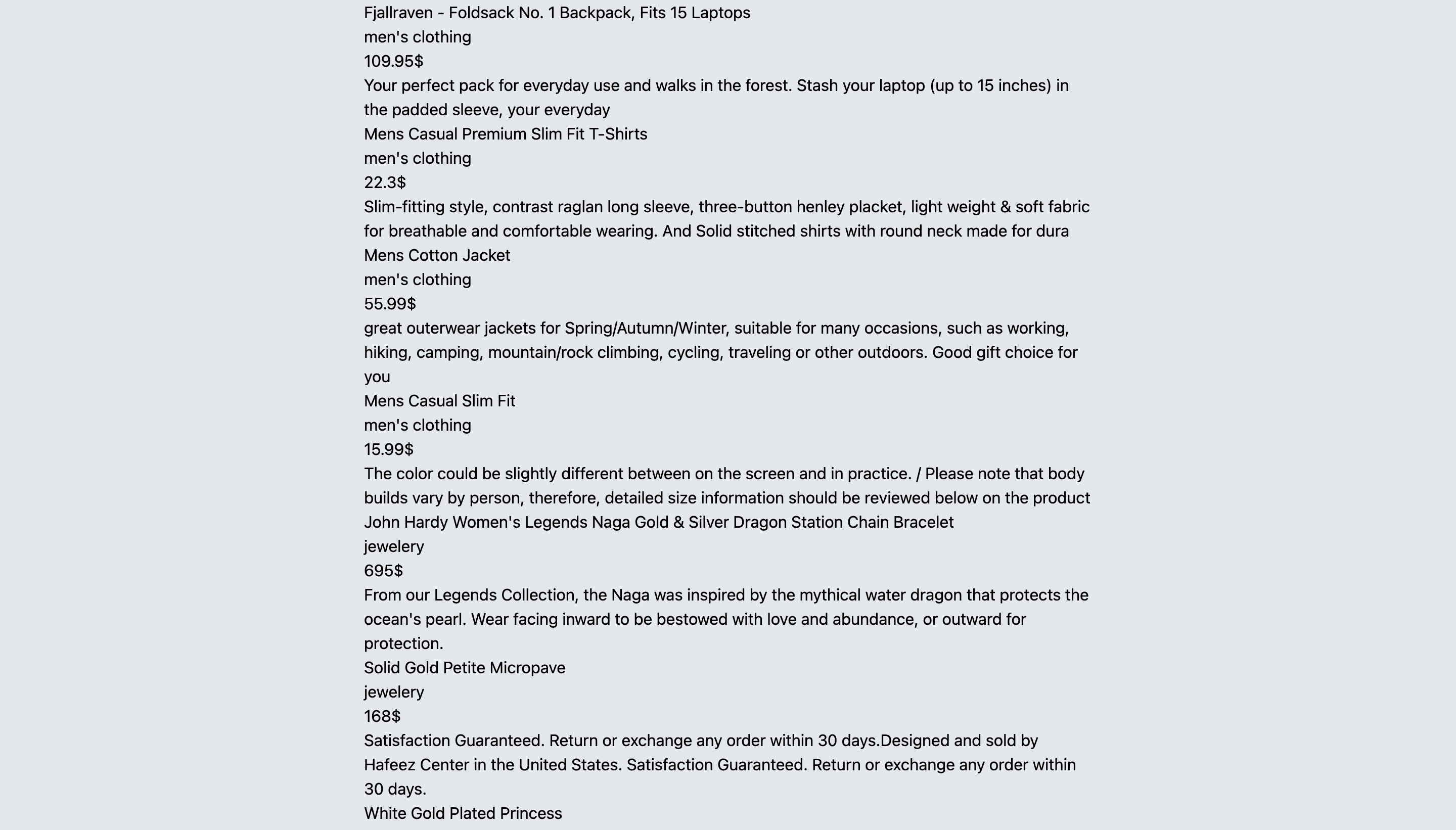
mx-auto:return ( <div className="bg-gray-200"> <div className="md:w-1/2 mx-auto"> {products.map((product) => ( <Product product={product} key={product.id} /> ))} </div> </div> );And you can see it's centered.
Styling the product component
Let's now move on to the
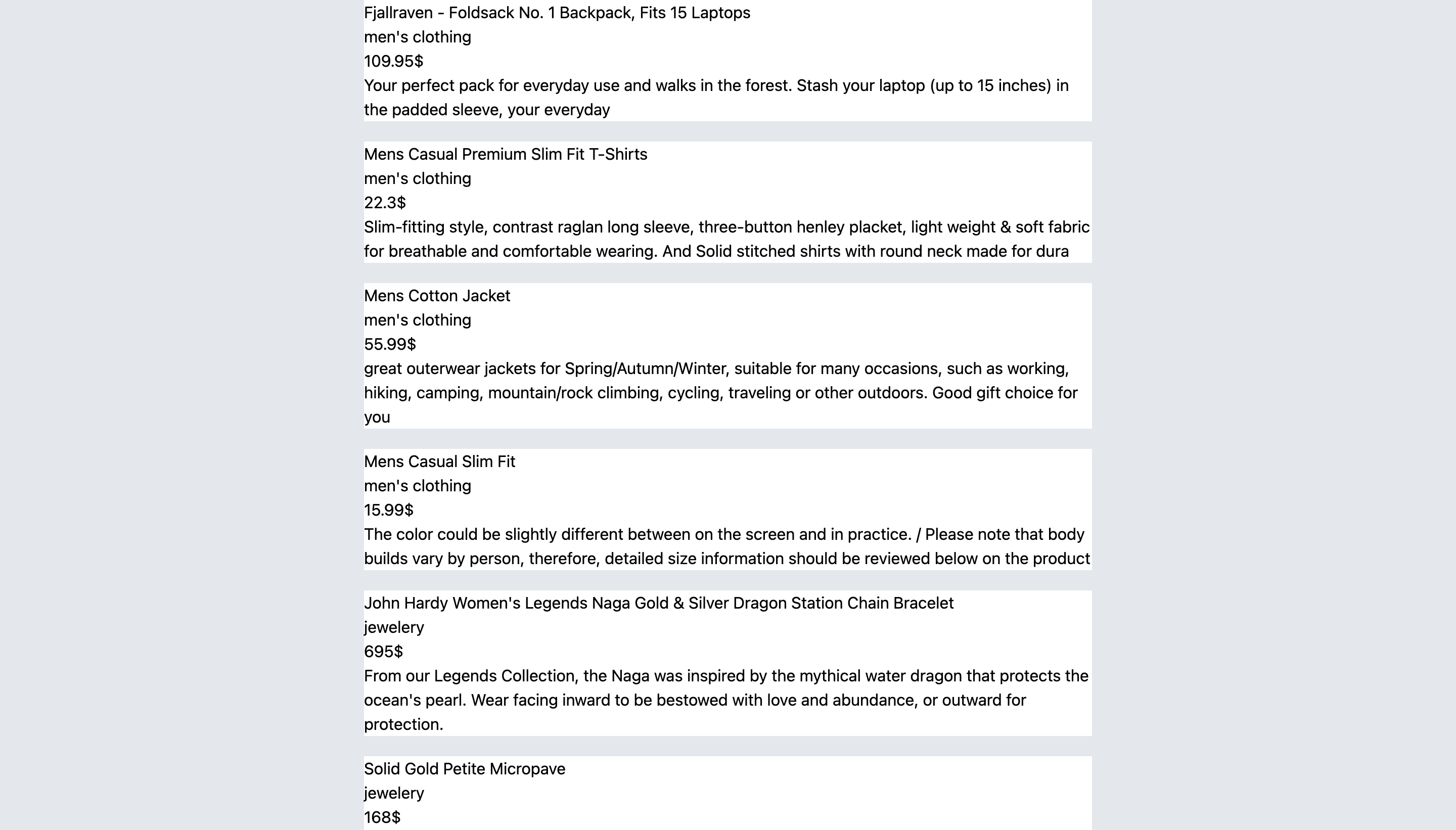
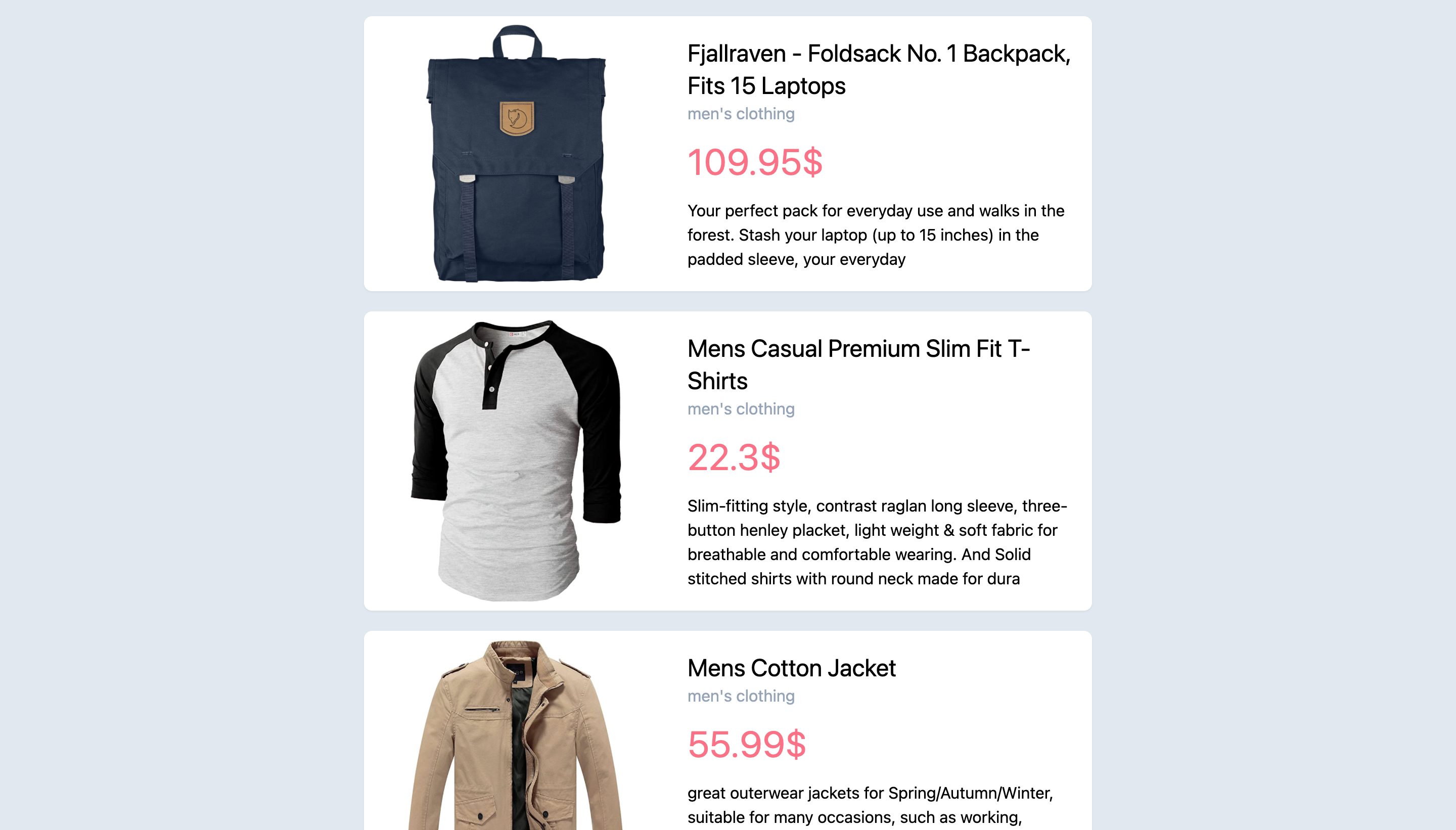
Productcomponent. We'll also add a background color for the Product card. We'll make it white so we'll usebg-white. We'll also make it full width so we'll usew-full. To separate the Product cards from one another, we'll add a margin bottom to the elements usingmb-5:return ( <div className="bg-white w-full mb-5"> <div style={{backgroundImage: `url(${image})`}}></div> <div> <h1>{title.substr(0, 50)}</h1> <h3>{category}</h3> <p>{price}lt;/p>
<div>{description.substr(0, 100)}</div>
</div>
</div>
);
And you can see the change on the website:
As you can see in our
Productcomponent, inside the outermost element we have two elements, one having a background image of the product and another having the information. We want to display them next to each other. The first thing we need to do is change the display of the outermost<div>to flex. To do that, we'll use Tailwind's display classes. Unlike the previous classes we mentioned, display classes don't have a format. They're just the name of the display we want. So, to change an element's display property toflex, you just add theflexclass:return ( <div className="flex bg-white w-full mb-5"> <div style={{backgroundImage: `url(${image})`}}></div> <div> <h1>{title.substr(0, 50)}</h1> <h3>{category}</h3> <p>{price}lt;/p>
<div>{description.substr(0, 100)}</div>
</div>
</div>
);
Next, we'll change the width of the
<div>elements using the width classes as previously:return ( <div className="flex bg-white w-full mb-5"> <div style={{backgroundImage: `url(${image})`}} className="w-5/12"></div> <div className="w-7/12"> <h1>{title.substr(0, 50)}</h1> <h3>{category}</h3> <p>{price}lt;/p>
<div>{description.substr(0, 100)}</div>
</div>
</div>
);
If you check the website now, you'll see that the image and text are now next to each other.
Adding some spacing
There's still a lot to fix. First, let's add some padding for the product information container. To do that, we'll use Tailwind's padding classes. The padding classes are exactly similar to the margin classes we checked earlier, except we use
pinstead ofm.So, we'll add
p-5to the product information container. We'll also add some margin to the description container usingmt-4:return ( <div className="flex bg-white w-full mb-5"> <div style={{backgroundImage: `url(${image})`}} className="w-5/12"></div> <div className="w-7/12 p-5"> <h1>{title.substr(0, 50)}</h1> <h3>{category}</h3> <p>{price}lt;/p>
<div className="mt-4">{description.substr(0, 100)}</div>
</div>
</div>
);
We'll also add top and bottom margin to the entire container in
src/App.jsso that the first and last products aren't right at the edge of the page from both sides. To do that, we'll add the classpy-4:return ( <div className="bg-gray-200 py-4"> <div className="md:w-1/2 mx-auto"> {products.map((product) => ( <Product product={product} key={product.id} /> ))} </div> </div> );We'll see the website is starting to look better now.
Improving the component's typography
Let's now work on the typography a little. You can see that the product information all looks the same. We can't distinguish the title from the category from the description and so on. First, let's change the color of some of the text. To do that, we'll use Tailwind's text color classes. The format for these classes is similar to background color classes, but replace
bwithtext. For example, to make your text's color green you add the classtext-green-100.So, let's change the text color of the category to
text-gray-400to make it a little faded in comparison to other text, and let's change the price text color totext-red-500to make it stand out. We'll also add a top margin to the price to make sure it stands out the most:return ( <div className="flex bg-white w-full mb-5"> <div style={{backgroundImage: `url(${image})`}} className="w-5/12"></div> <div className="w-7/12 p-5"> <h1>{title.substr(0, 50)}</h1> <h3 className="text-gray-400">{category}</h3> <p className="text-red-400 mt-4">{price}lt;/p>
<div className="mt-4">{description.substr(0, 100)}</div>
</div>
</div>
);
If you go to the website now, you'll see the text looks a little clearer in terms of distinguishing between the different parts:
Next, let's change the font size. To do that, we'll use Tailwind's font size classes. The format for these classes is
text-{size}, wheresizeranges fromsmto9xl.We'll make the font size of the price larger by adding the class
text-4xlfor screens that have a width at least768pxusing themdvariant, andtext-xlfor smaller screens, and we'll make the title larger by adding the classtext-2xlfor screens that have a width at least768pxas well:return ( <div className="flex bg-white w-full mb-5"> <div style={{backgroundImage: `url(${image})`}} className="w-5/12"></div> <div className="w-7/12 p-5"> <h1 className="md:text-2xl">{title.substr(0, 50)}</h1> <h3 className="text-gray-400">{category}</h3> <p className="text-red-400 mt-4 text-xl md:text-4xl">{price}lt;/p>
<div className="mt-4">{description.substr(0, 100)}</div>
</div>
</div>
);
The text looks now much better.
Positioning the product image
Next, let's fix the image to make it entirely appear and position the background image properly.
First, we'll change the background image size. To do that, we'll use Tailwind's background size classes. The format of these classes is
bg-{size}, wheresizecan beauto,containorcover. In our case, it will bebg-containto make sure the entire image is seen.Second, we'll change the background repeat's attribute to make sure the image doesn't repeat multiple times. To do that, we'll use Tailwind's background repeat classes. The format for these classes is
bg-{repeatValue}, whererepeatValueis the value you'd give to thebackground-repeatproperty, orbg-repeat-roundfor round value andbg-repeat-spacefor space value. In our case, we'll be usingbg-no-repeat.Third, we'll change the background position attribute so that the image is always centered. To do that, we'll use Tailwind's background position classes. The format for these classes is
bg-{position}, wherepositionis the value you'd give tobackground-positionproperty. We'll be adding the classbg-center:return ( <div className="flex bg-white w-full mb-5"> <div style={{backgroundImage: `url(${image})`}} className="w-5/12 bg-contain bg-no-repeat bg-center"></div> <div className="w-7/12 p-5"> <h1 className="md:text-2xl">{title.substr(0, 50)}</h1> <h3 className="text-gray-400">{category}</h3> <p className="text-red-400 mt-4 text-xl md:text-4xl">{price}lt;/p>
<div className="mt-4">{description.substr(0, 100)}</div>
</div>
</div>
);
Now, we can see the images fully.
You'll notice that some images touch the edge of the container. To fix that, we'll add a wrapper
<div>element to the background image element and add some padding to it:return ( <div className="flex bg-white w-full mb-5"> <div className="w-5/12 p-2"> <div style={{backgroundImage: `url(${image})`}} className="bg-contain bg-no-repeat bg-center w-full h-full"></div> </div> <div className="w-7/12 p-5"> <h1 className="md:text-2xl">{title.substr(0, 50)}</h1> <h3 className="text-gray-400">{category}</h3> <p className="text-red-400 mt-4 text-xl md:text-4xl">{price}lt;/p>
<div className="mt-4">{description.substr(0, 100)}</div>
</div>
</div>
);
Notice that we've moved the width we previously gave to the background image to the wrapper element and we've added
w-fullandh-fullto the background image element to make sure it takes100%of its parent's width and height.Adding box shadow and rounded corners
Our products are now looking so much better. We'll add two final touches to the current style. First, we'll add some shadow to each product. We'll use Tailwind's box shadow classes. The format for these classes is
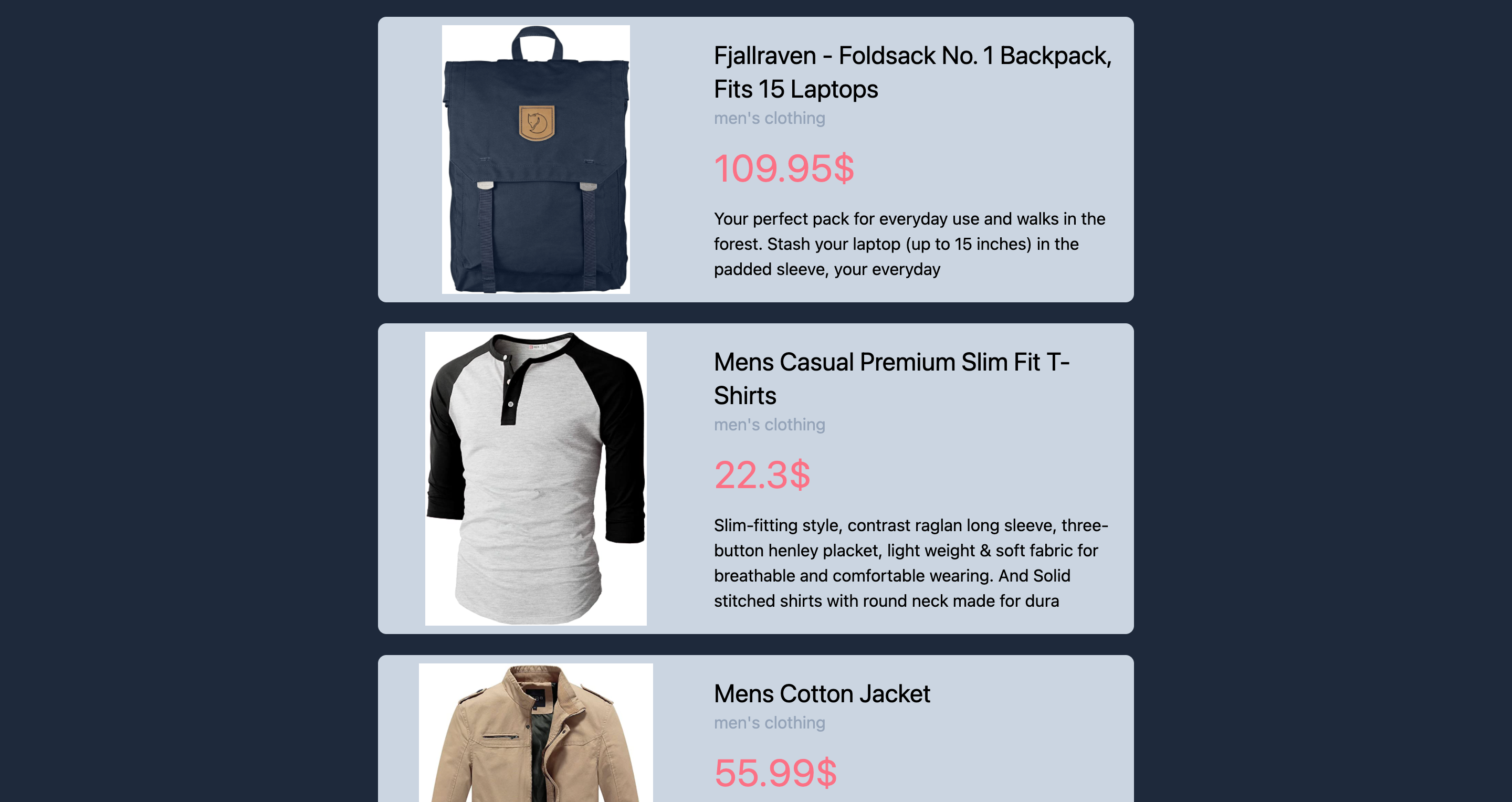
shadow-{size}, wheresizeis optional and can range fromsmto2xl. It can also benoneto remove any box shadow orinnerto make the shadow inner. Second, we'll make the product card's border a little rounded. We'll use Tailwind's border radius classes. The format for these classes isrounded-{position}-{size}, wheresizeis optional and can range fromsmto3xlor can benonefor 0 border radius orfullto make it fully rounded.positionis also optional and can be a specific position liketfor top orlfor left, or can be specific to a certain edge liketlfor top left.We'll add
shadow-smto the product card to add a small shadow to it, androunded-lgto make the border rounded:return ( <div className="flex bg-white w-full mb-5 shadow-sm rounded-lg"> <div className="w-5/12 p-2"> <div style={{backgroundImage: `url(${image})`}} className="bg-contain bg-no-repeat bg-center w-full h-full"></div> </div> <div className="w-7/12 p-5"> <h1 className="md:text-2xl">{title.substr(0, 50)}</h1> <h3 className="text-gray-400">{category}</h3> <p className="text-red-400 mt-4 text-xl md:text-4xl">{price}lt;/p>
<div className="mt-4">{description.substr(0, 100)}</div>
</div>
</div>
);
Finally, our product list page looks like the screenshot below.
Customizing the Theme
So far, all the styling we've done has been based on Tailwind's default styling. However, Tailwind also allows us to customize our theme. We can change the colors, font family, and more. All these changes are done in
tailwind.config.js.Let's try changing the colors a little. There are different ways to change the theme's colors.
One way to do that is by defining your own colors. For example, to add a new color to our theme, we can do the following in
tailwind.config.js:module.exports = { purge: ["./src/**/*.{js,jsx,ts,tsx}", "./public/index.html"], darkMode: "media", // or 'media' or 'class' theme: { extend: { colors: { turquoise: "#40e0d0" } }, }, variants: { extend: {}, }, plugins: [], };Notice that inside
theme.extend, we've added acolorsobject, then inside that we've added the keyturquoisewith the hex code for turquoise color. Now we can use that color just like we would use the default colors. For example, to set the background color to turquoise, you can usebg-turquoise.Another way to customize the theme's colors is by changing the default colors. As mentioned before, the default colors in Tailwind are
white,black,gray,red,blue,green,yellow,orange,indigo,purpleandpink. You can change the actual value for these colors.For example, to change the
yellowto more of a mustard yellow, do this:module.exports = { purge: ["./src/**/*.{js,jsx,ts,tsx}", "./public/index.html"], darkMode: "media", // or 'media' or 'class' theme: { extend: { colors: { yellow: "#e1ad01" } }, }, variants: { extend: {}, }, plugins: [], };Now, when you use the default classes for yellow, you'll get the yellow color you defined here. You can also specify the value for different shades of the color using numeric scales:
module.exports = { purge: ["./src/**/*.{js,jsx,ts,tsx}", "./public/index.html"], darkMode: "media", // or 'media' or 'class' theme: { extend: { colors: { yellow: { 200: "#feca1d", 400: "#e1ad01", 700: "#b48a01" } } }, }, variants: { extend: {}, }, plugins: [], };You can also use keys like
lightest,light,DEFAULT,dark,darkest:module.exports = { purge: ["./src/**/*.{js,jsx,ts,tsx}", "./public/index.html"], darkMode: "media", // or 'media' or 'class' theme: { extend: { colors: { yellow: { light: "#feca1d", DEFAULT: "#e1ad01", dark: "#b48a01" } } }, }, variants: { extend: {}, }, plugins: [], };Adding a color palette
A third way to change the color is by using other color palettes in Tailwind CSS, which is what we'll do.
First, require
colorsfromtailwindcss/colorsin the beginning oftailwind.config.js:const colors = require("tailwindcss/colors")Next, we'll change red to the rose palette, and gray to blue-gray:
const colors = require("tailwindcss/colors") module.exports = { purge: ["./src/**/*.{js,jsx,ts,tsx}", "./public/index.html"], darkMode: "media", // or 'media' or 'class' theme: { extend: { colors: { gray: colors.blueGray, red: colors.rose } }, }, variants: { extend: {}, }, plugins: [], };If you check the website now, you'll see a slight change in the colors we used.
If you want to see the difference in colors well, you can try to change gray to amber:
const colors = require("tailwindcss/colors") module.exports = { purge: ["./src/**/*.{js,jsx,ts,tsx}", "./public/index.html"], darkMode: "media", // or 'media' or 'class' theme: { extend: { colors: { gray: colors.amber, red: colors.rose } }, }, variants: { extend: {}, }, plugins: [], };You'll see that the background is now yellow-ish.
You can also change the font family, and much more, all from
tailwind.config.js, while still using the same classes provided with Tailwind CSS. This way, you can easily customize the theme to suit your design.Adding Dark Mode
The
darkvariant allows us to easily style our elements for dark mode at the same time we're styling them for light mode.In the beginning, when we were setting up our website, we changed the
darkkey intailwind.config.jstomedia. This means that dark mode will be applied when the browser or OS is set to dark mode.If you want to test how the website will look in dark mode but you don't have it set to dark mode, you can emulate this in Chrome DevTools. Open the DevTools by pressing F12, then press CTRL + SHIFT + P (or CMD + SHIFT + P on macOS) and in the dropdown that appears enter "Show Rendering" and choose the option that shows. Finally, scroll down to "Emulate CSS Media feature prefers-color-scheme" and choose
prefers-color-scheme: dark. The same thing can be done to test light mode by choosingprefers-color-scheme: light.Let's start by changing the background color of the website in dark mode by add the class
dark:bg-gray-800insrc/App.js:return ( <div className="bg-gray-200 py-4 dark:bg-gray-800"> <div className="md:w-1/2 mx-auto"> {products.map((product) => ( <Product product={product} key={product.id} /> ))} </div> </div> );If you check now and your browser/OS is set to dark mode (or emulated), you'll see that the background color has changed to a darker shade of gray.
Let's now make changes to the Product card. We'll add the class
dark:bg-gray-300to the outermost element:return ( <div className="flex bg-white w-full mb-5 shadow-sm rounded-lg dark:bg-gray-300"> <div className="w-5/12 p-2"> <div style={{backgroundImage: `url(${image})`}} className="bg-contain bg-no-repeat bg-center w-full h-full"></div> </div> <div className="w-7/12 p-5"> <h1 className="md:text-2xl">{title.substr(0, 50)}</h1> <h3 className="text-gray-400">{category}</h3> <p className="text-red-400 mt-4 text-xl md:text-4xl">{price}lt;/p>
<div className="mt-4">{description.substr(0, 100)}</div>
</div>
</div>
);
If you check now, you'll notice that the background color of the product card has changed, but you'll also notice that the image now doesn't look nice, as it has a white background.
Let's make it better by adding a white background to the background wrapper when it's in dark mode. This can be done by adding the class
dark:bg-white. Also, the category text color is now barely visible, so we'll change it to something darker by adding the classdark:text-gray-700:return ( <div className="flex bg-white w-full mb-5 shadow-sm rounded-lg dark:bg-gray-300"> <div className="w-5/12 p-2 dark:bg-white rounded-tl-lg rounded-bl-lg"> <div style={{backgroundImage: `url(${image})`}} className="bg-contain bg-no-repeat bg-center w-full h-full"></div> </div> <div className="w-7/12 p-5"> <h1 className="md:text-2xl">{title.substr(0, 50)}</h1> <h3 className="text-gray-400 dark:text-gray-700">{category}</h3> <p className="text-red-400 mt-4 text-xl md:text-4xl">{price}lt;/p>
<div className="mt-4">{description.substr(0, 100)}</div>
</div>
</div>
);
The final look of our website is shown below.
Groups and Enable Variants for Plugins
Some variants aren't enabled for all plugins by default, as that would lead to a large file size. So, if we need to use these variants, we have to enable them manually in
tailwind.config.jsfor the plugin we want. Plugins here are the classes we've been using all along. For example, background colors belong to thebackgroundColorplugin.One of the variants that aren't enabled is group-hover. A group is a number of elements that are grouped together, so that any state (for example, hover) can affect the entire group. A group is declared by adding the
groupclass to the container. Then, you can use thegroup-hovervariant with one of the utility classes on an element that's the child of the container. The utility class you usedgroup-hoveron won't be applied unless any element in the group (that is, any element inside the container element) is hovered.We're going to make every product card a
group, then on hover we'll zoom in to the image. So, we'll add thegroupclass to the outermost element in theProductcomponent, then we'll add to the element that has a background image the following classes:
transition-transform: one of Tailwind's transition classes. It appliestransitionproperties totransformchanges only.duration-300: one of Tailwind's transition duration classes. It applies atransition-durationwith value300ms.group-hover:transform: as explained above,group-hovervariant ensures that thetransformclass is only applied when an element in the group is hovered.transformis one of Tailwind's transform classes. It allows adding other transform related classes.group-hover:scale-125: thescale-125class is one of Tailwind's scale classes. It sets thescalefor both X and Y to1.25, but you need to add thetransformclass first.Using the above classes, the image will zoom in once any element in the product is hovered. We'll also add the class
overflow-hiddento the outermost element in theProductcomponent to ensure that, if the image grows outside its container, it doesn't overflow. We'll also usehover:shadow-2xlto make the shadow of the product card larger withtransition-shadow duration-300, to ensure the transition is seamless:return ( <div className="flex bg-white w-full mb-5 shadow-sm rounded-lg dark:bg-gray-300 group overflow-hidden hover:shadow-2xl transition-shadow duration-300"> <div className="w-5/12 p-2 dark:bg-white rounded-tl-lg rounded-bl-lg"> <div style={{backgroundImage: `url(${image})`}} className="bg-contain bg-no-repeat bg-center w-full h-full transition-transform duration-300 group-hover:transform group-hover:scale-125"></div> </div> <div className="w-7/12 p-5"> <h1 className="md:text-2xl">{title.substr(0, 50)}</h1> <h3 className="text-gray-400 dark:text-gray-700">{category}</h3> <p className="text-red-400 mt-4 text-xl md:text-4xl">{price}lt;/p>
<div className="mt-4">{description.substr(0, 100)}</div>
</div>
</div>
);
Note: if you're emulating dark mode (or using dark mode), you might see the effect better in light mode, so make sure to switch to light mode.
If you try hovering over the product now, you'll see that the shadow enlarges and the image zooms in.
Conclusion
We've created a neat, responsive website with React without having to write any CSS! That's the magic of Tailwind CSS. Tailwind CSS removes the tedious, repetitive work or writing CSS. It also facilitates creating themes, and allows you to focus on creating reusable components with a sleek design, which is perfect for React. What we covered in this article is just scratching the surface of all the beautiful things you can easily create with Tailwind CSS.
FAQs on Using React with Tailwind
What is Tailwind CSS, and why should I use it with React?Tailwind CSS is a utility-first CSS framework that provides a set of pre-defined classes for styling web applications. Using Tailwind CSS with React can speed up the development process and maintain a consistent design system.
How do I integrate Tailwind CSS with a React project?You can integrate Tailwind CSS into a React project by installing it with npm or yarn and configuring your build process to process the Tailwind CSS classes.
Can I use Create React App (CRA) with Tailwind CSS?Yes, you can use Tailwind CSS with Create React App. There are several methods, including the
cracoconfiguration or thereact-scriptspostcss setup, to make it work seamlessly.How do I apply Tailwind CSS classes to my React components?You can apply Tailwind CSS classes directly to your React components using
classNameprops. For example,<div className="bg-blue-500 text-white">Hello, Tailwind!</div>.What are the benefits of using utility classes in Tailwind CSS with React?Using utility classes can make your React components more concise, and it promotes a consistent design system. It also simplifies responsive design and encourages reusability.
How can I use responsive classes in Tailwind CSS with React components?Tailwind CSS provides responsive classes that allow you to define different styles for various screen sizes. You can use these classes by appending breakpoints like
md:to your class definitions.Are there any limitations or drawbacks to using Tailwind CSS with React?While Tailwind CSS is powerful, it can lead to larger file sizes if you're not careful with class usage. It may also be challenging for designers who prefer working with traditional CSS.