
Have you ever tried to change the value of the font-weight property on link states? If yes, you may have noticed that the text shifts.
In this quick tip, we’ll first learn what causes this undesired behavior and then we’ll examine two possible solutions.
Key Takeaways
- The issue of text shifting when changing the font-weight property on link states can be resolved by either assigning all items a fixed width or by using the text-shadow property to simulate the font-weight behavior.
- Assigning a fixed width to all list items can solve the problem but might not be ideal in cases where we want to avoid adding a fixed width to our elements.
- Using the text-shadow property, combined with the letter-spacing property, can create a more visually appealing effect, without changing the size of the text or requiring any additional widths to be added to the elements.
Identifying the Problem
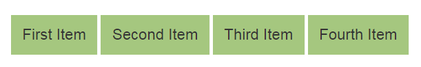
As a first step, let’s identify the problem by looking at a simple example. Consider the following visualization:
The items are links, so in your CSS you might try something like this:
a:hover {

  font-weight: bold;

}
Because we usually don’t define a fixed width for items like this, when the user hovers over the links, the text shifts. Of course, this happens because the width of each link gets bigger on hover. To test it, we assign the active class to the first link and add this CSS rule:
.active {

  font-weight: bold;

}
Lastly, we change the text of the second link to be equal to the first one, like so:

Now, if we open the browser console and target the first two links, we’ll notice that their computed width is different.
You can see what we’ve discussed above in the following CodePen demo:
See the Pen Using the font-weight Property on Hover States by SitePoint (@SitePoint) on CodePen.
Admittedly, it’s not very common to add a bold effect to a hover state, but it may come up at some point. So let’s look at two possible solutions to get around this problem.
Solution 1: Give All Items a Width
As mentioned, perhaps the most obvious solution is to give all list items a width. So, in our example, we set the width of each list item to 24%.
Here’s the result:
See the Pen Fixing font-weight hover states using defined widths by SitePoint (@SitePoint) on CodePen.
Even though the solution above works, it’s might not ideal because there are cases when we might want to avoid adding a fixed width to our elements. With that in mind, let’s discuss a better solution.
Solution 2: Text Shadow
By taking advantage of the text-shadow property, we’re able to somehow simulate the font-weight behavior. We do this by playing with the blur-radius value so as to adjust the shadow according to our needs.
Depending on the fonts used in our projects, we can combine the text-shadow property along with the letter-spacing property to create some nice text effects.
To demonstrate this behavior, we assign a few additional lines of CSS to our links:
a {

  letter-spacing: .1em;

  transition: text-shadow .3s;

}
a:hover {

  text-shadow: 0 0 .65px #333, 0 0 .65px #333;

  /* use the line below if you want a more intense effect */

  /* text-shadow: 0 0 .9px #333, 0 0 .9px #333, 0 0 .9px #333; */

}
Here’s the demo:
See the Pen Fixing font-weight hover states with Text Shadow by SitePoint (@SitePoint) on CodePen.
So we avoid the problem of the items moving, and we don’t require adding any kind of widths to the elements. And as you can see, this solution is much nicer than using font-weight because the size of the text isn’t changing at all. So it’s a much cleaner look.
Conclusion
If I needed to solve this problem, I’d likely use one of the two solutions I just described. Do you know of another way to fix this? Let us know in the comments.
Frequently Asked Questions (FAQs) about Fixing Font Weight Problem in Hover States
What is the font weight problem in hover states?
The font weight problem in hover states is a common issue in CSS where the text shifts or moves when it becomes bold upon hovering. This happens because the bold version of the font is wider than the regular one, causing a shift in the layout. This can disrupt the user experience, especially in navigation menus or links where the shift can be noticeable.
How can I prevent the layout shift when hovering over text?
There are several ways to prevent the layout shift when hovering over text. One method is to use a pseudo-element with the same text and font weight as the hover state, but set its opacity to 0. This way, the browser will reserve the space for the bold text, preventing the shift. Another method is to use a monospace font, which has the same width for all characters, preventing any shift.
What is a pseudo-element and how can it help fix the font weight problem?
A pseudo-element is a keyword added to a selector that lets you style a specific part of the selected element(s). In the case of the font weight problem, you can use the ::before or ::after pseudo-element to create an invisible copy of the text that will take up the same space as the bold text, preventing any shift when hovering.
Can I use JavaScript to fix the font weight problem in hover states?
Yes, you can use JavaScript to fix the font weight problem in hover states. You can use the onmouseover and onmouseout events to change the font weight and prevent the layout shift. However, this method may not be as efficient as using CSS, especially for larger websites.
Why does the font weight problem occur in inline elements?
The font weight problem occurs in inline elements because these elements do not start on a new line and only take up as much width as necessary. When the font weight changes on hover, the width of the element changes, causing a shift in the layout. This problem does not occur in block elements, which always start on a new line and take up the full width available.
What is the difference between font weight and font size?
Font weight refers to the thickness of the characters in a font, while font size refers to the height of the characters. Changing the font weight can cause a layout shift because it can change the width of the characters, while changing the font size can cause a layout shift because it changes the height of the characters.
Can I use CSS transitions to smooth out the font weight change on hover?
Yes, you can use CSS transitions to smooth out the font weight change on hover. By setting a transition on the font-weight property, you can make the change from regular to bold more gradual, reducing the sudden shift. However, this will not prevent the shift entirely, it will only make it less noticeable.
How can I test if my solution to the font weight problem is working?
You can test if your solution to the font weight problem is working by hovering over the text and observing if there is any shift in the layout. You can also use browser developer tools to inspect the elements and see if there is any change in their width or position on hover.
Are there any specific fonts that are more prone to the font weight problem?
The font weight problem can occur with any font, but it is more noticeable with fonts that have a large difference between their regular and bold weights. Fonts with a smaller difference between regular and bold, or monospace fonts, are less likely to cause a noticeable shift.
Can the font weight problem affect the accessibility of my website?
Yes, the font weight problem can affect the accessibility of your website. A sudden shift in the layout can be disorienting for users, especially those with visual impairments or cognitive disabilities. It can also cause problems for users who rely on keyboard navigation, as the shift can change the position of links or buttons. Therefore, it’s important to fix this issue to ensure your website is accessible to all users.