The 2011 Academy Award nominations were announced today, and I thought it might be interesting to have a brief look at the websites for the movies nominated for Best Picture and see if the sites are worthy of a backslap. So, in no particular order, cue drum roll, here are the websites of the nominees for Best Picture.
The Black Swan site doesn’t have too much to write home about. It’s a subsection of the Fox Searchlight website and features a small Flash presentation which gives a synopsis of the film, a gallery, downloads, video and cast and crew info. Each section starts with a brief scene from the film. Underneath the Flash presentation there is a HTML section which seems very overcrowded with information and is clearly the “easy” bit to update.

The Fighter has most of the same features as the previous site, but the overall look and feel is superior to the Black Swan. Large images are combined with a low key color scheme for the text to give a subdued, but sophisticated look to the site.

Inception (which is now advertising the DVD rather than the cinema release) is a Flash-based site with beautiful images and a menu that changes location in each section. I found it to be quite slow loading each section (but that may have been my connection) and it made me wonder what the wait was for.

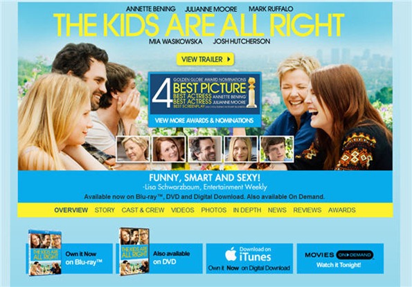
The Kids Are All Right site won’t overwhelm you with bells and whistles; it’s just plain old HTML and CSS, but it does have a bright blue and yellow color scheme.
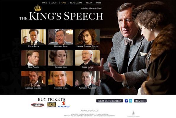
The King’s Speech is another simple HTML site. I think they may even be using Times New Roman for the menu and body text. This movie is really excellent by the way, if you haven’t seen it yet, go.
127 Hours is another Fox Searchlight sub-site with a Flash presentation. The movie clip buttons in between sections are a nice touch.

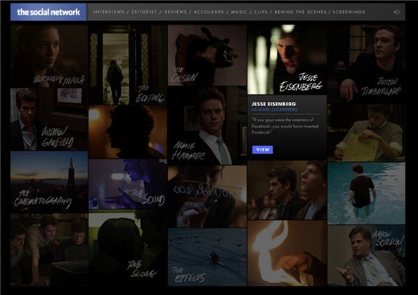
The Social Network is built using Flash and has been updated to showcase the awards and nominations it has received. The images and soundtrack are used to nice effect on the site.
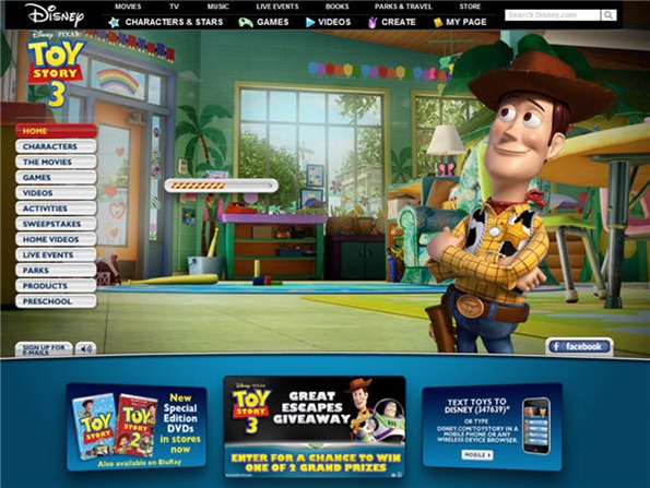
As would be expected, the Toy Story 3 site is very colorful with lots of activities for children, downloads and “stuff” for sale.
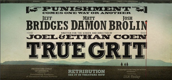
True Grit has a great Johnny Cash soundtrack on the site, and some nice Western style typography on the homepage, apart from that there is nothing outstanding to report.
Winter’s Bone makes use of a single photographic background with only the text changing in the center of the screen. This occasionally causes a hideous scroll bar to appear – a definite design no no.

What did you think of these websites? Inspiring or lackluster? If there was an Oscar for best website would you consider any of these to be worthy?
Frequently Asked Questions (FAQs) about Oscar-Winning Websites
What makes a website an Oscar-winning website?
An Oscar-winning website is one that stands out in terms of design, functionality, user experience, and content. These websites are innovative, engaging, and offer a seamless user experience. They are visually appealing, with a well-thought-out color scheme, typography, and layout. They are also easy to navigate, with intuitive menus and clear calls to action. Moreover, they offer high-quality, relevant content that provides value to the users. These websites are often recognized and awarded by prestigious institutions in the web design industry.
How can I design an Oscar-winning website?
Designing an Oscar-winning website requires a combination of creativity, technical skills, and a deep understanding of the user’s needs. Start by defining your website’s purpose and target audience. Then, create a design that is visually appealing and aligns with your brand identity. Make sure your website is easy to navigate and offers a seamless user experience. Use high-quality images and videos, and ensure your content is relevant and valuable to your audience. Lastly, optimize your website for search engines and mobile devices.
What are some examples of Oscar-winning websites?
There are many examples of Oscar-winning websites across various industries. Some notable ones include the interactive documentary “Bear 71”, the online magazine “The Outline”, and the e-commerce website “Hardgraft”. These websites are recognized for their innovative design, engaging content, and exceptional user experience.
How important is user experience in an Oscar-winning website?
User experience is crucial in an Oscar-winning website. These websites are designed with the user in mind, offering a seamless and enjoyable browsing experience. They are easy to navigate, with intuitive menus and clear calls to action. They also load quickly, are optimized for mobile devices, and are accessible to users with disabilities. Moreover, they offer high-quality, relevant content that provides value to the users.
How can I make my website more engaging?
To make your website more engaging, focus on creating high-quality, relevant content that provides value to your audience. Use visuals like images and videos to make your content more appealing. Incorporate interactive elements like quizzes, polls, and comment sections to encourage user interaction. Also, make sure your website is easy to navigate and offers a seamless user experience.
What are the common features of award-winning websites?
Award-winning websites often share several common features. They have a visually appealing design, with a well-thought-out color scheme, typography, and layout. They offer a seamless user experience, with intuitive navigation and clear calls to action. They are also mobile-friendly and load quickly. Moreover, they offer high-quality, relevant content that provides value to the users.
How can I optimize my website for mobile devices?
To optimize your website for mobile devices, ensure your design is responsive, meaning it adjusts to fit different screen sizes. Use mobile-friendly menus and buttons, and make sure your text is readable on small screens. Also, optimize your images and videos to load quickly on mobile devices. Lastly, test your website on various devices to ensure it offers a seamless user experience.
How can I improve the load speed of my website?
To improve the load speed of your website, optimize your images and videos, use a content delivery network (CDN), and enable browser caching. Also, minimize the use of heavy scripts and plugins, and use a reliable web hosting service. Lastly, regularly test your website’s speed and make necessary adjustments to ensure it loads quickly.
What is the role of SEO in an Oscar-winning website?
SEO plays a crucial role in an Oscar-winning website. These websites are optimized for search engines, meaning they use relevant keywords, have high-quality content, and offer a seamless user experience. They also have a well-structured URL, use meta tags, and have a fast load speed. All these factors help improve the website’s visibility on search engines, attracting more traffic and increasing its chances of winning awards.
How can I make my website accessible to users with disabilities?
To make your website accessible to users with disabilities, use a readable font size and contrast ratio, provide alternative text for images, and ensure your website is navigable using a keyboard. Also, use clear and simple language, and provide captions or transcripts for audio and video content. Lastly, regularly test your website for accessibility and make necessary adjustments.
Jennifer Farley is a designer, illustrator and design instructor based in Ireland. She writes about design and illustration on her blog at Laughing Lion Design.