We’ve been exploring the basics on how to use CSS3 shadows: box-shadow and text-shadow. Today, we are going to improve our skills and look into how to build some amazing text-shadows.
Some of the ideas for shadows, I found in various tutorials for Photoshop— I was interested in whether or not I could achieve similar effects by using just text-shadow.
Internet Explorer and Windows 8
To try all these samples yourself and express your creativity with the text-shadow, try downloading Internet Explorer 10. All mentioned techniques will also work with metro style apps for Windows 8 built using HTML and JavaScript. May The Shadow be with you!
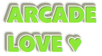
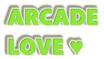
Arcade Love
In our first sample, we will try to draw some cool, embossed text. We will start with simple lime-colored text:
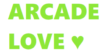
color: hsl(80, 70%, 55%);
Next, let’s add an embossed effect by adding a few shadows with one-pixel diagonal offsets (note how the shadow’s color is defined compared with the text’s color):
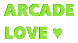
text-shadow: -1px -1px 0 hsl(80, 70%, 35%),
             -2px -2px 1px hsl(80, 70%, 35%);
Now we will add some nice details—a light white, blurred shadow around the text and a dark shadow on the bottom with a soft transition:
text-shadow: 0 0 2px #fff,
             -1px -1px 0 hsl(80, 70%, 35%),
             -2px -2px 1px hsl(80, 70%, 35%),
             -2px -2px 2px hsl(80, 10%, 15%);
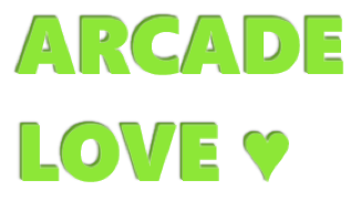
Next, let’s add a substrate for our text. To make it happen, we need to expand our shadow (here we are using the fourth parameter of the text-shadow rule—spread-distance):
text-shadow: …
             -3px -3px 0 7px hsl(60, 10%, 65%),
             -4px -4px 0 7px hsl(60, 10%, 65%),
             -5px -5px 0 7px hsl(60, 10%, 65%),
             -6px -6px 0 7px hsl(60, 10%, 65%);
Finally, to place our text on the background, let’s add a dark, blurred shadow to the bottom of the substrate:
text-shadow: …
             -7px -7px 4px 8px hsl(60, 10%, 40%),
             -8px -8px 6px 9px hsl(60, 10%, 55%);
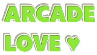
Final result
color: hsl(80, 70%, 55%);
text-shadow: 0 0 2px #fff,
             /* embossed text */
             -1px -1px 0 hsl(80, 70%, 35%),
             -2px -2px 1px hsl(80, 70%, 35%),
             /* transition to substrate */
             -2px -2px 2px hsl(80, 10%, 15%),
             /* substrate */
             -2px -2px 0 7px hsl(60, 80%, 95%),
             -3px -3px 0 7px hsl(60, 10%, 65%),
             -4px -4px 0 7px hsl(60, 10%, 65%),
             -5px -5px 0 7px hsl(60, 10%, 65%),
             -6px -6px 0 7px hsl(60, 10%, 65%),
             /* shadow for substrate */
             -7px -7px 4px 8px hsl(60, 10%, 40%),
             -8px -8px 6px 9px hsl(60, 10%, 55%);
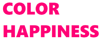
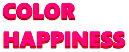
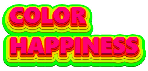
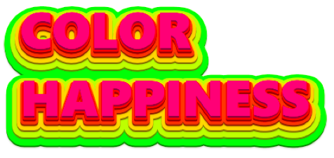
Color Happiness
In the second sample, we will reuse some ideas from the first one: we a going to build multiple, colorful substrates, making a pyramid of them. We will start with very simple pink text:
color: hsl(330, 100%, 50%);
First of all, let’s make it embossed. This time our shadow looks to the bottom and is really small, so I can reduce the number of applied rules by omitting intermediate, one-pixel offsets—but in the case of a diagonal shadow, such an approach would result in an aliasing effect. I will also add some blurring to soften the transition to the next substrate:

text-shadow: 0 2px 0 0px hsl(330, 100%, 25%),
             0 3px 2px 0px hsla(330, 100%, 15%, 0.5);
Next, let’s add one more expanded substrate with a different hue value (note that I’m changing only vertical offset, hue, and spread-distance):
text-shadow: 0 2px 0 0px hsl(330, 100%, 25%),
             0 3px 2px 0px hsla(330, 100%, 15%, 0.5),
             0 3px 0 3px hsl(350, 100%, 50%),
             0 5px 0 3px hsl(350, 100%, 25%),
             0 6px 2px 3px hsla(350, 100%, 15%, 0.5);
Now we just need to repeat the same trick a few more times, increasing the size of the substrates, and moving the hue in the right direction:
text-shadow: …
             0 6px 0 9px hsl(20, 100%, 50%),
             0 8px 0 9px hsl(20, 100%, 25%),
             0 9px 2px 9px hsla(20, 100%, 15%, 0.5),
             …
             0 15px 0 45px hsl(90, 100%, 50%),
             0 17px 0 45px hsl(90, 100%, 25%),
             0 17px 2px 45px hsla(90, 100%, 15%, 0.5);
Final result
color: hsl(330, 100%, 50%);
text-shadow: 0 2px 0 0px hsl(330, 100%, 25%),
             0 3px 2px 0px hsla(330, 100%, 15%, 0.5),
             /* next */
             0 3px 0 3px hsl(350, 100%, 50%),
             0 5px 0 3px hsl(350, 100%, 25%),
             0 6px 2px 3px hsla(350, 100%, 15%, 0.5),
             /* next */
             0 6px 0 9px hsl(20, 100%, 50%),
             0 8px 0 9px hsl(20, 100%, 25%),
             0 9px 2px 9px hsla(20, 100%, 15%, 0.5),
             /* next */
             0 9px 0 18px hsl(50, 100%, 50%)
             0 11px 0 18px hsl(50, 100%, 25%),
             0 12px 2px 18px hsla(50, 100%, 15%, 0.5),
             /* next */
             0 12px 0 30px hsl(70, 100%, 50%),
             0 14px 0 30px hsl(70, 100%, 25%),
             0 15px 2px 30px hsla(70, 100%, 15%, 0.5),
             /* next */
             0 15px 0 45px hsl(90, 100%, 50%),
             0 17px 0 45px hsl(90, 100%, 25%),
             0 17px 2px 45px hsla(90, 100%, 15%, 0.5);
Chocolate
The third sample I built while experimenting with alternating shadows starts with simple, brown text:

color: hsl(20, 100%, 20%);
The first step is to implement a classic 3D text effect:

text-shadow: -1px 1px 0 0 hsl(20, 100%, 16%),
              -2px 2px 0 0 hsl(20, 100%, 16%),
              -3px 3px 0 0 hsl(20, 100%, 16%),
              -4px 4px 0 0 hsl(20, 100%, 16%),
              -5px 5px 0 0 hsl(20, 100%, 16%),
              -6px 6px 0 0 hsl(20, 100%, 16%);
Next, I decided to darken my shadows by decreasing the lightness, and to add some space between the shadows by increasing the diagonal offset:

text-shadow: -0px 0px 0 0 hsl(20, 100%, 16%),
               -2px 2px 0 0 hsl(20, 100%, 14%),
               -4px 4px 0 0 hsl(20, 100%, 12%),
               -6px 6px 0 0 hsl(20, 100%, 10%),
               -8px 8px 0 0 hsl(20, 100%, 8%),
               -10px 10px 0 0 hsl(20, 100%, 6%);
The next step is to contract the shadows. By using contraction, you can reduce the shadow to just some pieces of original symbols (it also depends on the font, font size and other attributes). As a result, you will get a ragged shadow effect. Also, notice that as diagonal offsets and spread-distances differ for each of the shadows, we get a light twisting effect:

text-shadow: -0px 0px 0 0 hsl(20, 100%, 16%),
             -2px 2px 0 -1px hsl(20, 100%, 14%),
             -4px 4px 0 -2px hsl(20, 100%, 12%),
             -6px 6px 0 -3px hsl(20, 100%, 10%),
             -8px 8px 0 -4px hsl(20, 100%, 8%),
             -10px 10px 0 -5px hsl(20, 100%, 6%);
Let’s soften our shadows a little bit. By using blur-radius and color, we can add some intermediate lines:

text-shadow: -0px 0px 1px 0 hsl(20, 100%, 16%),
             -2px 2px 2px -1px hsl(20, 100%, 14%),
             -4px 4px 2px -2px hsl(20, 100%, 12%),
             -6px 6px 3px -3px hsl(20, 100%, 10%),
             -8px 8px 2px -4px hsl(20, 100%, 8%),
             -10px 10px 2px -5px hsl(20, 100%, 6%);
Finally, after playing with this sample for a few more minutes, I achieved the following result…
Final result

color: hsl(20, 100%, 20%);
text-shadow: 0 0 1px hsl(20, 100%, 18%),
             -1px 1px 0 hsl(20, 100%, 16%),
             -2px 2px 2px -1px hsl(20, 100%, 14%),
             -4px 4px 2px -2px hsl(20, 100%, 12%),
             -6px 6px 3px -3px hsl(20, 100%, 10%),
             -8px 8px 2px -4px hsl(20, 100%, 9%),
             -10px 10px 3px -5px hsl(20, 100%, 8%),
             -12px 12px 2px -6px hsl(20, 100%, 7%),
             -14px 14px 2px -7px hsl(20, 100%, 6%),
             -15px 15px 2px -8px hsl(20, 100%, 5%),
             -15px 15px 0 -8px hsla(20, 50%, 10%, 0.25);
Cream Cake
In the fourth sample, we build a cream-text effect for some cake. Here’s the text:

color: hsl(35, 100%, 30%);
background: hsl(35, 60%, 80%);
Let’s start with blurring. I added two shadows: the first one (upper) has the same hue value as the text, but with less saturation, and the second one (lower) is more blurred, lighter, and semi-transparent. I also moved the lower shadow’s hue value towards red:

text-shadow: 0 0 2px 1px hsl(35, 70%, 30%),
             0 0 4px 4px hsla(30, 100%, 55%, 0.5);
Now let’s add some cream-color substrate (the hue value is moved towards yellow and the lightness is increased):

text-shadow: …
             -1px 1px 2px 7px hsl(45, 60%, 95%);
On the next step, we should add some volume to the substrate: I added a new shadow with diagonal offset of the same color as the text, but less saturated. Note that this shadow is less expanded than the substrate (4px versus 7px):

text-shadow: …
             -3px 3px 1px 4px hsl(35, 70%, 30%);
And one last step: blurring substrate to soften the transition to the background:

text-shadow: …
             -3px 3px 4px 8px hsla(30, 90%, 55%, 0.5);
Final result

color: hsl(35, 100%, 30%);
background: hsl(35, 60%, 80%);
text-shadow: 0 0 2px 1px hsl(35, 70%, 30%),
             /* transition to substrate */
              0 0 4px 4px hsla(30, 100%, 55%, 0.5),
             /* substrate */
             -1px 1px 2px 7px hsl(45, 60%, 95%),
             /* adding volume */
             -3px 3px 1px 4px hsl(35, 70%, 30%),
             /* transition to background */
             -3px 3px 4px 8px hsla(30, 90%, 55%, 0.5);
Plastic
I was playing with the last one thinking, “What I can do on top of it…?” As in many other samples, final results depends on both the text itself (size, font and so on) and the applied shadow effects. In my fifth sample, I’m using the CabinSketch font. So here is what we have—it is just text without any special effects:
color: hsl(65, 60%, 20%);
background: hsl(65, 60%,95%);
First of all, I added some blurring around the text (notice that the shadow is lighter than the text, and as a result the text looks brighter and more saturated):
text-shadow: 0 0 3px 2px hsl(65, 60%,75%);
Next, let’s add some outlining with blurring effect (note that I’m using expansions and decreased lightness):

text-shadow: 0 0 3px 2px hsl(65, 60%,75%),
             0 0 1px 9px hsl(65, 60%, 20%);
Yeah, it looks too dark—I will add an intermediate shadow to lighten my text:

text-shadow: 0 0 3px 2px hsl(65, 60%,75%),
             0 0 1px 5px hsl(65, 60%,95%),
             0 0 1px 9px hsl(65, 60%, 20%);
Now for the most interesting step. Actually, I don’t need the full outlining (substrate), just some pieces. To hide excess details, I will draw a few shadows on top of the substrate. These shadows are smaller in size, but have bigger diagonal offsets:
text-shadow: 0 0 3px 2px hsl(65, 60%,75%),
             0 0 1px 5px hsl(65, 60%,95%),
             6px 6px 4px 7px hsl(65, 60%,95%),
             -4px -6px 4px 6px hsl(65, 60%,95%),
             0 0 1px 9px hsl(65, 60%, 20%);
You may also try softening some details.
Final result
color: hsl(65, 60%, 20%);
background: hsl(65, 60%,95%);
text-shadow: 0 0 3px 2px hsl(65, 60%,75%),
            /* light substrate */
             0 0 1px 5px hsl(65, 60%,95%),
            /* blurring */
             0 0 4px 4px hsla(65, 100%, 30%, 0.4),
            /* cutting substrate pieces */
            6px 6px 4px 7px hsl(65, 60%,95%),
            -4px -6px 4px 6px hsl(65, 60%,95%),
            /* dark outlining */
             0 0 1px 9px hsl(65, 60%, 20%);
Painting
The following two samples will offer you some techniques for using transparency. Think about it: how would you use the text-shadow to draw inside the text? Actually, you can’t use the text-shadow to draw inner shadows. All the shadows you apply to the text are combined into a stack, and are drawn one on top of another. Then the text is drawn on top of all of them. So you need to make the text disappear somehow… and to make it happen you can just make the text transparent!

color: transparent;
background: hsl(0, 75%,45%);
Now the way is clear. I’m going to draw with the white color (so the only thing that really matters is the 100% lightness). To draw something inside the text, just decrease the size of shadow:

text-shadow: 3px 3px 1px -8px hsla(0, 60%, 100%, 0.75);
Let’s add some more details by varying transparency, offset and size:

text-shadow: 3px 3px 1px -8px hsla(0, 60%, 100%, 0.75),
             -1px -1px 1px -4px hsla(0, 60%, 100%, 0.65),
             1px 1px 1px -4px hsla(0, 60%, 100%, 0.65);
To strengthen the shape, you can add an expanded and blurred shadow:

text-shadow: …
             0 0 1px 2px hsla(0, 60%, 100%, 0.65);
You may add extra details if you wish.
Final result

color: transparent;
background: hsl(0, 75%,45%);
text-shadow: 3px 3px 1px -8px hsla(0, 60%, 100%, 0.75),
             -1px -1px 1px -4px hsla(0, 60%, 100%, 0.65),
             1px 1px 1px -4px hsla(0, 60%, 100%, 0.65),
             /* background */
             0 0 1px 2px hsla(0, 60%, 100%, 0.65),
             * additional details */
             -3px -3px 1px 2px hsla(0, 60%, 100%, 0.25),
             3px 3px 1px 2px hsla(0, 60%, 100%, 0.25);
Up & Down
And the final sample! I’m going to continue playing with transparency. I will start with white text (selected just to make it visible):

color: transparent;
First of all, let’s add a classic 3D text effect (you can play with the transparency here). Note the increased lightness value in the middle shadow—I found it a nice way to emphasize the volume (try to increase the lightness to make it more visible):

text-shadow: 1px -1px hsla(0, 0%, 30%, .6),
             2px -2px hsla(0, 0%, 30%, .7),
             3px -3px hsla(0, 0%, 32%, .8),
             4px -4px hsla(0, 0%, 30%, .9),
             5px -5px hsla(0, 0%, 30%, 1.0);
Now to add more volume, I will add a shadow on top, repeating the form of the original text:

text-shadow: 0px 0px hsla(0, 0%, 50%, .5),
             1px -1px hsla(0, 0%, 30%, .6),
             …
Finally, similar to the bottom part, I will add upper 3D shadows, but with more transparency and more lightness (to make this part sharper, the uppermost shadow is drawn with less transparency):

text-shadow: -4px 4px hsla(0, 0%, 70%, .4),
             -3px 3px hsla(0, 0%, 60%, .2),
             -2px 2px hsla(0, 0%, 70%, .2),
             -1px 1px hsla(0, 0%, 70%, .2),
             …
Final result

color: transparent;
text-shadow: -4px 4px hsla(0, 0%, 70%, .4),
             -3px 3px hsla(0, 0%, 60%, .2),
             -2px 2px hsla(0, 0%, 70%, .2),
             -1px 1px hsla(0, 0%, 70%, .2),
             0px 0px hsla(0, 0%, 50%, .5),
             1px -1px hsla(0, 0%, 30%, .6),
             2px -2px hsla(0, 0%, 30%, .7),
             3px -3px hsla(0, 0%, 32%, .8),
             4px -4px hsla(0, 0%, 30%, .9),
             5px -5px hsla(0, 0%, 30%, 1.0);
Note
The text-shadow property discussed in this article is defined in the CSS3 Text module which is currently in the Working Draft status. While it seems to be quite stable, it still can change in details.
Spread-distance value for text-shadows is currently defined in the Editor’s Draft for CSS Text Level 4..
Frequently Asked Questions (FAQs) about Mastering CSS3 Text Shadow
How can I create a multiple text shadow effect in CSS3?
Creating a multiple text shadow effect in CSS3 is quite simple. You can add multiple shadows by separating each shadow with a comma. Each shadow is described by some combination of X and Y offsets from the element, blur radius, and color. For example, text-shadow: 3px 3px 5px black, -1px -1px 5px white; This will create two shadows – one black shadow offset 3px to the right and down from the text, and one white shadow offset 1px to the left and up.
Can I use CSS3 text shadow in all browsers?
CSS3 text shadow is supported in all modern browsers, including Chrome, Firefox, Safari, and Edge. However, it’s not supported in Internet Explorer. If you need to support older browsers, you may need to use alternative methods or fallbacks.
How can I create a neon text effect using CSS3 text shadow?
To create a neon text effect, you can use multiple text shadows with bright colors and large blur radius. For example, text-shadow: 0 0 5px #00f, 0 0 10px #00f, 0 0 15px #00f, 0 0 20px #00f; This will create a blue neon effect.
How can I create a 3D text effect using CSS3 text shadow?
A 3D text effect can be achieved by using multiple text shadows with different offsets and colors. For example, text-shadow: 1px 1px #ccc, 2px 2px #c9c9c9, 3px 3px #bbb, 4px 4px #b9b9b9; This will create a 3D effect.
How can I animate a text shadow in CSS3?
You can animate a text shadow by using CSS3 animations or transitions. For example, you can gradually change the text shadow on hover: transition: text-shadow 0.3s ease; and :hover { text-shadow: 0 0 10px #f00; }
How can I create a text shadow with no blur in CSS3?
To create a text shadow with no blur, simply set the blur radius to 0. For example, text-shadow: 2px 2px 0 #f00; This will create a red shadow with sharp edges.
How can I create a text shadow that looks like an outline in CSS3?
To create a text shadow that looks like an outline, you can use multiple shadows with 0 blur radius and different offsets. For example, text-shadow: -1px 0 black, 0 1px black, 1px 0 black, 0 -1px black; This will create a black outline around the text.
How can I create a text shadow with a gradient effect in CSS3?
CSS3 doesn’t support gradient text shadows directly. However, you can simulate a gradient effect by using multiple shadows with different colors and offsets. For example, text-shadow: 1px 1px #f00, 2px 2px #f90, 3px 3px #ff0, 4px 4px #9f0; This will create a gradient effect from red to green.
How can I create a text shadow with a glow effect in CSS3?
To create a glow effect, you can use a large blur radius with a bright color. For example, text-shadow: 0 0 10px #f0f; This will create a purple glow around the text.
How can I create a text shadow with a soft light effect in CSS3?
To create a soft light effect, you can use a large blur radius with a light color. For example, text-shadow: 0 0 10px #fff; This will create a soft white light around the text.
 Konstantin Kichinsky
Konstantin Kichinsky works at Microsoft Russia as Academic Developer Evangelist with special focus on HTML5 and IE, and apps design and UX for Windows Phone. Catch his blog here.


