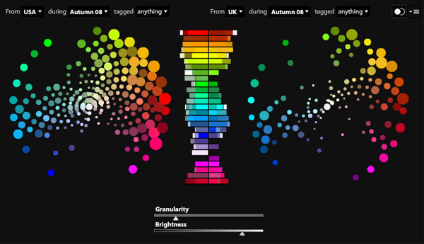
 Adobe’s Kuler, which is a community site where designers create and share color themes, added a neat new feature today called Community Pulse. We mentioned Kuler recently in our list of 15 design inspiration sites, but stopped short of calling it a “must bookmark” destination — this new feature may make us reconsider. Community Pulse is a data visualization that displays Kuler download information filtered across location, time, and tag.
Even cooler, Community Pulse can display two different visualizations side by side, which means that users can compare data across locations or time periods. What Community Pulse really shows is how the use of color changes around the globe and at different times of the year. The image below, for example, compares color usage between the US and the UK in Autumn 2008.

The larger circles represent the more popular color ranges (depending on your level of granularity, a circle might actually represent more than one color), based on downloads. For now, Kuler only has data available for the US, UK, Germany, Brazil, France, and Japan, and for the four seasons of 2008. According to the site’s FAQ, though, the plan is to rotate different data sets into the Community Pulse feature — which might even mean different filter options in addition to location, time, and tag.
The data visualization also features a histogram that shows color usage by hue, the longer the bar, the more popular the hue. The histogram is extremely useful when comparing two data sets because it very clearly shows which colors are more popular in different geographic regions or at different times of the year. Because the histogram preserves extreme values that the color wheel can’t (because it would end up causing some color clusters to obscure others), it is a better tool for comparing color between data sets.
One tiny issue we noticed with Kuler’s Community Pulse is that the time filter is semantically unclear. Because seasons vary in different hemispheres, it’s hard to tell what “Summer” really refers to. For example, at SitePoint’s main office, everyone is right now enjoying the early months of summer. On the other hand, I am bracing for another big snowstorm this weekend and heading into the coldest part of winter. (SitePoint is based in Australia, while I am in the Northeastern United States.) Since Adobe is an American company, we’ll assume they’re referencing the seasons as they happen in the Northern hemisphere.
The Kuler site requires Adobe Flash Player 10.
 Josh Catone
Before joining Jilt, Josh Catone was the Executive Director of Editorial Projects at Mashable, the Lead Writer at ReadWriteWeb, Lead Blogger at SitePoint, and the Community Evangelist at DandyID. On the side, Josh enjoys managing his blog The Fluffington Post.


