Scroll Snap Points are a native CSS-only technique that you can use to create layouts where your content is easily scrolled or panned. With this new feature you can easily control how your content will scroll and how it will ‘snap’ to the correct locations (letting you create features such as pagination with ease).
Historically developers have used JavaScript (often jQuery) to create perfect smooth-scrolling, snapping interfaces. While these work just fine, having a native CSS approach that does essentially the same thing is always better.
The specification for Snap Points is still relatively new (and under development); however it’s supported by a few browsers and is stable enough for us to start playing around with.
An Overview of Snap Points
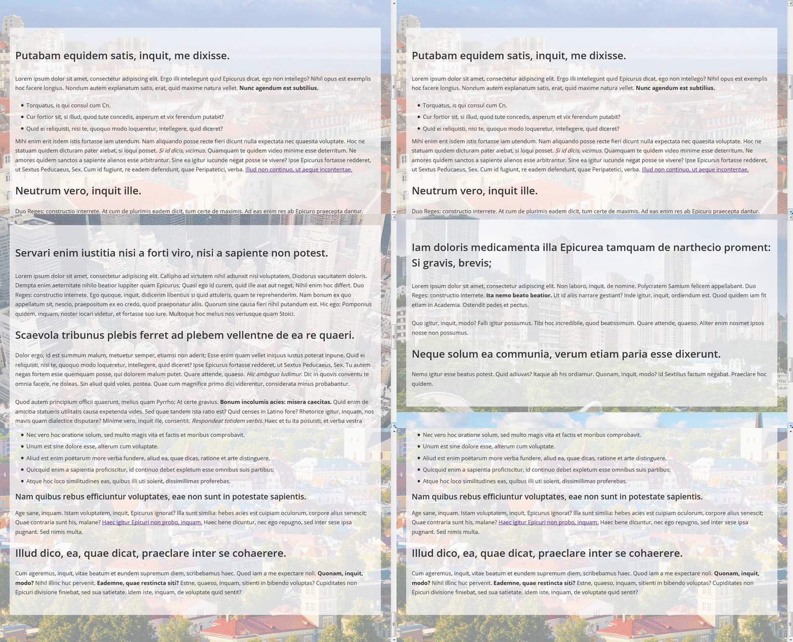
Snap point scrolling works by defining a Scroll Container element and then setting each of its inner elements to be Snap Points. Once these elements have been set, normal scrolling will be modified so that as users scroll/pan they will be snapped from one snap point to the next.
The main element that holds all of your other elements you wish to scroll between is called the Scroll Container. This is our main element and the majority of the snap-related properties will be set here. We can define:
- How tall/wide the container will be
- On which axis/axes the container will scroll (i.e. X, Y, or both)
- The strength of the snap elements and how they will react to scrolling
- The positions/offsets from the container to the snap elements as you scroll
The elements inside the scroll container will become our “Snap Points”. It’s this content that will be scrolled/panned to when we interact with the container. For an individual snap point you will define:
- The offset of the current snap element against the scroll container.

The Scroll Snap Points Properties
Getting Snap Points to work in your projects involves only a few CSS properties. Let’s outline these below and then later when can look at a few examples that showcase how they work.
scroll-snap-destination
This property is set on the scroll container and it defines the X position and Y position values (relative to itself) that the elements inside will snap to. You use this property to tell the container exactly where its elements will be snapped to.
Here are the possible values:
unset– Used to declare that this container is not a scroll container (by default no containers are unless you set it)position– You must set both the X and Y position or the browser will ignore your property
- Value can be in pixels such as
scroll-snap-destination: 50px 100px;which tells the browser that it will snap elements from 50px to the left and 100px from the top. - Value can be a set of percentages such as
scroll-snap-destination: 0% 100%;which tells the browser that it will snap elements from 0% to the left and 100% from the top. - Value can also be other allowed units such as
scroll-snap-destination: 0vw 50vwwhich tells the browser that it will snap elements from 0% of the current viewport height to the left and 50% of the current viewport height to the top.
- Value can be in pixels such as
Let’s look at a few visual aids so you can see how this property works (as it’s one of those properties you will need to adjust until you get the correct effect).
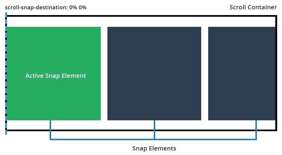
scroll-snap-destination: 0% 0%
Setting the scroll destination to 0% will ensure that all inner elements snap to the leading left edge of the container.
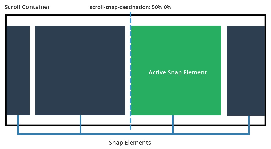
scroll-snap-destination: 50% 0%
Here we set the scroll container to snap content at 50% of its width. This means that as we scroll, the active element will snap to the left hand side of the 50% position.
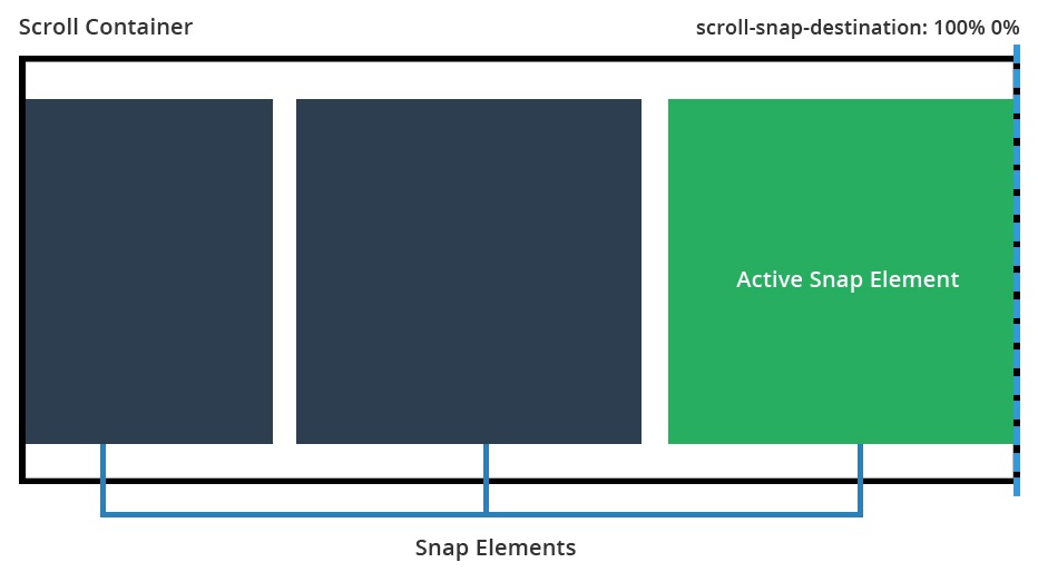
scroll-snap-destination: 100% 0%
This time our snap destination is 100%. This means each of the inner elements will snap to the right side of the container as we scroll.
scroll-snap-coordinate
This property is defined on each snap element and determines the X position and Y position values where this element will snap to. This property works together with the scroll-snap-destination declared on the container and determines the element’s offset from the snap point.
none– There will be no offset for this element. It will snap directly where the scroll container has defined.position– You must set both the X and Y position for this to work.
- Value can be in pixels such as
scroll-snap-coordinate: 100px 0px, which tells the browser the snap element will be offset by 100px from the left edge of the snap point and 0px from the top. - Value can use percentages such as
scroll-snap-coordinate: 25% 0%, which tells the browser that the element will be offset by 25% of its width from the left edge of the snap point (and also offset by 0% from the top). - Value can also be other allowed measurements such as
scroll-snap-coordinate: 15vw 15vwwhich will mean the snap element is offset by both 15% of the viewport width from the top and left of the snap container. position (multiple)– You can also set multiple coordinates for the snap element by passing set pairs such asscroll-snap-coordinate: 50% 0%, 100% 0%which tells the browser this element will snap to 50% of its width from the leading left edge of the snap point (and 0% from the top) and it will also snap to 100% of its width from the snap point edge (and 0% from the top). This is useful because sometimes at the start or end of a scrolling list an item should snap in multiple places, not just one.
- Value can be in pixels such as
If this property is not set, the element will simply snap as defined by the scroll container. If you do set the scroll-snap-coordinate property, the element itself will offset itself depending on what you enter. This is mainly used so you can position your elements just right (or to allow other content to peek through the viewport).
Let’s look at some examples for scroll-snap-coordinate with a description of what each one does:
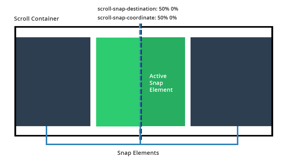
scroll-snap-coordinate: 50% 0%
This tells the browser that the element should snap towards the set edge of the scroll container, but that its snap should offset itself by 50% of its width to the left. This basically means that it will center align itself to the snap point.
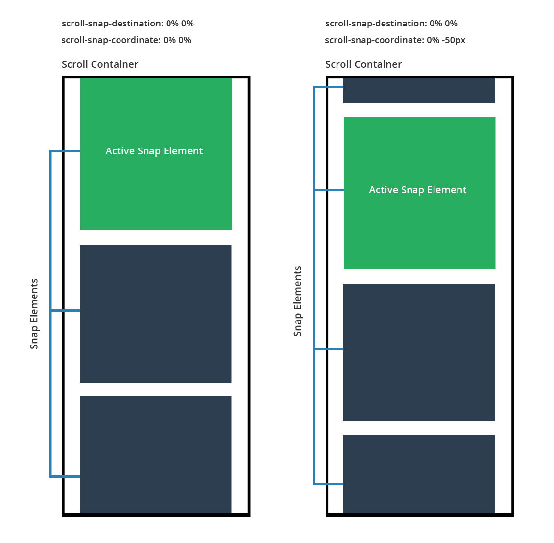
scroll-snap-coordinate: 0% 0% and scroll-snap-coordinate: 0% -50px
Here we see a side by side comparison so we can look at what happens when you specify that your elements will have a negative offset.
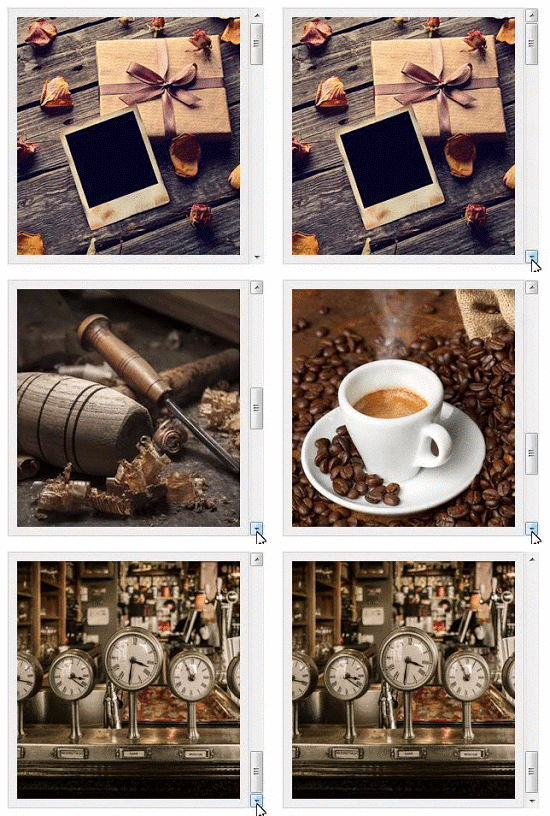
For the example on the left, we don’t set the coordinate property (it will just snap to its parent’s container). The example on the right, we explicitly tell the browser to offset the vertical snap position by -50px (which lets another element before it sneak in).
You can adjust the coordinate properties until your snaps work for your interface.
scroll-snap-type
This property determines how strongly the scroll container will snap to its inner elements. Here are the possible values:
none– The scroll container ignores all snap points (scrolls normally)mandatory– The scroll container will move to the next snap element during even a small scroll or single click on the scroll bar. The scroll container will immediately move and align itself with the snap point. This is best used you want to be 100% sure that as your user scrolls they will always snap to the next element.proximity– The scroll container will move to the next snap element only if it is somewhat close to a snap point. As the user scrolls or clicks on the scroll bar, the scrolling motion will seem to be normal, however if the user gets close to the edge of a snap element it will then snap into place. This is best used when you want your users to be able to scroll freely, but would like the scroll container to snap to content if it gets close enough (somewhat like a magnet).
I find using mandatory works the best as it’s a hard forced snap, however proximity also works well with its softer snap between zones (the downside is there is no way to customize how sensitivity of when it will snap)
scroll-snap-points-x and scroll-snap-points-y
If you view the current version of the spec you’ll notice it includes descriptions for the scroll-snap-points-x and scroll-snap-points-y properties. As pointed out in a notice on MDN, these two properties have been deprecated and so they’re not included in the editor’s draft of the spec. So I won’t go into details on those here.
Practical Examples with Scroll Snap Points
Now that we’ve covered the basics, lets jump into some examples so you can see how this all works in practice.
Each of the examples below has its own CodePen with even more notes that discuss exactly how the scrolling works (plus a few little design bugs you might run into). Feel free to fork your own copies and create something fun with them.
A full-width interactive section scroller
The great thing about CSS Snap Points is how easy they are to implement. All you do is define your container, its elements, and how it will snap. Look at the additional full-width container slider I have built below. Here’s what it contains:
- Full-width outer container (using vw and vh units)
- Each section has its own dynamic height, not a set height with px
- On scroll, each section is snapped to the top of the scroll container
Dynamic gallery slider with differently-sized images
This gallery contains images of all different shapes, sizes and aspect ratios. Here’s a description:
- Handles different image sizes and aspect ratios (so a real life example)
- Snaps content to the center of the container
- It’s responsive. Works based on either an auto width / height with additional maximums set by max-width / max-height. Images are adjusted to fit within (and their scroll positions updated).
- Uses a combination of
scroll-snap-destinationandscroll-snap-coordinateto handle the snapping
See the Pen Snap Points Demo: Scroller with different sized images by SitePoint (@SitePoint) on CodePen.
And here is the vertical scrolling example:
See the Pen Snap Points example: Vertical scroller with different sized images by SitePoint (@SitePoint) on CodePen.
Responsive gallery slider with equal-size images
For this example, all of our images are the same size. In addition, the images themselves will be responsive, using bottom padding to make them perfectly square. As the viewport resizes, they will resize accordingly (up to a set maximum width).
- Fully responsive, width 100% with padding 0% to create a perfectly responsive square gallery
- Shows one image at a time by using either
snap-scroll-points-xorsnap-scroll-points-yto move horizontally or vertically through the gallery.
See the Pen Snap Points example: Responsive Horizontal Scroller with same sized images by SitePoint (@SitePoint) on CodePen.
And here is a vertical example:
See the Pen Snap Points example: Responsive Vertical Scroll Gallery with Same Sized Images by SitePoint (@SitePoint) on CodePen.
Browser Support for Snap Points
Details on browser support for Snap Points can be found on Can I Use, but here’s a quick summary, as of this writing:
- Firefox 39+ – Fully supported for current specification.
- IE10 – Requires a touch device for this to work and requires the
-msprefix. - IE11 – Can use snap points on either a touch screen, mouse, keyboard, or trackpad and requires the
-msprefix. - Edge – Much like IE10 and IE11, supports snap points with the
-msprefix - Safari 9 – Supports snap points but doesn’t support the
nonekeyword for thescroll-snap-coordinateproperty. Also, doesn’t support length keywords oftop,right,left, orbottomfor thescroll-snap-destinationandscroll-snap-coordinateproperties. - iOS Safari 9 – Requires
-webkitprefix (this is the only mobile browser that supports Snap Points)
Basically we have great support if you’re on Firefox, average support on Internet Explorer / Edge and basic support on Safari. Chrome Canary (Google’s bleeding edge version of Chrome) has support for Snap Points so it should find itself in stable Chrome soon.
Sadly If you’re hoping to use this on mobile apps, it might take a while before most of the major browsers support it.
If you’re interested in using Snap Points today, you can try a polyfill by Clemens Krack.
Conclusion
I hope you now you have a fairly solid understanding of CSS Snap Points and how they can be leveraged to create interesting and easy to manage user interfaces. Going forward, support will spread fully to Chrome and IE and then we can start pushing for its inclusion in upcoming projects.
I’d love to hear from you if you end up implementing snap points in one of your projects!
Frequently Asked Questions (FAQs) about CSS Scroll Snap Points
What is the difference between mandatory and proximity in CSS scroll snap type?
The CSS scroll snap type property determines how strictly snap points are adhered to in the scrolling container. The two values, ‘mandatory’ and ‘proximity’, behave differently. ‘Mandatory’ means the scroll will always end at a snap point. If the user stops scrolling before reaching a snap point, the browser will automatically scroll to the nearest one. ‘Proximity’, on the other hand, means the scroll may end in the middle of a snap point if the user stops scrolling. The browser will only scroll to a snap point if it’s nearby.
How can I use CSS scroll snap with horizontal scrolling?
CSS scroll snap can be used with horizontal scrolling in a similar way to vertical scrolling. You need to set the scroll-snap-type property to either x mandatory or x proximity on the scrolling container. Then, on each scroll snap target, set the scroll-snap-align property to start, end, or center. This will determine the alignment of the target when a scroll snap occurs.
Can I use CSS scroll snap with both horizontal and vertical scrolling?
Yes, CSS scroll snap can be used with both horizontal and vertical scrolling. To do this, you need to set the scroll-snap-type property to both mandatory or both proximity on the scrolling container. Then, on each scroll snap target, set the scroll-snap-align property to start, end, or center. This will determine the alignment of the target when a scroll snap occurs.
Is CSS scroll snap supported in all browsers?
CSS scroll snap is widely supported in modern browsers, including Chrome, Firefox, Safari, and Edge. However, it may not be supported in older browsers or some mobile browsers. It’s always a good idea to check the current browser support on a site like Can I Use before implementing a feature.
Can I use CSS scroll snap with a carousel?
Yes, CSS scroll snap is a great tool for creating a carousel. By setting the scroll-snap-type property on the carousel container and the scroll-snap-align property on each carousel item, you can create a smooth, snap-to-scroll experience that works well on both desktop and mobile devices.
How can I control the speed of CSS scroll snap?
The speed of CSS scroll snap is determined by the browser and cannot be directly controlled with CSS. However, you can influence the scrolling speed by adjusting the size of your scroll snap targets. Larger targets will result in faster scrolling, while smaller targets will result in slower scrolling.
Can I use CSS scroll snap with infinite scrolling?
CSS scroll snap can be used with infinite scrolling, but it requires some additional JavaScript to manage the addition and removal of scroll snap targets. As new content is loaded, you’ll need to ensure that the scroll-snap-align property is set on each new target.
How does CSS scroll snap work with keyboard navigation?
CSS scroll snap works well with keyboard navigation. When a user navigates with the arrow keys, the browser will automatically scroll to the nearest snap point. This makes it a great tool for improving accessibility on your site.
Can I use CSS scroll snap with flexbox or grid layout?
Yes, CSS scroll snap can be used with both flexbox and grid layout. The scroll-snap-type property is set on the scrolling container, which can be a flex container, grid container, or any other type of block-level container.
How can I debug CSS scroll snap issues?
Debugging CSS scroll snap issues can be tricky, as the behavior is largely controlled by the browser. However, you can use the browser’s developer tools to inspect the scroll-snap-type and scroll-snap-align properties on your elements. If you’re having trouble with a specific browser, it may be helpful to check the browser’s documentation or forums for known issues and workarounds.
 Simon Codrington
Full stack developer and overall web enthusiast. I love everything to do with web / design and my passion revolves around creating awesome websites. Focusing primarily on WordPress, I create themes, plugins and bespoke solutions.


