
Key Takeaways
- Visuals play a critical role in modern information consumption due to our brain’s innate tendency to process information visually, with images often engaging both our logic and imagination simultaneously. However, the use of images should be balanced with text, as the latter provides precision to ideas and plays a central role in SEO.
- The use of typography in web design can significantly enhance the emotional impact and readability of text content. However, it’s important to use unconventional fonts sparingly and mainly for titles and subheadings to avoid overwhelming the user and detracting from the main content.
- The key to effective web design lies in striking a balance between text and visuals. While images can serve as the main visual hook, guiding the eye through the text information and enhancing user engagement, they should not replace text. Both elements must be harmoniously combined to achieve the design’s goals.
Technology has changed the modern world greatly in recent years and, in particular, it has changed the way we seek and receive information.
People simply have less time for the deep and thorough reading our parents might have done a generation ago. Most of us deal with many input sources — the web, email, twitter, SMS, and IM to name a few — so we naturally tend to favor any information that can be grasped in seconds, if not instantaneously.
Our brain is hard-wired to process the world in a visual form. It’s part of our ‘native OS’. For at least 40,000 years, humans have been transferring information from one person to another with the help of images, pictograms and graphic symbols.

Text information is a ‘kid brother’ by comparison. The first evidence we have for written communication appears in Sumeria around 2600 BC — an evolutionary blink of the eye.
Small children start their learning process with the use of picture books and are much more likely to engage with a book that has pictures than text-heavy book. Even older children (and, many adults for that matter) often only become engaged with a book after they’ve watched the movie that was based on it.
Why Are Visuals So Engaging?
It’s generally agreed upon that people in don’t read on the Internet. A recent study claims that most users endorse and share posts after scanning only a few first lines, or even just a headline.
So, if your well-considered and wordy Facebook rant of yours gets a batch of likes, don’t assume your tribe actually read it. The endorsement may be more of a high five for effort — especially if you have a cool image there.
Another recent Twitter study shows that tweets with photos and images are more engaging for users than text-only tweets. The key reason for this trend is that images speak directly to our emotions. Images get fed straight into our subconscious, unlike text symbols which need to go through a ‘decoding step’.
Color, size and shape of a visual element evoke various feelings — anything from warmth to anger to joy — and can even push us to engage with a brand, share a post or buy a product.
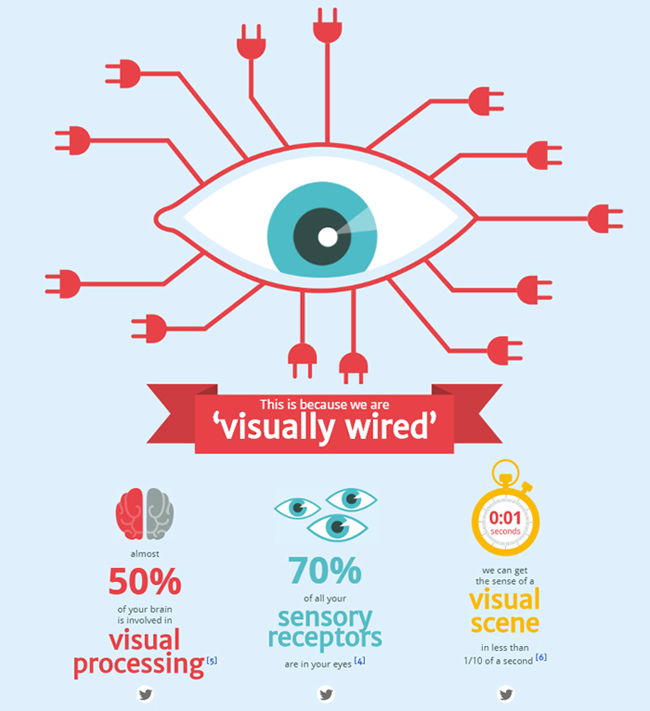
Credit :NeoMam Studios
Another part of the explanation is that visual images appeal to both the left and right sides of our brains, engaging our logic and imagination at the same time. Actually, the growing success of infographics is a plain evidence of this idea.
What About Text?
It’s hard to imagine a world without text. It borders our roads, adorns our buildings, buses and books. A picture may well be worth a thousand words, but it’s likely a different thousand words for each of us. Text gives our ideas a precision that we can rarely approach with images alone.
Text also plays the central role in SEO, being the only data we can say with certainty that search engines understand perfectly.
Of course, this may seem like a situation of tail wagging the dog: surely it’s not us who should be serving search engines’ needs, but vice versa. The truth is, we need them as well and that won’t change anytime soon. The fact is – the internet is a big place, and few will find your beautiful photos or cute cat videos without the useful tags and keywords you add to them.
Web typography is the area where pure text and visualization overlaps.
Wise font choices improve text readability, but it also changes the voice that delivers your message. Set Rhianna’s lyric ‘I want you to stay‘ in Didot and it will seem like a heartfelt plea. Set the same text in Bank Gothic and it turns into a direct order.

Additionally, typography color and size increases its psychological and emotional impact. Thus, typographical elements attract visitors attention as images do, and carry all necessary information the text provides.
How to Wisely Use Text and Visuals in Web Design
Your website needs a proper balance between textual and visual content. Awesome images or videos without text will give your visitor little to no useful data. On the other hand, you may find it hard to engage users with large slabs of plain text.
Images are the main visual hook for websites that appears in logos, backgrounds, sliders and many more. They draw users into reading the text, illustrate the information provided in articles and blog posts and sometimes just entertain.
Images are a perfect way to guide the eye through the text information.
One of today’s big trends — large background images — is used on many websites as an central organizing element. Among those who often get the biggest advantage from full-size background photos are:
- Photographers – to show up their best portfolio photos to potential clients;
- Decor and design studios – to showcase their greatest projects and products;
- Travel agencies – to provide visual info about places they offered to visit.

Today we’re also commonly seeing videos used as a website background. They often serve a purpose of drawing attention to the website content, and usually offer a playful element for a user.
Infographics are one of the most engaging and in-demand element among website owners and Internet users that combines text and images.
As a format, they’ve evolved from often dry, technical diagrams to informative, powerful, and even fun story-telling devices. That help simplifying things for all types of users. Typically infographics allow users to grasp a complicated ideas and data with limited amounts of text and tons of catchy visuals.
Today even text may be presented in a form of a beautiful and creative imagery. With a great variety of cool fonts and typefaces you may release your imagination. Always keep an eye out for unique typography solutions that support your imagery.
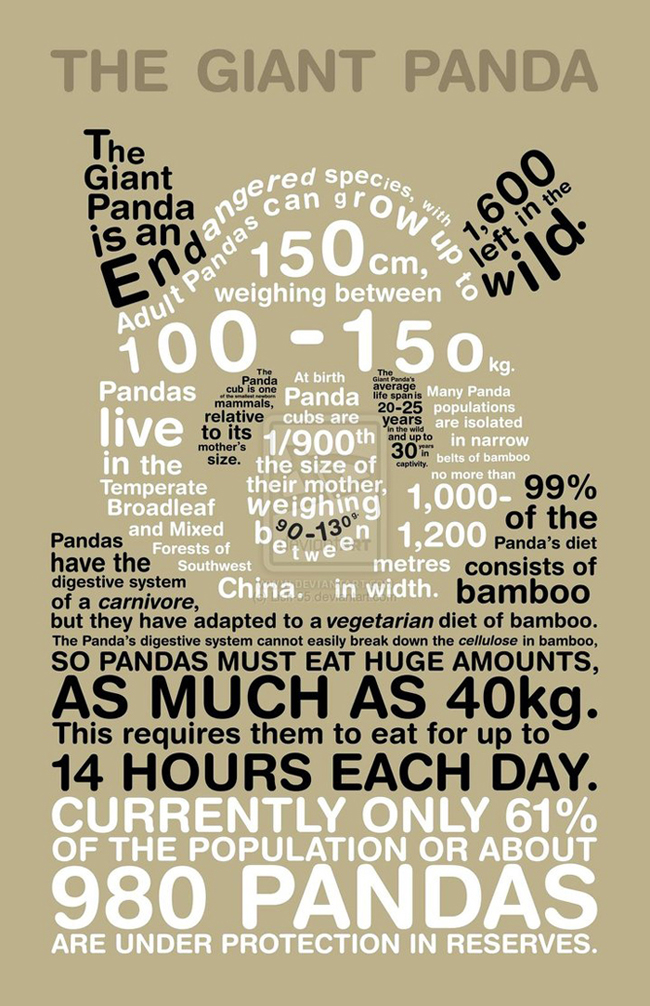
Infographic Credit :Lish-55
There is just one limitation to consider: user experience! Never use fancy or fussy typefaces for body text. Users won’t spend the effort to work through it, and your design will look overloaded. Save unconventional fonts for titles, subheadings and other design elements that are used for drawing users to the content — not deliver it.
When it comes to UX, the main thing to strive for is balance! Sometimes a design can begin too text-heavy, but swing too far towards towards imagery. Without both aspects harmoniously combined it won’t reach its goals.
Frequently Asked Questions (FAQs) about Images and Text Importance in Web Design
Why are images important in web design?
Images play a crucial role in web design as they help to create an engaging and visually appealing website. They can convey complex messages quickly and effectively, often more so than text. Images can also help to break up large blocks of text, making the content more digestible for the reader. Furthermore, they can enhance the overall aesthetic of the website, making it more attractive and inviting to users.
How does text contribute to effective web design?
Text is a fundamental element in web design. It provides the necessary information that users are looking for when they visit a website. Good, well-structured text can guide users through the site, help them understand the products or services being offered, and encourage them to take action. Additionally, text is crucial for SEO, helping search engines understand and rank the website.
How can I balance the use of images and text in my web design?
Balancing images and text in web design requires careful planning. The key is to use images to support your text, not replace it. Images should be used to enhance the message conveyed by the text, not distract from it. Similarly, text should provide the necessary context for images. A good rule of thumb is to use images sparingly and only when they add value to your content.
What are the SEO implications of using images vs text?
Both images and text have implications for SEO. Text is crucial for search engines to understand the content of your website and rank it accordingly. However, images can also contribute to SEO when used correctly. For example, using alt tags with relevant keywords can help search engines understand the content of the image, which can improve your website’s SEO.
How can I make my text more engaging for users?
Making your text engaging for users involves writing clear, concise, and compelling content. Use headings and subheadings to break up the text and make it easier to read. Also, use bullet points or numbered lists where appropriate to highlight key points. Additionally, try to write in a conversational tone that resonates with your audience.
How can I optimize my images for better web performance?
Optimizing your images for web performance involves reducing their file size without compromising their quality. This can be achieved through various techniques such as compression, resizing, and using the correct image format. Additionally, using responsive images that adapt to different screen sizes can also improve web performance.
What are the best practices for using images in web design?
Best practices for using images in web design include using high-quality images that are relevant to your content, optimizing them for web performance, and using them sparingly to enhance your message. Also, always include alt text for your images for SEO purposes and to improve accessibility.
How can I use text to guide users through my website?
You can use text to guide users through your website by creating a clear and intuitive navigation menu, using descriptive headings and subheadings, and providing clear calls to action. Also, ensure your text is easy to read by using a clear font and sufficient contrast between the text and background.
How can images and text work together to create a compelling web design?
Images and text can work together to create a compelling web design by complementing each other. Images can be used to enhance the message conveyed by the text, while text can provide the necessary context for images. The key is to strike a balance between the two, ensuring that neither overwhelms the other.
What are the common mistakes to avoid when using images and text in web design?
Common mistakes to avoid when using images and text in web design include using too many images, which can distract from the content and slow down your website; using low-quality images; not optimizing images for web performance; using text that is too small or difficult to read; and not providing sufficient contrast between the text and background.