A while back, I tried to sign up for Venmo, a service that promises to simplify online payments between individuals. I say tried because it turned out Venmo was US-only. This limitation, however, revealed some critical UX flaws I’ve seen in other websites before. All three flaws I’ll discuss in this post are incredibly easy to fix, and as such I’m often surprised at how long some companies take to fix them. Let’s go through them one by one.
Note that while I will be using Venmo as a case study in this post, they’re not alone in making these slip-ups — these issues apply to a wide range of other websites and services too.
The Password-required Social Login
Having landed on their home page, I opted to sign up using Facebook. I don’t usually do this, but I wasn’t in a mood to create a new account just for this, even if I do use a password manager and all it would take would be a couple of clicks. I clicked on the “Sign up with Facebook” button,
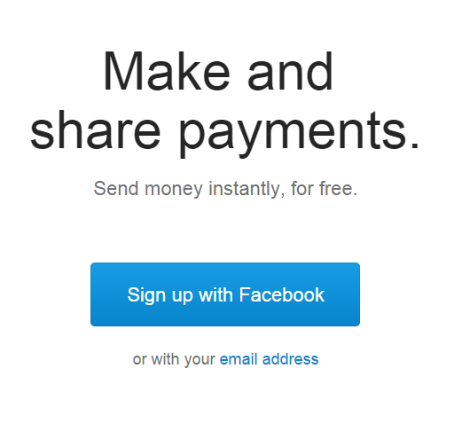
authenticate with the social network…
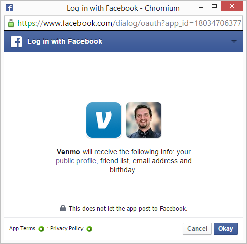
and…
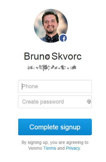
What? Password?
The Problem
The problem here is that I’ve opted to “Sign in with Facebook”, not “Create an account with us and link it to your Facebook account” – notice the difference? Facebook’s “Sign In” was made to help users skip the account creation process, thereby increasing the conversion rate and signups for your site due to users skipping that hurdle. Most people worry about privacy when signing in with FB, taking into account the information the app will now have about them, but clever folk usually don’t keep sensitive information on Facebook so the benefit of the ability to skip a signup process usually outweighs the potential privacy concerns.
The problem in this case is that it’s a “worst of both worlds” kind of scenario. Not only does the application now have access to your FB data, it still requires you to sign up manually. The only data it actually fetched were your name and email.
We can ignore the fact that the app is asking for the phone number, since that information isn’t available via the Facebook API.
The Solution
The solution is simple: you authenticate as usual and just skip the password generation step if the user is coming from Facebook. If your architecture doesn’t allow empty password fields, generate one randomly – it won’t be used anyway, because you’ll be using the access token you get from FB. The documentation to do this is dead simple as well.
The Error Reporter
Okay, so the signup flow is out of the way, let’s say we generated a password, put our phone number in and clicked “Complete Signup”:
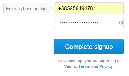
Hmm, okay, maybe it’s bothered by the + sign. Let’s just input it manually, and not through the autofiller, though if their app is bothered by the browser’s autofill, they should have just put “autofill=off” onto their form.
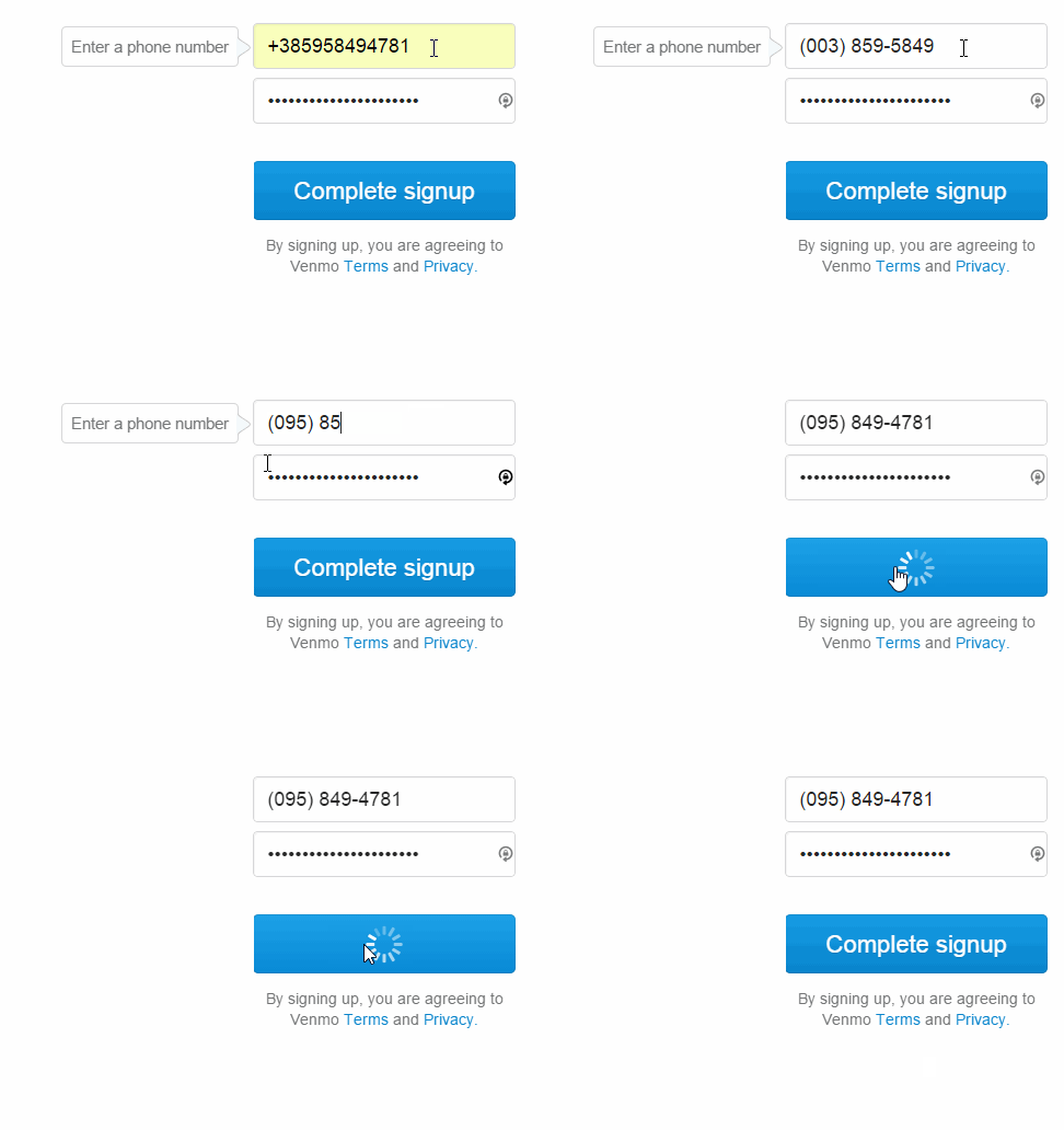
What’s happening? No one knows. First it refuses to let us type out the full number, so we skip the country code and just go for the rest of the number, hoping it’ll let us choose country later on. But then it just spins up and returns to the initial state. No error reports, no success reports, nothing. Let’s inspect the Dev Tools.

Ouch!
The Problem
The error is properly returned, but the front end doesn’t even check for it. It’s all there — a fully detailed error message and all — but it’s never used by the front end. The input field doesn’t flare up, no popups appear, nothing. There’s nothing to tell the end user about this.
The Solution
The solution is, once again, simple. In the JS that called the /users/v5 endpoint, look for the error node:
var returned_data = // returned data
if (returned_data.error.errors.length > 0) {
    // Errors exist - show them!
}
The Silent Country Ban
Which brings us the final UX slip-up. The error message we uncovered above tells us we need a US phone number to use Venmo.
The Problem
Looking into the Help Center now, we can see the service requires you to not only have a US phone number but to also be located in the US – which is something that’s not mentioned anywhere on the landing page – the single most important web page of any web oriented company out there. If your company is public on the web, if it makes money using the web, but is not available to all users of the web, you absolutely must let people know about it when they first open your website.
The Solution
The solution is simply checking for the IP of the visitor as soon as the page opens via tools like GeoIP and if the country it returns is not in the list of approved countries (anything other than US, obviously), all that needs doing is building a good looking header bar that says something like “It looks like you’re visiting from a country we don’t support yet – check back with us later?” User friendly, informative, approachable, and inviting – rather than have your users run into a brick wall head first and wonder what happened, you can let them down gently and maybe start building the foundation of a potential future relationship.
Of course, this approach doesn’t cover those using proxies and similar edge cases, but it does cover an enormous potential user base that mustn’t be neglected. Remember – the customers you don’t serve yet are customers, too.
Note: On Venmo, pasting in a number with a plus, like +95555555 will summon a friendly country-ban popup above the form, but seeing as you can only paste the + sign into the field and not type it I was unable to reproduce it via other means.
Conclusion
In this post, we looked at three common UX bugs and ways to easily fix them. Each of these solutions can be fully applied and deployed in under a day, even in the most rigid of development environments, so greeting your application’s users with them is pretty inexcusable. As web developers we should, nay, we must do better – we owe it to our users!
Have you met these problems before? Would you list any others? Let us know!
Bruno is a blockchain developer and technical educator at the Web3 Foundation, the foundation that's building the next generation of the free people's internet. He runs two newsletters you should subscribe to if you're interested in Web3.0: Dot Leap covers ecosystem and tech development of Web3, and NFT Review covers the evolution of the non-fungible token (digital collectibles) ecosystem inside this emerging new web. His current passion project is RMRK.app, the most advanced NFT system in the world, which allows NFTs to own other NFTs, NFTs to react to emotion, NFTs to be governed democratically, and NFTs to be multiple things at once.


