 Over the last couple of weeks, there have been a lot of rumblings on the web about a change that IKEA, the Swedish furniture store, has made to their
 logo and catalogues. To the average IKEA shopper, this change probably went unnoticed, but for type addicts it seems like IKEA has blasphemed.
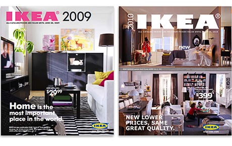
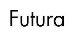
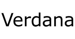
For the last fifty years, they have used the Futura font in the logo and in their catalogues. In fact, the font they used is a specially commissioned variation of Futura known as IKEA Sans. The IKEA catalogue is one of the most printed books in the world and the 2010 edition sees Futura replaced with Verdana. Yes, plain old Verdana — the font that’s safe to use on the Web. IKEA have said the reason for the change was to simplify and merge the fonts used on the Web and in print.

Image Credit: Brandacadabra
However, many typographers and graphic designers are up in arms in what’s become known as Verdanagate. A Romanian designer, Marius Ursache has set up an online petition asking IKEA to “Please Get Rid Of Verdana”.
It seems even IKEA themselves are surprised at the backlash. Ivana Hrdlickova, information manager at Ikea in Stockholm, speaking to The Swedish Wire said,
We didn’t expect people to react this strong. It’s sad that some people react negative. Still, we are very glad that people care so much. But what’s important is the message, not good looking fonts.
Back To The Futura
Futura is a geometric sans-serif font designed almost 80 years ago by Paul Renner and is renowned for its near perfect shaped letters. The strokes are of even weight with tall ascenders and upper case characters based on the proportion of classical roman characters. It’s a versatile and very attractive font available in several variations including Light, Medium, Bold, Bold Oblique, Oblique, Book and Extra Bold.

A little Verdana History
Verdana was designed by Matthew Carter specifically with screen-based use in mind. It is easy to read at small sizes on a computer screen due to its loose letter-spacing, large x-height. It is a font that is used every day on by web designers millions of web sites.
And I suspect that’s part of the problem for many designers. Verdana really is everywhere and on so many screens that it could be considered commonplace and when it comes to print, dare I say it, cheap.

So what do you think, should IKEA revert back to Futura? Does it bother you? Is this a case of typography snobbery? Should a brand as huge as IKEA change?
Frequently Asked Questions about IKEA’s Font Fiasco
What was the original font used by IKEA and why was it significant?
The original font used by IKEA was Futura, a typeface that was designed in 1927 by Paul Renner. It was significant because it was a reflection of the modernist design principles that IKEA embraced. The clean, geometric lines of Futura were a perfect match for IKEA’s minimalist, functional design ethos. The font was used in all of IKEA’s branding and marketing materials, making it an integral part of the company’s identity.
Why did IKEA decide to change its font?
IKEA decided to change its font in 2009 as part of a broader strategy to modernize its brand and make it more digitally friendly. The company switched to Verdana, a font that was designed specifically for screen readability. The change was also driven by the need for a font that could support a wider range of languages and scripts, as IKEA continued to expand globally.
What was the reaction to IKEA’s font change?
The reaction to IKEA’s font change was largely negative. Many design enthusiasts and IKEA customers felt that the switch to Verdana was a downgrade from the iconic Futura. They argued that Verdana lacked the distinctive character and aesthetic appeal of Futura, and that it made IKEA’s branding look generic and uninspired.
What is the significance of the Noto font?
The Noto font, which IKEA switched to in 2019, is a typeface developed by Google and Monotype. It’s designed to support all the world’s languages, making it a highly versatile and inclusive font. The name “Noto” is derived from the phrase “no more tofu,” referring to the blank boxes that appear when a computer or website can’t display a particular character.
How does the Noto font reflect IKEA’s brand values?
The Noto font reflects IKEA’s brand values in several ways. Firstly, its inclusivity aligns with IKEA’s commitment to diversity and accessibility. Secondly, its clean, simple design is in keeping with IKEA’s minimalist aesthetic. Lastly, the use of a digital-first font underscores IKEA’s focus on innovation and modernity.
What are the key differences between Futura, Verdana, and Noto?
Futura is a geometric sans-serif typeface with distinctive features like sharp, pointed apexes. Verdana, on the other hand, is a humanist sans-serif typeface designed for high readability on screens, with wider proportions and loose letter spacing. Noto is a sans-serif typeface that combines elements of both geometric and humanist designs, with a focus on universal language support.
How does the choice of font impact a brand’s identity?
The choice of font can have a significant impact on a brand’s identity. It can convey certain qualities or values, create a particular mood or atmosphere, and influence how customers perceive the brand. A well-chosen font can help a brand stand out, while a poorly chosen font can make it look unprofessional or out of touch.
What lessons can other brands learn from IKEA’s font fiasco?
One key lesson from IKEA’s font fiasco is the importance of considering customer reactions when making major changes to a brand’s identity. Another lesson is the need for a balance between practical considerations, like readability and language support, and aesthetic considerations, like design and style.
How has IKEA’s font change affected its global expansion?
IKEA’s switch to the Noto font has supported its global expansion by ensuring that its branding and marketing materials can be displayed in all languages. This has helped IKEA reach a wider audience and establish a consistent brand identity across different markets.
What is the future of IKEA’s branding and typography?
While it’s hard to predict the future, it’s likely that IKEA will continue to evolve its branding and typography to stay relevant and appealing to its global customer base. The company’s switch to the Noto font suggests a commitment to inclusivity, digital-readiness, and modern design, which are likely to remain key aspects of IKEA’s brand identity.
Jennifer Farley is a designer, illustrator and design instructor based in Ireland. She writes about design and illustration on her blog at Laughing Lion Design.


