As type is one of the major building blocks of page design on the web and in print, it’s a reasonable question to ask, “How do I choose my typefaces and which ones work best together?” Well there are relationships that exist in typography that can help us reign in a design and subdue it when required, or to produce something very eye-catching and bold. There are also relationships that we want to avoid. Let’s take a look at these three.
1. Concord
A design is considered to be concordant when you use only one typeface, and when the other elements of your page do not have much variety in weight, size and style. This type of design tends to sedate and evoke a fairly calm feeling. A concordant relationship in typography can be a good one depending on the aim of your design. If you want something high impact and in your face, this is not it. However, if you want a clean design with little fuss or clutter, you can achieve that by sticking with the one typeface and keeping other design elements simple.
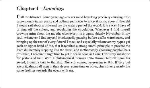
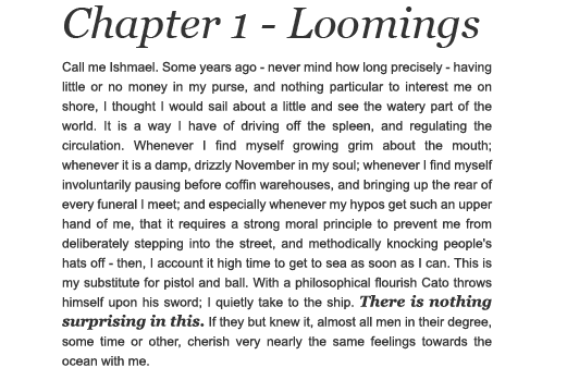
In the example below I’m using one font, Times New Roman. Within the Times New Roman typeface there are several styles, namely Regular (Roman), Italic, Bold and Bold Italic. The heading is larger and bolder than the body text, the first letter is larger and there is some italic type in the heading and near the bottom of the body text in the sentence “There is nothing surprising in this”. Overall the design is subdued, but it is also neat. You really can’t go too far wrong by sticking to just one typeface in your designs.
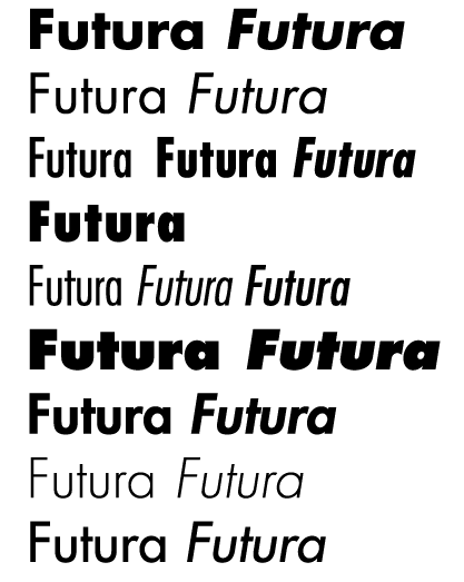
If you feel restricted by just one typeface, remember that many professional fonts offer a number of styles within the one typeface. For example Futura offers 19 different styles within the one typeface.
2. Conflict
Conflict occurs when you use two typefaces that are too similar. It might sound like that’s not a problem, but it actually disturbs the reader when a change of font occurs and the second font is very similar to the first one. Take a look at the example from before. This time I’ve put the heading in Georgia. Both Georgia and Times New Roman are serif fonts and while they do look a little bit different from each other, they still look too similar.
The heading here is not too much of a problem. The bigger problem lies in the sentence near the bottom, “There is nothing surprising in this”. The font has changed, but the reader might wonder why. Is it a mistake? In the previous example of a concordant relationship, I made this sentence stand out by using italics. Very simple.
So the point here is, avoid conflict.
3. Contrast
We can achieve much more appealing and attractive designs using contrasting typefaces. By using typefaces and design elements that are clearly very different from each other, simple designs become much more eye-catching. One of the easiest ways to get contrast on a web site for example, is to use a very large serif font as a heading, with small body text set in a sans serif font. (Note this is just one example, you can play around with all kinds of different font categories and mix them up).
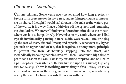
Again a good rule of thumb here is to use no more than two typefaces unless you are trying to deliberately make things look messy on your site or page. Looking at our Moby Dick example again, this time I’ve set a large size 40 pt, bold, italic heading in Georgia, and the body text is set in Arial. The sentence near the bottom also stands out clearly and doesn’t look like it was a typesetting error. It looks like the font has changed for a reason.
RikCat Industries is a nice example of the use of contrasting type on the web.

To sum up, concordant typography is good, but sometimes a little dull. Conflicting typefaces are
bad.
Contrasting typefaces are very good and eye-catching.
Do you use these guideline when it comes to choosing your fonts? What extra advice can you add?
 Jennifer Farley
Jennifer Farley is a designer, illustrator and design instructor based in Ireland. She writes about design and illustration on her blog at Laughing Lion Design.