

Key Takeaways
- WebSlides is a versatile tool for creating visually appealing HTML & CSS presentations, suitable for various content types like portfolios and interviews.
- The platform offers over 40 customizable components, promoting creative and semantic design flexibility.
- Integration with third-party tools like Unsplash and Animate.css enhances the functionality and aesthetic appeal of presentations.
- WebSlides is user-friendly, making it accessible for beginners and enjoyable for seasoned developers.
- The article provides a practical guide on using WebSlides to create a detailed presentation, demonstrating the future potential of SVG in web graphics.
This article was peer reviewed by Ralph Mason, Giulio Mainardi, and Mikhail Romanov. Thanks to all of SitePoint’s peer reviewers for making SitePoint content the best it can be!
Presentations are one of the best ways to serve information to an audience. The format is short and sharp, made up of small, digestible chunks, which makes any topic under discussion engaging and easier to understand. A presentation can contain all kinds of data, represented by many different elements, such as tables, charts, diagrams, illustrations, images, videos, sounds, maps, lists, etc, all of which lends great flexibility to this medium of expression.
Particularly on the web, presentations come in handy on many occasions, and there are loads of tools at your disposal to create some nifty ones. Today, I’ll introduce you to WebSlides — a small and compact library with a nice set of ready-to-use components, which you can leverage to build well-crafted and attractive web presentations:
WebSlides “is about telling the story, and sharing it in a beautiful way.”
In fact, one of WebSlides’ main benefits is that you can share your story beautifully and in a variety of different ways. With one and the same architecture — 40+ components with semantic classes, and clean and scalable code — you can create portfolios, landings, longforms, interviews, etc.
Besides, you can also extend WebSlides’ functionality by combining it with third-party services and tools such as Unsplash, Animate.css, Animate On Scroll, and so on.
WebSlides is easy to learn and fun to use. Let’s see it in action now.
Getting Started with WebSlides
To get started, first download WebSlides. Then, in the root folder, create a new folder and call it presentation. Inside the newly created presentation folder, create a new file and call it index.html. Now, enter the following code, which contains the needed references to the WebSlides’ files (make sure the filepaths correspond to the folder structure in your setup):
<!doctype html>

<html>

  <head>
    <!-- Google Fonts -->

    <link href="https://fonts.googleapis.com/css?family=Roboto:100,100i,300,300i,400,400i,700,700i%7CMaitree:200,300,400,600,700&subset=latin-ext" rel="stylesheet"/>

    <!-- CSS Base -->

    <link rel="stylesheet" type='text/css' media='all' href="../static/css/base.css"/>

    <!-- CSS Colors -->

    <link rel="stylesheet" type='text/css' media='all' href="../static/css/colors.css"/>

    <!-- Optional - CSS SVG Icons (Font Awesome) -->

    <link rel="stylesheet" type='text/css' media='all' href="../static/css/svg-icons.css"/>
  <body>

    <!-- PUT WEBSLIDES PRESENTATION CONTENT HERE -->
    <script src="../static/js/webslides.js"></script>

    <script>

      window.ws = new WebSlides();

    </script>
    <!-- OPTIONAL - svg-icons.js (fontastic.me - Font Awesome as svg icons) -->

    <script defer src="../static/js/svg-icons.js"></script>

  </body>
Now, you’re ready to go.
Create a Web Presentation with WebSlides
In this section you’re going to create a short, but complete presentation, which explains why SVG is the future of web graphics.
Note: If you are interested in SVG, please check my articles: SVG 101: What is SVG? and How to Optimize and Export SVGs in Adobe Illustrator.
You’ll be working step by step on each slide. Let’s get started with the first one.
Slide 1
The first slide is pretty simple. It contains only one sentence:
<article id="webslides">

  <!-- First slide -->

  <section class="bg-gradient-r aligncenter">

    <h1>Why SVG Is the Future of Web Graphics?</h1>

  </section>

  <!-- Second slide -->

  <section>

    ...

  </section>

  <!-- Third slide -->

  <section>

    ...

  </section>

  <!-- etc. -->

</article>
Each parent <section> inside <article id="webslides"> creates an individual slide. Here, you’ve used two classes from WebSlides’ arsenal, i.e., bg-gradient-r and aligncenter, to apply a radial gradient background and to align the slide content to the center respectively.
Slide 2
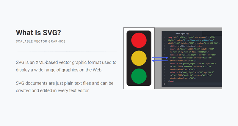
The second slide explains what SVG is:
<section>

  <div class="wrap">

    <div class="content-left">

      <h2>What Is SVG?</h2>

      <p class="text-subtitle">Scalable Vector Graphics</p>

      <hr>

      <p class="text-intro">SVG is an XML-based vector graphic format used to display a wide range of graphics on the Web.</p>

      <p class="text-intro">SVG documents are just plain text files and can be created and edited in every text editor.</p>

    </div>

    <div class="content-right">

      <img src="traffic-lights.png">

    </div>

  </div>

</section>
The code above uses the content-left and content-right classes to separate the content into two columns. Also, in order to make the above classes work, you need to wrap all content by using the wrap class. On the left side, the code uses text-subtitle to make the text all caps, and text-intro to increase the font size. The right side consists of an illustrative image.
Slide 3
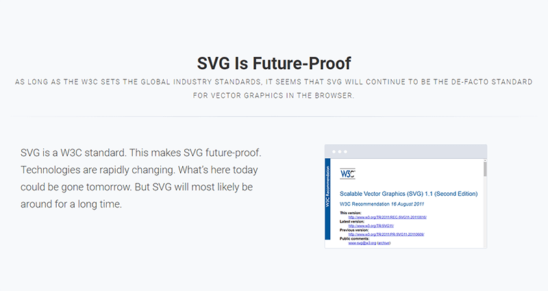
The next slide uses the grid component to create two columns:
<section class="aligncenter">

  <h2>SVG Is Future-Proof</h2>

  <p class="text-subtitle">As long as the W3C sets the global industry standards, it seems that SVG will continue to be the de-facto standard for vector graphics in the browser.</p>

  <hr>

  <div class="grid">

    <div class="column">

      <p class="text-intro" style="text-align: left">SVG is a W3C standard. This makes SVG future-proof. Technologies are rapidly changing. What's here today could be gone tomorrow. But SVG will most likely be around for a long time.</p>

    </div>

    <div class="column">

      <figure class="browser">

        <img src="standard.png">

      </figure>

    </div>

  </div>

</section>
The snippet above shows how to use the grid and column classes to create a grid with two columns. In the first column the style attribute aligns the text to the left (Note how the aligncenter class on the <section> element cascades through to its .column child element, which causes all text inside the slide to be center aligned). In the second column, the browser class makes the illustrative image look like a screenshot.
Slide 4
In the fourth slide, use the grid component again to split the content into two columns:
<section>
<h2 class="aligncenter">SVG Is the Best Graphic Format for the Web</h2>
<hr>
<div class="grid">
<div class="column">
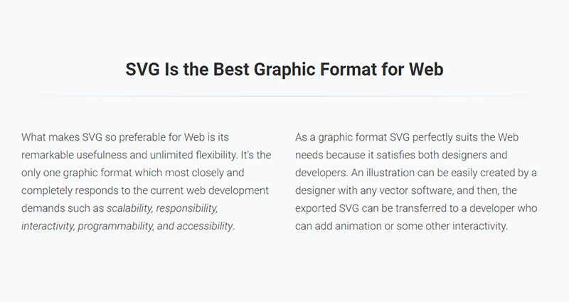
<p class="text-intro">What makes SVG so preferable for the Web is its remarkable usefulness and unlimited flexibility. It's the only one graphic format which most closely and completely responds to the current web development demands such as <em>scalability, responsibility, interactivity, programmability, and accessibility</em>.</p>
</div>
<div class="column">
<p class="text-intro">As a graphic format SVG perfectly suits the needs of the web because it satisfies both designers and developers. An illustration can be easily created by a designer with any vector software, and then, the exported SVG can be transferred to a developer who can add animation or some other interactivity.</p>
</div>
</div>
</section>
Slide 5
In this slide, place half of the content to the left and the other half to the right using the content-left and content-right classes respectively:
<section>
<div class="wrap">
<div class="content-left">
<h2>SVG Usage Is Growing</h2>
<p class="text-subtitle">Over the last year SVG usage has doubled.</p>
<hr>
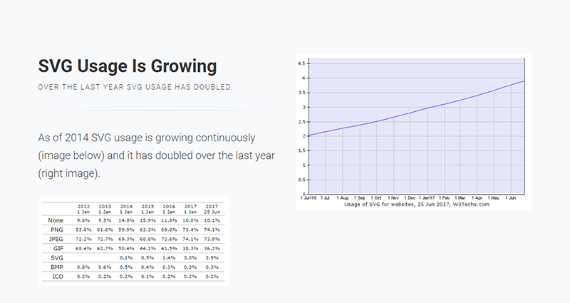
<p>As of 2014 SVG usage is growing continuously (image below) and it has doubled over the last year (right image).</p>
<img src="svg-usage-numbers.png">
</div>
<div class="content-right">
<img src="svg-usage.png">
</div>
</div>
</section>
Slide 6
In this slide, use the background class to embed an image as a background with the Unsplash service. Put the headline on light, transparent background by using the bg-trans-light class. The text’s color appears white, because the slide uses a black background with the bg-black class, therefore the default color is inversed, i.e., white on black rather than black on white. Also, for the text to be visible in front of the image, wrap it with <div class="wrap">:
<section class="aligncenter bg-black">

  <span class="background" style="background-image:url('https://source.unsplash.com/ICW6QYOcdlg/800x600')"></span>

  <div class="wrap">

    <h2 class="bg-trans-light"><em>SVG Solves the Most Important Problems in Modern Web Development</em></h2>

  </div>

</section>

Slide 7
In this slide, put the explanation text on the left and the illustrative image on the right at 40% of its default size (with the alignright and size-40 classes on the <img> element). For this and the next three slides, use slideInRight, which is one of WebSlides’ built-in CSS animations:
<section class="slideInRight">
<div class="wrap">
<img src="responsive.jpg" class="alignright size-40">
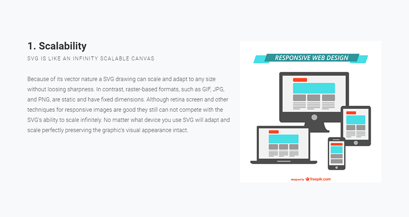
<h3>1. Scalability</h3>
<p class="text-subtitle">SVG is like an infinitely scalable canvas</p>
<p>Because of its vector nature an SVG drawing can scale and adapt to any size without loosing sharpness. In contrast, raster-based formats, such as GIF, JPG, and PNG, are static and have fixed dimensions. Although techniques for responsive images are good, they still can not compete with the SVG's ability to scale infinitely. No matter what device you use, SVG will adapt and scale perfectly keeping the graphic's visual appearance intact.</p>
</div>
</section>
Slide 8
Do a similar thing here:
<section class="slideInRight">
<div class="wrap">
<img src="interactivity.jpg" class="alignright size-40">
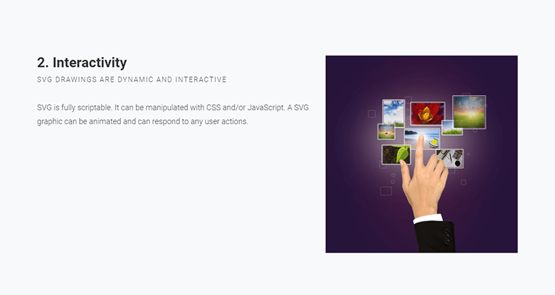
<h3>2. Interactivity</h3>
<p class="text-subtitle">SVG Drawings are dynamic and interactive</p>
<p>SVG is fully scriptable. It can be manipulated with CSS and/or JavaScript. An SVG graphic can be animated and can respond to user actions.</p>
</div>
</section>
Slide 9
This slide also uses a similar structure:
<section class="slideInRight">
<div class="wrap">
<img src="svg-market-position.png" class="alignright size-40">
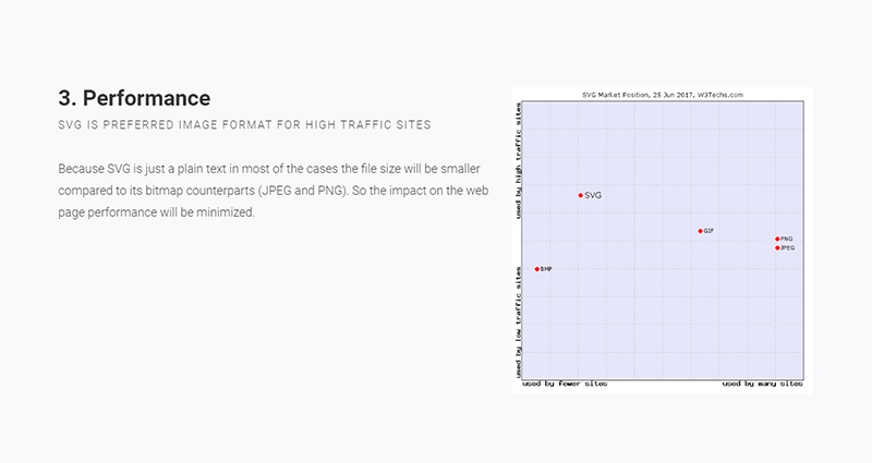
<h3>3. Performance</h3>
<p class="text-subtitle">SVG is the preferred image format for high traffic sites</p>
<p>Because SVG is just plain text, in most cases the file size will be smaller compared to its bitmap counterparts (JPEG and PNG). So the impact on web page performance will be minimized.</p>
</div>
</section>
Slide 10
Here, divide the content into left and right again. In the second <p> tag, use the inline style attribute to adjust the font-size and line-height properties. Doing so will override the text-intro class styles that get applied to the element by default. On the right side, use <div class="wrap size-80"> to create a container for the SVG code example:
<section class="slideInRight">
<div class="wrap">
<div class="content-left">
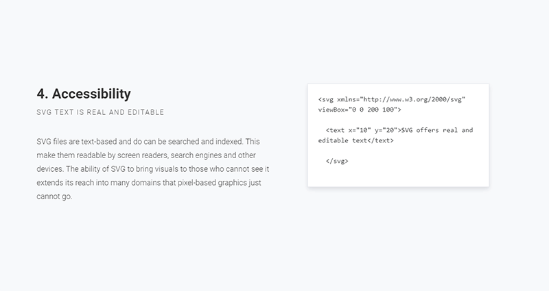
<h3>4. Accessibility</h3>
<p class="text-subtitle">SVG text is real and editable</p>
<p style="font-size: 1.8rem; line-height: 3.2rem">SVG files are text-based and can be searched and indexed. This makes them readable by screen readers, search engines and other devices. The ability of SVG to bring visuals to those who cannot see, extends its reach into many domains that pixel-based graphics just cannot go.</p>
</div>
<div class="content-right">
<div class="wrap size-80">
<pre><svg xmlns="https://www.w3.org/2000/svg" viewBox="0 0 200 100">
<text x="10" y="20">SVG offers real and editable text</text>
</svg>
</pre>
</div>
</div>
</div>
</section>
Slide 11
Here, leverage some of the classes you’ve already used to illustrate browser support for SVG:
<section class="aligncenter">
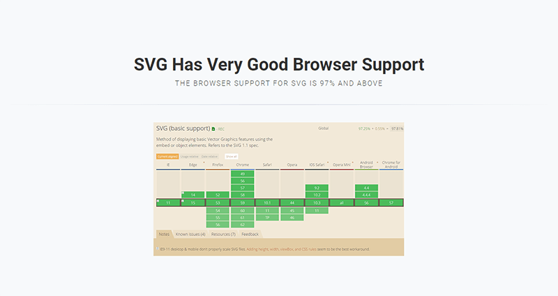
<h2>SVG Has Very Good Browser Support</h2>
<p class="text-subtitle">The browser support for SVG is 97% and above</p>
<hr>
<div class="wrap">
<img src="caniuse.png">
</div>
</section>
Slide 12
In this slide, show some of the use cases for SVG in the form of an image gallery. To this end, use an unordered list with the flexblock and gallery classes. Each item in the gallery is marked up with a li tag:
<section>
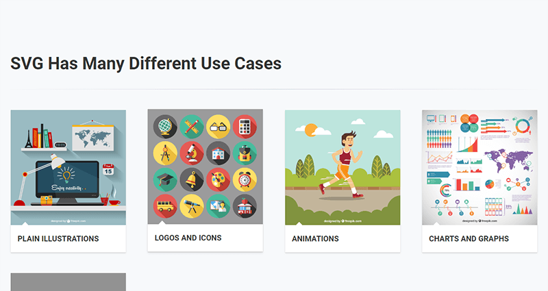
<h2>SVG Has Many Different Use Cases</h2>
<hr>
<ul class="flexblock gallery">
<li>
<a href="#">
<figure>
<img alt="Thumbnail" src="illustration.jpg">
<figcaption>
<h2>Plain Illustrations</h2>
</figcaption>
</figure>
</a>
</li>
<li>
<a href="#">
<figure>
<img alt="Thumbnail " src="icons.jpg">
<figcaption>
<h2>Logos and Icons</h2>
</figcaption>
</figure>
</a>
</li>
<li>
...
</li>
...
</ul>
</section>
Slide 13
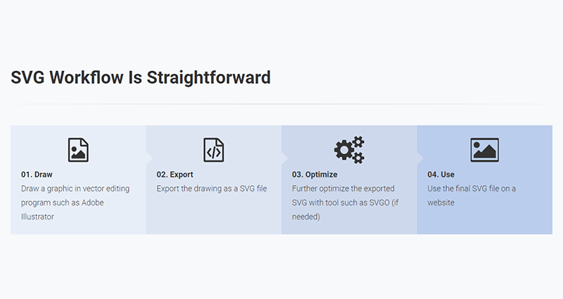
This section shows a typical SVG workflow, so you need to use the flexblock and steps classes, which show the content as a sequence of steps. Again, each step is placed inside a li tag:
<section>

  <h2>The SVG Workflow Is Straightforward</h2>

  <ul class="flexblock steps">

    <li>

      <span>

        <svg class="fa-file-image-o">

          <use xlink:href="#fa-file-image-o"></use>

        </svg>

      </span>

      <h2>01. Draw</h2>

      <p>Draw your graphic in a vector editing program such as Adobe Illustrator</p>

    </li>

    <li>

      <div class="process step-2"></div>

      <span>

        <svg class="fa-file-code-o">

          <use xlink:href="#fa-file-code-o"></use>

        </svg>

      </span>

      <h2>02. Export</h2>

      <p>Export the drawing as an SVG file</p>

    </li>

    <li>

     ...

    </li>

  </ul>

</section>
For each step after the first one, you need to add the process-step-# class. This adds a triangle pointing to the next step.
Slide 14
In the last slide, use another one of WebSlides’ built-in CSS animations, i.e., zoomIn:
<section class="zoomIn bg-black">

  <span class="background" style="background-image:url('https://source.unsplash.com/fPkvU7RDmCo/800x600')"></span>

  <div class="wrap">

    <h2 class="aligncenter">Start Coding SVG Today!</h2>

  </div>

</section>

Congratulations! You’re done. You can see the final outcome here:
See the Pen HTML and CSS Presentation Demo with WebSlides by SitePoint (@SitePoint) on CodePen.
Conclusion
Et voilà! You have just created a beautiful, fully functional and responsive web presentation. But this is just the tip of the iceberg, there’s a lot more you can quickly create with WebSlides and many other WebSlides features which I didn’t cover in this short tutorial.
To learn more, explore the WebSlides Components and CSS architecture documentation, or start customizing the demos already available to you in the downloadable folder.
Then, focus on your content and let WebSlides do its job.
Frequently Asked Questions (FAQs) about Creating Beautiful HTML & CSS Presentations with WebSlides
How can I customize the design of my WebSlides presentation?
WebSlides allows you to customize your presentation to suit your style and needs. You can change the color scheme, fonts, and layout by modifying the CSS file. If you’re familiar with CSS, you can easily tweak the styles to create a unique look. If you’re not, there are plenty of online resources and tutorials that can help you learn. Remember, the key to a great presentation is not only the content but also the design. A well-designed presentation can help keep your audience engaged and make your content more memorable.
Can I add multimedia elements to my WebSlides presentation?
Yes, you can add multimedia elements such as images, videos, and audio files to your WebSlides presentation. This can be done by adding the appropriate HTML tags in your slides. For example, to add an image, you would use the tag. To add a video, you would use the
How can I share my WebSlides presentation with others?
Once you’ve created your WebSlides presentation, you can share it with others by hosting it on a web server. You can use a free hosting service like GitHub Pages, or you can use your own web server if you have one. Once your presentation is hosted, you can share the URL with anyone you want to view your presentation. They’ll be able to view your presentation in their web browser without needing to install any special software.
Can I use WebSlides for commercial projects?
Yes, WebSlides is free to use for both personal and commercial projects. You can use it to create presentations for your business, for your clients, or for any other commercial purpose. However, please note that while WebSlides itself is free, some of the images and fonts used in the templates may be subject to copyright and may require a license for commercial use.
How can I add interactive elements to my WebSlides presentation?
You can add interactive elements to your WebSlides presentation by using JavaScript. For example, you can add buttons that the user can click to navigate to different slides, or you can add forms that the user can fill out. This can be done by adding the appropriate HTML and JavaScript code to your slides. If you’re not familiar with JavaScript, there are plenty of online resources and tutorials that can help you learn.
Can I use WebSlides offline?
Yes, you can use WebSlides offline. Once you’ve downloaded the WebSlides files, you can create and view your presentations offline. However, please note that some features may not work offline, such as loading external images or fonts. To ensure that all features work correctly, it’s recommended to host your presentation on a web server.
How can I add transitions and animations to my WebSlides presentation?
You can add transitions and animations to your WebSlides presentation by using CSS. CSS allows you to control the appearance and behavior of elements on your slides, including transitions and animations. For example, you can use the transition property to animate the change of a property from one value to another, or you can use the animation property to create more complex animations.
Can I use WebSlides on mobile devices?
Yes, WebSlides is designed to be responsive and works well on both desktop and mobile devices. However, please note that due to the smaller screen size, some elements may not display as intended on mobile devices. It’s recommended to test your presentation on different devices to ensure that it looks and works well on all platforms.
How can I add navigation controls to my WebSlides presentation?
You can add navigation controls to your WebSlides presentation by using the built-in navigation options. You can add arrows to navigate between slides, or you can add a slide counter to show the current slide number and the total number of slides. This can be done by adding the appropriate HTML and CSS code to your slides.
Can I use WebSlides with other web development tools?
Yes, you can use WebSlides with other web development tools. For example, you can use it with a text editor to write your HTML and CSS code, or you can use it with a version control system like Git to manage your project files. You can also use it with a build tool like Gulp or Grunt to automate tasks like minifying your code or compiling your CSS.