


Key Takeaways
- Utilize the Sencha ExtReact Grid to efficiently manage and display large datasets in React 16 applications, leveraging built-in functionalities like sorting, filtering, and editing without extensive DOM manipulation.
- Streamline the development process by using the ExtReact npm packages and the ExtReact app generator to set up a fully functional React application quickly.
- Enhance the user interface by embedding interactive components like buttons and sparkline charts directly within the grid cells, providing a dynamic and responsive user experience.
- Enable data export functionalities with minimal coding by utilizing the grid exporter plugin, allowing users to export data directly to Excel or CSV formats from the grid.
- Optimize the application for both desktop and mobile platforms by using conditional plugins and responsive design features, ensuring a seamless cross-platform user experience.
This article was originally published on Sencha. Thank you for supporting the partners who make SitePoint possible.
React 16 is the first version of React built on top of React’s new core architecture, codenamed “Fiber”. React 16 is designed from the ground up to support asynchronous rendering, which allows processing large component trees without blocking the main execution thread. It supports a number of key features such as catching exceptions using error boundaries, returning multiple components from render, reduced file size and support for MIT license.
If you’re developing a data-driven web application with React 16, chances are you’ll use a grid or spreadsheet-like interface at some point to display data for your users. Depending on the context, your users may expect the grid in your application to be capable of:
- Scrolling with a fixed header
- Sorting by clicking on a column header
- Showing and hiding specific columns
- Paging, grouping, and summarization
- Editing data in cells
- Exporting to Excel
- Drilling down/row expansion
A grid can be one of the trickiest and most complex UI components to build in React because many of the necessary features require both significant React expertise, as well as the willingness and ability to dig down into the DOM. Fortunately, the ExtReact Grid provides all of these capabilities and more.
In this article, we’re going to create an example using the Sencha ExtReact Grid that shows information about Stocks and equities companies. If you want to code a grid using an HTML table or another third-party component, you might have to do something like handle clicking on a column header to sort, or clicking on a divider between a column header to resize, or maybe sliding a pager and doing a fetch for the next page of data. With ExtReact Grid, these functionalities are built in. Want to try it yourself? Get started with a 30-day free trial of ExtReact today — sign up here.
Let’s get started with building an application using ExtReact Grid.
Getting Started with ExtReact App Generation
To get started on developing a React application with ExtReact components, please follow the steps below:
Make sure you have a Node environment set up
First, make sure you have Node 8.11+ and NPM 6+ set up on your system. You can download the latest Node version from the Node web site. If you’ve already installed Node, you can easily check the node and npm versions by using these commands:
node -v
npm -v
Get your login credentials for the ExtReact npm repo
ExtReact npm packages are hosted on Sencha’s private npm repo. You log in to that repo once to get access to all ExtReact packages. To get login credentials, go to the ExtReact 30-Day Free Trial page and fill out the form. We’ll send you an email with login details as well as some links to resources such as the docs and sample projects.
Login to ExtReact npm repo and get ExtReact app generator
The next step is to log in to Sencha’s private npm repo, which hosts the ExtReact packages. Use your npm login (provided in the email) to associate the repo with the @sencha scope, and enter the credentials when prompted:
npm login — registry=http://npm.sencha.com — scope=@sencha
The next step is to install ExtReact generator package.
npm install -g @sencha/ext-react-gen
Create your first React App
Run the Yeoman generator to create your first ExtReact app:
ext-react-gen app your-app-name-here -i
The generator will ask you to name your app, name the npm package, and select a theme. The default Material theme (based on Google’s Material design guidelines) is a good choice as a starting theme. Select “Generate an Empty App”. The generator will also prompt you to create a new directory for your project. The generator will then download and create your sample application, including relevant dependencies.
Run your React App
In the generator output, you will find steps to run your application. It’s as simple as changing to your new application directory and running the application using:
npm start
This will fire up the app, your empty React app will just show up with the title of the app. The main component (e.g. StocksGrid) in the application has one container at the root, which is marked as full screen, layout is set to fit, which means it will stretch its child to fill it.
See the code up to this step on GitHub.
Adding a Grid to the application
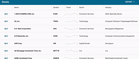
Add Stocks Data
We’ll be adding an example data set, called stocks.json to the application. It’s a fairly large data set, around 10,000 rows in json, and each row represents a company or ticker symbol — so we have the name of the company, ticker symbol, sector, industries they are in, and an array of ticks which are the last 5 sales of that stock. This is the data we’re going to display in our grid. In a real-world application, all of this data would be returned on the back-end. We’re going to load it statically for this sample application rather than go through all of the mechanics of how to build a back-end rest API. But it’s going to be loaded in the exact same way you would fetch from a real back-end.
Creating a Basic Grid
In the StockGrid component render method, we’re going to return a grid with columns.
To put columns in our grid, we use a column component, and it takes a data index that is the same as the name field of the stocks data. It takes a text prop that is the column header text, and then we can also give the column a width, like a fixed width or a flex or a combination of flex and minimum or maximum as well. We’ll add column components for company name, symbol, ticks, sector, and industry. Create a new StocksGrid class with Grid as shown below:
<Grid >
      <Column dataIndex="name" text="Name" width={300} />
      <Column dataIndex="symbol" text="Symbol" />
      <Column dataIndex="ticks" text="Trend" />
      <Column dataIndex="sector" text="Sector" width={200} />
      <Column dataIndex="industry" text="Industry" width={350} />
</Grid>
Now, add StockGrid to Class App as shown below:
export default class App extends Component {
  render() {
       return (
           <ExtReact>
               <StocksGrid />
           </ExtReact>
       )
   }
}
See the code up to this step on GitHub.You will be able to see the web application with empty Grid on npm start.
Binding Stock Data with Grid
A grid in ExtReact is a data table that pulls in and renders data from an Ext Data Store. In ExtReact, our store implementation is a data structure that allows you to sort and filter data for a grid or components (like lists or charts).
We can now start by loading the stocks data and creating a store. Again, grids always grab their data from the store, and some of the interactions with grid will trigger events on the store, like reloading or sorting or paging. So to do that, we’ll create our store here.
The Ext data store is different from the flux store. What makes the grid and the store a little different from the standard React approach is that the two are tightly integrated. Typically, you can pass data directly to a store, or a store can pull data on its own from a back-end using a proxy. With ExtReact Grid, you get interactive functionality like filtering, sorting, paging, grouping, and summarization without having to actually code it.
For this example, we’re passing the data directly to the store from the Stocks data file. You can also create a store with a proxy config — having a proxy allows us to do all sorts of great things like remote paging, filtering, and sorting. We set autoload to true, so it automatically loads the grid. The data isn’t particularly sorted by any criteria, so we’re going to have it sort on the client-side by specifying the name property.
     this.store = new Ext.data.Store({
           data: stocks,
           autoLoad: true,
           sorters: [{
               property: 'name'
           }],
           listeners: {
               update: this.onRecordUpdated
           }
       })
In the Grid, assign the store config to the store that was created.
<Grid store={this.store}>
      ...
</Grid>
Now, we have a grid with all the data as shown below:
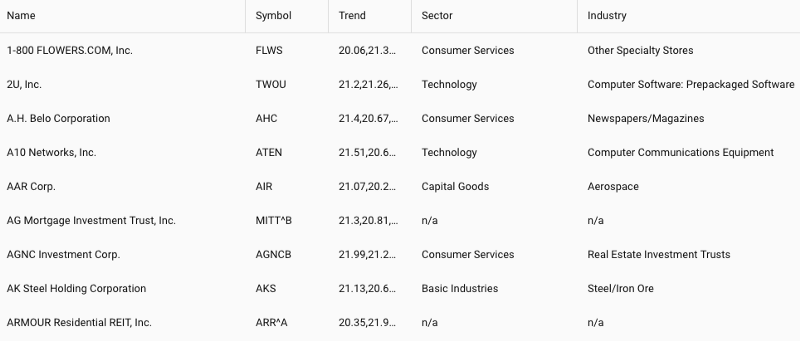
With this simple code, you get a lot of features for free — such as sorting — which allows you to click on any column header and it automatically sorts (see the symbol column in the example below).
In this case, the sorting is done on the client side. But if we implemented a real back-end API, we could configure the proxy to do remote sorting on the back-end and use an “order by clause” in the database to do a sort.
You also get resizable columns for free. So even though we set a width on these columns, if the user wants to see something or close something, he can do that by dragging the column from side to side.
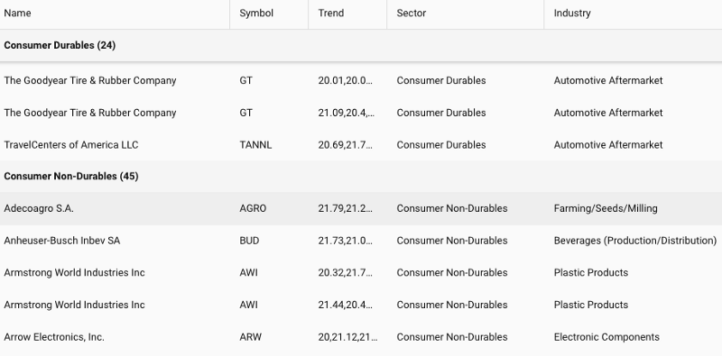
You also get a nice grouping feature too. So if we wanted to group by industry, we could say group by this field, and it will group all of the data by the value of industry, and it will give you a pinned header as you scroll down for each of the groupings.
You’ll notice that this data is rendering pretty quickly for 10,000 records. The reason it renders so quickly is because it’s using what we call buffered rendering. So despite the fact that this table looks full, and you can scroll down and it keeps going and going, on initial loading it only renders a little bit more than what you’re actually seeing in terms of the “view port height.”
As you scroll down, it’s actually replacing the content of the cells with the newer records as you page down in the store. So it’s actually conserving the DOM elements as much as possible, and keeping the DOM small, keeps memory consumption small and ensures high performance.
See the code up to this step on GitHub.
Styling Your Grid
There are multiple ways to style the Grid, so the data is easier to analyze.
Using Cell prop
Let’s take a look at controlling the styling of cells. We can make the Name bold — the best way to do that is by using the cell prop. The cell takes a number of configs that controls what the cell looks like. We’ll throw a style config on there, and then we’ll say fontWeight equals bold.
cell={ { style: {fontWeight:'bold'}}}
Adding a Button in a Row
Now, we’ll do something more applicable to the real world. Let’s say we want to have a button that we can click to buy one of these stocks on the left-hand side column. To do that, we can add a column, and this time we’re not going to add a data index because it doesn’t correspond to any particular item in the field, or any field in the store. We are going to add a WidgetCell with a Button. We’ll do some styling — we’re going to put action round UI on it, so the button will have a round action look:
<Column >
   <WidgetCell>
       <Button ui ="round action"
               handler = {this.buyHandler}
               text = "Buy"/>
   </WidgetCell>
</Column>
The buy handler that we’re going to use is very simple. When you click the buy button, we’re just going to use the assumption called ext.toast that will display a little toast message at the top that says the symbol of the stock that you’re buying. Again, we have our column that we’re going to render for each row. We’re going to render this button, and then when you click it, it’s going to call this function:
buyHandler = (button) => {
     let gridrow = button.up('gridrow'),
     record = gridrow.getRecord();
     Ext.toast(`Buy ${record.get('name')}`)
}
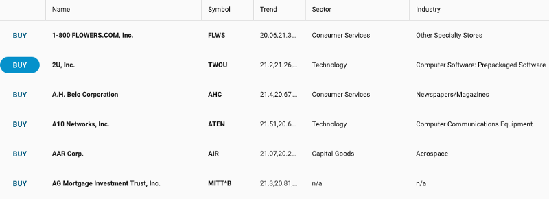
You can see from this example that you can basically embed any ExtReact component inside a grid cell, and it’s fully interactive. It functions as a full React component.
See the code up to this step on GitHub.
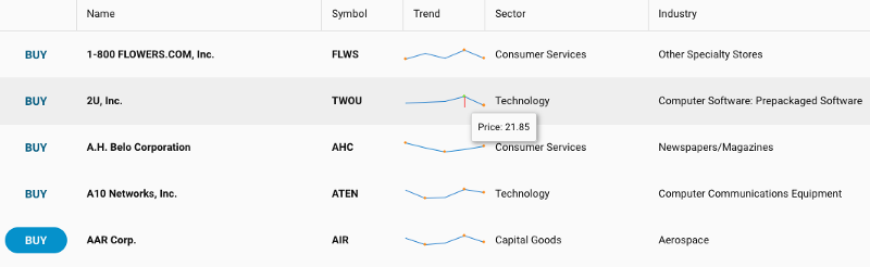
Adding a Trends Sparkline Chart
In Stock Data, we have this array of ticks on the last five Stock sales. Let’s embed that as a Sparkline chart inside the grid. We’re going to use widgetcell to render the ExtReact component inside a grid cell.
<Column dataIndex="ticks"
                   text="Trend"
                   sortable={false}
                   cell = { {
                           xtype: 'widgetcell',
                           forceWidth: true,
                           widget: {
                                   xtype: 'sparklineline',
                                   tipTpl:
                                   'Price: {y:number("0.00")}'
                             }
                   } }
               />
As you use your mouse to hover over different points in the line graph, it will display the Y value formatted with two decimal points.
See the code up to this step on GitHub.
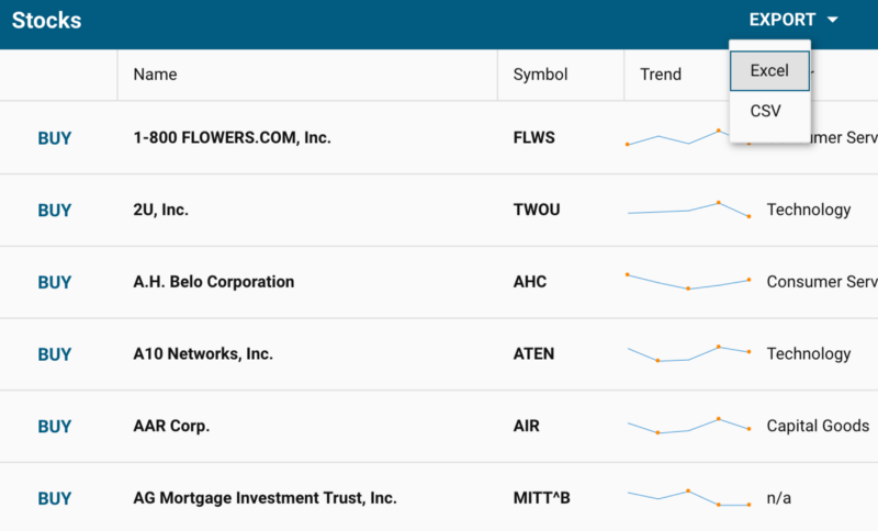
Exporting Data to Excel
One of the common requirements in data-intensive applications is to export the data to Excel. ExtReact makes it easy to do that by using the plugins prop for a grid.
<Grid
               ..
               plugins={{
                   gridexporter: true,
                 }}

           >
To make it easy to call the export functionality, we’ll add a few more components. We’ll add titlebar and dock titlebar at top of grid and put a menu inside. When you click on the “export” button, you will have the option to export either to Excel or CSV.
<TitleBar docked="top" title="Stocks">
          <Button align="right" text="Export">
                   <Menu indented={false}>
                          <MenuItem text="Excel"
                               handler=
                              {this.export.bind(this, 'excel07')}/>
                           <MenuItem text="CSV"
                                handler=
                                 {this.export.bind(this, 'csv')}/>
                    </Menu>
           </Button>
</TitleBar>
The export handler will pass along the type of the export and extension of the filename:
export = (type) => { this.grid.cmp.saveDocumentAs(
                             { type, title: 'Stocks' });
}
Make sure you have the exporter in the package.json dependencies. For example:
"@sencha/ext-exporter": "~6.6.0"
Install the dependency.
npm install
npm start
The Exporter plugin enables data export to various file formats. It supports native XSLX, Excel XML as well as HTML and CSV/TSV (comma/tab separated value) formats.
See the code up to this step on GitHub.
Adding an Editing Capability to a Grid
We can make the grid more like a spreadsheet by adding the capability to edit the data. To add that capability, we’ll need to add another plugin called gridcellediting. By adding this plugin and marking columns that can be edited as editable, you now have grid data that can be edited by double-clicking on any grid cell. You can continue to edit the grid by tabbing through the grid cells.
Adding grid cell editing plugin:
gridcellediting: true
Making “Name” editable:
<Column dataIndex="name" text="Name" width={300} cell={ { style: {fontWeight:'bold'}}} editable/>
Handling Edit Events
If you want to do something special after editing the grid cell, you can listen to that event on the store for data changes. You do that by adding a listener config and a listener for “update event”.
The “update event” will pass a number of parameters including store, updated record, the object that describes the operation that happened, and then passes an array of changed field names. You will add that in the handler. In this case, we’re just showing a toast message. In the real-world application, you would actually apply business logic such as persisting change in the database.
...
listeners: {
           update: this.onRecordUpdated
}
...
onRecordUpdated = (store, record, operation, modifiedFieldNames) => {
     const field = modifiedFieldNames[0];
     Ext.toast(`${record.get('name')}
                ${field} updated to  ${record.get(field)}`)
}
Adding a Select Option to a Grid Cell
If you want to add a “Select” option to a Grid cell, you can do that using another ExtReact component called SelectField. You just add the SelectField ExtReact component in the required Column.
<Column dataIndex="sector" text="Sector" width={200} editable>
        <SelectField options={sectors}/>
</Column>
See the code up to this step on GitHub.
Optimizing Cross-platform Experience
This works well for the desktop experience, but as you minimize the screen size for the mobile phone experience, the cell editing may not be the best experience for editing. For small screen devices, you may want to choose a different editing style.
The platformconfig option allows you to specify behavior for desktop or mobile. You can set any prop to a different value based on platformConfig and here we’re setting the plugin based on the platform. In this example, we’ll use gridcellediting when the application is on desktop. When the application is on mobile, we’ll use grideditable which provides a better way to edit data on mobile devices.
platformConfig={{
                   desktop: {
                       plugins: {
                           gridexporter: true,
                           gridcellediting: true
                       }
                   },
                   '!desktop': {
                       plugins: {
                           gridexporter: true,
                           grideditable: true
                       }
                   }
               }}
See the code up to this step on GitHub.
You can use the ExtReact 6.6 grid and add spreadsheet-like interface easily in your data-driven web application using React 16. With ExtReact, you can use any Ext JS modern component including grid, tree grid, pivot grid, charts, D3 visualizations and more — no customization required. You get to build an optimized and minimized package that contains only the components you’re using in your app. You can build immersive user engagement by using layouts and adaptive design features that looks great on both desktop and mobile devices. As a reminder, you can get started with ExtReact for free today with a 30-day trial — sign up here.
Frequently Asked Questions about Building React 16 Web Apps with the Sencha Grid
What is the Sencha Grid and how does it integrate with React 16?
The Sencha Grid is a high-performance grid component that is designed to handle large amounts of data. It integrates seamlessly with React 16, a popular JavaScript library for building user interfaces. The integration allows developers to leverage the power of React’s component-based architecture along with the robust features of the Sencha Grid, such as sorting, filtering, grouping, and editing of data. This combination provides a powerful tool for building complex web applications.
How do I get started with using the Sencha Grid in my React 16 application?
To get started, you need to install the Sencha Grid package using npm, the package manager for Node.js. Once installed, you can import the Sencha Grid component into your React application and use it like any other React component. The Sencha Grid component provides a variety of props that you can use to customize its behavior and appearance.
Can I use the Sencha Grid with other JavaScript frameworks or libraries?
Yes, the Sencha Grid is designed to be framework-agnostic, meaning it can be used with any JavaScript framework or library. However, the integration with React 16 is particularly seamless due to the component-based nature of both React and the Sencha Grid.
What are some of the key features of the Sencha Grid?
The Sencha Grid provides a wide range of features that make it a powerful tool for displaying and manipulating large amounts of data. These include sorting, filtering, grouping, and editing of data, as well as advanced features like infinite scrolling, row expander, and column locking. The grid also supports a variety of data types and formats, and can be easily customized to fit the needs of your application.
How does the Sencha Grid handle large amounts of data?
The Sencha Grid is designed to handle large amounts of data efficiently. It uses a virtual scrolling mechanism that only renders the rows that are currently visible in the viewport. This means that even if your grid has thousands or even millions of rows, the performance remains high and the user experience is smooth.
Can I customize the appearance of the Sencha Grid?
Yes, the Sencha Grid provides a variety of options for customizing its appearance. You can change the colors, fonts, and other styles using CSS, and you can also customize the layout and behavior of the grid using its extensive API.
How do I handle user interactions with the Sencha Grid?
The Sencha Grid provides a variety of events that you can listen to in order to handle user interactions. These include click events, selection events, editing events, and more. By listening to these events, you can implement complex behaviors and interactions in your application.
Can I use the Sencha Grid in a commercial application?
Yes, the Sencha Grid can be used in both commercial and non-commercial applications. However, for commercial use, you need to purchase a license from Sencha.
How do I update the data in the Sencha Grid?
The Sencha Grid provides a variety of methods for updating the data. You can update the entire data set, or you can update individual rows or cells. The grid automatically re-renders the affected rows or cells when the data is updated.
What kind of support is available for the Sencha Grid?
Sencha provides comprehensive documentation and tutorials for the Sencha Grid, as well as a community forum where you can ask questions and share knowledge with other developers. In addition, Sencha offers professional support and consulting services for customers who need additional help or guidance.