
Where would we be today without vacuums?
The vacuum is a wonderful invention. It sucks up your household dirt and puts it exactly where you want it to go — off your floor and into that little bag.
A successful homepage acts exactly like a “digital vacuum” — it sucks users in, away from the homepage, and straight to important content within the rest of the site.
Your site visitors are faced with only two choices once they’re on your homepage. Either:
- they click past the homepage to your site’s secondary pages, or
- they click the back button and leave your site.
You’d obviously prefer they click past the homepage. But how do you get them to do that?
Pull, Don’t Push
What’s the best way to get users to click deeper into your site? By pulling, rather than pushing.
You’ve probably heard the terms “pull technology” and “push technology”. Our friends at LearnTheNet.com tell us “pull technology” refers to technology that allows users to pro-actively seek out information, whereas “push technology” describes technology that delivers information to users, usually at regular intervals and without the user actively seeking the information.
I use these terms loosely to refer to the way in which a homepage can deliver content to a user. I’ve seen too many homepages that try to push users to other pages on the site by “feeding” them only a few simple links, or very brief content.
I’ve also seen a lot of great homepages that successfully pull instead of push. Some of the better ones include:
The developers of these homepages understand how to pull users to important areas within their sites, by enabling the user to choose from a variety of both links and content. They understand that not all users even know what they’re looking for, and that people need a variety of ways to gather information. And they understand that not all users are alike.
Two Kinds of Users
You may argue that the sites I just mentioned have visually “busy” homepages. You’re probably wondering, “Doesn’t that confuse the user?”
Good question. The answer? “Not necessarily.”
And here’s why: in his book “The Web Content Style Guide”, Gerry McGovern reports a study by the prestigious Palo Alto Research Center, previously named Xerox PARC. The study found that 75% of Web readers are in “content-gathering” mode, while only 25% are searching for a specific document.
Granted, we can’t directly apply those findings to all Web users, as the study referred only to Web “readers”. But a loose application of the study’s findings shows why the Websites mentioned earlier have so much content on their homepages. Yes, some users may be searching for specific products or information. But a larger majority may just be browsing for content.
These findings are harmonious with Jakob Nielsen’s argument that there are two kinds of users: those who search and those who browse.
A homepage that has only four links is definitely easy to navigate, so it suits those who search. However, it does nothing for those who browse in content-gathering mode. Not only that, but users are forced to choose from pre-categorized links such as Products, Company Info, etc., when they may not even know what they’re looking for.
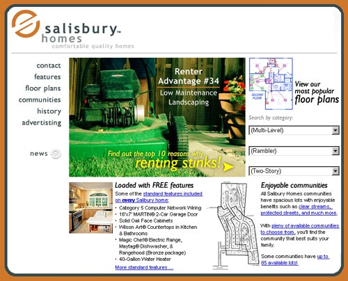
For example, take a look at the homepage for RentStinks.com, the Website for a local homebuilder here in Utah:

Really easy to navigate, right? Just pick a link and go.
However, put yourself in the place of someone visiting the site: Suppose you’re a first-time home buyer (in which case, you’d be part of the site’s key target audience). You’re probably in content-gathering mode. Perhaps you’re looking for a three-bedroom, two-story home.
But is that all you’re looking for? What about the location of the home? The amenities? Do you even know what a “rambler” is (I didn’t when we began searching for our first home!)? Or perhaps you’re simply not sure what to look for in a home, or even why you should choose one home builder over another.
Put yourself in the shoes of the user, and the homepage for RentStinks.com becomes less and less helpful. It attempts to push you to Floor Plans, Communities, and so on, rather than pull you to the page that contains 20 convincing testimonials from satisfied customers, or to the page that talks about Category 5 network wiring being a standard feature in all homes. What’s worse is that it does all of this without showing hardly any pictures of its homes.
Creating a Homepage that “Sucks”
It’s easier to create a homepage that draws users in than you might think. Take these three ideas for a test drive on your own site:
Bottom-Up Development
Perhaps the hardest obstacle to overcome is a change in the way you mentally and physically approach the development of a homepage. Most developers start at the top and work their way down, creating the content and design for the homepage first, and then trying to push users to other pages on the site.
To create a homepage that pulls, you need to develop from the bottom up, creating content for the secondary pages first. Then determine which of these pages should be emphasized and where to place appropriate links, images, and content on your site’s homepage.
Stephen Covey’s maxim “begin with the end in mind” is well suited to bottom-up Website development. Determine the final pages on which your visitors should land, and emphasize those pages on your homepage.
Link Wording
What? You’ve already created your homepage? No problem. An easy fix: try adding links, or even rewording existing ones.
A couple of examples:
- Instead of About Us, try:
- Instead of Products, try:
I’m not suggesting you rid your site of the About Us or Products links. I’m simply suggesting you add other links that may point to the same page or category of pages, but that are more successful at pulling users rather than pushing them.
Don’t Just Say It, Show It!
As obvious as it may seem, don’t just bore your site visitors with endless lines of text. Give them plenty of visual flavor to enjoy. If you sell homes, show floor plans and amenities on your homepage. If you offer Web development services, show some of your work on your homepage. You can rest assured a picture will often be understood more quickly than a sentence.
What if RentStinks.com applied these three principles and restructured its homepage? It could end up something like this:
Finally, Don’t Forget Targeted Content
Is emphasizing a few important secondary pages and rewording a few links enough to create a homepage that “sucks”? What if your site visitors find the homepage content to be completely useless?
BlueLight.com, Kmart’s former Website, faced this problem. A study conducted by the site’s research team revealed a startling fact: nearly 50% of site visitors left before ever clicking past the homepage! Despite the fact that BlueLight’s homepage had sufficient links and content, the available information was apparently of no use to half of the visitors.
How did BlueLight.com correct the problem? They created eight targeted homepages, each of which was displayed based on the visitor’s preferences. When visitors returned to the site, they not only saw a variety of content, but that content was targeted as well.
Take a look at your site’s statistics and you might see the same thing BlueLight.com saw. If you don’t remember anything else in this article, remember this: Never assume your visitors will click past the homepage. They’ve arrived at your site somehow and for some reason. Now give them several compelling choices that encourage them to click further into the site before they have a chance to click the back button.
Does this article cover everything you need to know to create a homepage that pulls? Of course not. But it’s a start. Try a few of these suggestions and you’ll be well on your way to creating a great homepage that really “sucks”.
Bibliography and Additional Reading
The following resources were used in the compilation of this article:
Content Must Suck: Pulling Users In with Jared Spool
http://www.webreview.com/2000/06_09/developers/06_09_00_2d.shtml
Learn The Net
http://www.learnthenet.com
RentStinks.com (current Website)
http://www.rentstinks.com
Stanford Persuasive Technology Lab
http://captology.stanford.edu
The Web Content Style Guide, Gerry McGovern
http://www.gerrymcgovern.com/guide_design_3.htm
UseIt.com, Jakob Nielsen
http://www.useit.com
User Interface Engineering, Jared Spool
http://www.uie.com
Frequently Asked Questions (FAQs) about Great Homepages
Why do some great homepages really suck?
Despite having visually appealing designs, some homepages fail to deliver a good user experience. This could be due to a lack of clear navigation, too much clutter, or a lack of relevant information. A great homepage should not only look good but also be functional and user-friendly.
What are some common mistakes in homepage design?
Common mistakes in homepage design include lack of clear call-to-action, poor navigation, too much text, and not being mobile-friendly. These mistakes can confuse visitors and make it difficult for them to find what they’re looking for, leading to a poor user experience.
How can I improve my homepage design?
To improve your homepage design, focus on simplifying your layout, making navigation intuitive, and ensuring your site is mobile-friendly. Also, make sure your homepage clearly communicates what your business does and what value it offers to visitors.
What are some examples of good homepage design?
Good homepage designs are those that are visually appealing, easy to navigate, and clearly communicate the value proposition. Some examples include the homepages of Spotify, HubSpot, and Southern Tide Media.
How important is the homepage in website design?
The homepage is extremely important in website design as it’s often the first page visitors see. It sets the tone for the rest of the website and can influence whether visitors stay on your site or leave.
How can I make my homepage more user-friendly?
To make your homepage more user-friendly, ensure it loads quickly, is easy to navigate, and is mobile-friendly. Also, use clear and concise language to communicate your value proposition.
What role does the homepage play in SEO?
The homepage plays a crucial role in SEO as it’s often the page with the highest authority on your site. It should contain relevant keywords and meta tags to help search engines understand what your site is about.
How can I make my homepage more engaging?
To make your homepage more engaging, use compelling visuals, include a clear call-to-action, and provide valuable content that addresses your visitors’ needs and interests.
What are some common elements of a successful homepage?
Common elements of a successful homepage include a clear headline, a compelling call-to-action, intuitive navigation, and high-quality visuals. It should also be mobile-friendly and load quickly.
How often should I update my homepage?
It’s recommended to regularly update your homepage to keep it fresh and relevant. However, the frequency of updates depends on your business and industry. Monitor your site’s performance and user feedback to determine when updates are needed.