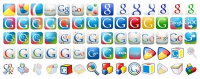
 Last week Google tweaked their favicon (that little 16×16 pixel icon in your browser’s tab), changing it from an uppercase G to a lowercase g.
Now, a change like this is normally something that shouldn’t matter — it’s not like they changed their actual logo to begin with a lowercase g, or made any changes to their home page. They just tweaked the 256 pixels in the browser’s tab. But this is one of the strongest brands in the world, and tabbed browsing has become a standard feature in all browsers.
Favicons are no longer an optional “nice-to-have” — users come to rely on them as a usability aid, so those 256 pixels are an extension of a company’s brand. Add to that the fact that people generally don’t like change, and the result is hundreds of blogs complaining about how ugly the new icon was.
Personally, I don’t mind it. The new icon threw me at first — the big G was instantly recognizable, and being able to jump to a tab based on that visual aid is a crucial part of how I navigate. However, after a few days of getting used to it, I realized that change was inevitable, for a number of reasons:
- Lowercase letters just look better at small resolutions. I don’t have any data to back this statement up, it’s just my opinion.
- Lowercase logos say “friendly and hip Web 2.0 startup“. Uppercase logos say “stuffy corporate”. Google has started to make efforts recently to open up and engage with their user base more; this supports that approach.
- The G was starting to look a little old. With mobile services forming an integral part of Google’s future offerings, it would have been difficult to make a big impact with a tired logo.
Google’s Marissa Mayer obviously isn’t completely sold on the new look though — Google is crowdsourcing the next stage of the icon’s design, in case someone outside of Google can come up with an improvement:
The design process was much harder than we thought at first. By no means is the one you’re seeing our favicon final; it was a first step to a more unified set of icons. If you have your own notions about the Google favicon, please send them to us … maybe your idea will be the one that people see billions of times per day.
If you think you can do a better job, Google have opened submissions for improvements on the little g. You have until June 20 to submit your image.
 Matthew Magain
Matthew Magain is a UX designer with over 15 years of experience creating exceptional digital experiences for companies such as IBM, Australia Post, and sitepoint.com. He is currently the Chief Doodler at Sketch Group, Co-founder of UX Mastery, and recently co-authored Everyday UX, an inspiring collection of interviews with some of the best UX Designers in the world. Matthew is also the creator of Charlie Weatherburn and the Flying Machine.