QR codes may seem like a nascent, cutting-edge technology, but they’ve actually been around for almost 20 years. They were originally invented in the mid-1990s to track car parts during the manufacturing process, but the emergence of smartphones (and QR code scanning apps) has brought quick response codes out of the niche car manufacturing and into the much broader mobile marketing industry. Now that smartphone owners can scan a QR code with just a few touches, the design possibilities for QR codes are almost endless.
But, the near-infinite possibilities for QR code use can actually pose quite a conundrum. The fact that they could be used for anything doesn’t necessarily mean that they should be used for anything. In fact, it’s not perfectly clear what the best practices for QR codes really are. They’re clearly not just for tracking car parts anymore, but how should they be used ideally? Designers have tried all sorts of creative, experimental implementations of quick response codes, and some have fared better than others. Quite a few questions remain regarding when, where, and how QR codes should be utilized.
QR Code Placement: Peripheral Or Front and Center?
It’s fairly common to see a small, inconspicuous QR code on the corner of a print ad or product packaging. Because QR codes aren’t exactly mainstream (many potential customers still find them strange and baffling), most advertisers do not want to rely on them too heavily for their ad campaigns and other messaging efforts. As a result, the most common QR code placements are on the sides, the corners, or the backs of marketing materials, making them a “nice to have” addition, but not a truly integral part of the design.
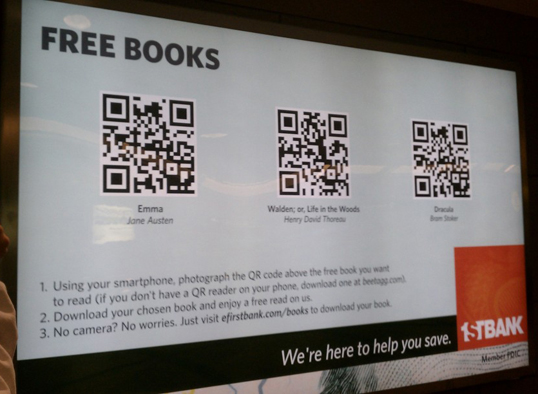
However, it may surprise you that a few intrepid advertisers choose to be big and bold with their QR code use, making advertisements that feature QR codes as the focal point of their designs. Take a look at the following advertisement inside of Denver International Airport.

If you examine the ad closely, you’ll see that they do the exact opposite of most QR code advertisements; the QR codes are front and center, and the company is mentioned inconspicuously in the corner. Despite the fact that the brand isn’t very prominent (and the destinations of the three QR codes have little to do with the sponsor), 1st Bank has found these ads to be very effective in building brand loyalty. In fact, they have an entire marketing campaign (aptly named the “helpfulness” campaign) based on little more than just helping people. In this particular case, weary, jet-lagged, stranded travelers will surely appreciate their choice of three famous novels loaded into their smartphone. Afterward, It would be hard not to favor 1st Bank when choosing between dozens of nearly identical, almost commodity-like banks.
Many mobile marketers would tell you that the “right way” to implement these QR codes would have involved designing a typical print ad and then squeezing QR codes onto the peripheral parts of the layout. But, is that really all that effective? This bank’s bold, thoughtful, “helpful,” QR-centric advertisement suggests the opposite, and makes it difficult to settle on a single correct way to effectively place a QR code within a design.
Should You Teach a Man (Or Woman) to Scan?
Should you try to describe QR codes and enlighten your potential customers within a design?
On one hand, it’s nearly impossible to educate a passerby — who in all likelihood has very limited time and attention — on what a QR code is and how to use it. Often, every word and every inch of a design is heavily scrutinized by approval committees, and adding extra information could arguably detract from the design, distract the customer or raise the overall cost of implementing the design.
But, on the other hand, designers of advertisements, product packaging, or other branding materials are typically tasked with condensing a message down to visual information accompanied by one or two succinct sentences. Couldn’t they follow the same familiar process to illustrate and describe how to use QR codes?
In the aforementioned 1st Bank advertisement shown above, the designers had ample room to describe a three-step process for making use of their offering. But, since these particular QR codes are unusually prominent in the design — making the added instructions an absolute necessity — this ad is a poor example of providing succinct, unobtrusive QR code instruction. Most designs have far less room and freedom for an elaborate multi-step guide. Instead, some designs include a short, semantic, memorable URL near the QR code, which has obvious utility for interested viewers who aren’t familiar with QR codes or don’t have a scanning app loaded. Other designs recommend scanning apps for major mobile operation systems i.e. “Scan this with QR Master for iOS or Scannable for Android.”
It’s hard to say whether the advantages of teaching customers to scan outweigh the downsides. You may confuse as many people as you enlighten. And, no amount of teaching will help a customer who doesn’t own a smartphone to begin with.
Are QR Codes For The Customer, The Company, Or Both?
At first, it might seem that QR codes are purely designed to appeal to customers. But, the fact that QR codes can provide extensive data on the efficacy and performance of their respective advertisements might mean that they benefit the company as well.
Many print ads have no way to measure their own performance. Unless the print advertisement in question includes its own unique phone number, email address, or URL, print advertisers won’t have any precise way to determine how much interest their design created. They can often get an approximate estimate of how many “exposures” or “impressions” they have bought with a given ad placement, but that metric offers no insight into how well (or how poorly) customers are actually responding to the ad.
Designers in particular could benefit greatly from knowing how engaging their ad design truly is; it would open the possibility of comparing the performance of similar QR-based ads and refining the ad design based on real customer feedback.
So, do QR codes benefit the customer or the company? Both smart companies and smart customers can reap benefits, but it’s difficult to say whether QR codes are meant to be a customer convenience or a method to measure ad performance.
Should QR Codes Be Used in Low Bandwidth Areas?
Anyone scanning a quick response code is almost certainly using cellular bandwidth to get to the destination. If your QR-based design is deep in an underground subway system or on the back of an airplane seat, it could be very difficult (if not impossible) to scan. In fact, it may even damage the brand of your company by frustrating and disappointing scanners. You’d think that these potential problems would be obvious, anticipated, and remedied, but some very large companies have placed poorly-designed QR codes in poorly-chosen places, where they end up frustrating customers instead of delighting them.

But, on the other hand, getting a customer’s undivided attention while they have little to no bandwidth could be very valuable. If you can manage to reach a customer on a long plane or underground train ride, they’ll likely have little else to do besides viewing your design and learning about your products and services. Additionally, there are occasions where bandwidth is available on boats, planes and underground trains. Finally, most well-designed QR code scanners have a scanning history that allows users to return to a code that they scanned days or weeks ago. Just making it into that scanning history could be a valuable tool for savvy designers.
Have you implemented QR codes in any of your designs? Do you have any examples of interesting, creative uses of QR codes? Do you have any answers to the questions above?
 Peter North
Peter is Chief Digital Officer of CuriosityStream, a multi-platform nonfiction streaming service by the founder of Discovery Communications (Discovery Channel, Science Channel, Animal Planet, etc.). Peter is also Co-Founder of True North, a management consulting firm and digital marketing agency with clientele that includes WebMD and Salesforce.


