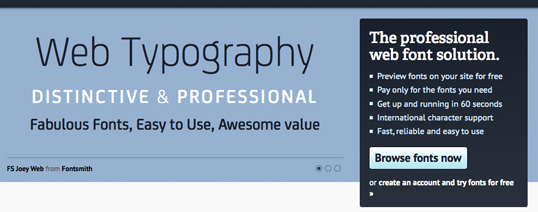
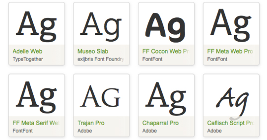
Embedded web fonts can add stylish typography to your web design for just a few kilobytes. Techniques that used to require large, slow-loading images are now handled with lightweight font files and several lines of CSS. Ever since the @font-face CSS property garnered broad support from all major browsers, specialized fonts have become very popular. As a result, a wide variety of web font services have appeared to harness the potential of embedded fonts.
There are quite a few very popular font services, and some very big names have created their own font libraries. Typekit (by Adobe) is a well-known font provider, and Google offers an extensive font library as well. There are dozens of lesser-known but equally worthy sites such as Fonts Live, Fontdeck, and Webtype.

The advantages of embedded fonts are numerous: Changes to even the most prominent lettering on your websites are easily done without the tedious task of loading your original design in Photoshop, correcting headers or taglines, and exporting. And, consciously choosing a font that works well with your other aesthetics is almost certainly better than deferring to a ubiquitous font like Helvetica or Arial — or worse — letting various browsers dictate how your text will show up based on their own defaults. Lastly, making your large lettering out of actual text (instead of images of text) may offer some SEO and site speed benefits that could place your site more prominently in search results.
But, web font services do have a few downsides that come with all of that stylish typography. Relying on an external site for font information could create noticeably slower page loads, and the fonts could be missing entirely if the external font library is down or if your installation somehow broke. There are many fallbacks to help your site “fail gracefully” if a problem occurs with your preferred font, but few designers want their design to be compromised, whether it’s done “gracefully” or not. It’s hard not to rely on your preferred fonts, and as a result, a font-dependent site can look very ugly and odd if those carefully-chosen fonts go missing. The added cost and increase in loading times may be small, but they’re nonetheless part of the price to pay for pretty typography.
And, the reality is that all of these services are based on @font-face, which is freely available for everyone to use independently.
Do you have a preferred font library? Do you work directly with @font-face instead? Or, do you avoid specialized fonts altogether?
 Peter North
Peter is Chief Digital Officer of CuriosityStream, a multi-platform nonfiction streaming service by the founder of Discovery Communications (Discovery Channel, Science Channel, Animal Planet, etc.). Peter is also Co-Founder of True North, a management consulting firm and digital marketing agency with clientele that includes WebMD and Salesforce.


