- How to Determine If a Theme Is Print Ready?
- Creating a Print Style CSS File
- @page Rule
- @media print
- Body Background Color, Text Color and Margin
- Hiding Navigation, Footer and Sidebar
- Printing Comments
- Page Breaks
- Styling Headings
- Styling Paragraphs
- Styling and Formatting Links
- Styling Images
- Further Styling
- The Complete print.css File
- Further Improvements
In this tutorial we’ll take a look at what designing a theme for printing means and how WordPress theme developers can design their themes for printing. Designing a theme to look great in a web browser is not enough, some people still like (or need) to print out web pages for various reasons, so we also need to design themes to look great when they are printed.

Throughout this article I’ll provide some basic CSS which can help to take your theme to the next level by optimizing its interface for printing. If you’re a theme developer then you can directly embed the CSS in your theme. If you’re a WordPress user and if want to make your current website print ready, then you can install this code via a plugin. I will go through all these steps in detail below.
How to Determine If a Theme Is Print Ready?
By default, when a user prints a WordPress web page that is not print ready, the style sheet is stripped away and the page prints as if there is no style sheet. It tends to look like a long line of information, starting with your header, the content, then the long list that is your sidebar, followed by the footer. It’s not very pretty.
A theme is typically said to be print ready if, when it’s printed, it only prints the website name, post content and comments. It shouldn’t print widgets, ads and other such elements. For image and anchor tags, it should display the URL beside the image and link text. Images should fit the width of the printed page. Backgrounds should be clean and the text should use standard fonts and colors. Overall the text and images should be easy to read and view, and must be aligned perfectly in the page.
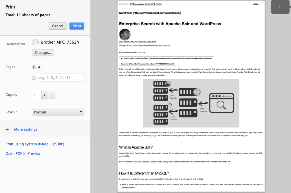
One of the best examples of a print ready website is SitePoint. Go ahead and press Ctrl + P and check out how it looks.

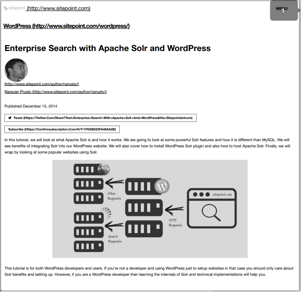
You can see that it removes most of the things from the header and includes only page url and logo. And then it starts directly with the header and content of the page. For every image and anchor tag it prints the respective URL beside it.

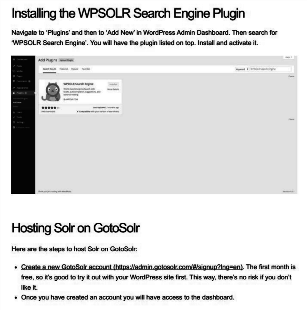
Here you can see that the image width fits the page width when the actual dimensions exceed the page width.
If you’re planning to create a new site, before choosing a theme, make sure you check if it is print ready. There are lots of themes that look great but are poorly designed for printing. Avoid these themes if possible.
Creating a Print Style CSS File
The first step is to create a print.css file which we will put our print design CSS code in. If you’re a theme developer, then you can enqueue this file along with the CSS files in your theme. If you are a WordPress user and your theme is not print ready then you’ll need to enqueue this script via a plugin.
Theme developers can put this code directly in their theme’s functions.php file
function prefix_print_style()
{
    wp_enqueue_style("mytheme_print_style", get_bloginfo("template_directory")."/print.css");
}

add_action("wp_enqueue_scripts", "prefix_print_style");
I am assuming you have placed the print.css file in the root of theme directory.
If you are a already using a not print ready theme then you need to install this style via a simple functionality plugin. Below is the code for the plugin.
<?php
    /*
    Plugin Name: SitePoint Print Ready
    Plugin URI: https://www.sitepoint.com
    Description: This plugin makes your theme print ready.
    License: GPL2
    */

    function prefix_print_style()
    {
        wp_enqueue_style("myplugin_print_style", plugins_url("print.css", __FILE__));
    }

    add_action("wp_enqueue_scripts", "prefix_print_style");

?>
Again, I am also assuming you have the print.css file in the plugin root directory.
From here onwards, whatever code I’ll show you, you’ll need to put in the print.css file.
@page Rule
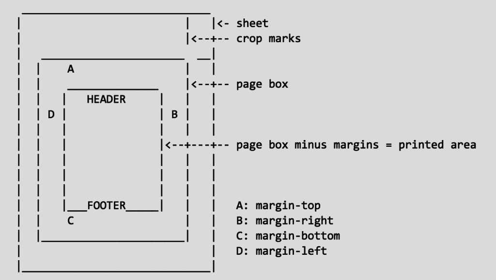
The @page rule can be used to define or change dimensions, orientation, margins, orphans, windows and page breaks of a printed sheet.
The image below marks each of the above terms in a printed sheet.

Add this code to your print.css file to keep margins between the printed page and the content.
@page
{
      margin: 2cm;
}
@media print
The @media print media rule is used to define CSS properties for HTML elements when they are printed. All of the CSS code used inside this rule is applied when the web page is printed.
From now onwards all the CSS code I will show you should be kept inside the @media print rule.
We will use the WordPress default classes, HTML5 semantic tags and the most common class names to style the web page for print.
Body Background Color, Text Color and Margin
The standard background color for printed pages is white and font color is back. As we have already given margin to printed sheet above using @page rule, we need to remove any margins from body.
@media print
{
    body
    {
        background:white;
        color:black;
        margin:0
    }
}
Hiding Navigation, Footer and Sidebar
We need to hide the navigation menu, footer and sidebar when web page is printed. We can achieve this by the following CSS.
@media print
{
    nav, .nav, footer, #sidebar, aside, #footer
    {
        display: none;
    }
}
Printing Comments
We also need to print comments but not the comment form.
@media print
{
    #commentform
    {
        display:none;
    }
}
Page Breaks
While the code below does not work for every browser or printer, you can instruct them not to “break” your photographs or graphics into two pieces, or break apart blockquotes, or not to have a page break after a heading, but to force it to break before the heading. This is not a perfect science, but if you’re really particular about how your printed web page should look, you might want to use these.
@media print
{
    h1, h2, h3, h4, h5, h6
    {
        page-break-after:avoid;
        page-break-inside:avoid;
    }
    img
    {
        page-break-inside:avoid;
        page-break-after:avoid;
    }
    blockquote, table, pre
    {
        page-break-inside:avoid;
    }
    ul, ol, dl
    {
        page-break-before:avoid;
    }
}
Styling Headings
You should style your web page heading specifically for print, you can do this by using the following CSS:
@media print
{
    h1, h2, h3
    {
        font-weight:bold;
    }
    h1
    {
        font-size:24px;
    }
    h2
    {
        font-size:16px;
        border-bottom:1px solid #ccc;
        padding:0 0 2px 0;
        margin:0 0 5px 0;
    }
    h3
    {
        font-size:13px;
        margin:0 0 2px 0;
    }
}
Styling Paragraphs
You should style your paragraph font family, font size and margins specifically for printing.
@media print
{
    p
    {
        font-size:11px;
        font-family:times new roman, serif;
        margin:0 0 18px 0;
    }

}
Styling and Formatting Links
You should style your anchor tags specifically for printing and also display href value in brackets beside the link.
@media print
{
    p
    {
        font-size:11px;
        font-family:times new roman, serif;
        margin:0 0 18px 0;
    }

    p a:after
    {
        content: " (http://yourdomain.com/" attr(href) ")";
        font-size: 80%;
    }

    p a[href^="/"]:after
    {
        content: " (http://yourdomain.com" attr(href) ")";
    }

    p a[href^="http://"]:after, p a[href^="https://"]:after
    {
        content: " (" attr(href) ")";
    }

    p a[href^="#"]:after
    {
        display: none;
    }
}
Styling Images
We need to make sure that the image width doesn’t overflow beyond the printed page width, we also need to display image URL beside it.
@media print
{
    img
    {
        max-width: 100%;
    }
    p img:after
    {
        content: " (http://yourdomain.com/" attr(src) ")";
    }

    p img[href^="/"]:after
    {
        content: " (http://yourdomain.com" attr(src) ")";
    }

    p img[href^="http://"]:after, p img[href^="https://"]:after
    {
        content: " (" attr(src) ")";
    }
}
Further Styling
If you’re a theme developer then you’ll already know the other classes containing the unnecessary parts of your theme. Add them to the print.css file to hide them or re-styling them.
If you’re building a plugin, then inspect your theme using your browser specific developer tool and find the class names, then add them to the print.css file for hiding them or re-styling them.
The Complete print.css File
If you’ve been following along, but haven’t yet created the example, don’t worry. Here’s the complete code inside the print.css file.
@page
{
      margin: 2cm;
}

@media print
{
    body
    {
        background:white;
        color:black;
        margin:0
    }

    nav, .nav, footer, #sidebar, aside, #footer
    {
        display: none;
    }


    #commentform
    {
        display:none;
    }

    h1, h2, h3, h4, h5, h6
    {
        page-break-after:avoid;
        page-break-inside:avoid;
    }
    img
    {
        page-break-inside:avoid;
        page-break-after:avoid;
    }
    blockquote, table, pre
    {
        page-break-inside:avoid;
    }
    ul, ol, dl
    {
        page-break-before:avoid;
    }

    h1, h2, h3
    {
        font-weight:bold;
    }
    h1
    {
        font-size:24px;
    }
    h2
    {
        font-size:16px;
        border-bottom:1px solid #ccc;
        padding:0 0 2px 0;
        margin:0 0 5px 0;
    }
    h3
    {
        font-size:13px;
        margin:0 0 2px 0;
    }

    p
    {
        font-size:11px;
        font-family:times new roman, serif;
        margin:0 0 18px 0;
    }

    p a:after
    {
        content: " (http://yourdomain.com/" attr(href) ")";
        font-size: 80%;
    }

    p a[href^="/"]:after
    {
        content: " (http://yourdomain.com" attr(href) ")";
    }

    p a[href^="http://"]:after, p a[href^="https://"]:after
    {
        content: " (" attr(href) ")";
    }

    p a[href^="#"]:after
    {
        display: none;
    }

    img
    {
        max-width: 100%;
    }
    p img:after
    {
        content: " (http://yourdomain.com/" attr(src) ")";
    }

    p img[href^="/"]:after
    {
        content: " (http://yourdomain.com" attr(src) ")";
    }

    p img[href^="http://"]:after, p img[href^="https://"]:after
    {
        content: " (" attr(src) ")";
    }
}
Further Improvements
If you want to further improve the how print friendly your pages are, it’s not only about hiding or re-styling elements. Some websites add elements such as QR codes.
Here’s an example that adds a QR code to all printed pages:
@media print
{
   body:after
   {
      content: url(https://chart.googleapis.com/chart?cht=qr&chs=150x150
&chl=http://<?php the_permalink(); ?>&choe=UTF-8);
      position: absolute;
      right: 0;
      top: 0;
   }
}
In this article I covered the concepts of styling a basic blog-style theme. However, your theme can be more advanced and can support playing video and audio. In that case, consider hiding the audio and video element but display the URL of the resource.
Please share your experiences with designing WordPress themes for printing, I’ve love to hear what you’ve done.
 Narayan Prusty
Narayan is a web astronaut. He is the founder of QNimate. He loves teaching. He loves to share ideas. When not coding he enjoys playing football. You will often find him at QScutter classes.


