The following is an extract from our book, HTML5 & CSS3 for the Real World, 2nd Edition, written by Alexis Goldstein, Louis Lazaris, and Estelle Weyl. Copies are sold in stores worldwide, or you can buy it in ebook form here.
Now that we’ve covered the basics of page structure and the elements in HTML5 that will assist in this area, it’s time to start building the parts of our page that will hold the content.
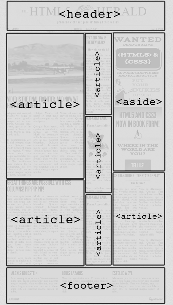
Let’s start from the top, with a header element. It makes sense to include the logo and title of The Herald in here, as well as the tagline. We can also add a nav element for the site navigation.
After the header, the main content of our site is divided into three columns. While you might be tempted to use section elements for these, stop and think about the content. If each column contained a separate “section” of information (such as a sports section and an entertainment section), that would make sense. As it is, though, the separation into columns is really only a visual arrangement, so we’ll use a plain old div for each column.
Inside those divs, we have newspaper articles; these, of course, are perfect candidates for the article element.
The column on the far right, though, contains three ads in addition to an article. We’ll use an aside element to wrap the ads, with each ad placed inside an article element. This may seem odd, but look back at the description of article: “a self-contained composition […] that is, in principle, independently distributable or reusable.” An ad fits the bill almost perfectly, as it’s usually intended to be reproduced across a number of websites without modification.
Next up, we’ll add another article element for the final article that appears below the ads. That final article will be excluded from the aside element that holds the three ads. To belong in the aside, the article needs to be tangentially related to the page’s content. This isn’t the case: this article is part of the page’s main content, so it would be wrong to include it in the aside.
Now the third column consists of two elements: an aside and an article, stacked one on top of the other. To help hold them together and make them easier to style, we’ll wrap them in a div. We’re not using a section, or any other semantic markup, because that would imply that the article and the aside were somehow topically related. They’re not—it’s just a feature of our design that they happen to be in the same column together.
The New main Element
At this point, it’s probably a good time to introduce another major structural element that’s been introduced in HTML5: the main element. This element was not originally part of the HTML5 spec, but has been added since the first edition of this book was published.
Unfortunately, defining the main element and how it can be used is a little tricky. But let’s start with where the element originated. In some HTML documents, developers were wrapping their primary content in a generic element, like this:
<body> <header> ... </header>
<div id="main"> ... </div>
<footer> ... </footer>
</body>
Notice the generic div element used here as a sibling to the header and footer elements. Notice also the ID attribute with a value of "main". In addition to this, many developers were adding an ARIA role to this element:
<div id="main" role="main"> ...
</div>
We’ll avoid going into the details of ARIA here―that’s covered in Appendix B―but basically, the new main element is meant to replace this practice.
The W3C spec defines main as follows: “The main element represents the main content of the body of a document or application. The main content area consists of content that is directly related to or expands upon the central topic of a document or central functionality of an application.”
The WHATWG spec defines it similarly; however, the two specs have very different definitions beyond that. The WHATWG spec says:
“There is no restriction as to the number of
mainelements in a document. Indeed, there are many cases where it would make sense to have multiplemainelements. For example, a page with multiplearticleelements might need to indicate the dominant contents of each such element.”
But uncharacteristically, in complete contradiction to that, the W3C spec says:
“Authors must not include more than one
mainelement in a document. Authors must not include themainelement as a descendant of anarticle,aside,footer,header, ornavelement.”
In addition, the W3C spec adds the recommendation to use the role="main" attribute on the main element until the main element is fully recognized by user agents. Having that knowledge, we’re going to adopt the W3C’s recommendation, and use only a single main element on our page, using an ARIA role as a fallback.
Going back to our Herald markup, this is how it will look after we’ve added the main element inside the body tag:
<body> <header> ... </header> <main role="main">
</main> <footer> ... </footer> <script src="js/scripts.js"></script>
</body>
As you can see, the main element exists outside the header and footer. Inside the main is where we’ll put the three columns we discussed, which make up the layout and primary content for The HTML5 Herald.
The last part of our layout we’ll consider here is the footer, which you can see in The Herald screenshot in its traditional location—at the bottom of the page. Because the footer contains a few different chunks of content, each of which forms a self-contained and topically related unit, we’ve split these out into section elements inside the footer. The author information will form one section, with each author sitting in their own nested section. Then there’s another section for the copyright and additional information.
Let’s add the new elements to our page so that we can see where our document stands:
<body>
  <header>
    <nav></nav>
  </header>

  <main role="main">
    <div class="primary">
      <article></article>
    </div>

    <div class="secondary">
      <article></article>
    </div>

    <div class="tertiary">
      <aside>
        <article></article>
      </aside>

      <article>
      </article>

    </div>
  </main><!-- main -->

  <footer>
    <section id="authors">
      <section></section>
    </section>
    <section id="copyright">
    </section>
  </footer>

  <script src="js/scripts.js"></script>
</body>
The figure below shows a screenshot that displays our page with some labels indicating the major structural elements we’ve used.

We now have a structure that can serve as a solid basis for the content of our website.
Note: What if I use the wrong element?
Although it can be confusing at times to remember which elements to use in which situations, we encourage you to avoid stressing or spending too much time making decisions on semantics. While it is good to be consistent, there are few repercussions from using the wrong elements. If your pages are accessible, that’s what is important. Of course, there are cases where the correct semantic element will be beneficial to accessibility, so we encourage you to research this and make sure your choice of element won’t cause your pages to become inaccessible. A good place to start might be HTML5 Accessibility or The Accessibility Project.
Wrapping Things Up
That’s it for this chapter. We’ve learned some of the basics of content structure in HTML5, and we’ve started to build our sample project using the knowledge we’ve gained.
In the next chapter, we’ll have a more in-depth look at HTML5 content, and continue to add semantics to our page when we deal with some of the other elements available in HTML5.
 Louis Lazaris
Louis is a front-end developer, writer, and author who has been involved in the web dev industry since 2000. He blogs at Impressive Webs and curates Web Tools Weekly, a newsletter for front-end developers with a focus on tools.


