
Not too long ago, adding decorative elements like fancy borders to a web page involved slicing images and patiently tweaking away at the CSS until it looked just right.
CSS has changed all this. A few lines of code are all you need to decorate your website with quite sophisticated borders. This article will show you how you can do so.
Key Takeaways
- CSS allows for the addition of sophisticated borders to web pages with just a few lines of code, including background images on borders using the border-image-source property.
- The border-image-slice property applies the selected image to the border, dividing the image into nine areas: four corners, four edges, and a middle, with the option to specify one to four numbers or percentage values for offsets.
- The border-image-width property designs inner offsets within the border-image-area, and the border-image-outset property allows for the border image area to be pushed outside of the border box.
- The border-image property can be reset with the shorthand border property, which can quickly reset the width, color, and style for all four borders of an element. As of the time of writing, border-image has almost full support in all major browsers.
Border Image Properties
A common way of styling borders is by using preset border-style rules. These are: dotted, dashed, solid, double, groove, ridge, inset, and outset.
These styles already give you quite a bit of choice. But you can go a step further and add appealing background images to your borders with the following CSS properties.
The border-image-source Property
With this property you assign a background image to an element’s border. The value is usually the image’s URL:
element {

  border-image-source: url('myimage.png');

}
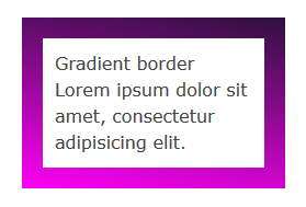
You’ll find that a CSS gradient works just as well:
element {

  border-image-source: linear-gradient(10deg, #fe01f5 0%, #2e113d 100%);

}
In the browser it looks something like this:
If you set this property to the value none, or the image can’t be displayed, the browser will use the values set for the border-style property. Therefore, it’s a good idea to use border-style as a fallback.
The image you use doesn’t need to match the width and height of your border. The beauty of CSS border images is that a small image is all you need to decorate an element’s border of any width and height, including elements that responsively adapt to varying screen sizes.
The border-image-slice Property
After you select an image using the border-image-source property, you apply it to the border using the border-image-slice property.
element {

  border-image-slice: 19;

}
Let’s get into a bit more details. This property designs inner offsets from the top, right, bottom, and left sides. The offsets end up slicing your small image into nine areas: four corners, four edges and a middle.
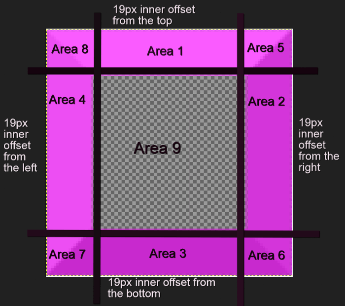
You can specify one to four numbers or percentage values. When you specify four values, they apply to the top, right, bottom and left offsets. If you skip the left offset, this will be the same as the right. If you miss the bottom offset, this will be the same as the top one. Omitting the value for the right offset will make this the same as the top. If you only use one value, it will be used for all four offsets.
Percentage values refer to percentages of the size of the image – the image width for horizontal offsets and the image height for vertical offsets.
Numbers stand for pixels in the image, or for coordinates in case of a vector image. One more thing, don’t add px after the number, it won’t work if you do!
Here’s how you can use border-image-slice:
<div class="box">

  Border Image

  Lorem ipsum dolor sit amet, consectetur adipisicing elit.

</div>
.box {

  border: 19px dotted #c905c6;

  border-image-source: url(border-bg.png);

  border-image-slice: 19;

}
Using a 100 x 100px image for your border that looks like this:

We end up with something looking like this:
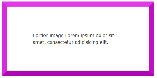
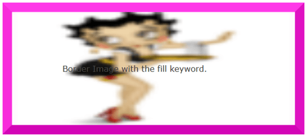
The middle region renders as fully transparent, therefore it’s not visible. If you’d like to make it visible, add the fill keyword.
For instance, using an image with a fully opaque middle area, without adding the fill keyword, will display exactly like the example above. However, apply the fill keyword like so:
.box {

  border: 19px dotted #c905c6;

  border-image-source: url(border-fill.png);

  border-image-slice: 19 fill;

}
With an image with a middle area containing details:

We then will find the image’s middle area is fully visible on the page, albeit somewhat blurred and squashed:
The border-image-width Property
This property is drawn inside what’s called the border-image-area. By default, the boundaries of this area are those of the border box. Just like the border-image-slice property, the border-image-width designs inner offsets which divide the image into nine areas.
This property accepts from one up to four values (top, right, bottom, left) either using a number or a percentage. Percentages are relative to the size of the border image area, i.e., the width of the area for horizontal offsets and the height of the area for vertical offsets. If you use numbers without the px unit, these will equate to multiples of the corresponding computed border-width. For instance, the code below:
.box {

  border: 19px dotted #c905c6;

  border-image-source: url(border-bg.png);

  border-image-slice: 19;

  border-image-width: 3;

}
… sets the width of the border image at 3 times the border-width value, which is 19px. This results in something looking like this:
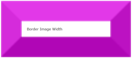
I’ve found that giving both the border-image-width and the border-image-slice properties the same value ensures that your border image displays at its best without undesired distortions.
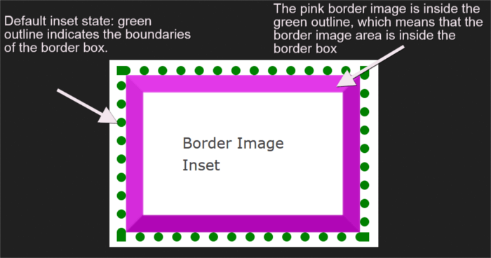
The border-image-outset Property
So far all the properties I have used default to an inset border image area. However, you have the option to push the border image area outside of the border box. You can do so with the border-image-outset property.
This property takes from one to four values (top, right, bottom, left) expressed either in a number or in length units like px, em, etc. In case you use a number, the result will be a border image pushed outside the border box by a multiple of the computed border-width.
To clarify further, I’ve drawn a green dotted outline to represent the border box. The border image area contains a pink border image. In its default inset state, the border image is inside the green outline. This means that the border image area is inside the border box.
Adding border-image-outset: 19px; to the CSS rule set, pushes the pink border image outside the dotted green outline. This indicates that the border image area is drawn outside the border box:
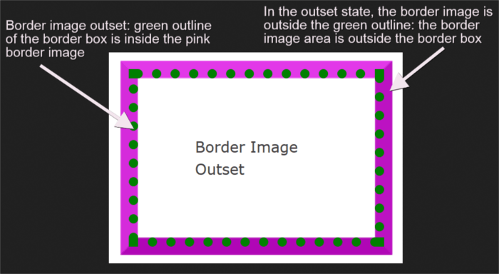
Be mindful of the fact that the portions of the border image lying outside the border box don’t trigger scrolling nor do they capture mouse events.
Check out all the examples discussed so far on CodePen:
See the Pen CSS Border Image Examples by SitePoint (@SitePoint) on CodePen.
The border-image-repeat Property
This property offers a few options on how to scale and tile the image slices on the sides and middle part of the border. The first value applies to the horizontal sides (top and bottom) and the second value to the vertical ones (right and left). If you set only one value, this applies to both horizontal and vertical sides.
Available values are:
stretch– The default if you don’t use theborder-image-repeatproperty. This keyword stretches the image to fill the available area.repeat– The image tiles repeated to fill the available area. The image can get cut off if the available area is not exactly divisible by the width of the tile.round– The same asrepeat, but if the space is not sufficient to accommodate the tiles, these get scaled until they all fit. This ensures the tiles never get cut off, but the images may look a bit squashed.space– The same asrepeat, but if the space is not an exact multiple of the tile’s width, the extra white space will be evenly distributed around each tile.
At the time of writing, it looks like Firefox renders space the same as stretch, while Chrome renders space the same as repeat.
The border-image Shorthand Property
You can condense all individual properties discussed above into the border-image shorthand property as follows:
border-image-sourceborder-image-sliceborder-image-widthborder-image-outsetborder-image-repeat
Here’s the code snippet:
element {

  border-image: url(myimage.png) 19 / 19px / 0 round;

}
Get your hands on the sample code for border-image-repeat and the border-image shorthand property on the CodePen demos below.
See the Pen border-image-repeat values and border-image shorthand by SitePoint (@SitePoint) on CodePen.
What if I Want to Remove the Border Image?
The best way to reset a border is with the shorthand border property. With border you can quickly reset the same width, color and style for all four borders of an element. No need to specify a border-image:none rule, nor any need to override any of the individual border-image properties.
Browser Support
At the time of writing, border-image has almost full support in all major browsers. Only Firefox can’t stretch SVG images across an element, and Opera Mini supports the shorthand syntax with the -o- prefix, but not the individual properties.
Conclusion
This article has been all about the border-image property: the values it accepts, how best to use it, and the level of browser support at the time of writing.
You can find more details in the CSS Backgrounds and Borders Level 3 specification document.
If you’ve used the border-image property in your project, why not share the end result with the community?
I’m waiting to hear from you!
Frequently Asked Questions (FAQs) on Decorating the Web with CSS Border Images
How can I create a CSS border image?
Creating a CSS border image involves using the border-image property. This property allows you to specify an image to be used as the border around an element. The syntax for this property is as follows:border-image: source slice width outset repeat;
The source is the URL of the image you want to use. Slice defines the inward offsets of the image. Width sets the width of the border. Outset determines how far the border image area extends beyond the border box. Repeat specifies how the image is tiled or repeated.
What are the different border styles available in CSS?
CSS provides several border styles that you can use to customize the appearance of your web elements. These include: none, hidden, dotted, dashed, solid, double, groove, ridge, inset, and outset. Each style gives a different visual effect. For example, ‘dotted’ creates a border with a series of dots, while ‘double’ creates a double line border.
How can I use CSS to create inset borders?
Inset borders can be created in CSS using the ‘inset’ border style. This style makes the box appear as though it is embedded in the page. The syntax for this is:border-style: inset;
Can I use different border styles for different sides of an element?
Yes, CSS allows you to apply different border styles to different sides of an element. You can use the properties border-top-style, border-right-style, border-bottom-style, and border-left-style to specify the style for each side individually.
How can I control the size of my CSS border image?
The size of a CSS border image can be controlled using the ‘border-image-width’ property. This property sets the width of the border image by defining the size of the border area. You can specify the width in pixels, or as a percentage of the element’s box.
Can I use gradient images as borders in CSS?
Yes, CSS allows you to use gradient images as borders. You can create a gradient image using the ‘linear-gradient’ function, and then apply it as a border image using the ‘border-image’ property.
How can I make my CSS border image repeat?
The ‘border-image-repeat’ property in CSS controls how the border image is repeated. The possible values are ‘stretch’ (default), ‘repeat’, ’round’, and ‘space’. ‘Stretch’ scales the image to fill the area. ‘Repeat’ tiles the image. ‘Round’ tiles the image but scales it to fit exactly. ‘Space’ tiles the image but with space between the tiles.
What is the difference between the ‘border’ and ‘border-image’ properties in CSS?
The ‘border’ property in CSS is used to set the style, width, and color of an element’s border. On the other hand, the ‘border-image’ property allows you to use an image as the border around an element.
Can I use CSS border images with rounded corners?
Yes, you can use CSS border images with rounded corners. You can create rounded corners using the ‘border-radius’ property, and then apply a border image using the ‘border-image’ property.
How can I create a dashed border in CSS?
A dashed border can be created in CSS using the ‘dashed’ border style. The syntax for this is:border-style: dashed;
This will create a border with a series of short lines or dashes.