
Key Takeaways
- CSS3’s border-image property allows for decorative borders to be added to any element using a small image which can be virtually sliced into nine sections and spread across a larger element.
- The border-image property is a shorthand property composed of border-image-source, border-image-slice, border-image-width, border-image-outset, and border-image-repeat. However, only the shorthand property is currently supported by browsers such as Opera, Firefox, Chrome, and Safari.
- You can utilize various image types as border images, including gradients, base 64, gifs, jpegs, pngs, and SVG images. The border-image-slice property defines the distance from each edge of the image marking the area to be sliced.
- The border-image-repeat property allows you to specify how non-corner images are repeated and/or scaled. The options include stretch, repeat, round, and space, though not all are well supported across different browsers.
Editor’s Note: Images are used throughout this article to illustrate the effects achieved with border-image. To see this in action. and view the code, go to the demonstration page.
A feature that is new in CSS3, but not so new to browsers, is the border-image property. Border-image provides a method to add decorative borders to any element. With the border-image properties you can create decorative borders for elements, beyond simple rounded corners, with images of very small file size or even with gradients.
The border-image property allows you to take a small image, slice it virtually into nine sections, and place /spread the portions of your small image across a much larger element.
You can take an image and stretch it across a button or a whole page.
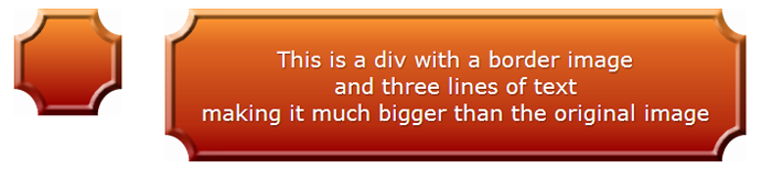
border-image for the div on the right, maintaining the corners, while stretching the center of the border-image to cover the entire div on the right.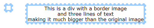
border-image, we’ve repeated, slightly distorting the image if necessary to ensure we don’t have a broken image in supporting browsers.To ensure that the image is not ‘broken’, the width should be a multiple of the slice’s width. While we’ve repeated the top, bottom and sides, we’ve maintained the four corners, creating a stamp-like effect.
Next, we’ll cover how to take a background-image, virtually cut it up, and either repeat or stretch the image to cover the borders and background of our element.
The border-image is a shorthand property used to declare:
  border-image-source:
  border-image-slice:
  border-image-width:
  border-image-outset:
  border-image-repeat:
The syntax for the shorthand is:
 border-image: <source>
<slice {1,4}> / <width {1,4}> <outset> <repeat{1,2}>;
At this time, Opera, Firefox, Chrome and Safari all support the vendor prefixed border-image shorthand property but don’t support any of the longhand properties that make up the shorthand. So, while we’ll cover the various properties that define border images, you should always use the shorthand instead of the shorthand properties described below.
border-image-source:
The border-image-source, is the URL, gradient or data URI of the image you want to use as your border image. In the above examples, while the longhand property is NOT supported, it is as if we we had used
.gradientBox {
  border-image-source: url(gradient.png);
}
.stamp {
  border-image-source: url(stamp.gif);
}
Just as you can include gradients, base 64, gifs, jpegs, pngs, and even SVG images as background images, you can include all these image types as border images.
border-image-slice:
The border-image-slice property defines from one to four lengths that set the distance from each edge of the image marking the area that will be used to cut, or slice, up our border image.
The border-image-slice property values represent inward offsets from the top, right, bottom, and left (TRouBLe) edges respectively of the image. In effect, with the four lines you define, the browser divides the one border image into nine regions: four corners, four edges and a middle. The four corners maintain their exact size. The other five values can be stretched or repeated or a combo of the two (round), depending on the values of the other border-image properties.
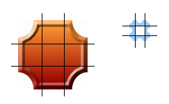
The black lines in the images above delineate how our four defined slice lines cut up our border-image.
In our examples, we’ve sliced the image 30px in from each side for our gradient, and 8 pixels in from each side for our stamp.
In the above examples, while the longhand property is NOT supported, it is as if we we had used
.gradientBox {
  border-image-slice: 30 30 30 30;
}
.stamp {
  border-image-slice: 8 8 8 8;
}
or, since the values are repeated, like the TRBL of border or padding, we can use a single value for all four sides
.gradientBox {
  border-image-slice: 30;
}
.stamp {
  border-image-slice: 8;
}
Note we’ve used no length units. If you are setting the slice values in length, and the value will be interpreted as pixels, omit the units. If you are using percentage values, include the percent. In our example, we could also have used the following:
.gradientBox {
  border-image-slice: 30%;
}
.stamp {
  border-image-slice: 26.7%;
}
For bitmap images, the omitted values are interpolated as pixel values. For vector images (SVG), the values are coordinates. For percentages use the percent sign (%).
border-image-width:
The border-image-width property sets the width of the element’s border. If the border-image-width property is declared, it takes precedence over the border-width, if one is declared. If omitted and the border-width is omitted, the value defaults to the border-width default which is ‘medium’, or generally 3px.
This shorthand is NOT supported in Opera (build 1024 is the most recent one checked). Additionally, the value of auto is not supported in any browser. As such, it is often recommended to include border-width as a separate property. Declaring as part of the shorthand is as if we had declared:
.gradientBox {
  border-image-width: 30px 30px 30px 30px;
}
.stamp {
  border-image-width: 8px 8px 8px 8px;
}
or, since all the value are the same,
.gradientBox {
  border-image-width: 30px;
}
.stamp {
  border-image-width: 8px;
}
So far we have:
.gradientBox {
  border-image: url(gradient.png) 30 / 30px;
}
.stamp {
  border-image: url(stamp.gif) 8 / 8px;
}
Since including border-image-width in the shorthand currently makes Opera fail, it is recommended to exclude this property, and instead opt for including the CSS2 border-width value.
.gradientBox {
  border-width: 30px;
}
.stamp {
  border-width: 8px;
}
Having the border-image-width be the same width as the border-image-slice will create the best looking border image with no distortion. But, they don’t need to have the same values. The slice will be stretched (or contracted) to the width of the border-image-width if the values are not the same.
Remember the box model! As you increase the border-image-width, your element will grow larger.
border-image-outset
The border-image-outset property specifies the amount by which the border-image area extends beyond the border box on all four sides. It is not supported in any browsers, and makes the entire declaration fail, so, for now, don’t include it. The default value is 0.
border-image-repeat
The border-image-repeat property allows you to delineate how non-corner images (the sides and middle) are repeated and/or scaled. The first value is the top and bottom, the second value is the left and right sides. If the second value is omitted, all four sides will have the same value.
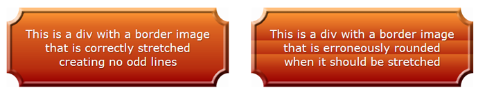
The specifications currently define four possible values, but only three are well supported. stretch means that the image should not be tiled, but rather stretched to fill the area. repeat means the image is tiled ( or repeated) to fill the area. If the area allocated for the repeating image is not exactly divisible by the width of the image, the last tiled image may be cut off. With round the image is tiled (repeated) to fill the area, with the image being scaled down, possibly losing its aspect ratio, but ensuring that the image is never cropped. Note that Webkit doesn’t support the round value, replacing it with repeat instead (which is better than failing, I guess).
The space value is not currently supported, but when supported, the border-image will be repeated as many times as can fully fit in the area provided, with the tiles evenly spaced, showing white space between the tiles if the width provided is not an exact multiple of the image size.
In our above examples, we used stretch for the gradient and round for the stamp. You will always want to stretch gradients, as repeating them creates harsh lines as one tile ends and the next begins. And, while it may seem to make sense to use repeat for the stamp, we have no way of knowing if the image is evenly divisible by the width of our design. The round does distort the image ever so slightly, but that is better than having the image cut off.
If we had used the inverse, the effect would be odd. While the top and bottom can use round, repeat or stretch, the left and right sides definitely need the stretch value:

Border-image shorthand
As mentioned earlier, no browser supports the longhand properties defined above, but Opera, Firefox, Chrome and Safari understand the prefixed shorthand border-image property. Now that we understand the components of the shorthand property, let’s put it all together.
The correct syntax is
border-image: <source>
<slice {1,4}> / <width {1,4}>  / <outset> <repeat{1,2}>;
Since outset is not currently supported, we can omit it:
border-image: <source>
<slice {1,4}> / <width {1,4}> <repeat{1,2}>;
Like all border-images, we’ve cut our gradient image into nine slices defined by the border-image-slice property. Generally, the slices are the same width as the border-width. And, since we have a gradient, we want to stretch the image, not tile it, so we don’t get harsh color transitions. As such our code is:
.gradientBox {
    border-image: url(gradient.png) 34 34 34 34 / 34px 34px 34px 34px stretch stretch;
}
which, with repeated values, we can narrow down to:
.gradientBox {
    border-image: url(gradient.png) 34  / 34px  stretch;
}
Since Opera doesn’t understand border-image-width when included in the shorthand, we include the border-width separately and then expand our declarations to include the various vendor prefixes:
.gradientBox {
   border-width: 34px;
  -moz-border-image: url(gradient.png) 34 / 34px  stretch;
  -webkit-border-image: url(gradient.png) 34 / 34px  stretch;
  -o-border-image: url(gradient.png) 34   stretch;
   border-image: url(gradient.png) 34 / 34px   stretch;
}
Similarly, our stamp effect includes the stamp image as the border-image-source, has borders that are eight pixels wide, has a repeating border which can’t have a partial image showing lest we break the design. We still have the Opera issue of border-width, and all supporting browsers still use the vendor prefix. As such, our code looks like this:
.stamp {
    border-width: 8px;
   -webkit-border-image: url(stamp.gif) 8 / 8px round;
   -moz-border-image: url(stamp.gif) 8 / 8px round;
   -o-border-image: url(stamp.gif) 8  round;
    border-image: url(stamp.gif) 8 / 8px  round;
    }
Resources
At this point, you hopefully have a good understanding of how to create a border image. There are a few tools to help you along:
- The W3C Border Image specifications
- Tool to create CSS code with your own border image
- Browser support grid for border-image properties
- Border-image visualization tool
Images are used throughout this article to illustrate the effects achieved with border-image. To see this in action. and view the code, go to the demonstration page.
Frequently Asked Questions about CSS3 Border Image
How can I use CSS3 border-image to create a responsive design?
CSS3 border-image property is a powerful tool that can be used to create responsive designs. It allows you to specify an image to be used as the border around an element. The image can be scaled or repeated to fit the border area, making it a great tool for responsive design. To use it, you need to specify the path to the image, the slice values, and how the image should be fitted to the border area. Here’s an example:#example {
border: 10px solid transparent;
padding: 15px;
border-image: url(border.png) 30 round;}
In this example, the border.png image is used as the border. The slice value of 30 means the image is divided into a 3×3 grid, and the ’round’ value means the image is repeated to fill the border area.
What are the different values I can use with the border-image property?
The border-image property accepts several values. The first value is the path to the image file. The second value is the slice, which defines how the image is divided. The third value is the width of the border, and the fourth value is how the image should be fitted to the border area. Here’s an example:#example {
border-image: url(border.png) 30 30 30 30 round;}
In this example, the image is divided into a 3×3 grid, the border width is 30px, and the image is repeated to fill the border area.
Can I use a different image for each side of the border?
Yes, you can use a different image for each side of the border by using the border-image-source property along with the border-image-slice, border-image-width, and border-image-outset properties. Here’s an example:#example {
border-image-source: url(top.png), url(right.png), url(bottom.png), url(left.png);
border-image-slice: 30;
border-image-width: 10px;
border-image-outset: 5px;}
In this example, a different image is used for each side of the border. The images are sliced into a 3×3 grid, the border width is 10px, and the border is outset by 5px.
How can I create a border image that repeats horizontally but not vertically?
You can control how the border image repeats by using the border-image-repeat property. If you want the image to repeat horizontally but not vertically, you can use the ‘repeat’ value for the horizontal sides and the ‘stretch’ value for the vertical sides. Here’s an example:#example {
border-image: url(border.png) 30 / 10px / 0 stretch repeat;}
In this example, the border image repeats horizontally but is stretched vertically to fit the border area.
How can I create a border image that scales to fit the border area?
You can make the border image scale to fit the border area by using the ’round’ value with the border-image-repeat property. Here’s an example:#example {
border-image: url(border.png) 30 / 10px / 0 round;}
In this example, the border image is scaled to fit the border area. If the image cannot be scaled to fit exactly, it will be rescaled so that it fits as best as possible while maintaining its aspect ratio.
Can I use a gradient as a border image?
Yes, you can use a gradient as a border image by using the linear-gradient() function as the border-image-source. Here’s an example:#example {
border-image-source: linear-gradient(to right, red, orange, yellow, green, blue, indigo, violet);
border-image-slice: 1;}
In this example, a rainbow gradient is used as the border image.
How can I create a border image with rounded corners?
You can create a border image with rounded corners by using the border-radius property along with the border-image property. Here’s an example:#example {
border: 10px solid transparent;
border-radius: 15px;
border-image: url(border.png) 30 round;}
In this example, the border image has rounded corners with a radius of 15px.
Can I use an SVG image as a border image?
Yes, you can use an SVG image as a border image by specifying the path to the SVG file in the border-image-source property. Here’s an example:#example {
border-image-source: url(border.svg);
border-image-slice: 30;}
In this example, an SVG image is used as the border image.
How can I create a border image that repeats diagonally?
You can create a border image that repeats diagonally by using the ’round’ value with the border-image-repeat property and rotating the element. Here’s an example:#example {
border-image: url(border.png) 30 / 10px / 0 round;
transform: rotate(45deg);}
In this example, the border image repeats diagonally.
Can I animate a border image?
Yes, you can animate a border image by using CSS animations or transitions. However, keep in mind that not all properties of the border-image can be animated. For example, you can animate the border-image-slice property, but not the border-image-source property. Here’s an example:#example {
border-image: url(border.png) 30 / 10px / 0 round;
transition: border-image-slice 2s;}#example:hover {
border-image-slice: 60;}
In this example, the border image slice is animated when the element is hovered over.